Lesson Info
17. Advanced Photoshop Layers
Summary (Generated from Transcript)
The topic of this lesson is Advanced Photoshop Layers.
Q&A:
What are blending sliders in Photoshop layers?
Blending sliders are a feature in Photoshop layers that allow you to remove or hide parts of an image based on brightness.
How do you access the blending sliders in Photoshop?
You can access the blending sliders by double-clicking on the empty area to the right of the layer's name, or by clicking on the FX button at the bottom of the layers panel and selecting Blending Options.
How do you use the blending sliders to remove a background?
To remove a background using blending sliders, you adjust the sliders to hide the dark parts of the image, and you can split the sliders and adjust them further to create a more gradual fade.
How can you permanently delete a hidden background in Photoshop?
You can merge the layer with the hidden background down onto a new layer to permanently delete it.
What other features can be used with Photoshop layers?
Other features that can be used with Photoshop layers include the Shape tool and Layer Styles. The Shape tool allows you to create shapes and combine them to create more complex designs, while Layer Styles allow you to add effects like gradients, shadows, and bevels to your layers.
How can Layer Styles be applied to shapes in Photoshop?
Layer Styles can be applied by clicking on the FX button at the bottom of the layers panel and selecting the desired style, such as Gradient Overlay, Drop Shadow, or Bevel and Emboss. The settings for each style can be adjusted to achieve the desired effect. In this lesson, the instructor covers various advanced techniques related to layers in Photoshop. They explain how to use layer styles to create different effects, how to copy layer styles to other layers, and how to apply layer styles to groups of layers. The instructor also demonstrates how to use layer masks in groups to apply effects to multiple layers at once. Additionally, they discuss the use of layer comps to create multiple versions of an image and export them as a PDF or separate files. Finally, the instructor explains a technique for ensuring grayscale areas only print with black ink when converting an image to CMYK mode.
Q&A:
How can I copy layer styles to multiple layers at once?
You can copy a layer style by right-clicking on the layer with the style and selecting "Copy Layer Style". Then, select the layers you want to apply the style to, right-click, and choose "Paste Layer Style".
Can I apply layer styles to a group of layers?
Yes, you can apply layer styles to a group of layers by right-clicking on the group and selecting "Paste Layer Style". This will apply the style to all the layers within the group.
How can I create different versions of an image using layer comps?
To create different versions of an image, you can use layer comps. First, set up your image with the desired variations (e.g., different backgrounds, effects, etc.). Then, go to the "Window" menu, select "Layer Comps", and click on the "New Layer Comp" button. Name the layer comp and choose the changes you want to save (e.g., visibility, position, appearance). Repeat this process for each variation. You can then export the layer comps as separate files or as a PDF.
How can I ensure that grayscale areas only print with black ink?
To ensure grayscale areas only print with black ink, you can convert the image to CMYK mode and use layer masks to control the ink usage. Create a separate layer for the grayscale areas, and in the layer's blending options, turn off the cyan, magenta, and yellow channels. Adjust the black channel to get the desired color. Then, darken the layer to compensate for the ink reduction. Finally, wrap the layers into a smart object and change the mode back to RGB. When the image is converted back to CMYK, the grayscale areas will only print with black ink. The topic of this lesson is advanced techniques using layers in Photoshop CC. The instructor discusses how to use blending sliders to remove backgrounds and retain specific elements, such as black ink signatures or tattoos. They also mention that tomorrow's lesson will cover tips and tricks and explore new features in the latest version of Photoshop. The instructor encourages students to join the Facebook group to share their experiences and learn from others. They also provide links to find them online, including Facebook and Pinterest.
Lessons
Introduction to Photoshop
56:15 2How to Use Camera RAW
1:06:19 3Making Selections in Adobe Photoshop
1:08:06 4Using Layers in Adobe Photoshop
1:28:09 5Using Layer Masks in Adobe Photoshop
1:03:14 6Tools Panel in Adobe Photoshop
1:13:27 7Adjustment Layers in Adobe Photoshop
1:04:25 8Color Adjustments in Adobe Photoshop
1:31:57Retouching Images in Adobe Photoshop
58:47 10Layer Blending Modes
1:03:19 11How to Use Filters in Adobe Photoshop
55:46 12Advanced Photoshop Masks
1:35:23 13Using Smart Objects in Adobe Photoshop
1:09:16 14Photography for Photoshop
1:00:11 15Photo Retouching in Photoshop
1:31:15 16Warp, Bend, Liquify
1:40:43 17Advanced Photoshop Layers
1:39:53 18Photoshop Tips and Tricks
1:07:39 19Photoshop Actions
1:25:48 20Troubleshooting Photoshop
1:09:07 21Photoshop Q&A
21:50Lesson Info
Advanced Photoshop Layers
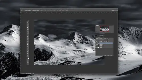
And we're back with another episode of Photoshop CC: the Complete Guide. We're on week four, and here are our topics for this week. We're getting into some pretty interesting ideas here. And today we only have four days to go after this. Today's topic is Advanced Layers. Now we've had an entire separate session on layers and we've also had sessions on features related to layers, like blending modes, but now we're going to explore where all the hidden features and layers and the unique settings we can use when using layers. So let's jump right into Photoshop so we can spend as much time as possible there. The first feature I'd like to talk about is known as a blending sliders. Blending sliders. And blending sliders will remove the background, or will hide things I should say, because it doesn't actually delete things, based on brightness. So here I have an image that has either a black background or something close to black, and I would like to tell Photoshop to hide everything that is ...
between black and 80 percent gray or something and keep everything else. There are many different ways of doing that, but there's a feature built into Layers that's designed for it. To accomplish it here, I'm first gonna have to unlock the background layer. If you have an older version of Photoshop, you would have to double-click on the name of the background to accomplish that. In the newer versions of Photoshop, you can just click the lock symbol to turn it off. Then to access the feature I need to use, I'm gonna double-click not on the name of the layer itself, but to the right of the layer's name, out here where there's nothing. And if I do that, it's gonna send me into this screen. And this is where I find the blending sliders. They're at the bottom. There's more than one way of getting to this screen. So if you've ever been to an area that looked similar to this, you were probably in this, it just might be that you didn't double-click on the layer to get to it. So just in case you would like to know, you can also as an alternative go to the bottom of your layers panel where you find the letters FX. And if you were to click on FX, the very top choice is called Blending Options. That would be another way to get to the exact same screen. Or you can go to the layer menu and you'd find an option in there too. So however you get to it, we just want to get to these sliders. The area is labeled Blend If, and we have two sets of sliders. One called This Layer, which always thinks about the layer we're currently working on, and one called Underlying Layer, which thinks about whatever's underneath that layer. And it shouldn't be called Underlying Layer, it should be called Underlying Image because what's underneath could be made out of multiple layers and it's not thinking about just one, it's thinking about everything that's underneath. When I pull in this slider like this, anything that is to the left of it, anything in that brightness range is going to become hidden. So if I were to bring it into the middle, now anything that is 50 percent gray or darker would disappear. If I go to the opposite side and pull this slider in, anything to the right of this slider, anything in this brightness range would become hidden. Then if you look at each slider, you'll notice there's a vertical line down the middle, which makes these sliders look a little bit different than others, and that's because you can pull them apart. It's like there's two sliders that are magnetically held together and if you want to demagnetize them, you hold down the Option key, Alt and Windows, and then you can split them apart. When you split them apart, and it's a little bit different. Still whatever's to the left of the two sliders, as if they were matched together into one piece, that will still become hidden and anything to the right of the sliders in this range will be normal, but now that we split the two sliders in half, the area in between the two halves is where the image will fade out. So that the area in this general brightness range all the way across here will be normal and once it gets to right there, it will start showing up a little bit less. And then less and less and less and less and once you get to here, it won't show up at all. So it's an even fadeout between the two sides. And so each one of these can be pulled in and if you hold Option, you can pull them apart. So let's look out some uses for that. Here we have fireworks. If we wanted to remove the background on fireworks, wouldn't it make sense to hide the dark parts? And therefore, I would take the upper left slider and pull it in, until I see the majority of the sky disappear. Then there are some areas that are a little bit brighter than black that are still clinging to the fireworks and I can either continue to pull this in until I get those areas to disappear, or I can make those areas partially transparent by splitting the slider in half. Now, I wouldn't usually just pull this over and not split the slider, because if I do then we have an abrupt transition between the area we're keeping and the area that's hidden, where there's no softness at all to it. It will look jaggy on the edge. In almost every instance I've ever used this with, I will split the slider in half, it just might be that I don't make a huge gap between the two halves of the slider. So I'm holding my Option key down right now, and I just spread that apart. I'll pull it in until those dark areas within the fireworks seem to barely show up and I'll fine tune the position of the other slider. And then I'll click okay. So we've already used an image like this one previously, and we used a different method to combine it with a different image. Didn't we have a picture of the Seattle skyline panorama and we dragged an image similar to this on top of it and we used some of the blending modes, like Screen Mode, or Lighten Mode. This is another method though, and if you look at this method on the main part of my screen, it looks as if this area and the surroundings have become transparent because it looks like a checkerboard, but if you look at the layer itself, you can still see that the black background has not truly been thrown away, it's just hidden. And now there's an icon to the right side to indicate that some sort of special settings have been used to do so. If I double-click on that icon, it'll bring me right back into where I was and I can see the settings that were used. Click okay. If I wanted to permanently delete that area, there is no command that gives me that. Actually, there might be one, let me look. It'd be under Layer Rasterize if it was available. Do you see the choice called Rasterize? Oh it's grayed out, so no it's not available for this. I just wanted to check because I might say there's no command that does this and there'll be one sitting there. I didn't think there was. So here is how we can trick Photoshop into deleting the background instead of just hiding it. Maybe you want to give this image to a client and you don't want them to know how you did it. They don't want to know what those blending sliders are. That kind of thing. So first, I want to create a brand new empty layer underneath the layer I'm currently working on. I'm gonna drag that underneath. With that new layer underneath, I'll click on the layer above and I'm just gonna tell Photoshop to merge that layer down into the layer that's below. Since the layer that's below does not have those sliders applied to it, it doesn't have them turned on, it's gonna try to maintain the appearance of this layer while not using the sliders. You can do that by either typing Command E or choosing Merge Down. Command E is just a keyboard shortcut for it. So here goes. Command E. If you looked in my layers panel, you would have seen it happen. Before you could still see the black background contained within there. Command E now, it's permanently deleted. It's just sometimes you want to for some reason be able to get rid of that. Maybe I want to paint on the image now with dark shades. Shades that would usually disappear with those sliders turned on. Who knows what the reason is? But it's nice to know you can do something to make it permanent. Now let's use those same blending sliders for different kinds of images. We can apply them to just about any kind of layer so we have to think a little bit about when they might be useful. Here I have two images. This one and this, that I'd like to combine together. I'll select those two images and I'll choose Tools, Photoshop, Load Files into Photoshop Layers. Just to get Photoshop to stack these two images in the same file. I'm gonna move the layer that contains the birds so it's on top. And let's see if there's any way I can easily remove the background on the bird. Well, if you look at the sky, isn't the sky quite a bit brighter than the bird? So if that's the case, anytime I notice what I would like to hide is dramatically different in brightness that what I would like to keep, then my mind thinks about the blending sliders. Because it can only show or hide things based on brightness. So I'll double-click not on the name of the layer, but to the right of that where there's empty space where there are no icons, there's no text. And that should send me into the layer options dialog, and this time I'm going to use the upper right sliders, which should make the bright areas disappear, and I'll bring it in until the sky starts to disappear. Once most of the sky is gone, I notice some light areas still clinging to the wings of the bird, so I'll hold down the Option key, I'll grab the left edge of the slider I have been moving and I'll continue to pull it towards the left. By holding Option, it should split apart and then I can make those areas that were still clinging to the bird, I'll make them partially transparent. Something like that. But anytime I see a great difference between brightness and subject, blending sliders might be a fast way of isolating that object and getting it separate. Now in this particular case, if I would like this to look better because I think the bird looks like it has a lot of grays in it, and it doesn't have much of the orangeish colors that are in the background, I might also change the blending mode in this layer. If I were to make the bird print like ink on top of the background, then wouldn't the color of the sky be printed with it? Printed together? So I'm gonna try Multiply mode, and then I notice the color of the sky combining with the wings a lot more and in this particular case because the bird is so simple, almost a silhouette, that works. If it was a bright white bird, then doing it wouldn't look right because the color of the background would be combined with it and it wouldn't look like a white bird anymore. But in this particular case, I think that made for a easy composite. Sometimes I want to combine two images together. In this case, I have two textures. This one and this one and I want to put them together. So I'll select them both, I'll choose Tools, Photoshop, Load Files Into Photoshop Layers, just like before, and I could combine them together in many different ways. One method would be to use blending modes but I want to do it based on brightness. I just want to keep the dark parts of this. And wherever it's not dark, show what's underneath. So again, I double-clicked not on the name but to the right of the name where there's empty space. And now I can say let's let the dark areas from this layer disappear if I pull in the left side or let the bright areas disappear if I pull in the right side. And then I can split the slider by holding Option to get a blend. I might need to get them quite a distance apart before it looks like at all a natural blend. But I'm not liking that quite as much. What I think what I actually want is I want the dark parts of what's underneath to show through. Because underneath there was more poles or knotty looking areas that were kind of dark blobs. I want them to show through to here. And that's when I'm going to start using the second set of sliders that are here, the bottom ones. They're called Underlying Layer. Should be called Underlying Image because it's not thinking about only one layer. It's thinking about whatever's under there regardless of how many layers it's made out of. And if I pull this side in, it'll start making the dark parts of what's underneath, it's gonna make it break through the layer I'm working on. If I pull in the opposite side, it'll allow the bright parts of what's underneath to break through. So let's see what happens. I'll pull in the left side and I start seeing some dark areas break through. Then I hold down the Option key, split the slider in half, and experiment to see if I can get an interesting combination. I'm starting to get some of the dark little areas from what's underneath. By turning Preview off, there's the original texture, here's some of the dark parts of what's underneath blended in. So I just have two textures combined. This can be any kind of image as long as I only want to keep the bright or dark areas, but there's just the texture by itself, here it is blended with what's underneath. So when might we need to use some of those sliders on something other than just putting one image on top of another? Well, sometimes you want to make a change to your image that only happens to the bright or dark areas. And there are some adjustments where you might be able to accomplish that, but sometimes you've already made the adjustment and you're just like, I don't like what it's doing to the bright part of the picture. So let's see an example. Here I'm going to apply an adjustment layer and the type of adjustment I'm going to use is called Vibrance. And in Vibrance, you have two sliders. You have a Vibrance and a Saturation slider. The Saturation slider is just like the one found in Hue and Saturation. But I'm gonna bring down the vibrance here. That's gonna make the image less colorful. Let's say I wanted to do that but once I'm done and look at the image and I don't like what it did to the bright part of the photograph. If I choose Undo or Hide This Layer, here's before you see how much yellow there was in the bright part of the photo? Whereas after there's a lot less but I do like what it's doing out on the edge of the photograph where it's really dark. Maybe I want to make it less colorful only in those dark areas. If that's the case, I'll double-click not on the name of the layer but to the right of the name where there's a little empty space. It'll bring me into the blending sliders. Now when it comes to an adjustment layer, here's how Photoshop thinks. When you're working on the adjustment layer, it thinks that that layer contains the result of this adjustment. So whatever the result of this adjustment would be, if that makes the image black and white, then it thinks this layer contains a black and white version of the picture. In this case, it made the image less colorful. So down here we have the original, up here it thinks it has a less colorful version of it. When it comes to the sliders, that's what it thinks of. It doesn't think this is an adjustment layer, it thinks it's whatever the result of applying that adjustment looks like. When I look in here, in this case, I can probably use either one of these sliders. Let me think about it. I'm going to let the dark parts of what's underneath, that's the original picture that's underneath, I'm going to leave those alone and I'm going to let the bright parts break through. Like this. If I do that, watch the image and you'll see in the bright areas, you see the yellow starting to come back? I'll bring it in until I get a good amount of the yellow, then because we have an abrupt transition in there I'll hold down the Option key and I'll split the slider in half and I'll spread it really far apart because I need a very gentle transition. Very gradual. And I'll experiment with the positioning of this. I'll click okay and let's see if we can see a difference. What I'm going to do is turn off this adjustment layer and we'll see what part of the image is changing. Look first at the bright part of the picture and notice the area that is intensely yellow is still pretty intensely yellow. But then look at the dark portion of the picture. I'm thinking about areas up in here, down in here, up in this corner, and a little bit in here we have dark stuff. That's where this adjustment is applying, is in those areas that are dark. The areas that are bright are barely changing at all. And that's because if I were to double-click on the area to the right of the name of the layer, we're saying let the underlying image show up. From white all the way down until we get to this brightness right here. We're gonna have original picture and then we're going to start bringing our adjustment in. Since we have these sliders spread apart so far, it'll start applying right here where it makes the image less colorful, but it's only gonna apply a little bit and then it's gonna fade in. So here it applies a little, over here it starts applying more. If I need it to apply more to my shadows, I would have left a gap over there. Because that would mean apply it full strength over here. Let's look at a semi-practical example of that. In this image of my wife Karen, I'm going to take all the color out and then I'm going to put color back in just to show you what happens when you try to colorize a picture. Before I do that, notice that on Karen's forehead, do you see the bright area? Do you notice that you can't see the color of her skin in the brightest area? Also, look at the darkest area maybe at the bottom edge of her arm here or right near here. Can you see much of the color of her skin in that area either? Not really. Usually when you do the extremes of brightness you don't have any color. And that's why when we did color correction with little eyedroppers, we could click on the brightest and darkest parts of our picture as some areas to investigate because they don't usually contain color. And we were looking for areas that don't contain color. The problem is going to be when I put artificial color in here, it's not gonna know to not put a lot of color in the bright areas and it's not gonna know to not put a lot of colors in the dark areas. Instead, it's gonna shove the same amount of color everywhere. And only after we use those sliders should it make it so it looks okay. So I'm going to come here and do an adjustment called Black and White and I can adjust the end result, just get the background a little brighter. I just moved my mouse on top of the image and drug to the right. See if she looks acceptably bright. So there I pulled all the color out. I used a black and white adjustment layer so my image is still in RGB mode, meaning it's still in a mode where I can have color, and now what I'm gonna do is there's many different ways of adding color to an image. One is I could use an adjustment layer. The adjustment layer called Hue and Saturation has a checkbox within it called Colorize. Because usually the sliders in there won't do anything unless there's already color in your picture, so I could apply a Hue and Saturation adjustment layer and click on the Colorized checkbox. That's one method. The other method would be to create a brand new empty layer and to choose a color to paint with and it's best to open an example photo so you have a good color to paint with. One that would actually resemble a skin tone, whereas what I'm doing, which is eyeballing it, probably gonna make her look kinda fake but you'll still get the idea of how the sliders are gonna help me. Then I can come in here and paint over the area where I would like color and it might be useful if I were to use something like the Quick Selection tool to isolate this. I would have done that back when it was in color because it would be easier. Because right now when it's only brightness information there's not all that much info for it to work with but for now I'm not going to try to get my painting to be perfect. You're welcome to spend time doing that on your own. Instead, I just want to show you what's gonna happen when I apply any kind of color to the image and then I'll show you how to limit where that color is applied so it doesn't apply quite as much to the bright or dark areas. Let's just get an okay amount of paint in here. And all I have to do to get this color to apply to the underlying image is in my Layers panel at the top we have a blending mode and the blending mode I need to use in order to apply color to an image that does not already have color is one that is called Color. The choice that's in there called Hue which some people think about because they're used to using it for changing the color of things will not work when the image that's underneath doesn't already have color because the choice called Hue leaves your picture just as colorful as it used to be. It does not modify how colorful it is. So if the image is already black and white and you paint with Hue mode, you're not gonna see it. So let's try that. I'll set this to Hue mode first. You'll see that it simply doesn't do anything. Hue means apply the basic color that's here to the brightness that's already in the underlying image and leave it just as colorful as the underlying image. And it's doing a good job leaving it just as colorful. Then I change it to the choice called Color and then I start seeing the color applied. When I do that and you look at the image, look at how much color is in her forehead in the bright part. Isn't there a lot compared to what the original picture had? And look at this area under here. We have a whole bunch of color showing up in that area. Which usually makes the colorizing effect not look at all realistic. So to fix it, I'm gonna double-click not on the thumbnail or on the name of the layer, but in the empty area. Then I'll move this over and I'm gonna say let's let the bright areas of what's underneath show through. Now I could actually use either one of these sliders, the upper or the lower, because what it thinks is in that top layer is... Well actually no, if it was an adjustment layer I could use either the upper or below because it would think that what's contained in the upper layer is the result of your adjustment. And therefore, it's these highlights and the dark and bright areas would be similar. But since I did painting, it would blatantly look at what is in that layer and so I don't want to use this layer sliders. I want to instead use Underlying Layer because that's where the brightness is that I wanted to think about. Watch her forehead up here. I'm going to bring in this slider and I'll be looking at her forehead and I'm looking for when the color goes away and you see it starting to go away. I want a smooth transition so I hold down the Option key and I split the slider, pull it further to the left and I'll fine tune the position of both halves until it looks relatively good, then I'm going to try to get a lot of the color out of the shadow of the image and I'll do that by pulling in the lower left slider. I'll pull it in until I see the color disappear from under her arms. You might have to pull it in quite a distance there. Starting to go away. Then I will split the slider and adjust the position of both halves. And you can, if you look at the sliders, you can have them cross over each other meaning this slider here can be pulled way over here if you need it to. Somewhere in there. I might need to change the color I'm painting with. Remember, I chose the color off the top of my head, just guesstimating. Usually what I do is open a full color picture of the person, grab the eyedropper tool and click on their skin. Grab the color right out of there. But I didn't have the example much handy. So I'm going to turn the Preview checkbox off and let's see if we can see a difference. Before, can you see how much color is in the highlight on the forehead, afterwards there's less? Look under he arm before, under the arm after. And I can probably fine tune it even more, spreading out the sliders a little further, that kind of thing. You get the idea that we can have control over it. Then what I could do to fine tune the color is since all we have in that top layer is a solid color I've painted with, I could adjust that layer and this is a time when I would not use an adjustment layer because all I want to do is act as if I've painted with a different color. And therefore I do want to directly affect what's in this layer. What's in this layer is a single color, so it doesn't really matter. It's not like it has a lot of detail to it. So this is one time where I choose Image Adjustments, Hue and Saturation, instead of an adjustment layer because it's just gonna change the color of what's sitting in that particular layer. Because when you go to the Image menu and choose Adjustments, it can only affect one layer, the layer that's active, and so I can move this around and try different colors, fine tuning it so maybe she gets a little more warmth in her. Seeing what happens if I make it a little bit more colorful or a little bit less, to see what I might decide to use. And all it's doing is shifting the color of the paint that's already in that layer. So you get the idea that blending sliders could be useful there. You can sometimes use them to remove the background on clouds depending on the image because the blue sky is often darker than the clouds. I should mention something there and that is, sometimes you'll have difficulty getting the clouds to show up enough and if you do I want to give you one little tip that might be helpful. First, let's try to remove the background on those clouds using those sliders. We have to unlock the background layer by clicking the lock symbol and then double-click on the empty area of the layer in the layers panel and then I would say let's hide the dark parts of this layer. I start to bring it in. Eventually we get to the blues. I try to get as much of them to disappear and I stop if too much of the clouds start disappearing. So do you see how the edges of the clouds are starting to break away there? I might stop about there. Then I hold down the Option key and I pull this further and I need to fine tune both halves and in this case, the very bottom of the image, I might have to use a layer mask on it to get rid of the background but I'm having some difficulty. Do you see how much blue is up here? There's still some clinging and all that. I don't know if I'll be able to completely fix this or not, but the main thing is right now it says Blend If Gray. That means think about a grayscale version of this picture. Ignore the fact that the sky is blue and just look at how bright it is. Act as if you're working on a black and white. But if I click there, we have red, green, and blue available and that is thinking about your Channels panel. If you don't have your Channels panel open on your screen, you can go to the Window menu and that's where you'll find the choice of channels. And here I have my Channels panel and just glancing at it, I can tell which channel makes the sky separate from the clouds the most. Can you just glance at them and see which one make the sky more dramatically different from the clouds in here? It looks to me like the red, doesn't it? Now you can control the size of these by right-clicking in the empty area below it and I'm just gonna set it to large so it's easier for you to see. But here's the red, green, and blue that this image is made out of and that menu we were working with that said Blend If Gray, it was thinking about a black and white version of this image but the other choices were these three. And so I can have it look at this black and white version of the image or this one or this one. So I'm gonna tell it to work on the red. That might help or it might not, it's hard to say, but at least I have it as an option. Sometimes it's gonna be a dramatic difference where it'll make it so it's become so easy because that one color totally separates from the other in one of those channels. So I'll come in here and this time I'm gonna set this menu to Red. So now it thinks about, should we make the areas that contain an awful lot of red disappear? And I don't believe I want to do that because that would be the areas that were bright in that particular channel and the clouds were bright. Do you remember how dark the sky was? Well this means areas that don't contain very much red. That's areas that would be dark in that channel. So I'll pull that in. And I'm not sure on this image if it will be better or not but my assumption is it will be a little better because only now do we get the clouds. Up in here, do you remember before how much blue we had left? Before the edge of that cloud started to disappear. So then I'll split the slider. And if I was gonna put any kind of blue background, having the littlest hint of blue on the edges isn't going to harm me. It'll usually look fine. But that's one option we would have with clouds. There are other options for getting rid of the background with clouds. But one is just doing it based on brightness. So if you ever have difficulty with the blending sliders and you notice the subject of your photograph is quite a different color than the background, it's not just a separation in brightness, it's a distinct difference in color. If that's the case, go look in your Channels panel. You'll probably notice that one of the channels makes those two things become more dramatically different in brightness and therefore will make the blending sliders easier to use if you tell it to use that as your source. So that's enough about the blending sliders. So now let's move on and talk about other features. I would like to discuss both the Shape tool and Layer Styles. I'll open a few different images. This image here was created completely with the Shape tool and layer styles. Let's open another one. This one as well uses a lot of the Shape tool and layer styles to create things. We'll use a combination of a bunch of features to create various effects. And we'll start with a simple empty document then we'll move onto those. First, the Shape tool. If you look in your Tools panel, down near the bottom, just above the Hand tool is a slot where usually you'd see just a rectangle sitting there but if you've ever used it before it might look like a different shape and if you click and hold down on it you'll find various shapes found in that area. I'm gonna choose one of those shapes. I'll use the Ellipse tool. Then if I click and drag within my picture, I'm gonna get an ellipse. If I want it to be a perfect circle, hold Shift before you let go. Shift will constrain things. Then if I use that tool a second time, the setting that is found right here will determine what happens. With default settings, each time you use that tool you would get a new layer. I'm gonna tell it instead to either add to this shape or to take away from this shape. And I'll switch between these things but for now I'm going to tell it to take away from this shape. What I might want to do though is draw the second shape first. I'll come in here and say Combine, I'll draw my second shape. I'm just gonna draw one on the inner portion here. Just so you know while you're drawing it, you can press the spacebar to reposition it, if you didn't click quite in the right spot. As long as you have not released your mouse button yet, you can always press spacebar to reposition. After I've drawn that shape I'm gonna tell it to then subtract from the shape that was already there. Then I will use the same tool over again and I'm gonna draw another shape. Hit my spacebar if I want to reposition. And I wish the Properties would not pop up every single time I draw a shape, but I'll put it over here 'cause it insists. And this one I'm gonna tell it to Add To, or Combine. And I can just continue this process. What's nice is I can also type Command T to transform if I wanted to put it at a slight angle and I can create all sorts of different shapes in this way. If I continue to draw more shapes, I can eventually come up with a more sophisticated shape where it doesn't look like it's made completely out of these individual pieces. If I need to move around some of the pieces, you do have two kinds of the path tools over here where I can click on a particular piece and use it. It's like the Move tool but it works on individual parts. So imagine I got this wherever I'd like it and if you look at the shape I'm starting to end up with, if you switch to a different tool, a tool not related to the shape, you'll see more of the end result. If I was more careful with this, I would be creating things similar to these shapes or if you remember on a previous session, I had a similar image that had interesting shapes in it. Well I used it by combining together pieces from the Individual Shape tool. So if you look at some of the other examples. Let me see if I can find one. Actually I haven't gotten it open yet, this one. Let's look at a few examples of where the Shape tool was used. Well, to create this bar at the top. Draw a rectangular shape to create the bar then draw an oval that overlaps that shape and tell it to make the oval take away. Therefore you have the rectangle you started with with the top curve removed. There's just a rectangle with a big oval largely overlapping it, the oval set to take away. Then on top of that, we have these little bolts. Those bolts are just the Circle tool, where you hold Shift to make sure it's really round, then we also have the Polygon tool. See the Polygon tool down there? And when you choose the Polygon tool, one of your options at the top of your screen is how many sides you should have. And so I can make it be a triangle by saying it should have three sides or in this case, what do I have? One, two, three, four, five, six sides. And so that's one shape drawn on top of the other. A circle and a polygon. But that has more than just a solid-colored circle and a solid-colored polygon. So let's see how that was put together. I have those as smart objects. The reason why I have it as smart objects is because we have four of those used total. And if you remember when we talked about smart objects that if you turn one thing into a smart object and then you later duplicate that layer multiple times, it thinks that each duplicate points back to the same original and therefore I could modify the original and it would update every use of that element. So I'm gonna go in and edit the smart object and we'll see how it was produced. Here we are. If you look in the Layers panel it's pretty simple. A circle drawn, and now you tell it to create a new layer. And a polygon drawn. But then to make it look like this, we used Layer Styles. Let's turn Layer Styles off one at a time, see how they put this effect together, then we'll talk a bit about layer styles. I'll turn off all these layer styles, turn off all of those, and you would see that we just have two simple shapes. Let's start with our base shape and in there the effects we have applied, there's one called Gradient Overlay which applies a gradient, or transition from two colors across the image. Do you see the gradient? Then there's a drop shadow applied. Do you see the little shadow? And finally to get a three-dimensional edge on it, there's Bevel and Emboss, which gives it a slightly embossed look. Put it on top of that, the polygon, and in there why don't we put in, let's see, a color overlay, which just means put a solid color in and then we have an inner shadow. In fact, I can show the inner shadow before I put the color in. See the inner shadow? We have a stroke around the edge which adds just a little hint of an edge and then we have a Bevel and Emboss to make it feel like that edge is more pronounced. Finally we change the color inside from red to whatever color we chose here, which is a really dark one, almost black. You see how that's built up? The way we can add those layer styles is you go click on any layer, go to the bottom of the layers panel, click on the letters FX, and you choose from this list. And then you'll have the options for that particular choice. It looks like there's a whole bunch of options and there are but when it comes to Bevel and Emboss, you mainly have the size which is how much does it encroach in towards the middle of your layer? So if I brought the size up more you'd see it on the right of my screen. See the bevel coming in further? Maybe I want a more rounded screw like that. Then we have the depth itself which controls the highlight versus shadow, how much contrast is in there. And this is the angle of the light source. There's also a choice versus Up versus Down. Up means does it stick above the surface we're thinking about or is instead pushing down? That just reverses where the shadow is. Now it looks like it's indented instead of sticking up. Most of the other settings are unimportant. This would be the color of the highlight, the color of the shadow, and all that. If you want to get in there and really tweak it you can, but most of the time you don't need to. So you can see how it's built up just from those effects. So now I'm gonna take this and since I made a change to it, I'm gonna close this document and when I do it'll ask if I want to save the changes. I'll click Save and that should update my other document so that if I were to zoom up close on those bolts and choose undo, before they were more of a flathead, after they were a bit more rounded because I modified their settings. And all of them updated because it was a smart object and when you duplicate a smart object, they all think that they're pointing back to the same original. So when you double-click on the layer, the little thumbnail for the layer to view it, you're looking at the original that everything points back to so any change you make affects it. Let's look at the bar at the top. This is that bar you can see once I click on it. There's the big oval that is overlapping the rectangle. The oval is saying take away from. It has some layer styles applied and let's take a look at what they're doing. I'll turn off their eyeballs. You see that was just a red bar. In there we've added a pattern overlay and that pattern overlay is kind of a brushed metal. The brushed metal is created by running the Add Noise filter and then the Motion Blur filter. Those two put together make this. Then on top of that, we've put a gradient overlay. And a gradient overlay makes it so that the brightness of the sides are a little bit darker than the center. That's a gradient overlay. Then an inner glow is put in. And that's lightening up the edges a little bit and then finally a drop shadow underneath. With all of these when they're listed like this in the layers panel you can double-click on them to see the settings. So if you want to see the gradient overlay that was used, I'm guessing it goes from black to white, then back to black. But I'll double-click on it to be sure. It looks like the reason why it does what it does is there's a choice here called Reflected and that makes it apply twice. Where it reflects like it's in a mirror. So if I changed it where it was no longer set to Reflected, just set it to Linear, it would have one side bright, the other side dark. But when it's set to Reflected, it repeats itself, reflects itself halfway across. We'll come back to this image because there's other stuff going on in it I'd like to discuss. Before we do, let's look at some of our other images. This particular image is primarily made out of shapes and layer styles. If I turn off one of these and then another one, you'll see that each one is on its own layer. They kind of just build up. They're just being rotated. The next layer down might have been scaled a little bit. I'll turn those back on. Let's just look at one, which would be the top one and we'll look at only it. We'll expand its layer styles and it's made out of only three. I turn them off, that's the shape. And that was created with the Shape tool. Make a circle, tell it to take a circle away from the circle and fix the edges a little better, just modify them. On top of that we have a drop shadow, which is relatively predictable. Then we have something called Satin. And Satin is an effect. If I double-click on it. That mainly you have a setting down here at the bottom called Contour and if you click you have a bunch of shapes and if you click through them it creates different highlighty things. There we go. And one of these might look interesting. Then on top of that is Bevel and Emboss. In fact, if I turn off Satin, Satin's not critical at all. Do you see how this is Satin on, this is Satin off? It's mainly Bevel and Emboss that's doing 90 percent of that effect. So what makes this Bevel and Emboss special? Because a lot of time you apply Bevel and Emboss and it just looks kind of plain. This looks more shiny, doesn't it? Well in here there are some settings and one of them is called Gloss Contour and if I set that to its default, which is the first one, you can see that it looks more like what you're used to as far as Bevel and Emboss's go. If you switch through the settings called Gloss Contour, you will get considerably different looks with your Bevel and Emboss and once you get into the ones that look like little ups and downs, M's and W's, you get to the more interesting settings. That, and there's a setting called Altitude which has been changed to a somewhat unique setting. If I change the altitude, you'll see the difference. There's an altitude of zero and if I bring it up you can see it varying between a bunch of things. So experimenting with the altitude. Those two settings are really what makes this particular Bevel and Emboss different than some others you may have applied in the past. Made it look more shiny. Apply that across a bunch of duplicate images that have been rotated and you can end up with something more like this. So some people think of the layer styles feature as being a really basic feature because all it does is add drop shadows, but I find it can be a huge feature to work with because I can use it to create something out of just the Shape tool and a few little styles that to me looks very useful and interesting. This would be one example of it. Now when you use Layer Styles, there's something you might need to consider and that is, if you have more than one shape, the way a layer style interacts with things can be a bit different. I'm gonna work with this vertical bar that's on the left side of this and I'll go down to the letters FX at the bottom of my layers panel. I'm gonna choose Drop Shadow and while this screen is open that gives me the options for my drop shadow, I can click and drag to reposition it. I'll do that and click okay. Now I want to move or copy that drop shadow to the other layers and one method I can use for doing that, I think we've talked about it before, which is I could click on the name within the layers panel and drag it to a different layer and if I let go it would move it to that layer. The problem is, it would remove it from the top layer. So I have to hold down the Option key if I want to move a copy. I hold Option, I drag it to the next layer down, I hold Option, drag to the next layer down, and I could do that. But I'd have to do that a total of eight times to get through this whole document and I'd rather not. So let's look at another method for doing so. Once I have it on one layer, I could click on that layer and if I go to the layer menu, there's a choice in there called Layer Style. This lists the same layer styles, the same choices we had from the menu at the bottom of our layers panel and this is just another way to apply the same things, but then you find a few extra options in here. One of the extra options is Copy Layer Style. And that means look at the layer I'm currently working on and if I have any of those effects applied, copy their settings so I can use them somewhere else. Then I'm gonna select the rest of the layers that I'd like to apply that to and I'll right-click again. Actually, I didn't right-click before, I could've. I'll go back to the layer menu again and in the same area I have the choice of Paste Layer Style. And that's gonna suddenly paste it on all those layers. What I could have done to get to the same choices that are found in this menu is to right-click and that's what I usually do, that's why my brain automatically went to that. If I were to right-click on the word Drop Shadow, I would also have Copy if I hadn't already copied it, Paste, and you'll also find Clear if you wanted to get rid of it from all those layers. But if I do that, you'll notice that it treated each layer separately. I wanted it to treat the entire end result as one shape so that it wouldn't have a drop shadow going over this area. Instead it would think this vertical bar is the same as this horizontal bar that's here, the same piece. So let's see how I could accomplish that. First I'm going to right-click on the word Drop Shadow on any one of these layers, I'm going to choose Clear Layer Style to have it get rid of all those effects from the layers, then I would need to put these layers into a group. In this particular case, they're already in a group. I just took them out of a group so I can show you how it's done in case you haven't done it before. I'm gonna click on the top layer, hold Shift, and get the bottom layer that I'm thinking of, and at the bottom of the Layers panel there is a little folder icon. In the newer version of Photoshop if you have more than one layer selected when you click on that folder icon it will automatically move the layers you have selected into that folder. If on the other hand you have an older version of Photoshop, you have Photoshop CS6 let's say, then when you click on the folder icon, I think in CS6 it would create an empty folder. And you would have to manually drag those layers onto the folder to tell Photoshop you wanted them in there. There was a trick in the older versions, and that is you could have held down the Shift key at the time you click the folder icon. And you'd have to do that in order to get it to automatically put them in the folder. But with this version, if I just select the layers, I don't have to hold down any keys. I can just click on the folder icon and it puts them in there. So now that's a group and if I open the group by clicking on the lower triangle next to it you'll see all the layers contained within and what's nice is I can then add a layer style to the group and it'll act as if whatever's inside that folder has been merged together into one piece before whatever effect it is is applied. So I'll right-click on that and I'll choose Paste Layer Style because remember, I copied the layer style before? And now do you see that it treats all those pieces as if they had been combined together into one before it adds the drop shadow? You can also add a layer mask to a group and then that layer mask applies to every single layer contained within the folder. So let's say I make a circular selection here in the middle. And I want to only keep that area, or maybe only hide that area. I'll add a layer mask to the group and now everything in the group is clipped. So that can be convenient. Sometimes I have a bunch of adjustment layers in a document and they're only affecting the main subject matter of the image, they're not supposed to affect the background. And so I might throw them in a folder and have a layer mask that isolates them so the only thing they can affect is the subject of the photograph because I painted with black in the entire background in that mask to prevent it from being able to apply. Here there are a few weird things being used. This was made a long, long time ago so it's not using the most modern features in Photoshop but I'd just like to detail a couple things in here where I'm using some more advanced layer features. Do you remember how I already told you to make brushed aluminum? You do Add Noise and then Motion Blur and that's all that is, Add Noise, Motion Blur. To make it look like a drill hole here in the metal I did Add Noise and then there's a Spin Blur. Is it called a Radial Blur? I can't remember, but it spins things as it blurs. Kind of like a tires in motion kind of blur. And that's all there is in here, that's what that looks like. That's what that is. That's Add Noise and then I can tell you the filter in a second. The filter is called Radial Blur. When you do Radial Blur you choose the choice of Spin. See Spin? Just spin it a lot. So if you do that to Noise, you end up with this. That just looks like some spun noise. It doesn't look like a drill hole into metal. So what I did to it is I added a little Bevel and Emboss style to it, which just gave me that little shadow and it also put a highlight on this side but then on top of it is something special, let's see what it is. What's that? Let's deconstruct that. Let me undo all the special features that are in there. Take me a minute to do so. Don't look. Alright. Here's where you gotta combine a lot of features. Remember this is advanced layers, right? So to make this, this is the gradient tool. If you choose the gradient tool, which is this guy right here, most of the time you make what's known as a linear gradient. A linear gradient means it just travels in a straight line. One side of your document to the other. So it would look like this. That's a gradient, linear. Instead of using that, I used a different setting up here. It looks like it goes around like a radar. You see that little one? That is known as an Angle Gradient and if I were to use it, I would get this. But do you see that white area abruptly hits the black area? So I want it so instead of white hitting black, I want it to blend so it looks like this. It's got that smooth transition. How do I do that? I edit the gradient. If you click right here you can edit the gradient. And all I'm gonna do is have it both start and end with black. If I hold down Option when I drag these little dudes around. Actually, am I dragging the wrong ones? Yeah. I gotta drag the bottom ones. Get rid of these guys. This determines what it is I'm putting in there. I can hold down Option to pull over a copy and I'm just gonna make this so it both starts and ends with black and it goes to white a few times. I'm holding Option to move copies of these. I need the middle one to be black though. If you double-click you can choose the color that's used. Do you see this gradience? It would start with black, go to white, go to black, go to white, then go to black. That's what I used and when I did this is what I got. Kind of weird, 'cause it's going around like a radar. So it starts with black about here, it starts going this direction, it gets to the white I put in, goes back to the black I put in, goes back to the white I put in, goes back to the black and ends. So you can see how you can get kind of advanced with your settings but that's what I have sitting in this layer. You remember how you can make one layer only show up where there's information in the layer below? We've done that it feels like a dozen times so far and that is I chose Layer, Create Clipping Mask. That's gonna make this only show up where that little round area is below. Put that in. Is there a not a blending mode that makes 50 percent gray go away but areas that are brighter than 50 percent gray still brighten? Areas that are darker than 50 percent gray still darken? I think there is and it's one of the ones in this category. In fact, it's all of the ones in this category. So I can try one overlay, try another one, Soft Light, try another one, Hard Light, and if it's too much I can lower the opacity. So you getting the idea of how all this stuff can combine together? It all depends how comfortable you are with the individual features of Photoshop. The more you spend time on each little feature that feels insignificant and you actually go to the point where you feel comfortable with it, not just I did something and I didn't mess up, but no, I got this. I understand how this works. If you truly get to the stage where you understand something and you do that to each little part of Photoshop then it becomes not too much of a big deal to combine those together. This is really simple content in that that's noise that's been blurred. And then I put a bevel on it and a gradient but I had to combine it in fancy ways. Not everybody will need that. Then let's talk about organizing our layers. Do you remember those folders that are called groups? Well they can be used to really simplify your layers panel. If you end up with a very complex image, then I would suggest before you save and close that image and think you're done with it and you might revisit it months later, is to clean up your layers a bit. If you look at what we have here in our layers panel, I've organized all our layers into various folders. Whenever you do that with folders, the eyeball icon next to each folder will show or hide all the layers contained within that folder. So here, I might have a dozen layers making up the backdrop of this brochure but I can easily turn them on or off with a single eyeball. Then I have some fake Polaroids in here that I can easily turn on and off with a single eyeball and do the same with the top bar. Even though if I open that bar, there might be a bunch of layers in there that would otherwise make my layers panel look cluttered and if I came back to this particular document months later I might get my eyes glossed over because I'm like, I don't remember what all this junk's for. And then you end up sitting there randomly turning off layers to see what is that. But if you organize them into these folders, it can become much easier. Also if you use Photoshop's Move tool and you click on a folder, then you're going to be moving everything that's in that folder. And so therefore if you ever are gonna later on need to possibly move things separately, you could organize them into folders and you can put folders inside of folders if you want to get fancy. Some people end up getting too fancy and I probably did that here. But here I have a folder with more folders inside. These used to be pictures of cars but they're stock photos that I don't want to show on air. Usually these days, this is an old brochure, I use my own photos back here which was probably 10, 15 years ago I would use stock photography for my seminars. But you can see that each grouping of those Polaroids is its own folder so I can easily reposition them later. Some of those folders are really complicated. If I open it up and you actually saw what was inside, I have even another folder for a single Polaroid there. If I open that up you can see it's many different layers. So imagine if no folders were used at all. The layers panel for this document, it would take a very long time to scroll through it because each one of those Polaroids is made out of at least four layers. There's the text that's on there, there is the image that's on the Polaroid, there is the Polaroid part itself, and there is a shadow to have it interact with other things. But by organizing it into the folders, it makes it now so that it's relatively easy for me to navigate this document and I almost never need to see the entire list of layers. These days I'm much lazier than I was at the time I made this one so I might end up with a total of three folders like that. So here's an example and a different picture. Here I can easily turn off everything and show you the original picture. And then I can turn on my Retouching, I can turn on my Adjustment Refinements here, and I did a tinted black and white so I can turn that on. And only if I needed to go in and actually change some of those things will I actually expand the various folders that are there. In this case for retouching I did three separate layers for it. I did one for my overall retouching. Those were things that I absolutely was certain I wanted to remove. Then on the right side of the photo, there was some clutter over there. I wasn't certain if in the end I was gonna want to get rid of, so I put that on a separate layer. Do you see on the right edge of the photograph? And then, I don't know, something about this electronic sign I just felt like doing it separate so I did it on a separate layer. Then if I go into my refinements, this is where I refine each area of my image until I either run out of problems, patience, or time. When it comes to my fine art images, I keep going until I run out of problems. Which means I'll just keep coming back and revisiting the image. So here you can see how many different refinements I have. I'll adjust Curves, Adjustment Layers, or Hue and Saturation, which are the two main adjustments we had talked about. And these are shifting, like fine tuning the color of each individual area within the picture and all of that but I threw them all in a folder so that I don't have to look at the whole list where it looks really complicated. And then finally at the top is tinted black and white. You'll notice if you look at the sky, how it goes completely black and white. And the trees get a little bit of black and white. But here I'm using an advanced feature that I'd like to discuss since we're talking about advanced layers. I have a black and white adjustment layer here. It is located inside of a folder which is known as a group. Most of the time, your adjustment layers come with masks and you can paint on the mask to say I don't want this black and white adjustment layer to be able to affect this area. So I paint with black there. We'll paint with black to say bring that back, don't let my black and white adjustment layer apply there. But then I decide, I want to have just a hint of the black and white adjustment layer removed from the trees. If I do it on the same mask, then the areas where I painted with black to say completely remove the adjustment, and the areas where I paint with a shade of gray are mixed together and makes it difficult to change later because I end up with masks that look rather complex. Lots of shades of gray in them and things. But here, let me show you what I have and then I'll show you how it was set up. Here I have various layers. These are what's known as empty adjustment layers. What's an empty adjustment layer? It's an adjustment layer that would not change the look of the image whatsoever. Imagine you went to Brightness and Contrast and you did not move the sliders, you just clicked okay. You'd get an adjustment layer and if you turn on and off the eyeball on it, it wouldn't change the look of your image whatsoever. These happen to be curves adjustment layers but it doesn't matter. They could be levels, brightness and contrast, or any other adjustment where you didn't touch the sliders at all, and therefore it did not affect the look of your picture. Then I'm using a special feature which allows me to have each one of these masks that are up here be applied to this. And what it allows me to do is this particular one, if I show you a color overlay, I'm hitting the backslash key to get that. In those areas where you don't see red, the opacity is set to 100 which means knock out 100 percent of that black and white adjustment layer. Eliminate 100 percent of it. And that's why those areas are in full color. Then this adjustment layer here if I turn it on is applying to where the trees are. Do you see that? And its opacity is at 37 percent and what that means is that this layer is knocking out 37 percent of the adjustment that's below it. And I can adjust it. I just click on the word Opacity, I want to knock out 100 percent. That's all the color coming back. Or I can narrow it down. And all I'm doing is adjusting my opacity. Then I have another one here. This one is causing just those little lamps on the very top to be worked on and that's cutting out 77 percent of the black and white. Then I have another one. That's the station itself. In that one, I'm having cut out 50 percent around of this black and white. If this was all in one mask, which is what you'd usually have here, I would have an area that is white, I would have an area that is 35 percent gray, I'd have another area that's 50 percent gray and another with 70. They'd all be intermixed and it would be almost impossible to easily make changes to those individual areas. But doing it this way allows me to have tremendous control. And so let's look at how you can do this. I'll turn this off and recreate it. I'll leave it here just so that I can steal from the masks that are there, but we'll act as if we've never done it yet. First thing I would do is create a folder. That's known as a group. And name it whatever you want. Then I would put an adjustment inside of that folder. In this case, we'll use black and white. We'll make any kinds of adjustments you need to your black and white adjustment, whatever you want it to look like. When you're done you're welcome to keep that mask but just to make sure I know there's no paint in it or anything, I'm actually gonna drag it to the trash. Because we're going to use some layers above this as an alternative. Now let's say there was an area where I want the black and white to be completely removed. Well, I could select that area. You see right now I have a selection in this image. And what I'm going to do is create what's known as an empty adjustment layer. It doesn't matter what kind it is. We'll use Brightness and Contrast. And I'm gonna not move the sliders within it at all which means it's not brightening, it's not changing the contrast. But then, I want this mask that's right there to affect this and that's where we have to get fancy. I'm gonna double-click not on the name of the layer, but to the right of the name where it's empty. That's how we got to those slider things we were in before. So if I double-click there, here we are and here's where I find a special feature. It's called Knockout. Knockout means poke a hole through. And you have two choices: Knockout Shallow and Knockout Deep. Shallow means knock only through layers that are contained in the same folder as I am. A folder is called a group, the little folder icon. So I set it to Knockout Shallow and now when I click okay, do you see those areas suddenly are not affected? Because now wherever this layer would usually do anything at all, which is where the mask would be white, it's knocking a hole through whatever is below it in the Layers panel. This could be a picture, this could be anything. This will knock a hole through it. But it's gonna stop knocking once it gets out of that folder and gets to the rest of the image. So then I find another area, let's say it's the trees. And I say I want those to not have the black and white on it quite as much, so I do another empty adjustment layer. We'll do Brightness and Contrast. I'm not going to move the sliders at all and I'm going to set it to Knockout Deep. So I'll double-click beyond the name of the layer. I'm sorry, not Deep, Shallow. And now the tree has come all the way back to full color. I don't want them full color, though, so I lower the opacity of this layer. So this layer would affect things less and less. If you watch the trees on the right, you see them getting more and more of the black and white. So I can dial in exactly how much would I like to knock through. In this case, knock halfway. Then I select the next area I would like to work with. In this case, the gas station and do another adjustment layer. I'm just doing the same process over again. Double-click beyond the name of the layer and set it up to Knockout Shallow. And adjust its opacity. This is now affecting the gas station. And just continue until you have as many masks as you want. You can have 50 of them there if you want. But in doing so, we have more than one mask applying to this and I can click on the mask and control the opacity. So everything I put in this mask in general is white to say, this is where I want this to happen. And then this opacity setting up here actually controls how much of the black and white will be knocked out. And I find that makes this tremendously versatile. Just remember the setting called Knockout Shallow. Shallow means only knock through what's in this folder. The one called Knockout Deep would knockout all the way through every single layer until it hits a layer called background. And if there is no background on that layer, it's gonna knock through and show you a checkerboard to say there is no background down there. So I think I have one that used that here. Here do you notice I have a background layer and here I have a black and white and there are a few layers. Here there is no folder involved. So if I wanted to knock through this black and white adjustment layer until you get to the normal image, in this case I'm using Knockout Deep. There's just no folder involved. If these three were in a folder I'd use Knockout Shallow. But it's the same process. I happen to put some on this mask down here but there's my black and white adjustment layer. I painted in this mask only to control where it completely disappears, then up here I have the bridge and I can control the opacity. 100 percent it pulls all the black and white out and then I can dial it down. Then up here I have the trees and I can either bring it up to get it completely gone on the trees or dial it down to see what I like. But I find being able to do that gives me tremendous control. It's not for everybody. Some people are just not that keen on adjustment layers, they're not as comfortable using masks and things, but once you get comfortable with adjustment layers, once you get comfortable with layer masks and you really get them in your work flow and they're no big deal at all, then you can start thinking about this kind of stuff. If adjustment layers and masks are still new to you, then don't think about this at all yet. Just think, oh he did something weird. I'll go look at that video in a year or two. You don't need to use everything. But knowing that it's possible lets you know where to go back and revisit possibly in the future. Alright, let's get away from those semi mind-numbing things and look at something a little simpler in concept. Let's say I needed to present to a client a bunch of options for what they might like. In this particular case, I had a client and they wanted me to remove the background on this particular image which I did using this mask. Using the same techniques that we used when we did advanced masking, if you saw the image of palm trees and we had a big arch thing with a bunch of white bars in it and stuff. Same technique was used to remove the background on this. And then I wasn't sure what sky they would want me to put in behind it, so I came up with a few different options that they might want to consider, and I just wanted to show them those various options. I want to email those to them and what I usually have to do is I might throw them in the Layers panel like this but then wouldn't I have to turn on the eyeball here and choose Save As and save it as a JPEG and then turn off that eyeball and turn on the next eyeball and choose Save As, save it under a different name, then turn that off, turn this on, choose Save As, and imagine if I had 30 variations. I don't know about you, I'd get bored with that process. Well what I could do instead is use a feature that is called Layer Comps. If you go under the Window menu, you'll find a choice called Layer Comps. In With Layer Comps, we can have Photoshop remember which layers were visible. And I believe we can have it remember which layer styles were applied as well. And so I already have this set up. I will just show you what it does and then I'll show you how to set it up. But in here I've set it up so they have a total of four options and if I click on these little boxes over here on the left side I'll switch between them and just watch the image. I'll get rid of these layer comps. I just selected them and hit the Trashcan down at the bottom. Let's create them ourselves. So what I'm gonna do is get one set up so we have the sky and at the bottom of the Layer Comps dialog, I'm gonna click here. That means new layer comp. Now it asks me what I want to save. I'm going to name this Option One and it can save the following changes that you make to your layers. The visibility of various layers, meaning the eyeball icon, the position, which means if you use the Move tool to move it around, and the appearance which means the blending mode and the layer styles like Bevel and Emboss, those kind of layer styles. And I can also put in comments. Click okay and so far we have one layer comp in here. Next I'm going to turn off that eyeball and I'm going to turn on the next. And I'm gonna save another layer comp and I'm going to call it Option Two. Then I'll turn off that and turn on the next. And I'll save another layer comp. I just gotta repeat the process until we have them all. So now if I switch between them by clicking on the little rectangle to the left of each layer comp, do you see how it remembers which layers were visible when I created those layer comps and when I click to the left of the name of each one, it's going to simply bring me back to that state of the image. And over on the right side it tells me which settings were saved in that layer comp. The visibility was saved, the position was saved, and the effects were included. So those are the things that will change possibly with this. Now, I want to supply all of those images to a client. So what do I do? Well I go to the File menu and I can choose Export and I'm gonna choose Export, Layer Comps to Files. Or Export, Layer Comps to PDF. Because if it's 30 pictures I might not want to give them 30 files, I might want to give them one file. So Layer Comps to PDF. Then it asks me, should it only be the selected layer comps? If I turn that off, we get them all and if I want it to be like a slideshow where it automatically advances every five seconds, no I'm not going to do a slideshow. I'm just gonna make sure I browse here and go to my desktop so I remember where to save this and if I hit Run right now, it's gonna automatically switch between all those layer comps, saving each one as a PDF, combining that PDF into a multi-page PDF so that when it's done if I were to go look on my desktop, I'd have a four page PDF to give to my client. You also have the choice of exporting them as separate files so if I wanted to give separate JPEG's to the client I could do so. And it should be done here pretty soon. This is a high-res image so it takes a little bit of time for it to save each version. And you can have as many of these layer comps as you want. So if you do a baseball team and you have a certain surround around each picture and then the same player in there over and over again, you can just say Load Files Into Photoshop Layers, here's 30 players, I got 30 layers, then you can put your little template on top that says the name of the player and something else at the bottom. The year, whatever it is. And then make layer comps where you're just turning off each layer one at a time and making layer comps. You don't even have to name them unless you want to but you could name them the name of the player that's being featured. And then you suddenly just say, hey, let's export all those as JPEG's. They're all in one file then. They're not separate files, which can be convenient. And you can very quickly do it later and do it again later when the client says, no I wanted those all black and white, or can you add contrast. Just add an adjustment layer to the top of the layer stack, add some contrast, and that additional new layer would appear in all your comps unless you go through and change them. You can always change a layer comp. Let's say I put something different in there, you can right-click on a layer comp and there's a choice called Update. Meaning I made a change to my picture and I want to make sure this layer comp matches that now. That kind of stuff. But the other choice was to export as files and then I can tell it what kind of file do I want. I want JPEG's. And what quality level, where should it save it. So it can quickly save out a bunch of these. So if I go look on my desktop, I would assume that I have right here a PDF. And this PDF has a total of four pages and I can send that to the client. Another instance of that would be a calendar. If you got a calendar, you're probably gonna put that calendar all in one document and you could organize it using your folders so that each one could be turned on and off for maybe the top or each month or whatever it is and you'd have to have the numbers in different positions on various ones but you could put it all in one document. And then you can create layer comps so that here's my January calendar, there's my February, there's my March, April, May, June, and so on. And then you can export that as a PDF. You made it all from Photoshop, all one file. Alright, one last thing. This is for those people that need their special little dose of advanced layers. This image is in RGB mode, and when you work in RGB mode, if you ever convert your image to CMYK mode, which is what is used when you print on a printing press, then all the areas in your image will be made out of a combination of cyan, magenta, yellow, and black. But if you have a special image where you have a lot of shades of gray, do you see the entire gray background in this document and the shadow underneath the bus? The problem with that is the way you make gray in RGB mode is balanced amount of red, green, and blue if you remember from color correction. In CMYK mode it's a little bit different. If I convert to CMYK let's see what happens. I'm gonna say CMYK. This always comes up. Do you want to merge your layers or not? I'm gonna say don't merge because for some reason I need my layers. We might change the text in here or something. But if I choose that, then if I look I put a color sampler in this image right up here which gave me an extra readout, look at what it makes that background out of. This is the correct formula for making gray in CMYK mode. It's not a balanced amount of cyan, magenta, yellow, and black. The cyan ink is not as efficient as the other colors so you need more of it in order to do its job but the problem with that is if you have magenta ink print the littlest bit too heavy on the printing press, that background won't look gray anymore, it'll look yellowish. If you have-- I don't remember what color I was talking about, if it was magenta. If cyan ink prints too heavy, that background is not going to look gray anymore, it's gonna look cyanish. Does that make sense? And it's not uncommon to have the colors off a little bit on your print run. So that means it's gonna be very easy for that background to shift in color. So I'm gonna choose undo so we're back in RGB mode and I want to do something that's gonna cause that background to print with only black ink. I want it to print with only black ink because then it can't shift in color. It doesn't matter how heavy magenta's printing, it's not gonna shift 'cause no magenta ink is being used. Make sense? So we're gonna have to get pretty fancy to do that, but since we're in an advanced layers class, we can do that. Let's see. I'm gonna take the two layers at the bottom of my document. Those are the two layers that I want to print with only black ink. I want to leave this image in RGB mode because we're going to make additional changes on it and I just don't want to go to CMYK mode yet. But I want to ensure that if somebody takes this document and converts it to CMYK, that that background is printed with only black ink. Here's how we're gonna do it. And we'll learn some advanced features while we're in the process. I'm gonna select those two layers and I'm gonna drag them to the new layer icon. That's one way of duplicating layers, but when I do it I'm gonna hold down the Option key. Alt and Windows. Because I'm holding the Option key down, this will come up. It simply wants to know what document should I duplicate those layers into. And I'm gonna say let's duplicate them into a brand new one. I'm just telling it to go to a brand new document. That's what this pop up menu does. Then I'll click okay and we're gonna have a copy of those two layers sitting in a brand new document. And the other document's still sitting there. I'll pull this over so you can see it. There it is behind. That's the RGB document, here's our duplicate. Now I'm gonna take that image and I'm gonna change the mode of it to CMYK mode. I'm not gonna merge the layers 'cause I just wanna keep 'em. And if I were to look at what this is made out of, it would be like most images if you look in the Info panel and that is, can you see that all the colors of ink would be used. In fact, look at how much black ink would be used in this area. One percent. I don't want that. I want it so that it only uses black ink there. So, let's use a special feature in our layers to make it so that it only prints with black ink. I'm gonna double-click not on the name of the layer but just beyond it, same way we got to those sliders, same way we got to the setting that was called Knockout. And this comes up. In there, I find some check boxes which means, which of these channels or in this case inks should we use? And I'm going to say, don't use any cyan. Don't use any magenta. Don't use any yellow. Therefore, it should only use black. I'll click okay and since we removed all that other ink, this lightened up a tremendous amount because it didn't change the amount of black ink that would be used, it just said we're not gonna use any. We're gonna use everything except for black and there was only one percent of black ink in there to begin with. Do you remember that? So now I'm gonna need to darken this a bit but my layer here is a solid color layer so I can just double-click on it to change it. And I'm gonna darken it up until it looks about my original image. About there, maybe. Just the teeniest bit darker. Somewhere in that range. Click okay. I'll move my mouse on top of it and if you look in the info panel, can you see we'll only be using black ink now? We're gonna do the same thing to the little shadow that's in there. I'll double-click not on the name but to the right of the name and I'm gonna turn off cyan, magenta, and yellow so the only thing it can affect is black, but that's gonna pull a lot of ink out of the shadows so it'll be lighter than it was before. So I'll double-click on this area right here. It's a solid color layer, so that'll bring up the color picker and I'll just darken it to try to compensate, make it look about as dark as the image on the left, and I'll double check by moving my mouse on top of this that in the info panel it says that would only print with black ink. Do you see, 73 percent black? But now I wanted that to be in my RGB document so that some other people can work on it, that's the mode they're used to working on, and I want to make sure that when they convert this back to CMYK mode that it goes back to what we have here, just black ink. How can I do that? I'm gonna select both layers and I'm going to wrap them into a smart object. If I wrap them into a smart object then it cannot change the contents that's inside. It's protected in there. Whatever it was, the moment I put it in there is what's gonna be in my smart object. Those are CMYK layers in that smart object and then I'll change my mode back to RGB. Told you we're getting fancy here. And I would say no, don't rasterize. Now I want to get this layer back in the original document. I could just drag it across, but that's not advanced enough. So we're gonna hold down the Option key, drag it down to the New Layer icon, it'll ask me this question and I'm gonna say, why don't you put it in the document that's called that one. That's the name of the other document we started with. I'll click okay and what it's doing is copying this layer over to the other document. So I can close this one. And it's right here. It's that newly created layer. I can throw away our original two layers and then let's confirm that this would work. We'll open the info panel and it's gonna first preview what it thinks it's gonna end up with over here where it says CMYK. It looks like it's screwed up. Not gonna work, right? That's a smart object and what's inside that smart object is CMYK layers. But right now being in RGB mode, it can't quite figure that out. It just kind of translates that a little bit. If on the other hand I change my mode and I say don't merge, don't rasterize, look at the CMYK numbers. This is only using black ink. Even though I was working, most of the document stayed in RGB mode almost the whole time. That's not an easy concept but some people who work in the pre-press industry, people who print magazines and books and everything else, that can be a pretty special way of working in that you can predetermine what is going to end up printing with black ink. By having whatever it is you want to print with black ink, bring it to CMYK mode, do whatever technique you want to make it only print with black ink. And while it's still in CMYK mode, put it in a smart object. Now that smart object can go to any mode you want. It can go to RGB mode, it can go to just about anything, and then the next time it's converted back to CMYK mode, as long as you don't merge your layers together, it's gonna realize that what's inside that smart object is CMYK and it won't need to translate it at all and it will still only print with black ink. So I hope that's advanced enough for you guys with advanced layers because some people are like, oh man, he didn't get advanced enough. Let's do other things. And so I needed to at least come up with one thing that was pushing the boundaries a bit. I used to work for companies that would print a lot and I know how to do key lining, typesetting, stack camera work, retouching negatives that would go off through printing, and all that kind of stuff. And black only shadows were very important back when I did that and with Photoshop it can be quite a frustration that they're not easy to make sure that certain things print with only black ink. But we can if we know enough about our layers. So for some of you guys what we covered today in this session, you'll only use a little bit of it. Those blending sliders though, I bet you you could get right on those because if you have some clouds, the background on the clouds is much darker than the clouds, we can get rid of that background. We got fireworks, we got lightning you can use in there. You got a tattoo or you have your signature scanned in. This is another way to get the white paper to disappear but keep that black signature or that black tattoo that you can transplant to somebody else's body. There's all sorts of things you can use with the techniques that we have done here today. I just wanted to make sure I introduced you to the more advanced side of layers. So, let's think about what we're going to have tomorrow. Tomorrow is all about tips and tricks. That means all the little things that we haven't had time to talk about on the other days. Because we'll be working with big subjects and haven't had the time for the little details. Also, tomorrow we'll look at some of the other new features in the version of Photoshop that was recently announced. I believe it was announced on the 20th of June and we'll take a look at the smaller features that were put into the program at that time. And that's something to look forward to tomorrow. Between now and then though, why don't you go to the Facebook group and let us know, are you using the features that we use today, have you thought of any uses for them that I didn't bring up today because we'd love to learn more from the collective knowledge of the group. If you haven't been to the group yet, there's the web address to it. You do have to request to be a member of the group by clicking a button that requests membership. It takes us just a little while to approve you, so it might be an hour or two or maybe the next day, and then you can get in there. The reason for the approval process is because only people that are members of the group can see the posts. That way, you can post in there saying, I have no clue how to do color correction and your clients don't see those posts unless they're a member of the group as well. But otherwise, if you want to find me online, here are various areas you can go to. If you want to find me on Facebook or if you want to go to Pinterest. Pinterest, I don't just post my photography and stuff, I post everything I'm interested in. I have over 20,000 people following me there and I rarely post anything that I made so it's all just cool stuff that I run into. So be sure to check that out. But this has been another installment of Photoshop CC: the Complete Guide. I hope to see you for the next one.
Class Materials
Bonus Materials with Purchase
Ratings and Reviews
Mary
Ben Willmore is exceptionally and intimately knowledgeable about Adobe Photoshop and Lightroom, including Bridge and Camera Raw, and how they work together. He's also a wonderful photographer. That's great, but what's even better for us is that he's an incredible and generous teacher. He shares his knowledge and experience in an organized, thorough, thoughtful and relatable way. I envy his efficiency with words and ideas! He isolates hard-to-understand concepts - things we'd be unlikely to figure out on our own - and explains them in simple terms and with on point and memorable examples. I completely enjoy Ben's teaching methods and his personality. His admiration and appreciation of his wife, Karen, are telling of what a good guy he must be, and he's got just an overall pleasant personality. I love his amusement when something "ridiculous" happens during an edit! This bootcamp is fantastic and just what I need. It's only one of Ben's many CL classes that I've watched and learned from - they are all excellent. Thank you, Ben Willmore. (And Karen!)
Lynn Buente
I purchased this course ---SMART MOVE!--because, at 74, I learn more slowly and need more practice. While I've had some "novice" experience with PS, this course is moving me along in a totally different way. Most tutorials just tell you what to do. Ben tells you not only WHAT to do, but WHY (--or why not) and HOW. Understanding better can lead to using the practices in PS more fluently AND to greater freedom to be creative. I find Ben's approach to be kind of a "come as you are" session. No matter where you are on the learning spectrum, there is something to review, something new, or a brand new challenge. The relaxed manner of presentation is great, but doesn't minimize the content of the class. I appreciate the additional explanations and theory. These help to make total sense of the tools and practices of good editing. I would really recommend that, if possible, you purchase the course. The practice images, the homework, and the evolving workbook are great review and reference points. Personally, I have downloaded the classes by week so I can view, re-view, and stop, start, and repeat segments as often as I need to --which is often! Also, sometimes I like to view and work on one segment of the class at a time. My study of this course will be a LOT LONGER than four weeks, and I know I'll be referring to it as long as I'm a Photoshop user. Thanks, Ben! (And thanks to your wife for her contribution as well.)
Carol Senske
I've used PS for about five years in many of it's various versions. Learning on your won is a tough proposition, and I've struggled the whole time. Seeing work I admired and that inspired me to strive for great er things then not being ablr to figure out how to do them was a major frustration. The jargon was sometimes foreign, the complexity of the program overwhelming but I soldiered on and learned bits and pieces. A friend recommended Ben's course and I immediately came to CL to see what she was so thrilled about - I was amazed! Ben is down-to-earth, explains each step, gives shortcuts, defines terms, and shows how to accomplish what he's teaching. After two weeks I bought the class. I not only bought the Photoshop course but I added the Lightroom course as well. I'll do that, on my own, when things slow down a bit, and I have no doubt that course will help me even more than the PS course. I'm totally at sea with LR. I like Ben's teaching style, appreciate all the homework and extras included, and greatly appreciate the magnificent, easy to use, workbook by Ben's wife. I give my wholehearted endorsement for this course!