Designing a wordmark* is part science and part feeling. As I learned in Michael Stinson’s Logo Design: Wordmarks class, the science of it has been lost in most modern design education. In previous generations, learning how to typeset with metal type was fundamental to becoming a graphic designer. It gave the student a heightened sensitivity not only to the letterforms but the space in between. But just because you didn’t learn how to typeset a 50 page document with 10pt type by hand, you can still learn technical skills to help you successfully get to the heart of your wordmark.
I’ve been practicing design for close to a decade and still came away with lessons to help me improve my type and professional game.
1.) Get your ruler out!
Analyzing your logo on paper really helps! Michael asked us to draw lines to indicate where the base line and cap height were. Then we drew any other lines to help us figure out the system of the wordmark. We marked lines to figure out the amount of tracking was in between letters. Like any other layout, good wordmarks use grids to help align and space out elements properly. I was skeptical at first. I just wanted to go directly into the computer. But it actually helped reduce computer time by working it out by hand and allowed me to think through the design solution. We used this technique to analyze existing wordmarks, but you can also use it to check and refine a wordmark that you create on your own.
2.) The details matter.
In fact, creating a logo or wordmark is ALL details. Once you get your concept down, you will spend just as much time refining it until you get a beautifully crafted mark with a succinct message.
3.) You sound a lot smarter when you know your terminology.
Think of yourself talking with a client and saying things like “thing-a-ma-bob” and that “curvy part that is partially enclosed.” But what if you said “ball finial” and “aperture?” You sound like you know what you are talking about! Perhaps your client thinks, “Wow. My designer is worth what I’m paying. And I’m so glad I have someone who is so experienced. I’m going to pay them double!” Ok, that last sentence probably won’t happen, but at least knowing that your client has confidence in you will make the design process a lot smoother. Learn those terms!
4.) Create more options than you deliver.
If you are presenting 3 options, make 12. That way you can be sure that you are only showing your client something that you would be proud to put your name on and so that you are more informed on what works and doesn’t work. When they ask you to change all the round edges to right angles, you can confidently say that the sharp edges create a inharmonious atmosphere in your wordmark…..or something like that.
5.) “See through the type.”
In a conversation with Michael after the class, he told me that typography really clicked for him when he could “see through the type.” I understood this to mean that the negative space is just as important as the positive space. A technique to really see this is to turn your design upside down and view it in a different perspective. You will see it in a way that you hadn’t been able to see it before.
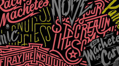
*A wordmark is a type of logo that has a unique type-only solution that communicates the name and brand attributes of a company or particular product. Designers create custom fonts, hand letter or choose existing fonts that conceptually pair well with the company’s or product’s brand personality.