
Don’t you love it when your Facebook friend posts a really interesting link but it leads to an article with basically no meaningful content?
Oh, you don’t? Well neither does anyone else.
In fact, you’re likely to form a negative opinion of this “friend” for dashing all the hopes and expectations you invested in that click of your mouse.
Now imagine an advertiser on Facebook subjected you to the same emotional turmoil. Obviously, it’s not going to go well for that advertiser. This makes it important for advertisers to create an end-to-end experience for potential customers. The best results come when the transition from Facebook ad to company website feels seamless and natural.
Start with a Solid Foundation
After exhausting your efforts to get more people visiting your website organically, you may want to give your business an extra boost through a paid platform like Facebook Ads. The same caveat that applies to organic visitors needs to be made for advertising as well: Have a clear goal about what you want to accomplish by bringing visitors to your site. From there, you can start by satisfying some basics.
Your images need to actually fit Facebook’s specifications before you create an ad. If you’re new to social advertising, check out this page for a primer on Facebook and Twitter. Facebook may not disapprove your ads if they fit oddly but the ads will certainly look wonky and leave viewers with a bad first impression.
If you plan to link your ad outside of Facebook, then your image should have a 1.9:1.0 aspect ratio. Keep in mind, however, Facebook may resize your image based on placement so it should not be too detailed or complicated. The official Facebook documentation provides specificity and a selection of formats.
On mobile screens, people will simply scroll past images that they cannot easily recognize or read. To avoid this, check your ads in preview mode on desktop and your phone before you set them live.
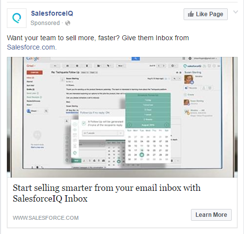
To demonstrate this point, the image below is incoherent because it contains too much detail:
Interrupt the Mindless News Feed Scrolling
Facebook users scroll quickly through their News Feeds and often have a strong internal filter for clickbait and sales pitches. Your landscape photo may indeed be attractive but will it interrupt a user’s uncompromisingly mindless News Feed scrolling?
Your ad’s image not only needs to be high quality but it must:
• Grab the viewer’s attention
• Engage them long enough to get your message across
• Avoid using a lot of color similar to Facebook’s blue color
That third point is particularly important.
Think about it: If your ad blends into the rest of the site or application, then people are likely to miss it completely and keep scrolling. They will never experience the rest of the interaction you created for them. How unfortunate for them since you will design such a stunning user interaction, right?
To help combat this, grab attention effectively by including people in your image. A human face attracts more attention than an illustration. Taken one step further, eye gaze can be considered strongly automatic so an image of a face looking directly at the viewer will draw that viewer’s attention.
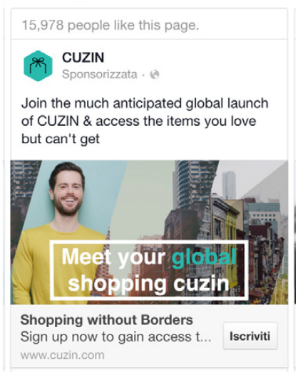
The picture below combines graphics with original images and a human male looking right at the viewer. Eyes looking right at you tend to draw your attention much more:
High resolution, high quality images will attract attention more effectively than poorly lit, grainy, cluttered, or confusing photographs. Furthermore, people will lose interest very quickly when presented with obvious stock images. On top of that, having a beautifully designed logo can really make you stand out from the crowd. Get these essential logo design tips from Ian Paget at Logo Geek.
That doesn’t mean you should shun stock photography completely. Stock images can still work if you choose images that are not excessively generic and make sure they meaningfully connect with your message.
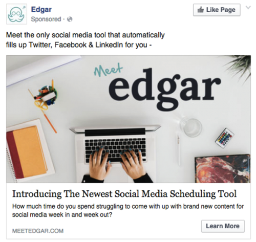
The ad below looks like a stock photo with a nice logo overlay. The photo totally works because its quality and resemblance to a common conception of a modern entrepreneur’s work space:
Make Your Images Relevant
In many cases Facebook ads will be an individual’s first impression of your brand.
Ensure that users associate the ad with your brand in a memorable way so that you make a lasting impression. A relatable image that is relevant to your brand will help make your brand relevant to the viewer as well.
You can add relevancy to your image by simply including your brand in the image. If you sell a product, create an image that showcases your product (bonus points if you include people in the image interacting with your product). This contextual situation provides a use-case that will cement the image in a viewer’s memory. If this use-case addresses a problem that a large number of people have, then you can expect a ton of positive attention and website visits.
This wine ad shows exactly what people should expect when they click through:

Context works even if you don’t have a physical product or cannot produce an image with one. For example:
• If your product or service solves a common problem, you can demonstrate that problem through imagery and pique the interest of those who might suffer from it.
• If you wish to target a certain demographic or type of company, then include typical models of your demographic or situations typical of the company type you are targeting.
Relatability improves your advertisement and recall of your brand.
Use Facebook images to elicit an emotional reaction in viewers. An emotional association on the first impression determines the tone of later brand interactions. Smiling faces work well for landing page conversions and positive brand association with ads. To this point, the Stockholm School of Economics conducted a study that showed a smiling face can elicit “a positive overall attitude to the firm… and intentions to patronize and recommend this firm.”
Associating humor or excitement with your brand generally comes easier than other emotions. Emotions like awe, appreciation for beauty, or a fear of missing out can work but carry a higher risk of falling flat or creating negative associations.
Virgin America’s recent airfare promotion incorporates humor well:

Use your image to elicit tangible responses as well. If gaze can be considered strongly automatic, use the direction of a person’s face within your image to cue the attention toward your CTA or link.
In the end, the important thing to remember is to pick and choose among relatability, context, emotional reaction, and visual cues to drive traffic to your landing page.
Match Landing Page with Facebook Images
Use the image from your Facebook ad as a hero image on your landing page to ensure a consistent experience across ad and landing page.
Pick an image that:
• Works well as a page background and within the ad
• Put the largest, highest quality version on your landing page
• Resize or crop for Facebook once it looks right on your landing page
If you use the 1200×628 version that Facebook requires, then your landing page may end up looking grainy or pixelated on certain screen sizes. This detracts from the page experience and may turn some visitors off to your brand.
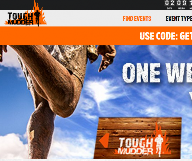
Tough Mudder’s “landing page” looks odd on large screens, so you should try to avoid situations like this:
Your Facebook ad and landing page will both benefit from the concepts discussed above. The ad should engage viewers and provide enough information that they visit your landing page. Once there, provide greater detail and encouragement to take your desired action.
It’s very important that your landing page images set a mood that makes visitors receptive to the information on the page.
Your page should maintain the emotional state set by your Facebook ad in order to overcome the hesitance visitors may feel about buying or signing up. The information you provide should address a visitor’s rational concerns while the images overcome emotional misgivings and you end up with a lead or purchase.
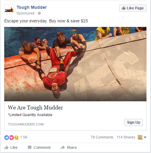
Despite the image size mentioned above, Tough Mudder does a great job maintaining an experience between Facebook and their landing page with similar colors and emotional tone.
Tough Mudder’s Facebook Ad:
Their corresponding landing page (on desktop):

Refresh Your Creative Periodically
Facebook differs from search engine marketing in that performance for a particular Facebook ad declines over time. Be very careful not to put all your resources in creating the one beautiful ad and landing page combination and expect it to perform well for the life of your business.
You need to account for ad fatigue.
Users on Facebook are not searching for information specific to your business like search engine users. This makes ads more noticeable and disruptive. Specific images are far easier to remember than text ads, and seeing the same image frequently will annoy some users and result in ad dismissals as well as lower clickthrough rates (both lower your Relevance Score).
Similarly, remember Facebook offers the option to use images, GIFs, a carousel of multiple images, video ads, and the new mobile Canvas ads. To get the highest engagement and click-through rates, it’s recommended you test all of these with combinations of device targeting.
“Reach and Frequency” campaigns allow you to restrict the number of times individuals see your ad within a given period. Generally this is not your best choice but it is available if users are seeing individual ads too often.
With normal campaigns you can check the frequency column in your ad set reports and lower budgets or expand targeting for very high frequencies. You can create audiences for users that have already seen your landing page recently and exclude them. Finally, refresh your creative assets periodically to provide a new experience for viewers.
How will you choose your Facebook ad images?
Nothing you read in a blog works 100% of the time.
Use the above tips to inform your general Facebook ad strategy and don’t treat them as strict rules for each ad. Come up with well-informed hypotheses, test them, and use their performance to determine the most appropriate strategy.
Fortunately with Instapage you can create multiple pages and easily A/B test page variants to find that correct strategy, quickly.


