Entrepreneur and baker du jour Jason Sigala wanted to open his own bakery in Southern California, offering quality, old-fashioned American desserts made from scratch. He wanted his shop’s branding to have a decidedly mid-century East Coast look and feel. Tim Frame was commissioned to create the brand identity for this foodie start-up, that would be called Towne Bakery.
Sigala provided Frame with plenty of visual inspiration derived from traditional New York bakeries, as well as a visual audit of the competition.
Here, we ask Frame how he approached this project and how all the logo elements came together.
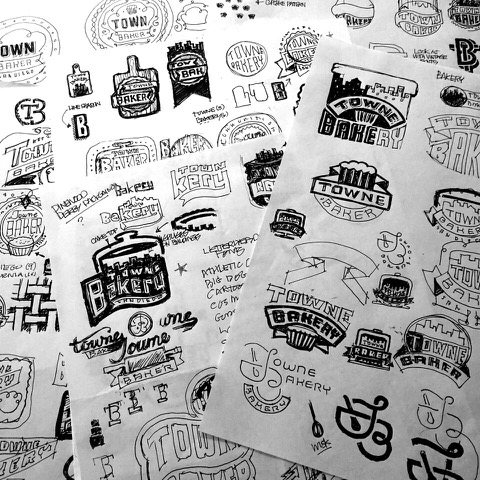
Tell me about some of the different sketches you started with and the thinking behind them.
I always try to develop concepts that take different approaches to solving the problem.
Three of the concepts were aimed at incorporating the cake icon I developed, which forms a city skyline in the negative space created by the icing.
I really thought this was a unique solution and a great visual metaphor for the business, so it was really a process of looking at different ways of incorporating that with other elements along with exploring type treatments of the name.
![]()
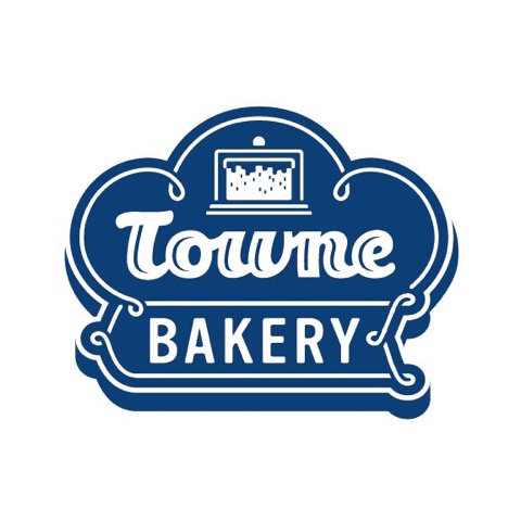
The logo I pushed for was the one with the unique shape that incorporated the script type. It has the appearance of typical signage from the ’40s, a unique shape, line work that resembles decorative icing, and a script typeface that mimics stylings consistent with that era.
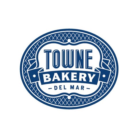
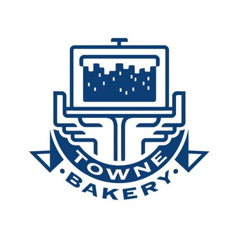
The client locked on to the concept that uses the elliptical shape to frame the elements. This was based on the very first sketch I did. It combines a simple pattern, a banner, a unique shape, and typography that convey a sense of nostalgia as well as quality.
Talk a bit about the typography. How important is the type to getting the right logo solution?
When creating marks that are intended to have a retrospective look or feel, the challenge is to capture that without being too literal because it needs to work in a contemporary context.
Typography is always key to convey the essence of an entity, but it also has to be very readable because logos are executed in so many mediums at a wide variety of scales. You also have to be careful of not using a typeface that already has other associations with it because of its use by a major brand or due to massive exposure of one type or another. It’s always a good idea to explore customization and/or modification of an existing typeface to make it unique and ownable.
How did you come up with the color palette?
The light “butter” yellow seemed a natural for a bakery. The primary color obviously needed to have a value deep enough to make the elements read, whether the logo was in one color or two. The final color ended up being a pale blue, which is consistent with the nostalgic theme, and complemented the color and materials used in the bakery.
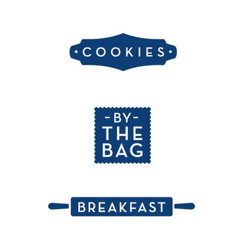
Talk a bit about some of the icons you developed to work with the brand and how it works on the signage and packaging, etc.
Towne bakery has a pretty extensive menu of baked goods with lots of options. Because of this, it was necessary to create secondary graphics to identify and differentiate the treatment of different menu items. This was done utilizing unique shapes, silhouettes, and border treatments.
Don’t miss Tim Frame’s upcoming class, Logo Design 101.