Lesson Info
9. Recolor Artwork
Lessons
Intro from Jason
03:07 2Intro to Color in Illustrator
11:57 3Swatches Panel
27:56 4Color Panel
17:15 5Eye Dropper Tool
07:22 6Color Themes Panel
13:52 7Color Guide Panel
07:14 8Gradients Panel
17:01Lesson Info
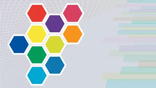
Recolor Artwork
re color artwork. Now, this is a very interesting thing in Illustrator. If you've never worked with a re color artwork, this is something that really can change how you can rapidly and easily change all of the colors in any type of illustration or composition that you've done. Now the re color artwork is something that for years I didn't completely understand. And the more I got into it, the more I liked it. And this version of Illustrator, they've actually up their game. Even Mawr. I'm gonna show you how this works. I'm gonna select my artwork that I would like to use the re color artwork on and the re color artwork can be accessed through your control bar through this little wheel. There's the re color artwork or under the edit menu. Edit colors, re color artwork. Now, what's new in Illustrator 2021 is this panel before you get to the advanced options in the re color artwork, if you're using an older version of illustrator, you will not see this portion of it. You'll go directly to t...
he re color artwork panel. So here I have my color wheel with all of the colors indicated that I've used in my illustration. This link allows me to link my content together or unlinked, and what this does is with it linked together, and you can tell it's linked together because all these lines are solid to click the unlinked, we can now move these colors independently. And what does this do for you? Well, this allows you to go in, and instead of having to select each object or target each section in here, which could be difficulty on a complex illustration. This allows you to target two colors via the color wheel. When this is unlinked, select any color paddle, and when you move this around, you're going to see that that particular color will now change in your creation. So this allows you to select, change and edit those colors without having to physically go in. Find that shape, find that stroke, find that Phil and change it. What's new here is this prominent color section, and this I like. This is something that is a huge game changer to me, because when you go in and you want to edit entire illustration overall, maybe you want to go in and just make some of the colors darker, lighter, more saturated, very much like editing a photo. You just want to darken the whole thing or light in the whole thing. If you're working with your swatches panel, only you'd have to edit each and every color every place where those exist. And then you'd have to go in and target those colors and adjust and hope it works. So prominent Colors works very much like a dimmer switch for a light. If you select in between any one of the colors, this allows you to control the dominance of each and every one of the colors in your file. So here I have predominantly grace like Grey's Dark Grace and blacks, because that's what most of the body of this real body is made of. If I click between those panels, I can then move that divider, and what that will do was that will cut down the prominence of those colors at any time. You see Mork Color in this prominence bar. That's the color that's gonna become more prominent in your illustration. So click on any one of those dividers, either between or at the bottom with the little pointer, and you can adjust those colors to adjust the prominence of those colors. Overall, it's nice. Warm it up, cool it down, all based on your colors, inside your illustration at the bottom. Here we have two different buttons here. We have our saturation, and we have our brightness. We can adjust the saturation and brightness by clicking on either of those buttons and then sliding back and forth. And this is going to do the entire color composition of this image so more saturated, less saturated. I love it. If you want to exit out of this, click the exit or undo changes era. If you want to reset this back to your original and start all over, you certainly can if you want to change your color Overall, keeping everything linked together here well, then, allows you to go and move your paddles around the wheel. And because they're linked together, all of these are going to change based on your entire color choice, and they're all going to change together. Let's click on the advanced Options tab Now the full panel comes up of re color artwork. We have the edit button, and we have the assigned button. The edit button is very much like the panel you just saw. We have all of our color paddles. We can go and we can use our hue, saturation and brightness, and we can link or unlinked those colors and edit those together. The one thing that you can do here is when you go in and you use this at it. We have a few more things weaken Dio than that simplified panel that we first saw. If I click on a color and I would like to change that color, not by moving this around the wheel, I could go in and change the hue, saturation and brightness by clicking directly on that paddle and then adjusting that directly instead of moving this around the wheel. I could be a little bit more precise with this, not changing any of the other colors on the wheel, but just targeting that specific color. That's nice. Let's go to the assign button, which is what popped up when we came from our original panel Thio here. Here's what the Assign Button does with this. We see all of our colors listed in our entire document. There's everything these are all my current colors, these air any of my new colors. If I'd like to target a specific color in here and change it, say I want to change the orange. I could go over to the new section, double click on the new section, call up my color picker, and maybe I'd like to change the saturation or even the hue of that color and click. OK, I can double click here, or I can use my sliders down here as well to change the hue, saturation and brightness. And I can also click on the drop down menu here to choose any other sets of color sliders. If I am not comfortable using the hue, saturation and brightness sliders. If I change this color and I like it, that's great. I can run with it. There is my new color. If I don't like that color, I could go back to the arrow to the left of my new color box. Click on that, and that's going to add that color back in. I now have on top of this split box the color that I previously had, and the color that I have just reapplied so I don't lose the colors that air in here. This is where I can experiment, and I can see how this is going to change. And if I like that change, I can keep it. And if I don't like that change, I simply click that arrow and go back. You'll notice that this has no arrowhead because I went back to the original color, so there's no arrow here. There's no color to go back to now. There's a couple interesting things that we have here at the bottom. We have the ability to randomly change the color order where you click on the random button, and it simply changes the color order in my entire creation and just swap through this all, and you can see how it changes completely. This may work if you want different variations of colors, but you don't want to spend 10 15 minutes going through selecting these shapes and choosing your colors. This just allows you to randomly go through. Of course, you don't like that. Click the reset button and you could go back to your original set of colors. Not bad. If you'd like to apply a different preset completely different set of colors here. Clicking on these squares allows you to access your swatch libraries. So maybe I want to go when I want to do a Swatch library called Scientific. And so I'm gonna go through here and I'm going to choose maybe the Tet Trad. And here it applies the colors that are based on the colors that I have in my illustration and it goes in and it applies this based on those colors. Now, any color library that I use. Maybe I want food. Maybe I want ice cream and I wanna make this look like an ice cream robot. It'll go through and it'll apply those colors of the ice cream Swatch library and apply those colors. Always click reset. If that's not working for you. Great, Let's go up to the top drop down menu here, and here's where we can go and we can choose. If we would like to use a color harmony, we can choose a color harmony from here Now. When we went through our color Themes panel, we were able to go and choose some basic color harmonies. Here we have our same set of color harmonies that we could go through and we sat our base color and our base color is just simply sat by clicking on any colors in our current color panel. Whatever they maybe maybe I want to use the blue or the green as my base color. Once I do that, that's my base color. And then I've choose my color harmony. I make sure that I get my base color in here is well, there we go just clicked over to get that base color to make sure that base color is now active. Now, based on my base color that's active. If I'd like to go through and use any of my color harmonies instead of the colors that I've chosen originally in my document, I can scroll down. Choose a set of colors and it will apply these colors in by illustration. Works kind of cool. So this is something that you can do and you can experiment with. But I found that it works really well when I'm going through, and I want lots of different color ideas and lots of different color shifts in my artwork. It works really well and it allows you to very quickly and very easily re color all of your artwork. A little bit of learning curve on this, But it saves you so much time and so much work to go through and quickly and globally change all of these colors rather than selecting one at a time. I'm gonna click, Cancel and I'm going to duplicate this entire set here so we can see just some of the changes that can happen when we use the re color artwork. I'm using my all to click and drag to change this content under the edit colors. We have several different items here. We could go on. We can adjust the color balance on the color balance. Treats this very much like kind of like an image where we can go in and adjust the different range of colors the click, the preview so I can see what we're doing here. I can take out the red or I can add red to it. I can take out the green or I can add green to it Could take out the blue or and blue to it to warm it up, cool it down and change those quite easily. Edit menu edit colors. Let's go to convert to grayscale. This will take all of my colors and convert them to gray scale values. Go back under the edit colors again, and I can also invert the colors so it takes everything and simply flips the colors. So I get the opposite. And if this was gray scale, then I get the opposites of the grayscale. If I take color illustration and I used the invert colors, this will allow me to invert those colors, and I get the exact opposites. So if I want to do something, this could be great. If you're doing some type of animation and like you're having an electric shock, where you bounce back and forth between the positive and the negative, colors here kind of make it look like electric accu shin or something like that. If I go back under the edit colors, I can also go back, and I can saturate the colors, get my saturation slider to take any of the colors and Aiken saturate those mawr, or I can kind of de saturate those. So I make it a much softer look overall, and these were just some of the ways you can go in and edit colors, but the re color artwork is something that I find extremely helpful. There is a large learning curve to it, but once you get used to using this and start to apply this to your artwork, you confined. You can really create and edit and target colors in a way that you've never could before, much easier, much simpler without having to select. Take your objects apart. You can use the re color artwork to your advantage.
Class Materials
Bonus Materials with Purchase
Ratings and Reviews
Paula Ayers
Well taught and super useful. Will be looking at his other classes.
Nelson Mueller
Student Work
Related Classes
Adobe Illustrator