Workflow For Modern Black And White Photography
Lesson 2 from: A Modern Black and White Photography Post-Processing WorkflowBryan ONeil Hughes
Workflow For Modern Black And White Photography
Lesson 2 from: A Modern Black and White Photography Post-Processing WorkflowBryan ONeil Hughes
Lesson Info
2. Workflow For Modern Black And White Photography
Lessons
Lesson Info
Workflow For Modern Black And White Photography
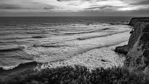
I want to talk about capture and I want to talk about visualization. Eso I'll just get out of the way. Really, really quickly. Years ago, I used to work in a high end camera store long, long time ago, and people would come in and they buy all sorts of fancy gear, cause the Bloods and like us and all this great stuff. And they shell out all sorts of money to have the the best of the best. And we didn't sell a lot of tripods. It was it was amazing how many How many folks would buy all this great stuff? But they didn't have a tripod. The fundamentals haven't changed Clean lens, which I mentioned earlier a stable image on appropriate capture A low I s o thinking about the tonal range of your image. Those things are all extremely important. That doesn't change. No matter how incredible the files are on, that doesn't change. No matter how incredible this software is. The other thing that will hark back to the early days is back in the film days way back when we would take out color film and ...
we would put in black and white film and we would we would change our thinking toe black and white. We would need to look through the lens in a different way. Now you can absolutely go out and you can just shoot like mad and think about it later. You can do that. But I would encourage you whether it's an editing or in capturing to start thinking in black and white. And so I want to talk you through that process. It's gonna involve looking a bit of looking at a whole bunch of images, some of which will be more interesting than others and share with you the thought process that I used both in terms of editing and capturing. And I think there's probably some good lessons in there s. So what we'll do is we'll look at light room here on the desktop, and the first thing that I like to do in light room always is get rid of the panels off to the left and right. I'm just gonna hit the disclosure crying goals there so that that will only be available to me as I hover over it. Um, we like to say light room is by photographers for photographers. That's absolutely true. Most of us do come from some form of photographic background many years ago. That's how I made my living. Uh, I want to see my images. In fact, as we go through these, I want to double click on them, and I want to just see the image. So I'm actually going to go into lights out and we'll just cruise through these really quickly. And I'll talk about some things that make a black and white image more interesting are texture, which we certainly see here. Contrast lines, things that might get lost in a color image. Otherwise, a black and white image can become very iconic just by removing the color. It's pretty neat. It's a subtracted process that can add to the image field of grass you know might not be that interesting. Becomes, uh, has a whole different feeling as a different texture when it's black and white. Macro photography Very interesting. As black and white against strong contrast doors, textures, lines, skies. There are a lot of different reasons that use black and white to make things look better, and there a lot of reasons use black and white to disguise artifacts and the hide things that are wrong with the file recent trip that I took shooting a ton of content. I often don't know what's gonna work better. The exact same place with two entirely different treatments, some of its up to the person looking at it. It's all about how you compose it, how you view it, how you edit it. For what it's worth, I put both of these images on instagram and the color one got considerably better feedback. So the other thing I've learned over the years is I am not the best judge of what people will like, and I think that's that's sort of a constant. We will talk about how toe have your cake and eat it, too, with black and white. How to use virtual copies so that you can have a color image. You can have a black and white image. Sometimes you don't know which one you want. We went on this trip to pick up car, and I shot a lot, and I edited a lot. I challenged myself to do it on Mobile seven. Images just don't work in black and white. This is too compressed you get no sense of the space at all. The color image introduces a sense of depth in the image. One thing that happens often and this is a good example of it is if you make a black and white image from a color image. All of the common tune tones just kind of get muddied together. So imagine someone's wearing a blue shirt and, you know, a pair of khaki pants. Or maybe they're wearing an olive shirt and a pair of jeans. You make that a black and white, and they just sort of all bleed together. So if you have a lot of color separation, a black and white could be really interesting. If you don't, you run the risk of compressing it. So there are a lot of rules. None of them are hard and fast, but they are good things to be thinking about image of my wife taken with the IPhone great dynamic range. But in order to recover the highlights, you start picking up a lot of noise and strange colors and what not it? It looks a little odd by going to black and white. You can blow it out. It's forgivable to blow out the background. If you did that with a color image, you see a bunch of strange yellow post or ization where the color was almost there. Ah, lot of the time will use black and white with ruddy skin with dark shadows with noise. One thing that happens with a noisy image with black and white is the noise becomes grain. Grain is acceptable in a black and white. It feels organic. It's not really acceptable in a color image and something we want to wash away. This is a great example. There are artifacts in the color image. They go away with the black and white image. Silhouettes and shapes, especially dramatic skies, are much more interesting in black and white. You would still get the shoes up there, but because they're colored, they sort of jump out at you individually in a way that they don't as a silhouette. The truck was kind of a distracting color. It had a lot of different paint on it, and so it was sort of muddled, and it kept drawing your eye to it as a black and white. It just, uh, not only does it do those distractions go away, but it sort of takes you back in time. Could have been taken 50 years ago. Could have been taken yesterday. This was initially a throwaway image. It was a much larger image. One of the things I was playing around with on the trip was shooting a lot with various mobile labs, and one of them was a slow shutter up to get motion. It's one of those things I wish I had in the OS capture. It's a really fun effect. I initially discarded this image and figured it was a loss. Then I went with my black and white idea to get rid of all the distractions. But then when I cropped in really close and went color, it ended up being an image that I liked because you're I could put together that you're in a tunnel. They're brake lights. There's some warmth. The answers aren't always simple. You guys saw the color version of this. I do really enjoy the go pro, and I like that I can remove lens correction. But one thing that bothers me about it and I understand this has recently changed is that because it's a J. Peg. And because it's a small lens, there is a lot of noise. And there's some strange things that can happen with lighting, especially when you're shooting from an ashtray like I was here. Easiest way to just save yourself. All of the editing and all the problems is to convert it to black and white. Subtract all of that weird lighting information in mixed lighting like we're in right now, where there's a lot of light sources. If you're shooting indoors, if you're shooting at a at a wedding or at an event, Ah, lot of the time you have halogen tungsten fluorescent daylight. If you try to edit that later and post, it could be really difficult. The easiest way to circumvent that whole process is the edit in black and White. So a lot of the time black and white just solve the problem. This image was totally blown out its picture of my dad in a ah fellow racer, and, uh, it was they didn't know I was taking the picture. I'm being sneaky with the IPhone, and I thought I lost it, but only in converting it to black and white did all the noise just sort of become a non issue and all the weird Hey, lowing sort of went away, and I'm able to focus on the two guys in the picture. It saves you very often. Obviously, something images don't want to be black and white. No matter how good of a conversion I do, I'm never gonna make an orange car look more interesting than it doesn't color. Sometimes black and white and monochromatic don't mean black and white. Sometimes they just mean there isn't a lot of color information in the image. What I did in this case is I d saturated most of the colors. I left the red. I left some of the gold, but a couple of distracting blues and greens I've removed from it. So there is a place in between. I think it's very delicate. I think selective color is often kind of Ah, in effect, that's not very pleasing. But if you use it carefully and gently, it can work well back toe orange I've never maybe have yet to encounter, but I've never encountered an image where there's something bold and orange that looks better as a black and white. I'm sure There's one out there somewhere. But sunset, by and large wants to be Ah ah, color image. But in this case, I liked them both for different reasons. Tunnel. Because of the lousy color, you'd think maybe black and white would work well for it. But you kind of lose the feeling that you're in a tunnel. Sometimes the world takes care of it for you. This is sort of a sepia toned image. It is a color image, but it's monochromatic, as is this one of China. If you've ever been to China, it's all just sort of softened and diffused. It's it's actually like having a big soft box on the world, which makes for some interesting lighting. But you don't really have to worry too much about converting this deceit because it's already been taken care of by the small, almost done walking three days and we get into the editing. That's another example of how it was more or less a black and white day. But there is a little bit of color in it, and sometimes you find that naturally, you guys know I talk about cars a lot. I, uh, didn't just I I started off with motor sports photography, and I went back to chronicle other people doing it. People who do it better. I'm always reluctant to call myself a photographer because I think that term should be reserved for people who make their living that way. It's delicate, but I don't call myself an author because I write emails a day. It seems a little unfair to guys like Bobby here makes this living behind the camera. He's a real pro. So when they documented him, I learned a lot. The world had changed a lot since I used to shoot cars in the nineties. One of the hardest things was he's wearing this clearing orange that that just distracts from everything. So black and white took care of that. And yet there were times to my point earlier about separation where, uh, I want to show the fact that Michael should probably wear more sunscreen on his legs, and I want to show some separation between the foreground and the background, and being able to have that color is important. I went and shot with my boss out of the race track. I brought him out there. He's a great football photographer had never shot cars. I got the images back from him. Some my favorite images from that day were of him. You can just imagine trying to capture his sunglasses there. It's not gonna work in a black and white image. Okay, so this, uh, black and white lends itself to Portrait's for many reasons. Ready skin becomes just textured. This guy's standing under a blue tarp and I tried and I tried and I tried to edit it, and I just I just couldn't do it. The sun was coming through a translucent blue tarp and it washed everything with this weird blue glow. And somewhere along the line, I've made a black and white and the problem was solved. It was just so much easier to deal with. And I swear we're almost done with the visualization here. Another example. The, uh, backtrack is dark. There's long shadows and everybody told me, Well, don't go shoot there. You want to shoot in the morning. It's all shadows, and I thought, Well, there's nobody over there, and it's crowded on the other side where it's lit, so I'm gonna go over there and check it out, and sure enough, they were right. The shadows were long attempting to get a car racing between the shadows, let alone to almost impossible. And it was really frustrating, really frustrating. I shot a lot over there, but my favorite image of the whole day ended up being a black and white image of a car coming through the shadows by making at black and white. By cropping it, I can focus on the curves, the lines and the shadows, which I was working against suddenly become my ally because they make the image more bold. It doesn't matter where the lighting is. Normally, when people shoot sports, they stray away from black and white. You want the color popping out, but I mean it. This was my favorite image of the day, and I was shooting a place where everybody told me not to go at a time when everyone said it was lousy, and I believed that until I was editing it later. And then I carried that over toe other places. Last couple, um, product shots for a product that hadn't been released yet, so I was putting props in the foreground colored books they want to be color, whereas an old camera lends itself to that vintage feel and it wants to be black and white. My wife's in the background, being a unacknowledged model out of focus the way she wanted to be on the subject changes totally different feeling, same set with the subject and the editing.
Class Materials
Bonus Materials with Purchase
Ratings and Reviews
creativelive student
He is a great teacher, but I resent the confusion over the wonders of producing and sharing photos and videos with apps and mobile devices, vs. producing fine art or high quality specialized portrait or landscape or wildlife, etc. Standards have not gone down just because so many people have great access to producing good things. Great literature is still great literature, no matter how many people write good things. Same is true for the visual arts. Short cutting the methods that produce great work, including producing great black and white and great prints, doesn't produce greatness. I love his idea, I follow them, but that is no reason to negate the traditional greatness that still has no shortcuts.
JIll C.
Bryan lays out a comprehensive, yet efficient approach to converting images to black and white and included many examples in this course. It's more than just clicking the "black and white" buttons in Lightroom or Photoshop. I especially like the suggestion to make Presets of the various B&W conversions I've used so they can easily be applied during import. Bryan also covered very quickly various other very useful and fun Adobe products including Adobe Spark Post and Portfolio, and I even made a Spark Post during class and posted it to my facebook page. Lots of interesting content in this class, which I'm definitely going to watch again!
Margaret Lovell
I wanted to learn more about creating a black and white workflow. I'm just starting out, and so far, my attempts have been fine. I want to get better at it. Bryan's course made the whole process seem easy and didn't rely on cheap outs in creating them. I learned how to better use Lightroom when it comes to creating black and white photos.