Lessons
Lesson Info
Blend if' Sliders for Textures
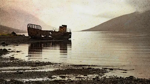
So just to demonstrate how this works, I'm going to add a Grady in on here on this layer so you can see now we have this layer. And really the layer below is the whatever that thing is on the beach because this other layers hidden. So I want to get to this setting called Blend. If and the way we do it, we have to actually open the same dialog box that you use for layer styles like drop shadows and strokes, etcetera. So the simplest way is just go a little past the name of the layer and double click and opens the dialogue boxes actually called layer style. But I said, actually clicking on, you know, drop shadow were stroke or whatever actually to be in this general dialog box. And down here you can see the sea where it says blend if and there's these two sliders just to clarify what's happening here, I chose to add a grading of black toe white so there is easy to understand. I could have done Red Orange, and those sliders would still look the same way, so they never changed. It's just e...
asier at first to equate Okay, I see what you have. Black and white. But just so you know, if you open as you'll see when we added actual photograph, it still has those sliders going from black to white. So the idea of this, it's another way to hide areas of photograph based on their level of black and white. But instead of taking a paint brush and painting, I'm just saying, Take everything that's black and make it see through. So as I move this triangle to the right, look what happened to our photograph. All the dark areas of the photograph disappeared. If I go the other end and take the White Triangle, it's basically saying everything to the right of that triangle should be transparent. Having the left should be opaque, so if I go to both ends, it would do both. Okay, now that's the basic theory of how that works. However, what people often find is if I, oops, was the wrong keyboard shortcut. Apparently, it's Stop that. Sorry about that. Okay. I want to zoom in closer. As you can see what's gonna happen here. This is a good theory of saying, Take the Black Triangle and start to drag it in. But see how the edge has that kind of almost jagged look. That's because it's so pixel specific. Wherever you dragged that triangle, it's saying this pixel is see through this pixel is not. You often get this kind of picks allies Jagged edge, and there is a solution for it. It's probably one of the hardest to find if you someone didn't tell you this, Um, if we look a little closer here, see that triangle that I was born and see? There's a little line there that's actually secret code, that you can split it in half. But you have to know the secret handshake to be able to do it, because by default it doesn't split in half. You have to know it's a recurring theme here. What key do we hold down in Photoshopped to make something act differently? Option Or Ault? Hold on the officer All key. It drags the trying going to half. Now there's a little transition zone to say. See through opaque, kinda, same kind of thing we talked about with layer Mass, so you can do that on either end. There are some of us which would prefer that these triangles split automatically by default, but they do not, and there's no way to change that. But what it does is it means you got to stop using keyboard shortcuts. Apparently held on what it means is now. When I look at something I can say, Well, I'm gonna try this and split this triangle and then take this triangle and split it. I can even overlap them and do crazy stuff and is taking that layer completely changed the way it looked. Here's the thing that's going to throw you off probably at first compared to like a layer mask or something when you click. OK, the only indication you've done something is this little symbol right over here. If you have versions of photo shop before I want to say CS six, there was no indication. So you just had to know. Why does it look on the my thumbnail? I see the full Grady int on my image. I don't That was really the only clue. The other thing that throws people off is unlike a layer mask. We have actually hidden the pixels. This is kind of ah, fake hidden because you can see by the sun will see. I can still see the entire Grady int. Not that I would do this was to show you if I added a stroke. As far as he's concerned, the whole thing is still there. So he would know I might have hidden edges of it as far as its concerned. It's still ingredient this big. So that's the other thing you have to remember about the blend of size. The good thing about them is it's another nondestructive method. So I could do this with my Grady int try a bunch of stuff and oh, yeah, that was probably a little too much to let me come back and pull it more like this and this and just adjust it. You need a bigger monitor than I have to be able to see it, but you get the idea now where it really gets fun. I'm on the layer called this layer, which means the layer I'm on my great aunt layer, the other option. So much fun if to say, take the underlying layer and make it push through this layer. So if I take the Black Triangle, it'll take all the dark parts of the underlying layer and show it through in sometimes things that would have taken me 27 a half minutes to mask. Now I'm moving a slider and going, Oh, all that kind of worked or you take the white Triangle and say, Make the white parts of the layer poke through and the same rule applies. It's looking a little too jagged. You start splitting the triangles and do stuff like this. And of course, you can do both if you really want to. So needless to say, this was for demonstration. I don't typically drag ingredient on a layer to do this. This is to demonstrate how it works. The rial fund is where you put a photograph and use these blend if sliders on the photograph like this. So let's get rid of that and get back to this one, which remember, let's put it back to normal for a second. If there's my texture member, just review. Both of these are cameras. Smart objects, selection to edit them, right? I go to this. Why don't Here's the key. Double click on the thumbnail jumps back to camera raw, double click to the right opens this dialog box of the blend of sliders. So now let's just say just to try it. Let's see if we take the underlying layer and start to poke it through like this, maybe something like that. And then you take the top one and take the light areas that completely different look than just That's still normal mode. I didn't change the blend mode, but I'm changing on a pixel level, the where it's blending in and just really start having fun. But you can still also change the blend mode, so we want to say and in multiply mode. So it'll pile on top and say, We've done the blend of sliders and multi mode and you could lower the opacity or do whatever you want. I've done all those things. I click OK and look at and say I'm kind of liking that the way that looks. But I wonder if the color aspect of that texture is contaminating my photo. Maybe I just want the texture and not the color. Well, it's still a camera smart object, so I double click and say, What if I just go to gray scale and click OK, will that make a difference a little bit, but I might like that better. But I mean, think about the possibilities here of never feeling like, Well, I like that. But I wish it wasn't yellow. It's like, Well, doesn't have to be. But even now you do all this. And of course, you could still do Photoshopped stuff like masking and all those other things. But every level of what I've done so far can be edited. I can change the blend mode. I can change the blend. If sliders I could change the camera raw settings so again to use the same thing I said last time. The great part is you're never finished. The downside as you're never finished because you just be like Woo. I can do this and try that. And I mean, it's both good and bad. And, of course, normally, like I said before, I don't like to in large things because they don't look great. But in the case of this texture, because it's a texture and because I'm fading it so much with all these things I could say, you know what? Let's just make it really big, because that would probably work to where I normally wouldn't do that. But because of the scenario, I man, now that I made a bigger maybe I don't want it to be grayscale anymore. So these raw settings continue to be adjusted, I could say, living with just vibrance down a bit and maybe more. Contrast anything you want look OK, so this will be one of the tools will use a lot for the remainder of this class because a lot of times we get to a certain point. Go. Well, that looks pretty cool. But if I also did the blend if sliders the thing that people see the blend of slaughter sometimes go, Oh my goodness, that's gonna make it so much easier Do X, y and Z hold on a second because there's one little caveat about this. It's not like a layer mask where you can paint just on this one area. It's global meaning if there's ah, house with a white picket fence and white clouds. If you move the white slider, both the fence on the clouds are gonna be disappearing because it's not. You can't say on Lee blend. If this part it doesn't work that way, So sometimes people see that go. I could use this for like instead of masking. Maybe chances are realistically, the chances are it will be frustratingly close to working and you'll be moving that well. That looks great. And all of sudden, half the photo disappears like, Oh, that was so close. And that's just the way that the blended slash work. But for something like texture blending to me, I would say a good 80 to 90% of time that plays a role somewhere in it, at least to try it. Because, you know, if you don't like it, you can always say, Well, maybe I just shouldn't do that. I can take this back and put it everything back to square one and just stick with a blend mode in opacity and what I've done in camera raw doesn't that save a lot of energy time layers rather than adding adjustment? Mascot. So it does. I mean, it's it's it's, you know, in my house. Always use that six of 1/2 dozen the other. Some people would do this same thing with adjustment layers, which is fair enough to. But then I used to find out have, like, five adjustments have to go. Okay, if I show these two, but not that one. And it was just at a certain point, always became too many factors. I especially want to get back to something. I done previews. I was like, Wait. Whereas here I'm down to two layers now, I could take a step further and do that duplicate the smart object to try something different in mask. And I mean, you can take it to whatever level you want, but I particularly love the fact that just simply by having these two layers, but to very specific kinds of layers, they're both camera smart objects that I know. I'm never at a point where I'm gonna go. Oh, well, you know, I guess I'm gonna have to live with that. So as we do some other techniques, this is a very common thing you'll do. And the point that I want to really stress here is I'm deliberately would in a class like this would never say. Now, make sure using overlay mode at 72% with this camera city, because there's no way to say that it's gonna entirely depend on the photos were using the look you're trying to get. You know that's it's the key thing to remember is the set up was two cameras, smart objects With that link back and forth, it means I can edit both the layers, and on top of that, I can also add in blend modes. Blend of sliders, layer mask, etcetera. Okay, there. Used used blend. If gray, What are the other options, and would you ever use them? Thea. Other options air Just if if you have even more time on your hands, you can do red, green, blue. So if you have a photograph where like in this underlying layer, the buildings read that if I chose red, it's gonna have a slightly different impact now. Normally, when I compare, it's not like a whoa! That's night and day difference. It's slightly different because you know, the Red Channel information of a photograph is still part of the same photographs. The ultimate is gonna be a similarity, but it's another thing to try. I would say for me personally, the majority time, I happy with the results I get out of gray, but there may be some times were like Well, I'm gonna try this alternative instead or in addition to so you do the gray first, and then you switch to red, green or blue and try that. Okay? And the key thing remembers has said before the sliders will always look like a great, no matter what you have going on it, sister, that's a reminder that I'm talking about the light parts, the photograph of the dark part or the part in the middle, and the simplest way to remember it is whenever you drag a triangle, it means everything. The left of it is completely see through having the right is completely opaque. So if I end up moving both triangles in so far, you see my textures all but disappeared because there's not much left, which may be okay, depending on the texture. May have a texture with a really grace area right in the middle, and you want the two extremes to be taken away. That's the whole point of this. It's gonna be another one of those great big. It depends on what you're working with. But the fact that the net result of this is at this point, let's say, for the sake of argument that I was pretty happy with what I've got so far. I would say this is a PSD file The next time I open it once again, it looks just like that, and I have ongoing ability. Edit it now to answer a question that someone's bound to ask either out there or in here. Yes, it makes your file size considerably larger. Oh, well, I mean, I'd rather have a bigger file size with all this capability that a nice, small little J peg that I can't do anything to because maybe it's just me, But I changed my mind a lot. When I'm experimenting, I want the ability to go down a path pretty far and go well. I kind of like it, but I wish it wasn't quite so gold ish. So I could still go back in, in effect, to an earlier stage adjusted and see the result as I go. And what will also often happen is you use the blend if sliders and you love the way overall it looks. Except for this one corner down here, because something about its didn't work. So add a layer mask in, do some mask painting just to remove that part yourself. So blend. They're sliders are global. They'll do the whole layer, but you have the control. Or it could be a matter of, for example, and look at this image and see how the corners are little dark. So I might have to go into the camera settings or something else and say, I don't want any been getting in there so adjusted or, you know, So that could be the reason why one corner doesn't quite look the way you want. It was a little darker than the rest, something like that. So you still have full ability to edit in camera raw. But when you click OK, it updates in the context or whatever else you've done in terms of blend modes, etcetera, etcetera. Okay, so that theory means now I could take five other textures and put them on this photo and go a complete different direction because of the nature of that texture. And that's kind of the point is that you have these techniques that allow you to try something, but you want to see what what else can I do with it?
Class Materials
Bonus Materials with Purchase
Ratings and Reviews
Beatriz Stollnitz
Great class for anyone looking to blend a photo with a texture for a creative effect. Dave discusses Blend If, smart objects, Apply Image and many other techniques that enable us to get the most out of Photoshop when adding texture to photos.
Laura D
Loved this class. Dave covered exactly what I needed to know to add textures, including a multitude of ways to make the texture more or less subtle. I learned a lot. You do need some Photoshop background to understand all the content.