Combining the Methods
Lesson 4 from: Adding Vintage and Distressed Effects with PhotoshopBrandon Rike
Combining the Methods
Lesson 4 from: Adding Vintage and Distressed Effects with PhotoshopBrandon Rike
Lesson Info
4. Combining the Methods
Lessons
Lesson Info
Combining the Methods
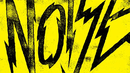
Let's see what mix of both. Let's give back Teoh Wash away and another lettering course. We created a letter. We did original. You know, we illustrated original letter forms and we came up with this wash away graphic. Now do a little. We'll do a little of both to it. Duplicate this background layer merger, These two together filter blur. So here's a good example that someone seems like I'm taking it too far. And I found out I am because if the everything is touching, then maybe you're blurs a little too crazy. Brightness contrast. It's almost assumes they're not touching. That's good. So select the white area. So, like similar new layer. Now we have back on layer the merge layer in this layer. We can trash the merge layer, so that graphic So we did. The total destruction is what that one was called. But now let's select the inside of this. Actually, I'll show you guys my action. I call it Select Feather, and it just does it for me. Let's use one of our other brushes and she's this wate...
rcolor brush. We can do this subtly, so now that gives it a little bit more of a subtle texture, and we can do another one. We can go back to the other methods of using, you know, filter sharp and smart sharp in, and we can make those little lines inside a little bit sharper. Drink the contrast again because when I'm sitting here doing this stuff, I'm actually working with this. That's the layer mask that sits over top of it. So the white keeps and the black takes away. That's kind of cool on its own, to that actually looks like it's been washed away, so we'll go back to us. Contrast. Now you can start seeing all these different types of T shirt graphics. I'm sure you've seen a T shirt graphic that looks like that. Actually, let's Dio let's make this red because I just see this So you're going back to a layer mask. In doing contrast, you've seen a T shirt graphic that looks like this. It was like that. No one looks like this. There's all these different levels. Whatever you think. The story is whatever you think this thing's been through, then just kind of make it appropriate to that. You know, I I have fun sometime. You know, like you'll see high end fashion. That's just that you can't even read what it is. But, you know, if it says you know, like a popular soda brand or something like that, then that's a pretty cool brand, and that's a pretty cool shirt. So, uh, we'll just find a cool medium in here. I think this is a cool spot, and that's that. And if you want, apply the layer mask, uh, from online, wondering if there's any particular reason where using the legacy check box on filters. Yes, that's a good question. Um, the latest C check box is more destructive, and I like to be destructive. So use the legacy means go back to the way we used to do it in Photoshop, because now they're a little more. They take care of the image a little bit better. The problem with if you don't know what you're doing, a photo shop is you can take a photo and just mess it up and never get it back. But obviously I'm not working with photos. I'm working with textures and graphics and stuff, So I used photo shop in a different way than photographers use it. You're gonna get a lot more drastic changes if he used legacy. So that is a little mix of interior wear and tear. I think that's pretty cool. So we got total destruction, then we have a raven somewhere. Oh, no. Where brave and go. Well, here, um let me just show you how quick it actually happens after you learn to do this stuff, dude, as long as I have, you find a lot quicker ways to do it. And again, I can't let my clients see this His legacy. It's destructive. We don't use a legacy. There's a lot less stuff happening using legacy. I get what I want quick. And you guys know by now that I like being quick. I use my handy dandy action select feather. Really? We're gonna make a total destruction a little more our destruction forever. A little more collegiate. So there's some methods on applying vintage and distressed effects. And I think all those have a story rave in a super extreme. They're all pretty extreme. But you also see with wash away how they cannot be so extreme. They don't have to just, you know, they don't have, you know, just depends on what it is. Like I said, I do a lot of graphic tees, So this is the stuff that makes a whole lot of sense on graphic tees. You know, if there's a band name rave in, that works really well for a T shirt, and it's a, you know, and or destruction forever. That works really well for, like, a a sign, you know, circular sign that sticks out in front of the shop, skate shop or whatever. It iss uh, wash away. You know, that could be used for, ah, title to a magazine article or something like that. And maybe behind it, there's an image. But there's all this story that I want my work to have inside of it. I don't want my work, Teoh. I don't my work to just look how you could be done by anybody. Um, after a while doing it, you start out your career trying to please everybody else. And then when you do it for a while and you start feeling comfortable and your place and you feel comfortable and your, you know, in making a living like I can now say that I am a graphic artist for a living for riel, and I'm not lying about that. I'm not trying to, like, give myself a cool title. I know I'm a graphic artist for Riel. That's actually how I pay my bills, and that's always been how I pay my bills. And it's the only way I have made any money is being a graphic artist. There wasn't some secret or anything like that. I was broke, and now I'm not broke because of graphic being a graphic artist. And, um so I like now, knowing that not only do I want to do good work for people, I want to send stuff out that just feels the way I feel like the way I like to do things. And if you're not into my style, I totally get it. But, man, I love looking at that stuff. I love that. It's not just the thing that anybody could do. It was this style on this method of texture and distress that I put it on there. So when it goes out into the world, not anybody could have done the wash away. The way it looks. Now that's my style That's things that I made myself. And it just means a lot to me to have my identity wrapped up in those things. I don't I didn't place an actual writing signature autograph on those things, but to me, they totally have my name on him. And that's been a fund fun thing to make a whole career out off. So I want you guys to be able to add a story to your work and again, you know, we've talked about, you know, and, you know, another class. I talked about the importance of speed, and in this situation, the importance of speed in your work is that you're gonna have a deadline. That means you have to do something very quick. But you don't want that thing to go out of door without you having a little bit of your personality into it. So I want you to be able to add your story to your work quickly. So these distress methods, they don't take a long time. You know, it doesn't take long to make your stuff look vintage of distressed. You can create it today and in five minutes it will be look like it'll look like it's 100 years old, and it's not a hard thing to dio. What's hard is to put together your own methods that put together your own way, that you like doing it every time. And, um, and then what's really cool is after a while, you just start getting really happy about your own methods the way you did it, and you feel like they don't realize it. But your personality is in there. You fit, you fit every need that the client had, and you got to put your personality into it. And I think that's a valuable thing. I think that's a valuable thing to keep you excited about your work and keep you motivated about your work. And you know, it's your own little motivator inside there so that you're not bored out of your mind when you do this work. So, um, yeah, add your signature this stuff. Add your story to your work and do it quickly. So that's my method on applying vintage and distress effects to your work
Class Materials
Bonus Materials with Purchase
Ratings and Reviews
Rebecca Pike
It is so great when a class is instantly helpful in advancing your workflow and getting the results you are looking for. He provides tips and examples and introduced me to functionality in photoshop that I hadn't previously taken advantage of, particularly the legacy brightness/contrast function. He does his designing in Illustrator and these designs seem to have been detailed in another one of his classes. This course focuses on bringing those designs into Photoshop and do the distressing in Photoshop. Like other reviewers mentioned, if you only have photoshop, you can just use that to make you design and do everything in photoshop. I would definitely be interested in his other classes.
a Creativelive Student
Great course! Simple process with HIGHLY effective methods. This will be one of my "go to" courses. Thanks Brandon
Student Work
Related Classes
Design Projects