Total Destruction Method
Lesson 2 from: Adding Vintage and Distressed Effects with PhotoshopBrandon Rike
Total Destruction Method
Lesson 2 from: Adding Vintage and Distressed Effects with PhotoshopBrandon Rike
Lessons
Lesson Info
Total Destruction Method
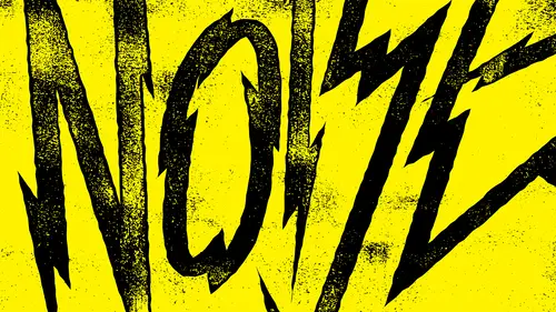
So what I want to dio is I just want to show you how I go about doing this stuff and how I go about these different methods. So the first method we're gonna call total destruction method and you actually watch me designed this little thing, which I don't know what I'm going to design. So I could either use the word total destruction or you guys give me something disaster. Okay, I'm gonna merge in both houses. That total disaster. Okay, here we go. So let's just do this is gonna be basic. This isn't gonna be the most groundbreaking T shirt design anyone's ever seen, but it will give us a good canvas, Teoh screw stuff up with. And I just want to use basic funds. I don't really want Teoh. I want to do anything like, totally amazing, because we're going to see how much texture that we can get out of. You know, we will make the texture, do everything and will make the design be relatively basic. That's used. Let's go. Just for the sake, Of course, destruction. Something else. We'll get rid ...
of total destruction forever. That's an oxymoron. I kind of just want whistle, You guys mind if I whistle? I won't whistle destruction forever. Put a D in F in there. I want to put a star, but I think a lightning bolt probably work better. Let's make a happy little lightning bolt. Happy little skulls. What up, Bob Ross? What you know about happy little skulls? That's the name of my punk band, All right. Not really destruction forever. All right? So when I build stuff, I better than illustrator um, try to build everything else. Sure, Sometimes things come along and they have a you know, they have, like a I don't know, just like it's more. It almost seems like it's more of, Ah, fine art piece. So it seems to make sense to Teoh kind of put pieces together inside photo shot because there's fades there. There's all that stuff. So I do have fun doing that a lot of time. If it's like a photo collage, I'll do all that pretty much everything. And illustrator, I mean in Photoshopped. Sometimes I will, you know, if I have to do like a photo T which as cool as you guys think it is to be a graphic arts and music industry has a lot of photo teas. Is Alana the name above the picture? That happens. So when I do that, I usually take a screenshot in photo shop. And then I bring it over into illustrator to create, like, the word. So when I build things, I build them in illustrator, so destruction forever. So I'm just gonna copy the squeaky clean thing. Let's just do some optical. Um, spacing on these real quick just to fix a few things. Okay, so I'm gonna select all that. Copy it. So again, we're going back into my beloved 16 by 20. Black canvas is paste on its own layer. Pixels is fine. So total destruction again. What I mean is, I'm gonna merge all this together. I'm gonna put this black right on top of white. I'm gonna blur it. Image adjustments, Whether it filter, blur, Gaussian blur, we'll leave it there. Cool with that. I have another course on Photoshopped brushes, and we're just gonna use some of the photos shot brushes that we created in the other course to add to stress to this. So with my brushes on another layer, it's gonna add some stuff now. Things were happening here. I deleted some areas. Some areas this aren't visible. So with my layer mask, I'm gonna use the same brush and start removing that area. But I'm OK with some of it being destroyed after all, does say destruction. Um, now, if you notice the sharpness of the brushes air sharper than the blur of the thing. So I don't want the brushes to be too sharp. I kind of want everything to have a similar blur. A similar like, Ah, you get what I'm saying. It's the sharpness, is isn't matching. So let's blur this new texture layer that we just made. So I'll apply this layer mask. So now this is all by itself this little texture, layer, filter, blur, Gaussian blur. And honestly, I've never used the other blur, So I don't know what they dio. So it issues. Alan seems toe work the way I want. Okay, so that blur matches a little bit better. So these two layers I'm gonna merge again. And then here comes the destruction. Turn the contrasts all the way up, and that's too thick for my liking. So I make it darker. So this is the complete destruction. The D even got destroyed Now. If this was for a client, it probably was sitting there Mess with the D If their brand name was destruction forever, than I would care a little more about D. But what I'm doing here is I'm just allowing whatever happens to happen because it's not like overtime. The wind and the elements would care. Well, hey, Rain, Let's not mess with the D because that's the brand. It just happens. Whatever happens, happens. So there's something I love about. Whatever happens, happens. So I've taken my magic wand tool, and I just selected one area of the white so that selected just this. See, so I select similar and we'll find all the other white. So this is again coming into a good benefit of sticking to blacks and whites. If there were great aunts there, then it was selected white, but it wouldn't select the like light, light, light, light gray. So it's important to have them black and white, at least for the applications that I tend to work in so destruction forever. So now I have this selected. What I don't want to do is hit command J and just bring this stuff up to its own layer. Because if you do that here, let me do it. Command J. So now it looks like this stuff is on its own layer. But if you go really close in, there's this little black line that appears that just drives me nuts. So I don't do that. Instead, I get in here with the magic wall until I select a white area. Select similar. And then I just make a new layer. And whatever my background color is, I'll make it Yellow X to switch those to the foreground and background. If you don't know that already. So I'm gonna hit command, delete. And then now everything that's inside that Marquis is now yellow, so I can just So I have three layers here. That's one layer that's one layer, and that's one layer. So I no longer need this. I'm gonna delete it. I tend to try to keep my layers clean, so a lot of the things that people would want to keep around, I usually just delete them because it's cleaner that way. So here's the graphic. Um, I never really like I like to take saturation down on colors most of the time. Smooth. That a little bit of an orangish deal. So here we gotta destruction forever. Now, this works on different applications. It's all by itself. Um, so I would call this method total destruction. Well, let's save this here. Total destruction. I would really embarrass myself if you guys saw me in my office alone. Total destruction. It's just that all day.
Class Materials
Bonus Materials with Purchase
Ratings and Reviews
Rebecca Pike
It is so great when a class is instantly helpful in advancing your workflow and getting the results you are looking for. He provides tips and examples and introduced me to functionality in photoshop that I hadn't previously taken advantage of, particularly the legacy brightness/contrast function. He does his designing in Illustrator and these designs seem to have been detailed in another one of his classes. This course focuses on bringing those designs into Photoshop and do the distressing in Photoshop. Like other reviewers mentioned, if you only have photoshop, you can just use that to make you design and do everything in photoshop. I would definitely be interested in his other classes.
a Creativelive Student
Great course! Simple process with HIGHLY effective methods. This will be one of my "go to" courses. Thanks Brandon
Student Work
Related Classes
Design Projects