Color Management and Profiles
Lesson 47 from: Adobe Lightroom: The Ultimate Guide BootcampJared Platt
Color Management and Profiles
Lesson 47 from: Adobe Lightroom: The Ultimate Guide BootcampJared Platt
Lessons
Differences Between Lightroom Desktop and Lightroom Classic
19:42 2Hard Drives
08:06 3File Organization
08:31 430,000 Foot View of Workflow
05:36 5Importing into Lightroom
04:10 6Building Previews
07:14 7Collections and Publish Services
05:11 8Keywords
06:27Hardware for Lightroom
06:08 10Searching for Images
07:51 11Selecting Images
14:15 12Organizing Images
04:02 13Collecting Images for Use
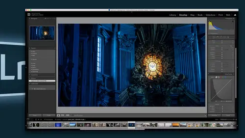
14:56 14Develop Module Overview
10:15 15Profiles
11:34 16Basic Adjustments
11:45 17Basics Panel: Texture, Clarity, and Dehaze
05:31 18Basics Panel: Saturation and Vibrance
02:40 19Tone Curve
09:26 20HSL
04:48 21Split Tone
08:19 22Lens Corrections
08:32 23Details
09:34 24Transform Tool
05:52 25Effects Panel
10:00 26Synchronizing for Faster Editing
07:40 27Spot Tool
17:51 28Skin Softening and Brush Work
07:00 29Range Masking
13:28 30Dodge and Burn
17:36 31Working with Specific Colors
08:30 32Edit Quickly with Gradient Filters
11:22 33Making Presets
13:24 34Preparing Image in Lightroom
09:51 35Content Aware Fill
11:14 36Skin Repair
02:44 37Skin Smoothing
14:39 38Expanding a Canvas
04:30 39Liquify
10:22 40Layers and Composite Images
12:54 41Sharing via Web
17:52 42Exporting Files
10:47 43Sharing with Slideshows
08:00 44Archiving Photos and Catalogs
19:54 45Designing
13:35 46Making Prints
11:27 47Color Management and Profiles
13:00 48Archiving Photos and Catalogs
11:31 49Using Cloud Storage
04:09 50Adding Images to your Portfolio
09:23 51Collecting for Your Portfolio
18:03 52Publishing Unique Websites Per Project
19:48 53Sharing to Instagram
07:06 54HDR
15:32 55Panorama
06:41 56HDR Panorama
09:54 57Making Presets
15:39 58Creating Profiles
18:09 59Maps
07:08 60Setup for Tethered Shooting
23:21 61Sharing with the Client
05:42 62Watched Folder Process
07:04 63Second Monitor and iPad
06:09 64Backup at the Camera
03:50 65Gnar Box Disk Backup
06:45 66iPhone and iPad Review
12:52 67Importing to Lightroom on iPad
02:59 68Cloud Backup
04:39 69Adjust, Edit, and Organize
07:46 70Using Lightroom Between Devices
11:27 71Lightroom Desktop
05:27 72Removing Images from the Cloud
10:49 73Profiles
09:34 74Light
04:34 75Color
05:36 76Effects
15:22 77Details
08:33 78Optics
03:49 79Geometry
04:12 80Crop
04:39 81Adding and Using Presets and Profiles
13:41 82Local Adjustments
15:40 83Healing Tool
03:29 84Synchronizing Edits
04:57 85Editing in Photoshop
08:54 86Finding Images
07:09 87Sharing and Exporting Albums on the Web
09:18 88Posting Images to Social Media
14:01 89Overview of Lightroom Desktop
07:35 90The Workflow Overview
10:08 91Organizing Images
05:10 92Albums and Shared Albums
18:21 93Lightroom Desktop Workspace Overview
04:36 94Importing and Selecting Images
09:23 95HDR and Panoramics
22:44 96Light
07:47 97Profiles
07:23 98Tone Curves
02:57 99Color
08:35 100Effects
17:01 101Details
12:43 102Optics
04:05 103Geometry and Crop Tool
06:01 104Sync Settings
02:40 105Making and Adding Presets
03:48 106Healing Brush
02:21 107Brush Tool
03:14 108Gradient Tool
04:16 109Edit in Photoshop
02:53 110Finding Images with Sensei
06:32 111Sharing Albums on the Web
04:57 112Print through Photoshop
02:09 113Exporting Images to Files or Web Services
04:36 114Connecting with Lightroom Classic and Mobile Devices
05:24 115Archiving Images for Storage
09:55 116Review of the Workflow
07:20Lesson Info
Color Management and Profiles
Um, and then at the bottom. This is the most important thing. This is print color management, and what we're gonna do is we need to make sure that we're choosing the proper paper and that we're putting a profile in it. On a profile is a definition of color, and every paper has a profile, and every printer has a profile on. Every monitor has a profile, so you need to make sure that you have profiled your monitor. And if you haven't profiled your monitor, you need to get a monitor. Profiler X right makes really great profilers. There's one called The Color Monkey that's a little less expensive and slower, but it's great. And then there's one that's faster, more professional. Andi. It's called the I one display pro. I think there's a I want to space I one display pro plus is what is the latest one, but either of them are fine. Just go to X right on and buy a profiler and and you're gonna calibrate your monitor and it's going to install a profile in your system. And that way your system kn...
ows what the definitions of color that you're seeing. Are it knows what red is red. It knows what it looks like. Then that profile needs to talk to the printer. So the computer looks at what you're looking at on your monitor, looks at the printer and says, What kind of printer colors or you're going to send out? And it also looks at a paper profile that tells the printer. So the printer and the paper need to get together and say, What does the color look like when we printed on this paper? And then it shares all of that data with the computer and the computer then tries to match all that data up and say I if I'm looking at this color and it looks like this on the monitor, what do I have to do mathematically to the, uh, the data in order to make it look the same on the printer and on this particular paper, that's what you're doing. So you have tohave a profile for that paper. Now ex right makes in another profiler, so it's ah, little over around $1000 for a paper profiler, which is a great tool, and you can profile your own paper and it will be dead on accurate, and every print will be perfect. But if you don't want to spend money on a paper profiler because you're just getting started or because you only print once in a while or you don't need to be that accurate, you can get a paper profile for every piece of paper that cans on makes that cannon makes that, uh, uh, Hannah mule makes that all of them make profiles based on that printer, whatever printer using. So if I go back to the website for canceling at the very bottom, once I've checked all the papers that I own, I can click on download, and when I click on that download, it's going to give me a paper profile. I'm gonna show this in my finder, and it downloads this paper profile right here. Double click that it unzips it. And now I've got a folder with some pdf instructions and what's called an icy sea profile. That profile right there is the computation that gets they can't that my particular canon printer here and that paper put them together. And that's the profile that specifically tells my computer how to match the monitor. How to match the print to the monitor. All right, so and never try and go the opposite way. Don't print out a print and then trying to just over here you need to profile the system. And if you profile it correctly, whatever you're seeing on your monitor will print on the paper. If you If you're not getting that, you're not doing it right. Start over. So we're gonna take this download here, and we're going to put it in the right place. So follow me on this because this is a little bit tricky. So we're going to make a new folder here in a new window, and we're going to go find where that exists on a Mac. In order to get into the system, you have to go to the system library and you have to go up to the go menu and you have to hold down the option of the bulky so that the library shows up and then I click on library. That library area has two different areas that you can put a printer profile. You can either go straight into the color sink area and put it in this profile folder or you can go and and that will make that profile available everywhere. Or you can go into applications, support adobe, and then go to light room an inside of light room. There is a color profiles folder as well. And that color profiles folder. If I put this profile right here in here, I will now have access to that piece of that profile for that particular paper on that particular printer. So let's go back to light room. And I need to I need to quit light room and start up again so that it really looks for those papers. Eso I'm in a quit light room really quickly. So, yes, I want to quit. I'll skip the backup this time. Um, and now I'm just gonna reopen light room. And once I've reopened light room, um, I'll be right back in the print module again with that same image ready to print, and I'm going to go here. I've got all of my settings still set, and I'm going to go down to the bottom here. I want to print at 300 peopie I That's good. Print sharpening standard for Matt paper so you can choose glossy or matte printing on Matt paper. So if I sharpen it, I need to sharpen it. For Matt Paper, 16 bit output means it's going to try and send as much data as it has to the printer. If you go to eight bit output, it's so if you turn this off, it's gonna have less information going to the printers. So leave it on. If you have a printer that's capable of that and then color management, we're not going to manage by the printer. We're going to manage by our specific, um, are specific paper type. And so this one. See how this one says, media setting other fine paper. That's the one for the Cannon Pro 10. You can see that it says can and pro 10 right here, and this one is the one for my Canon Pro 1000. So I'm gonna click on that, and that's going to adjust it so that it's perfectly suited for that paper on that printer. Once I'm done with that, all I have to do is hit the print button, and once I had the print button, it's gonna send it away to the printer. The printer manages everything, and we're going to get the print back now in order to save time. I've already done that for you, and so I have a print for us to look at. So let me grab that off the printer. So we're looking at that print and we're looking at the print on the screen and you can see that they are dead on accurate like they look beautiful together. There's no I'm looking at both, and I don't see any difference. I mean, there's always a slight difference because, ah, monitor is backlit. And so it glows a little bit. Whereas paper doesn't, it's reflective, so there's gotta be some difference. It can't look exactly the same, especially when you're looking at a glossy monitor, which is a horrible thing. I don't know why Mac has glossy monitors, but if they do so so it's always gonna be a little different. But the colors, the tones, everything is accurate and perfect, and it's exactly what I expected to see when I got this print. Furthermore, if when you're looking at your prints, if you want to see what it's going to look like before you print it, you can always go to the develop module looking at that same image, and you can go into the top area here, pull down the hissed, a gram looking right here, and and what you want to do is at the very bottom. There's a thing called. We set this down at the very bottom. Here there's a thing called soft proofing, and when I click on soft proving it shows me a piece of paper and then right up here under the hissed a gram is what kind of profile do I want to use? So if I click on it and I choose that rag paper and then I scroll back out, I will see exactly what it looks like on that rag paper. In fact, the white here gets a little bit more dingy because it's actual paperwhite rather than a screen white. And as I look at the two now, they really look very similar because it's trying to simulate the softness of the paper. It's simulating the a little bit of warmth to the paper and its simulating the the fact that it doesn't quite glow as much as a screen close. It's a fantastic way to see. What is this gonna look like before I print it? And I could make some adjustments based on that print. So if I'm gonna print something with a printer away from not not a printer in my house but a printer at, say, White House custom color, I can always go in here. Click on this, and I can look for other papers. If I install one of their paper profiles, say, for a metallic print, I can see what it's going to look like on a metallic piece of paper. So these profiles air very useful. So if I I want to see what it's gonna look like on a pro luster paper canon, click on it and you saw a shift. There's a shift in kind of the oranges. I'll go back so that we can see that shift again and see that this the paper I'm using, I think, is better than that pro luster paper for showing that warmth in the background. Their premium Matt paper, though, is quite nice, but it actually thins out the blacks a little bit more. Whereas this, uh, Kant's on paper has a better way of holding those blacks, and I can see here that it's that's ringing, true that I've got nice blacks inside of the shadows. So when you look at these papers and I and I printed up a whole bunch of these things, but they all just look fantastic, like here's Here's another shot of the canal and I'll compare that and it just looks. It looks right. It's perfect. And if I want to go to the next print, let's see what else I printed. Oh, I printed this one. So let's let's look at a black and white print. It's actually got a little bit of a color tone to it, so but the color tone is accurate. I'm looking at the color tone, and this color tone matches that color tone. And that's oftentimes that's the hardest thing to do. When you're printing to a printer at your home is when you print like a C p a tone. The sea Peotone doesn't show up, correct, and this is dead on accurate, and it's because I'm using a paper profile and I'm putting it in the system so that when I print the print looks just like it does on the actual computer when I printed it. So So we have and I just really love printing. They're so nice and, ah, it's just a It's a wonderful way to look at an image. And I think in today's age, we've gotten to the point where we deliver too much digital stuff and we don't really show our clients what beauty they could really have in a physical item. Um, and some people on Li like digital things. But, man, you'd be surprised at how many clients love a simple print as a gift, especially when that parent has them in it. So I would suggest I highly recommend the idea of printing either whether it's a book through blurb or whether it's a print out of your own home or whether it's sending in a way to a professional printer. I highly suggest printing, but when you print, make sure that you're downloading whatever profile you need for that paper so that you know exactly what that prints gonna look like before you ever print it. And that's how you print inside of light room
Class Materials
Bonus Materials with Purchase
Ratings and Reviews
Ira Richterman
I am truly a recreational novice in the photography world and this video is fantastic. Photography has become a very technical world both on the camera side as well as post production. Jared has great teaching skills and sure makes it look very simple. I would recommend this video for those starting out in Lightroom as this program can be overwhelming and has a daunting amount of information. I would like to know if there is a resource of location of contact to ask a question or two for clarifications as a viewer goes through the course. For example, when making a new collection and if you choose the option of making this new collection a target collection, what happens if you then make another new collection and select that new collection to be a target collection? If you click on B to add a photo to a target collection and you made two target collections then where does this virtual selection go, ie into which target collection? Thanks Ira irichterma@aol.com
Dan Clarke
This class was great. I've never used Lightroom before and now I feel comfortable in it. Massive amount of good info.
catherine Haggerty
Loved this class. As a beginner it really gives me working knowledge to use LR confidently. This class is older, so a few times I really had to stop and figure out how it worked in the newest version of LR... but all in all this class was amazing!