Composite in Photoshop®: Lighting and Color Adjustments
Lesson 7 from: Make a Polished Image BackgroundBrooke Shaden
Composite in Photoshop®: Lighting and Color Adjustments
Lesson 7 from: Make a Polished Image BackgroundBrooke Shaden
Lesson Info
7. Composite in Photoshop®: Lighting and Color Adjustments
Lessons
Class Introduction
02:34 2How to Use Bedsheets as Backdrops
05:37 3Effectively Use Color Theory
06:07 4Set Design and Prop Placement
05:02 5Shoot Props and Self-Portraits for Composites
13:41 6Composite in Photoshop®: Selection and Shadows
33:25 7Composite in Photoshop®: Lighting and Color Adjustments
19:43Lesson Info
Composite in Photoshop®: Lighting and Color Adjustments
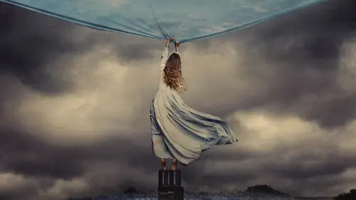
Now that we have the shadows thoroughly, well placed, we're going to move on to some lighting changes in color changes and more overall adjustments to make this really fit. Because right now, I think that the first thing that you notice when you really pull back from the image and you take a fresh look at it is that the Tea Cup and the teddy bear both have this yellow tone to it, whereas the subject has a very blue tone because of that dress and the way that it picked up the color temperature of the light. So we need to make some adjustments to make everything fit. We also need to make sure that they are of the same brightness so that the teacup and the bear aren't too bright looking. And we can do that by making some overall adjustments to the objects themselves. So I'm going to click on the teacup random, going to create my adjustment layer. A curve adjustment layer curves is my favorite thing, so I'm almost always going to choose curves above anything else. So choose curves, and I'm...
going to then pin that layer down to the cup, so I'm making sure that this adjustment layer is Onley affecting our cup. And now when I make my changes, it's only going to be on that teacup. So I'm going from my highlights and taking that down so that the cup is just a little bit dimmer. But I also want to make sure that I'm making a choice here and that is am I going to change the color of the teacup or the color of my subject? So I want her to be more yellow or my teacup to be more blue because we have to make the match here and I think that we contest both, but I'm probably going to want to make the subject a little bit more yellow. But first, let's go into RGB right here in this drop down and choose our blue curve because the opposite of blue is yellow. So if you are lacking one, you simply need to pull the curve in the other direction. So right now we have our blue curve, and if you pull up on that curve, you're going to get more blue. And if you pull down, you'll get more yellow. So I contest right now, this is normal, but I contest just outing a slight bit of blue in there and maybe that'll look good a little tiny bit and curves Congar a really long way. So we're just neutralizing the color. I think that looks good, but what this has done is now indicated to me that this curve where it used to be a little bit whiter, a little bit more yellow. I'm actually now seeing red in it. And I see that this dress is not only blue, but also science. The opposite of science is red, so there's a lot of color matching going on which goes back into color theory and what colors match and what colors don't what opposites are and how exactly to work with that. So I'm going to go to my teddy bear, which we have up here and do the same exact thing with a curve adjustment layer that I'm pinning down. I'm gonna make my teddy bear a little bit darker, especially paying attention to where we are in this room. For example, this teddy bears in this natural shadow in the room, we need to make sure the teddy bear is in shadow so I'm going to go ahead and darken him quite a bit more than the teacup. Just make sure that he really is in the shadow of the room, because that's what's there. Alternately, we could lighten that shadow. That would be another option, but we'll go ahead and dark in that teddy bear down and then same thing with the blue curve. Just adding a little bit of blue toe are Teddy bear, which maybe that's too much was pulled back just a little bit. Now we want to work on our subject, which I saved till last, because our subject is going to be a little bit trickier. If we zoom in, you can see that my skin is already pretty yellow. It's just the dress that we want to change the color of here. So we'll see how we dio with an overall curve adjustment, just the same as we did the others going to pin that down to my subject. And I don't think that she needs to be any darker, so we could yet we could make her darker, but she actually fits pretty well as it iss. We just adjusted the other objects, but do you see now? Close up. How much more read the teacup in the teddy bear look than she does. So the first thing that I want to do is go to the red curve and let's see what happens when we just add a little bit of red to her. Do you see how much more she blends in now with the other objects in the room? And it might not be perfect, So maybe it was too much. Maybe it was too little. It's really hard to tell sometimes when you're making these tiny little adjustments to individual objects, so it's good to just step back and say, Okay, how does this look? So let's go ahead and resume out, and I think that our objects are all matching pretty well right now, but we need to make some good overall adjustments up until this point. If you remember, we haven't actually done anything but make individual adjustments to the layers of our composite, but I want to make overall adjustments. For example, maybe I want to add a little bit of shadow to the back of this wall that's going to really bring it all together and Then maybe we can start to change overall colors and light. So I'm gonna quickly just drawing a shadow like wherever I think it should be. That's a weird shadow, but we'll see how that goes. Could be good. Could be bad. Gonna feather it just like we did before. I'm gonna try 30 pixels. That might not be enough Again. We're always experimenting. And that's in the background, which is our background layer here. Just going to create curve layer, create a little shadow, a tsa weird shape. Let's try one more time for that one. So instead, we're going Teoh, maybe. No, I'm doing a weird shadow, but don't worry. It's gonna turn out normal in the end. Maybe not. Okay, we're gonna get rid of that weird thing, okay? It's a little bit more normal. Maybe we'll just that. Okay, Souther. And we'll do 35 pixels this time and we'll go on down to our background layer and just try again. I mean, that's what this editing process is largely just figuring out what's working and what's not working. And it's super subtle. You know, we don't need a really dark shadow back there, just something to indicate that we know that there are objects in this room. Nobody else knew it, but we did, creating a new feather and doing the same exact thing in the background, just creating a little bit of believability. And the teddy bear doesn't need it cause he's not tall enough. So let's go ahead now and we're going to make our first overall adjustment. First thing that I'm thinking is the foreground is too light. There's just too much light coming in here. I don't like it. So we're gonna select anywhere that it's a little bit too bright. We can always change your selection. For example, the shadow doesn't need to be any darker than it ISS, so we'll get rid of that. I'm going Teoh, right click feather. I'm gonna do a big feather on this one because we have a much larger selection, so the size of your feather can often correspond to the size of your selection. In this case, I'll try 250 pixels, and I don't know if that's enough, but we'll see trying curves, then bringing that down. So you see how by bringing that area much darker, it's actually making our subject fit in a lot more. The lighting simply has to match, and it doesn't yet. Now that I have done that, I noticed that the dress is too bright where it's hitting in the shadow. So I'll go in, select that dress, feather that selection and then make an adjustment on the dress. Only the dress. So making for this layer is pinned down to my dress, just making it a little bit darker in that region. There we go. Just there. All right, so that's looking pretty nice. I've got this weird thing in the foreground, which I'm going to fix very quickly. Just by cloning that out, I don't have any idea what that was. Might have been a rug or something that I rolled up to try toe fix that. So I'm just clone stamping that out by selecting some pixels and replacing foreground just a little bit so that everything is nice and clean that I'm actually going to go in and dark in this area even more. I'm gonna go in and create sort of a vignette here so that we have a lot of attention drawn onto our subject. 200 pixels. Another curves layer make that area even darker. Okay, so now that we've got some darkening in the foreground, let's see what we can do with light play and see if we can make this whole area a little bit brighter and draw attention to our subject. I'm going to pretend like the light is coming from the upper right hand corner of this picture. I'm just gonna go ahead and make this weird big selection, which is going to be our light beam coming in. Not a really strong light beam. Just some slight sense of direction here. Going to right, click and feather and we'll do 300 pixels on that. Just some nice big number for a big feather. I'm doing this above all of my layers. I don't want this to just it the background or just hit the teacup over everything curves and we can work on making this brighter. Now we could go from the highlights. We could go from the mid tones or we could go from the shadows. And I tend to like to go from the shadows a little bit because it gives sort of a dusty feeling in the light. Almost like there is a beam of light coming in in this indoor add icky space, which I think is really beautiful. So that's going to help us just bring some cohesion to this image. But let's try another overall adjustment instead of just one specific part of the image. Let's go ahead and do our first curves layer that will change absolutely everything, not just a specific part. We talked earlier about color theory, and I talked a little bit about color signature. Well, you can also have a lighting signature if you want. You can deal with light and color in the same way, with highlight mid tone and shadow. It's very obvious to do that with light, not so much with color. So let's do that with white first. And the way that I handled White is to work from the highlights in the shadows and not so much the mid tones. So what I want to Dio is actually take my blacks and skew them up to be gray and do the same thing with my highlights, but opposite. So I'm taking my highlights and skewing them to be gray as well, which is exactly what everyone has taught not to do all the time. And that's okay, cause I know it's technically not correct. But it's fine. I'm going to now add contrast back into the mid tones, just bringing a little bit more attention to my subject. So what we've done there is. We've gotten rid of the harsh distinction between the shadows and the highlights, and we're just sort of softening those shadows and highlights. It gives it a little bit more painterly feel, and that's really good for an image like this, which is very, very tell. So we've gotten rid of those things. And now let's go in and do our first riel big color adjustment. So I'm going in. I've got my new curves layer and I'm going into RGB. I've got red, green and blue, and maybe you're the type of person that stops on green first, and that's your thing, and you like to adjust green and magenta. I think those colors are the worst, so I never touched them. But you might. If Green is your thing or magenta is your thing, go for it. I like the blue curve personally and part of my color signature. Working from the highlights and shadows is to add blue to the shadows and yellow to the highlights just like this, which also will soften the image quite a bit. So I like to start with that. So now that I've got some lighting and color signatures put on there, you can see the difference that that made overall. Now I'm starting to think about Okay, I've got some color in there. Got some light. But this wall is pink and it is driving me crazy. I hate the color pink very much so. I need to change it. What color will I change it to? I have so many options. So one option that I have here is to try to do replace color like we did before on this wall. Would it work? Maybe. I don't know for sure, because if you zoom in, you can see that the skin tone is fairly similar to the wall color. And you might say No, it's not. The skin is yellow in the Wallace pink, but they're still in the same range. Learn the same family and I have tried to replace color enough times to know that it doesn't work very well on anything. That's a soft light color. And these air not saturated colors here. So what might work even better in this scenario is actually to just select the wall. I'm gonna do a really bad selection here just to show an example. But you want to select the wall. In fact, I'm going Teoh, just go and refine this in just a moment. Okay? There we go. And instead of trying any sort of like overall color replacement to do this more manually just to shift the color So you don't have Teoh get a perfect selection on this. But something fairly close because what we're going to end up doing is we're going, Teoh choose curves again, and we're actually going to go in and just manually adjust the color of this wall. I don't know if we're going to shift it very drastically, but some little amount will probably work out here. So this is looking pretty good. I don't know if I want to include this. I think I might get rid of the little crack in the wall there. Okay. Hey, what are you doing? Okay, there we go. And right click and feather, which is probably very predictable. By this point, I'm going to do 20 pixels. Could do more, could do less were just experimenting, seeing how it goes and curbs. So you notice. Whenever I do an adjustment layer, the selection goes away. But it's the retained here in the layer mask. So I always have that. And I can always click on that layer mask if I hold command and click and you can get your selection back. So if you need to go in and make another adjustment to this wall, you can totally do that. And that works out just fine. And let's see what we can do about color here. So in my curve adjustment and you can see that we have that wall selected, and now it's just a matter of what direction do I want to take this in? Do I want to add more red to this? Probably not. So I want to take away red. That looks much better to me, just dulling it down a little bit, making sure that we're not having too much of that pink salmon color in there. So I'm going to see what I can do with that. But I'm keeping in mind that right now the selection looks OK because you can't see all the parts that we've missed. So if I go ahead and I d select, you can see that there are lots of pieces in here right up against the subject, for example that need to be refined. But that's OK, because we have an adjustment layer which has a layer mask attached to it, so we can always go in. I'm just gonna take my opacity up in a just my hardness a little bit. We can always go in and just make those adjustments. So if I need to erase because I selected too much here, that's OK. Well, just refine it. But I find it much easier to go about it this way instead of getting a perfect selection Instead, Teoh, go in and just erase later. That is so much easier for me. I have so much more control when I do that, I'm totally aware that I just messed that up, but we're gonna fix it because we can. Okay, so I'm just making sure that everything is finessed. There's a bit of ah, halo effect happening around the subject. That's okay. Same with in here. Okay, So I would go in and fix this a little bit more, of course. Especially around the door. Wrong way, especially around the door there. But you get the gist of different ways that we can adjust colors within the frame. One being replaced, color, the other being a manual selection. Of course, there are many more than that, but those are my two favorites that I like to dio. So I'm going to back up here, back up and look over this once more. Okay, so we've got the color adjusted, but now everything looks a little bit sad and dreary. I don't know if you guys agree, but I definitely think so. So let's go into curves one more time and see if we can't really ramp up the color here. So I'm going to add more yellow and more blue the same way that I did before, into the highlights and shadows, and we'll see if we can't just play without a little bit saying if yellow is good for this image or if blue is good for this image going into the red curve at the same time, maybe adding a little bit of a dim blue feeling to it because you never know what's going to look good, what's not unless you play with it just a little bit. So I'm going ahead and just adjusting these colors to see what looks nice. What doesn't. I'm trying sigh in the shadows. I'm trying red and highlights, and I'm not sure you see how much red that was, though before I think it's good to get rid of some of that. So I think we're getting into a decent area here where we've got some, uh, some blues coming in, which I like. I think that we could still do a lot of work here in terms of toning down this door in the background may be adjusting the dress a little bit, but for now I think that it's pretty good. I think that we just need to step back, take some time, figure out what needs to happen if anything and then move on from there. And that's a large part of my process. Is stepping back from the computer for just a little bit. Sometimes I'll even go ahead and make the image really, really tiny and just look at it fresh to see an overall composition overall light. I don't know if you guys agree, but when we do that, I noticed that the door is really bright and that's really distracting. So that's the thing that I will definitely go after next is just a really big selection on that door saying, If we can't take that down, I think the editing is so much fun because it gives you this opportunity. Teoh. Create whatever you want in your process. In your editing process, you can make the store darker. If you want Teoh, you might choose not to. Whatever is authentic to your personal slow. Much better. Oh, that makes me feel so much better. So I'm going to leave it there because I think that we've really gone over the basics of how you can get rid of a background, how you might transform an image, and it might not be perfect yet, but we've got the basics down. So if you have a sheet at home that you can use great if you've got a piece of fabric that you don't know what to do with use it. You don't have to have any particular thing to create, and that's really want. What I want to drive home right now is that you don't have to have a lot of money. You don't have to have great locations. All you have to have is an imagination and some super basic tools, and you have everything that you need, so have fun creating.
Ratings and Reviews
Kamand
I started to use Photoshop just for two months now, and I just came to this fruitful tutorial from the Adobe Photoshop official page for beginner tutorials. And I can say that it was amazing. For me that had already learned the basics of software, her amazing lessons were a chance to dig even way deeper into the color theory and light/shadow/color aspects of photo editing/compositing. Besides from that, it was a real inspiration on how we can use our simplest tools and options we have even at "home" to just start building our little home-studio and start photo shooting, compositing and eventually CREATING inspiring, mesmerizing artworks. HAVE FUN CREATIVES! =)
Ahmad Mostafa
Great, great to watch, great to listen and great to learn from, loved the instructor.
Deann DaSilva
Fantastic, super helpful. I love her creativity and imagination. Her technical explanation is spot on. Thank you Brooke.