Color Balance Tool and How to Save Styles
Lesson 6 from: Advanced Color Correction in Capture OneDavid Grover
Color Balance Tool and How to Save Styles
Lesson 6 from: Advanced Color Correction in Capture OneDavid Grover
Lesson Info
6. Color Balance Tool and How to Save Styles
Lessons
Class Introduction
03:10 2Advanced Color Selections
26:44 3Color Correcting: Product Photography
06:34 4Color Correcting: Architecture Photography
06:09 5Color Correcting: Travel Photography
07:07 6Color Balance Tool and How to Save Styles
14:13 7Dive into the Color Editor's Skin Tone Tab
14:04 8Color Manipulation for Portraits: Headshots
07:36Lesson Info
Color Balance Tool and How to Save Styles
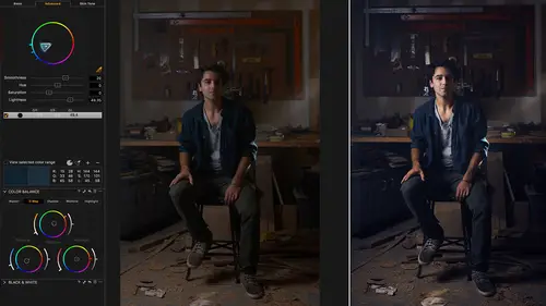
So it's influenced heavily from the movie industry where they've been doing color grading since the dawn of time as such. And it's really interesting to see like a raw movie footage before color grading and then after color grading. Raw movie footage is really flat, really lifeless, no color, and then they do a huge amount of work in the color grading process to get that emotion and feel across to the audience. And this is exactly what the color balance tool is designed for. So it has two kinda different modes of use. So we have the master wheel, and we have three-way, which is shadows, mid-tones, and highlights. So in my master wheel, let's just give this image a bit of base correction. So a bit brighter, a bit more shadows, bit more highlights, bit more contrast. So in the master section, this is exactly the same as placing some kind of color filter in front of your eyes or over the lens of the camera. So if I grab the center point and push it this way, then you see we get a warm ton...
e over the whole image. If we go in the opposite direction, for example, then we get a cool tone. If I go over here, then we get a red tone, for example. The further you go out, the stronger that color toning is. So you can moderate by just how saturated it is. Once you're happy with a particular color tone, and you wanna lock that in, you can leave this alone, and then grab the slider on the left hand side and then you're always moving in the same plane of color. So if you wanna be very specific about your color tone, then you can just rock that back and forward like so. So the further you are out, the more saturated the color tone is. So this is happening on the entire image, so if you just want to warm something up, cool something down over the whole image, very easy to do with the color buttons still. If we go to the three-way tool, then now we have the ability to cut up the image into shadows, midtones, and highlights and apply differing color tones to each of those sections. So in the three-way tool, it's represented all three wheels at once. If you need a bit more space to work, you can look at the shadows, midtones, and highlights separately. If you want to, let's just get rid of this. We don't have enough screen resolution to fully show you, but there's not reason why you can't add more color balance tools. And just to show you what I mean. We probably don't have enough resolution. Let's just delete these tools. See, then we can have shadow, midtone, and if we had space, we could have a highlight tool as well. So if you like working on the larger wheels, do so. Otherwise, you could use the three-way tool. And you'll see here if I move the midtone, you see it's moving here as well, so it's exactly the same, it's just giving you a bigger representation. If you like, you can also drag out the color balance tool and you can make it larger as well or smaller. Which also makes it simpler to use as well. If you have a track pad on your MAC or PC, you can also do two-finger swipe like so. So if I go down here and use two fingers on my track pad, then I can actually move around going left and right and up and down to change it as well. So lots of different options. Additionally, on the three-way tool, you also have sliders to the right-hand side which change, let's just reset, which change the density of each of the areas, so the density of the shadows, midtones, and highlights. So if we drop shadows down or lift up. Drop highlights down and lift up. And then, midtones down and up like so as well. So let's, any questions on that Jim, the color balance tool? Color balance tool, let me take quick peek. Okay. No, we're good. Okay, so using this really, this isn't science now. This is kind of emotion and feeling or such. There's no right or wrong way to use the color balance tool. It's how ever exactly that that you want to use it and get that across. If you're kind of unsure where to start, there are some built-in presets that you can try as well. There are companies like Phase One and other third-party selling color balance presets or styled presets as well. But the way I like to use it, we've got another image from Bella here, I'm just gonna straighten this up like so. Base corrections, it's pretty good. I might just brighten it a little bit. Add some contrast and maybe a slight Vignette. And then now, we can really enjoy using the color balance tool. So if we take the shadows then we can decide what direction you want the shadows to go in. So we could cool the shadows off in this case. Grab a, see the midtones affects the skin tone quite a bit so I might leave the midtones very subtle. And then boost up the warmth of the highlights like so. Then we can again influence contrast by using the sliders on the right. So let's make those a bit darker and then lift our highlights somewhat as well. Now most of the look on this image is really only being created the one tool in the color balance tool. Let's option click, so that's before and after, like so. Previously, without the color balance tool, you would have to actually get involved in editing the different levels, color channels or you can go into the curve and then also edit the different color channels as well. But the reason why using the color balance tool is better, is because color and density are two totally independent things. When we play with the color wheels, we're only influencing a color. And when we use the slider up and down on the side of the color wheels, we are only influencing the density. So it's two separate things if you're using a levels tool or a curves tool, that they're meshed together, they're joined together. You cannot pull those apart as such. So the color balance tool is a great tool for those creative adjustments. Any questions on that Jim? I think we're good David. Okay, so again, so going back to color balance. So we got a nice wedding shot here from my colleague Alex. And again, no right or sort of wrong way to use this tool. And again, I would do a similar cinematic color grade as such of having cooler shadows and then, warmer midtones. Sometimes, what's nice to, kind of, bring into this, is also, how does the shot looks like? Would it benefit from being warmer? Does it benefit from being colder? Is there any queues that you can get from the shot as such, which would benefit as such. Like this, loads of like fantastic warm tones and greatness in this shot, I don't know whether I want to kind of give it cold shadows so then if that would be right so I'd be looking to just give it a nice warm tone as such maybe a nice rich shadows and a tiny touch of warm highlights like so. So drawing influence from the image itself really really helps as well. If we look at a couple of other wedding shots like this goes back to distractions again. So in this particular case, let's just kind of reset my workspace as I added a few additional things. So let's go back to the color editor. So in this particular case, this is our subject. But my eyes are kind of zipping over here to this dress. So does it make sense to grab the picker, do a quick check and then, take saturation out of it like so. And now, it's less distracting than that sort of bolder color that it was before as such. Especially if we then in a little Vignette. Then now, our eyes are focused back on the center as it was before. So I use the color editor a lot for playing around with getting rid of distractions or enhancing something that I wanna see. Same goes for this one, if we do a quick pick here. And then, take saturation out. Then we've got overall nice sort of warm tones whereas this is less distracting down at the bottom of this shot for example. So once you've done all these various edits and things with the color editor and the color balance tool. You might want to save that as something repeatable. So don't forget in the color balance tool, let's just go back to ... Let's take one of these images for example, from my friend John Schell in LA. So let's reset this and let's think about ... Let's just do a quick color grade. We've got nice warm scenes, I'm pretty gonna air on the side of being warm, I would think. And let's say, we wanna make this repeatable color look that you wanna have for all your shots. So very simple advice, easy thing in Capture One. Don't forget that you can simply save that as a user preset. So let's save that and just call that My Warm Lifestyle, for example. And then, if I go to any other image as such, then I can simply pick that up like so and choose. And notice as I scroll down the preset list, do you see how the color wheels change? So it gives you an instant preview of how your preset is gonna look. So sometimes, you might find that a preset or a color grade that looks fantastic on one image doesn't look so great on another image. So that's always something to be wary of as such. So I find saving the presets in the color balance tool very useful. I probably find it less useful saving presets in the color editor because I think the color range selections and adjustments, are kind of unique to each of the images. So I think for the color editor, it's harder, me personally to make presets. But for the color balance tool, then definitely having, you know, a set of your various different looks is a great way to have a repeatability and consistency on all your various different images. If you want to combine, say your color balance look, sorry, color balance adjustment with a few other tools. Then just be a little bit cautious. So if we grab, let's grab this image for example. And let's do some base adjustments. So let's open up the exposure, lets open up shadows a bit. Bringing the highlights back. Let's have a little Luma curve as well for some contrast. And then, let's go to our color balance tool, and then throw in a nice cozy sort of warm grade as such. Now, we wanna save almost everything we've done as a style cause we did a contrast Luma curve and so on. So just a little warning, when we go to save a style, and remember, a style is collection of different tools. A preset is one single tool. So let's go to our styles and presets tool tab up here. And we're gonna save this style. And you have a really important step to do here. Because, I don't want to include an exposure correction and a shadow and highlight correction in my style because that's unique to an image. But I do wanna include my curve. And I do wanna include my color balance. So it's always worth having a look on this list and deciding what makes sense to have as a style. And exposure correction does not really make sense to have as a style. But in this case, I want my curve and I want my color balance. We could argue that, in this case maybe, if we wanted to desaturate a bit, this could be part of the style. So let's say, save style. We don't want exposure, we don't want shadow and highlight recovery. We do want saturation, we do want curves and we do want color balance. So let's say, save, call this My Lifestyle Style style. That's an ineffable, save that and then if we go to another image like this one, we can first think about, well I'm just gonna correct the exposure and lift the shadows a bit. Now, I can go into my styles and presets. Look in my users styles and apply my style. And I know, because my style didn't contain any of the environmental things like exposure correction. Then it's gonna fit really nicely with that particular image and now these two match really well. Because we've done individual exposure and HDR corrections. But the consistent part of the style, the color balance, and the curve and the saturation is exactly the same.
Class Materials
Bonus Materials with RSVP
Ratings and Reviews
Dan
Can you get all this stuff online? Probably, but it's great to have it all in one place and it's pretty comprehensive. David doesnt waffle it's pretty much pure content so it gets a thumbs up from me.
Jakob Lehner
I use CP1 for about two years now being pretty happy with it and my color editing skills. So I thought, nahhh not for me I know it all... After some time I bought it on sale and I couldn't be more wrong. I learned much more in the first 40mins than in the last 2 years from YouTube tutorials. This one is really great, highly recommend it!
user-940746
David's knowledge of the color correction process in CaptureOne is amazing! This class has not only adde to my knowledge of color correction, it has shown me how to do it with a quicker and easier process.