Creating the Perfect Cluster
Lesson 9 from: Layering in Adobe Photoshop for Digital ScrapbookersTraci Reed
Creating the Perfect Cluster
Lesson 9 from: Layering in Adobe Photoshop for Digital ScrapbookersTraci Reed
Lessons
Intro to Scrapbook Layering
04:15 2Paper: Your Layout Foundation
11:35 3Building Paper Strips & Blocks
12:04 4Create Chevrons with the Shape Tool
05:24 5How to Line Up Repeating Shapes
04:10 6Custom Shapes with Polygon Tool
09:27 7Make Your Own Pennant & Banners
10:47 8How to Add Interest with Your Photos
05:10Creating the Perfect Cluster
11:52 10Embellishments with the Visual Triangle
12:57 11How to Use the Visual Triangle with Pictures
03:06 12The Rule of Three
02:18 13Using the Power of White Space
04:43 14Using the Rule of Thirds
08:42 15Learn the Importance of Shadowing
10:30 16What is the Brush Tool?
05:16 17Using Brushes in a Layout
06:04 18Using Paint in a Layout
03:23 19Understanding Blend Modes
07:21 20Creating Mixed Media Mash Ups
05:19 21Using Layer Masks
02:41 22How to Blend Photos
03:16 23How to Blend Papers
02:17 24How to Blend Text
01:13 25Lighting Effects: Learning Radial Gradient
05:17 26Lighting Effects: Learning Inner Shadows
01:51 27Dodging & Burning Washi Tape
07:58 28Creating Custom Journaling with Text Tool
05:41 29Journaling with the Pen Tool
06:46 30Incorporating Journaling in the Design
04:29 31Making Stamps from Fonts
06:49 32Different Ways to Cluster with Alphabets
07:54 33Adding Embellishments to Titles
04:24 34Drawing Banners to Title Cluster
03:20 35Creating a Stitch Brush
12:21 36Creating Other Types of Stitching
08:03Lesson Info
Creating the Perfect Cluster
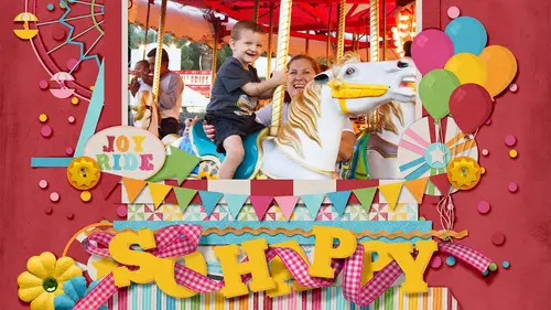
Let's talk about embellishments, let's, talk about what we're going to be learning in this segment we're going toe really delve into clustering and trying to figure out what the perfect ratio is of embellishments on where you should put them and what you should do with them. We're going to understand the science of clustering, which includes like visual triangle and the rule of thirds, and where do you put things on? You lay out for maximum impact and they were gonna make it easy. You don't have to reinvent the wheel every time you don't have to do the same thing over and over and over again, just like we learned in the shadowing course with creating actions, we're going to learn how to make things easier for ourselves when it comes to layering as well, and then we're going to spend a little time just a few minutes on shadowing, too, so that we can really see how important it is to make sure that you shadow correctly in photo shop when you're clustering. So we're going to just dive rig...
ht in and I'm going to be showing you example, layout things I've already finished and how to achieve them so first, we're going to start with this lovely layout of myself and my boss, robin carlton. I love her I hope she's watching so that she can see her put her face on there with the mustache and she can love me forever for it but this is a really good example of clustering and how to build a cluster of embellishments that doesn't detract from the main focus of the layout but rather adds to it and sort of in this instance it frames the layout so we're going to be building this set of clusters right here and we're gonna be talking along the way about how you do that and what makes sense visually when you are combining this's a ton of embellishment and so what do we dio when we're adding a ton of embellishment? How do we make sure that we don't overdo it that we don't put things in the wrong order that we don't detract from what we really want to see here which is this silly picture of us so what's open up happiest e file and I've already brought in all of the embellishments that we're going to use and they're just randomly placed on the file so that we can really build it together so the perfect cluster really consists of a combination of flat embellishments such a stickers, drawings ah illustrations that sort of thing or even buttons and then a combination of things that are going to float away from the page and added more depth to your lay out now if we were to build a cluster that just consisted of flat objects, things that, um, don't float away from the page and don't give you very much depth while we can build a cluster that can be visually appealing and it's, it'll be fine. It doesn't have that extra that we really want to really create dynamic and engaging visual design. So, yeah, this works it's, a nice little cluster of three objects and it's cute it's pointing to the photo, and it works, but how can we take that to the next level? So all we're going to be focusing on right now is building this side of the cluster because this is where all of the visual way is. Yes, there is embellishment on the side as well, but let's, concentrate where the visual weight is. So, um, I always start when I'm building a cluster, I always start with the flat things, the things they're going to go on the bottom your sticker is not going to make sense on top of your big flower, it just doesn't happen, it's ugly, it doesn't make sense, and I actually see it a lot, and so when you're focusing on clustering, you really need to make sure that you understand layer, order and you understand, ok, this is a sticker and it's going to be stuck to the layout, which means it cannot be on top of something big and puffy, so let's, make sure that we don't do that. So the first thing that I always do is I start building the stickers, and I'm going to keep this up right here so that we can see the whole thing as I'm building it. So I liked to stick the stickers to somewhere where there's gonna be a lot of contrasts. So in this case, that's, where the black is in my photo, because I really want to be able to see it. So we, um, we move this stickers around, we open this just a little bit if I could get rid of this for you, start with the layout, and then bring all those elements in and lay a mic there. So you know what you're using, or would you be going back and forth searching for stuff? No, I go back and forth, I don't I don't decide ahead of time. I like it. I start with the flat stuff, so I'll look through the folder and I will pick out flat stuff that I want to use, and I'll drag things in and I'll decide I don't want him, and I'll believe them it's totally process for this, because I didn't want tio you know, be wishy washy and waste time trying to figure things out I brought them all in in advance because I was recreating something but if I was creating from scratch I know I'm not going to bring in okay I'm to use all these and let's figure out how they work together so let us talk about the stickers and I've already pre shadow these just in this instance because we don't need to talk about the shadows here um this is another flat embellishment thiss sticker oven arrow and now let's talk about this arrow does it make sense to be pointing this way? No does it make sense to be pointing this eye? Yeah uh it doesn't even make sense to be pointing this right even though in the end product there is journaling and stuff down there that you do want to see what we want to point out is the photo so we want to make sure that the arrow is pointing towards the photo and it's okay to stack stickers on top of each other. You can do that in real life and this is actually paper object so it would be on top of the sticker and not not underneath it and then now that we have some stickers settled, we want to this is another paper object, so I'm at this point when I'm designing this I'm not actually going to know where everything is going to end up exactly, but I do know that I want tio build a cluster around the photo, so I'm just gonna put this over here and it'll probably move later. It does move later, but that's, what I would do in real life if I was scrapbooking, so it looks good let's put it right here, corner of the corner of the picture, we've got some flowers sticking out that makes sense for now, but really, what happens is if I left it like this and I started adding the heavier embellishments up here, it kind of it doesn't make sense visually, the visual wait all start going up towards this empty corner of the photo and away from the arrow, so because we're pointing directly at the photo, we want there to be visual wait on the bottom of the layout as well. So I'm gonna move this sort of less dimensional object up of it and were instead going to anchor this layout. Oh, you know how they're following, so I added all of the flowers paying it off, I guess not. Ok, so we have this blue flower here, but we're going to use the pink one instead because I'm not gonna dig through my files, so what we do is we have this the more visual wait on the bottom so we're going to have this flower and we're going to have the leaves underneath it because that's what makes sense in the stacking order and now what happens with these leaves if I'm going to frame the cluster I could bring them this way so that they're pointing towards the the center of the photo but that doesn't visual weight wise it adds too much over the photo we're starting we're starting to cover up the photo now and if we left it over here instead rotate if we left it over here instead what ends up happening is it frames the layout it frames the center cluster it also gives your your eyes somewhere to leave the photo so our point is to bring our into the photo with embellishments but also the eyes going to need somewhere to rest and leave the layout as well so it kind of gives our I somewhere to go in this direction we've looked at the photo and now we're done and we can lead out we also can do that up here as well like I did originally with this photo this would lead out of the layout as well now we want to be able to see our camera a little bit more so let's pull this down and now little things like this make great just little touches that add to your clusters so we want to have them in pieces of under under the pieces of the layout that it would be coming off the page like the leaves and the flowers, but they can start to disappear, but we do want them to be kind of just additional. You can also if you really wanted to get bling e with it, you can put them over. Things are nearly out just it's accent like you would on a paper layout. You've had a little bling to things, but I prefer to keep them a little bit more hidden, kind of like a enamel dot and then let's talk about this banner. Now the purpose of this banner is it's cute, but it also is a way to finish framing off the bottom of this of this cluster, and it gives a place for my little monogram title to sit so that I can kind of title the picture. But since it's such a little off of it, you don't want to have the alphabet way apart from the cluster, because it's so small, so it's, really good when you have small alphabets to incorporate them into your embellishment clusters rather than having them far off, and then we have a little bit of ah, just a little touch, so it's not perfect, we don't want it to be perfectly framed. Every time it could go here which would perfectly frame that photo but I like to have just a little bit of imperfection in my clusters it doesn't have to be perfect every time so I'm gonna drag just a little bit of visual wait out here instead and then these buttons for realism we're going to hold down the banner so it doesn't you don't have to over think it you just have to know I want to draw attention to my photo and how do I do that? And you have to make sure that you're not messing up the sacking order stickers don't go on top of puffy flowers on dh puffy flowers don't go um underneath stickers thiss just the main point when you're choosing the elements do you do you also start with choosing the flat ones first or do you just kind of pick with your favorite ones? Are that you want to put in the cluster and kind of both? I'll have some favorite things I know I want to incorporate like that adorable camera I love it I want to incorporate it I took this is one of my kids so I made it so I knew I wanted to use it so I started with the camera and actually I probably started with the camera as the basis from the layout and then decided how I was going to build my layout around it because I'm awesome. I knew that I wanted to use that camera. You spent a lot of time on it, exactly, just your kids to match your kids. You don't get your kids to match your kids. Yeah, exactly. So I knew I wanted to have the camera as the main focus of the layout. So I picked a photo that I wanted to be the, um, the center of attention, and then built my way around it. S o, normally I'll start with one thing that I really specifically have in mind, and then I'll build around it.
Class Materials
bonus material
Ratings and Reviews
Corrina
I have recently discovered digital scrapbooking and have been using a great scrapbooking software that I downloaded on-line. There are limitations with the software that prompted me to look deeper for ideas. Traci's course was fantastic! I learned so much from her not only in scrapbooking layouts and using different elements in a page but my level of understanding of photoshop has improved dramatically. The presentation was easy to follow and broken into perfect chunks to go back and review the techniques. Thank you so much Traci for presenting this awesome course. I will look for more of your courses. Your scrapbooking is beautiful and inspiring!
ChristyWhitehead
I'm a photographer. I do a lot of graphic design for my business. I feel like I'm fairly knowledgeable. I saw this class being shown for free on Creative Live one day and it wasn't my first choice to watch, but was the best out of the list... I was wrong. This is a great class. I didn't expect to learn that much and I've been learning a lot! Great info!
LourdesM
This course was amazing. I learn some things I didn't know how to do. Traci is simple and straight forward in her teaching. Very easy to understand.