High Contrast Black and Whites
Lesson 6 from: Advanced Landscape Editing in PhotoshopMatt Kloskowski
High Contrast Black and Whites
Lesson 6 from: Advanced Landscape Editing in PhotoshopMatt Kloskowski
Lesson Info
6. High Contrast Black and Whites
Lessons
Lesson Info
High Contrast Black and Whites
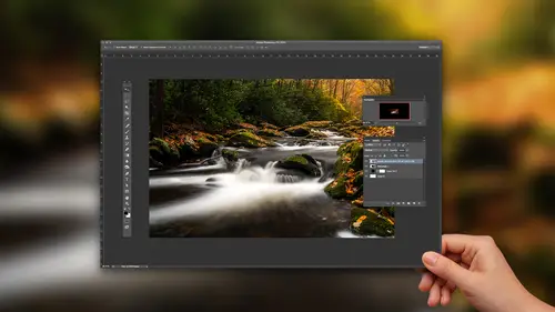
So, I've seen these photos and I set out, when I was here in Seattle, one time, to create one. What I've realized is a couple of things: One, I didn't have my neutral density filter with me. So I wasn't able to get the clouds as streaky as I wanted to. Two, the security guard did not like me taking pictures of this building. And I was on the street, shooting up and he was trying to get me to leave. Like I was, I'd moved onto... I wasn't on their sidewalk. I was on the street and I'm shooting up and he's like, "You can't do that." I'm like, "Why?" Like, "You can't do that." I'm like, "Everybody that's at Kerry Park and a thousand people a day shoot this skyline with this building in it. And I can't take a picture of it?" Anyway. Maybe I can't. I shouldn't have just said that. So, let's go ahead and do a couple of quick adjustments for contrast. But, this isn't a photo that we're gonna pre-adjust. All right. Best thing I'll do is maybe fix the white balance. Just take my eye dropper here...
and click on the clouds. That will kind of fix the white balance a little bit. I did have a neutral density filter which is what got my clouds streaky. But, I didn't have a thick enough neutral density. I could go in here and turn on my spot healing brush and get rid of all my spots. Like so. All right. Close that up. But, this is all done in black and white. So we're not gonna do anymore Lightroom work to it. We're gonna head over to Photoshop. The first thing that I wanna do is, we're gonna fake this a little bit. So these high contrast... Have you ever seem 'em? You see, that's on architecture a lot. Architecture and bridges. They do like a three minute exposure. The clouds all streak and they convert it to black and white and there's just a piece of light coming through, but the photo's almost all black. So that's what I'm looking for. Part of what hurt me is that I couldn't get the clouds to streak quite as much as I wanted to. So, we're gonna fake that by making a selection and going to Filter, Blur, Motion Blur. I missed my selection a little there so you'll see, kinda taking the... You probably wanna go into Refine Edge. Could probably smooth that out just a little bit. But you'll see it kinda grabbed an edge of the building. So just spend a little bit of time on that selection. Again, Filter, Blur, go to Motion Blur. I'll know if that helped it. And I can make it go in any direction that I want. So now I've got streaky clouds. Forget about the streaky building that's in there. So now we wanna go black and white. I'm here to tell you that nobody uses Lightroom in Photoshop for black and white anymore. Almost anybody that does any black and white conversions is using a plugin. So, I think the best one, obviously, is On1, it has a black and white filter in it. But, I don't say it just 'cause I work for them. Like, I think it's a great filter. But Nik Silver Effects is a great one. Tonality is another one. But I just think the black and white here in effects is one of the best ones. So now all this becomes about, guys, is contrast. What you're looking for is just, I look through the presets and I'm just looking for, like, mega amounts of contrast on the photo. That's not a bad one, neutral. So I could add my own contrast. I like chrome. But, once it converts to black and white. It starts to take on... You start to see the light a little bit better. You can see all the bright parts of it. So, I think I'm gonna actually, kind of, lean toward... We'll go with that one. Then we'll come down here. I'll usually click through all the different color filters until I get, again, a super contrasty one. Reduce the brightness, crank up your contrast, and then, as everybody does, you add a vignette. The vignette is what ties it all together. A really strong, really, really dark vignette. But the idea is is that you see the clouds and you just see a portion of whatever the architecture is. It's not all supposed to be lit. It's just supposed to have a tiny portion of it. So, you can have a lot of fun with it though, to start off with a color image.
Class Materials
Bonus Materials with Purchase
Ratings and Reviews
Pamela Richardson
I would absolutely recommend this class. I really liked Matt's detailed explanations of each step that he was demonstrating, and his review of alternates for each step. I have been photographing landscapes for over 40 years, including the last 10 years in digital. I really appreciated Matt's clear demonstrations of how images can be improved, and am eager to apply his examples to my own work.