Editing and Post-Processing of Rock Climbing images
Lesson 21 from: Advanced Lighting for Adventure PhotographyMichael Clark
Editing and Post-Processing of Rock Climbing images
Lesson 21 from: Advanced Lighting for Adventure PhotographyMichael Clark
Lesson Info
21. Editing and Post-Processing of Rock Climbing images
Lessons
Class Introduction
03:25 2Evolution with Lighting
04:44 3Why Use Artificial Lighting?
06:43 4Pre-Production and Pre-Visualizing
07:16 5Equipment: Overview of the Gear
25:28 6Equipment: Selecting the Right Gear
24:05 7Strobes vs. Speedlights
08:01 8Lighting 101: Flash Sync Speeds
14:35Lighting 101: Flash Basics
24:46 10High-Speed Sync (HSS) vs. Hi-Sync (HS) vs. HyperSync vs. Leaf Shutter
14:50 11Gear Requirements for Hi-Sync (HS)
12:29 12Flash Exposure
21:39 13Pre-production and Location Scouting for Rock Climbing
06:02 14Gear on Location: Rock Climbing
07:04 15Rock Climbing Photography 101
11:37 16Rock Climber: Environmental Portrait
24:22 17Finding the Shot
13:48 18Capturing the Action: Rock Climbing
07:09 19Shooting at High Angle: Rock Climber
21:15 20Digital Workflow: Overview
16:09 21Editing and Post-Processing of Rock Climbing images
30:17 22Cyclocross Photography 101
11:32 23Location Scouting for Cyclocross
05:36 24Gear on Location: Cyclocross
11:42 25Intro to the Cyclocross Rider
16:29 26Capturing Action: Motion Blur
43:13 27Communication with Athletes
18:55 28Variations of the Shot
23:21 29Cyclocross & Trail Runner Portraits
40:40 30Location Scouting & Planning the Shot
09:20 31Capturing the Action: Lighting Set Up for Trail Running
37:01 32Editing and Post-Processing of Cyclocross Images
21:34 33Editing and Post-Processing of Trail Running Images
07:52 34The Business of Adventure Photography
17:42 35Image Critique with Chase Jarvis
48:41Lesson Info
Editing and Post-Processing of Rock Climbing images
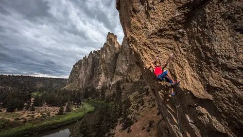
So what I'm gonna do now is I have, I've done generalized adjustments for the entire image up to this point. I'm gonna go in now and start doing much more localized corrections. And the first thing I grab is the graduated filter and I'm gonna deal with this and I'm gonna do something that's gonna look horrific for a second, just so I can see what's going on. Adjust this over there and I'm gonna back that off. So I'm gonna back that off quite a bit. One thing to note is when you pull the exposure slider you're adding gray to your image. When you pull the highlights you're just controlling the brightness or darkness of the highlights so it's not adding gray to the image. So little tricks here. And I do subtle adjustments here. You're not seeing me do like massive giant sweeping adjustments. Draw another one there. Let's see. There's some gray stuff coming in there at the top so I might back this off and do another one up here to kind of control that. One thing you will note is the sky is...
getting really dark here so I might grab the brush. Go down, auto mask is on. I'm gonna hit erase. And I'm going to erase, let me show the mask here so we can see what's going on. I'm gonna erase that mask on the sky because I don't want it darkening my sky in the background. We're gonna do that on this mask as well. So you can see here, woops let me just close that. Let me turn these on and off so you can kind of see the effect that's having. So that's basically me flagging my light off the cliff just a little bit and evening out the tones in the image. And if I hit the backslash key here you can see before and after where I'm at. So that's a really key thing to know is the backslash key can really help you figure out where you're at. Let me keep going here. I might do a few things with the adjustment brush. I've still got the automask on. And let me, I've got show selected mask, so I'm just gonna start painting here and create a mask on this entire thing. And the automask looks like it's doing a great job. So it's not selecting the sky, it's just selecting that cliff. And I'm gonna open up those shadows quite a bit. Maybe even, the other thing on a laptop is you gotta keep your face perpendicular to the screen even though this Macbook Pro has a pretty stellar screen. Just adjusting and opening up the exposure on that cliff. So that made a huge difference. One of the things that I always talk when I'm shooting and when I'm working up images is it's good to know what you can do in post while you're shooting because that will change how you shoot so you saw here I exposed for the background in this image and then lit for Kai on that cliff, knowing that I could recover these cliffs. It was the same thing with the portrait of Kai on the rock. When you saw that, you looked at those spires in the background like oh my gosh those things are pitch black. At least they looked pitch black. But I knew from the histogram they weren't, and that I could do exactly what I just did here and pull out detail in the cliffs behind him. I mean if we're really getting crazy we could have hiked over some lights over there and lit up that whole rockface. That would have been kind of amazing and exciting. It just would have taken a lot of effort while we were there and we didn't have time for that. Another little thing, I'm gonna zoom in here. And just go in and do some super techy detail right here on Kai. And I'm gonna add a mask onto his arm just darken that down a little bit because it's a little brighter. And that's when we reset these to zero. And get back to exposure. Not that much. And let's see what effect that has on him. Super subtle effect. Just blends it a little bit better together. Let me zoom out now, close off that mask. Oh woops, see what I did? Command Z. Let's go to our history. So I forgot to create a new mask there so I'm gonna go back in my history. And right there, always fun to screw up on here and then you just you get to go back and fix it. It's the beauty of these Lightroom and Photoshop is that you can undo stuff and redo stuff. Let's see, I'm still on automask I think so if I show the mask you can see the light red there. Wow it selected his whole arm perfectly, that's beautiful. I don't want shadows, if I double click on this slider it actually puts it back to zero. I'm just gonna darken down the light on that a little bit. And. I mean the cool thing is zooming in like this, look at the light on him. You can tell the light's pretty high because his whole ear's lit, there's no shadows from below on his face. So you can tell the light's on par with him even though he's 40, 50 feet above my shooting position. And that's why I chose this climb and why I chose this location. So we're getting close. That's not bad. I think the rest I will do in Photoshop. So I'm gonna just cruise into Photoshop real quick. And I'm gonna open it as a smart object in Photoshop just in case I need to come back to the raw file and tweak something. Wait for it to open up. Photoshop is open, so there we go. There we go, size Photoshop here so we see everything. So I am going to get rid of typically I guess it squeezed it a little bit. Let me open the layers panel here. I am going to create a new folder and inside this folder creates a new layer and I'm gonna call this cleaning. And then I'm going to create another folder and call this adjustments. Just so I can stay organized. And what I'm gonna do in here, well I'll get there in a second. First for the cleaning, this is where I typically do, on this layer, all of my healing and cloning if I need to. And for an image like this, it depends on the client. Or who I'm shooting for. If I'm shooting for National Geographic, obviously I'm not taking anything in or out of the image. This is about as far as I go in terms of cleaning anything up. I'm just adjusting the tones in the image because that would be a photojournalistic situation. If I'm shooting for Red Bull and this is an athlete's shoot and it's a corporate advertising deal they're not too worried about me massaging the image a little bit and removing like a quick draw or something. So it just depends on who I'm working for and what's going on. I'm gonna cruise around the image briefly and just kind of look for dust spots. I don't really see a whole lot. What I do see are these quick draws on the route next to it that I might take out. Hopefully you're not getting dizzy with me spinning around the image here. I don't really see a whole lot on there that needs to be taken out in terms of, I don't see anything in terms of dust spots. What I do see is I'll probably come in here and remove these quick draws. And let me just go to 100%. And you see this is a huge image file so I'm gonna go to my content aware fill tool over here. The spot healing brush, which is J on the keyboard shortcut, for Apple at least. And I'm just gonna paint over this and get rid of these quick draws. And you know, because I'm trying to tailor this, wow that did a great job. It's not bad. Do a little, this is where the Wacom really comes in handy. And then I'll zoom out just a bit and let's go up to that one. We'll take this one out as well since we're going this far. And that didn't do quite as great of a job. I can go back over here, grab the healing brush. Adjust my size of my brush real quick. I guess it did a decent job because I can barely find where it was, but I'm gonna just paint over this. To kind of put that chalk back on the wall there. So something like that, if we zoom out, well that's still not great. And I might do a little more healing on that to fix it up, I probably used too big of a brush in the beginning. And with all the healing and the cloning tools, you know you try one see if it works, if it doesn't work go to the next one. If that doesn't work go to, you know, my last ditch resort is the clone tool here. But I think that's pretty good. If I'm being hyper critical I might even go in here and remove some of the chalk on the hold. So I'm looking at the edges of this, so this is getting into commercial world for sure because I'm removing stuff and really tweaking it. You know that little stuff in the corner doesn't bother me too much but if we have some giant white thing let's just look at the whole image. This guy over here is well, yeah, that's kind of drawing your eye off. So I'm gonna go to 50%. And just take that out. Let me increase the brush size here. See how this goes. Not bad. And then I might cruise around on the image, up here. I might just take that whole thing out. And that looks horrible, so no. Let's do a little more careful sampling here. That still doesn't look that great. But you get the idea there since we're pressed for time. And also, you know, looking in the corners some of the stuff up here I might take out or I might not it just depends on if this is a climbing magazine or Rock and Ice I'm shooting for, they probably don't want me taking holds off the wall. So it just depends on the client. So, forgetting about that for a second. That's good enough, let's go back down and I'm gonna add a levels layer to this adjustment folder. And then we pull the layers back up, I'm gonna add a brightness and contrast layer to that. And then I'm gonna add a vibrance layer. And this is kind of the standard work up all of my images get. And I'll show you here in the properties panel with the levels adjustment the reason I don't do a really critical levels adjustment in Lightroom is that technically Lightroom is a pro photo RGB color space with a SRGB tone curve applied to it so it's not a real world working color space like the pro photo color space we have in Photoshop. So the histogram can be a little different in Lightroom than it is in Photoshop. So that's why I wait to come here because this is a true pro photo color space. And you know, we could have a whole dialogue on whether to work it up in pro photo RGB or Adobe RGB, I don't think we have time for that. But I typically work things up in pro photo RGB and then convert them to whatever colorspace I need for the client. So typically I add my output levels at 3 and that's something that Getty Images told me to do years ago. There's a good reason for it, so that if you print an image and say the paper is very yellow like some of the fine art papers we have that we print on our Inkjet printers today that means that there's gonna be ink printed everywhere on the image and there's no like holes where the paper would show through if there's pure white in the image. So quickly here I hold down the option key in the blacks and I'm looking at this right there. And then I'm gonna do the same, we're pretty much right up against it there so I'm probably not gonna change that side. This is having a very small difference in this if I turn it on and off it's just basically by clipping those sides of the levels I'm just adding a tiniest a little amount of pop. For some images it's a much bigger difference when you do an accurate levels adjustment. It's not always the case that I'm pulling these levels in because if this is a picture of a sea kayaker in fog and I pulled the levels all the way in then I just erased all of the fog. So it's not like you have to pull those levels all the way in it's just a matter of maximizing the color in the image and the full width of colors that we're showing. The full range of tones we're showing in the histogram. So going back to that, by holding down the option key I am seeing that some of this black is clipping on him. And I may or may not want that. I think I don't want that, so what I'm gonna do is go down to my layers. Here and I'm gonna choose black and there we go back to the brush. Let me change the size of that brush and I'm gonna change my flow to about 14, 15%, and I'm just gonna paint that back in so that I'm undoing that levels adjustment on the shadow right here on his shirt. And so you'll see that the shadow is not changing but the colors are shifting just a little bit. So that's also a way of basically creating a wider dynamic range than your camera was capable of creating. I know that's super techy and geeky but it can really add a whole nother dimension to images where there's a bigger difference in the levels. We have questions about that? No, okay? Impressive. So let's go over here to brightness. Sometimes when I adjust those levels I adjust the brightness a little bit. These are tiny little moves, maybe just a little one point there. And often when you do an adjustments on the levels it actually does affect the saturation so I might adjust the saturation there you see those are tiny little moves. And here is where the fun starts. I'll create dodge and burning layers and I typically do this with levels, or curves. Instead of using the dodge and burn tools that are built into Photoshop. we're gonna do two curves layers. And I'm gonna go in and delete these layer masks by right clicking on the mask and hitting delete mask. Delete that mask as well. And I'm gonna hit option click on, this is on a Mac I think it would be alt click on a PC, On add layer mask and creates a black layer mask. So the black layer mask is hiding any adjustments. So I'm gonna go up here to the properties panel for the bottom one. This is a pretty standard dodge and burn technique. And just pull that curve down. So essentially that's making whatever I paint on darker. And for the upper curves I'm gonna do the opposite. And pull that one up. Maybe not quite so crazy. So this is where I can really craft, and I mean if we're doing lighting when you look at images that are lit often times there's a lot of dodging and burning especially with a portrait for the cover of a magazine. I mean there might be so much dodging and burning that it's hard to tell how it was actually lit. So that kind of makes it a little fuzzier to figure out how something was lit. You can look in the eyes, like I said earlier to see how it was lit. But you just have to see what's going on. You'll see here, I'm gonna do very subtle stuff. So let me go back to my brush. Because the layers are black to reveal the lightening or darkening I need to use a white brush and I'm gonna go with a really low flow here. Like 3% is the magic number for me. Let me adjust my brush. I'm actually gonna make my image a little smaller. And we're on, that went fast. Maybe I'll go down to 1%. I'm gonna make a pretty big brush so I can kind of craft the lighting on this wall. And come in here and maybe I'll darken that down just a little bit. I'm taking very small strokes and I can click the eyeball on and off to see what effect I'm having. Looks pretty good, I might darken this down just a little bit more here. And at 1% I mean it's very subtle maneuvers here. What I'm doing is basically trying to force your eye to go to the climber at this point. So I'm gonna go up to the, I always get dodging and burning confused as to which one is which even though I did work in the darkroom back in the day. I'm gonna open up these shadows even a little bit more here. Just so we can see it and that's a very very subtle adjustment but, I don't know if you can see that on your monitors back home. And then what I might do is come back and just add a little sweep of darkness so the top of that is darker than the, or is lighter than the bottom. So you know from there to there you can see we're just adding very subtle adjustments. I might even come back in here, we're still at 1% and just darken this down a little bit. So it's a little more even on the cliff. And I might even go in all the way to my climber and you know, do a little dodging and burning on his arm there. I might even come in and open up these shadows a little bit even though they're probably not going anywhere too far, I might even darken down the red shirt there that's kind of catching the light a little bit more. And if you see what I'm doing there, they're very subtle maneuvers on that but just kind of helping even out the tones and taking it that extra 3%. So if I hit the option key and the eyeball for down here you can see what happened in Photoshop and it's not a huge difference but just cleaning up that extra little percent. So that's pretty much as far as I was gonna take this so I'll just hit save and it'll save it in Photoshop and then we'll also save it back into Lightroom. And once it saves we can compare it to how I worked it up the first time. Obviously this is kind of a faster job, you know for me when I work up images if there's you know, for the average image it's gonna be minimum three to five minutes in Lightroom probably 10 to 20 minutes if I'm really being critical. You didn't see me go in. Typically I would zoom in in Lightroom and look at the chromatic aberration on the edges of stuff just to make sure I've taken out any color fringing and really look at the image pretty critically. So I mean to really do a halfway decent job on an image takes 30 minutes per image. Almost minimum for me. If it's a portrait and you're gonna actually do some serious retouching, you know, where your dodging and burning the skin, I don't like to smooth out skin on portraits or anything like that. I like to keep it very real because they're usually gritty pictures of athletes, you know, in the outdoors but sometimes up to an hour or maybe even two sometimes. But if it's beyond that I'll hire a retoucher and have them do it because I don't necessarily have the patience or the skill even of like Pratik Naik or some of the best retouchers in the world, I definitely don't have that skill. So know your limits and then hire people to help you out if you don't have the ability to go that far with the image. If you need to. So let's go back to Lightroom go back to the library module. I think this is the one that I worked up just now and that's the one. So I did a little bit more dodging and burning on this one. I actually opened up this one quite a bit. You can tell the color balance is different too. I left the sky a little bit more blue here versus the one I worked up at home. And it might be because of what I could see on my monitor at home. So I have a big Eizo monitor at home that does show me the full Adobe RGB color space. And I don't want to harp too much on the monitors because I know people think I'm a little nuts on that one but go ahead. We just have a question come through from Lucas Beavah who asked is it better to adjust the flow or the opacity when you're dodging and burning, or maybe what's the difference? Let me go back to Photoshop. My experience has been if you adjust the opacity, let's just say we take the opacity down and I start painting, let me make sure we have a brush here. And I just go like that, very little is actually happening. Am I on white? Huh, nothing's happening. Whereas if I take the flow and do 100% it's additive to a point because it's only going as far as pure white to reveal that behind it. So that's why I take the flow down and then when it's additive like this I have to paint a lot to get it really dark. I do know there's a different, maybe if I'm on a layer down here like the levels. Oh, gotta paint with the other color. That's not really doing anything either. I don't know is the answer to that question. This is the way I was taught to do it and how I've always done it and it seems to work. But if there's a better way to do it please email me so I can learn. Yeah, one question going back to your photos with the two lights when you were up on the rock in the video. And at some point you showed a few of those worked up and you said you were not too happy with it because they came out too dramatic. I was curious to know what your thought process was there. Is it just because you didn't like the harsh shadows or what is it that you did not like? That's a good question because I've never tried that before as I think I said at the very end of that video. I think it's the first time I've seen that light setup before. And that's definitely, let me go back to some of those images so we can see one here. Oh they're way back there. You know for me, let's go to a better one I think that's one of the best ones. They're definitely dramatic. They're maybe a little too dramatic for me in terms of the lighting. I'm still grappling with whether or not I like this. Because it's something I've never seen before. And you know it's just like, i think I said at the very beginning of the class earlier that when all of us adventure sports photographers started using strobes to light up climbing the initial reaction from the client was not like oh that's amazing, it was like whoa that's really different. We've never seen this before, we're not sure we like it. And so I have the same reaction. I've never shot from above with a two light light trap. Where you get this stripe down the middle of the climber. I mean sure it looks cool, take out the stairsteps down there and it would be better, I think my angle could be better, there's a lot of things that could be better about this image. We could of done it, at the time we shot this it was getting pretty dark so it made it an overly contrasty image. And if we had shot it earlier in the day and it was less contrasty I think it would have looked a little more natural. This looks almost a little too artificial for me. In my taste. Though that taste is evolving. I was asking because I actually like those, but I do like high contrast so that's why I was asking why do you not like this, this is the coolest thing I've ever seen. Yeah well, and you'll see through this and you'll see tomorrow, I'm hyper critical of my work. I mean I get asked what are my favorite pictures and out of the like, million pictures I've shot or however many it's been over my 21 year career, there's like three that I like that I've created, maybe five. So, I'm really being, like I'm looking at every little nuance on this climb, like you know I can barely see that the arete is an arete because it's lit so evenly and you see this stripe so I need to tweak the lighting to make it better. And I'm always, you saw with the ice climbing images, I'm always going that extra 3% trying to take it to a whole new level that I haven't done before. And I'm inspired by my peers and other photographers outside of the adventure genre to like oh, if they can do that there maybe I can take that here. So that's what I'm thinking about when I'm looking at some of these. Plus this image, we know, where Kai is hanging off the cliff is just so much stronger visually, like that just like whaps you upside the head with a hammer and you're like wow that is amazing. I get exactly what he's feeling. I feel the draw of gravity there. Whereas here, you know I think for you, you don't necessarily see this perspective unless you're a climber, so the average non-climber might be more enthralled by that image but I see that all the time. Same issue when I started shooting surfing photography. And my good buddy Bryan Bielmann who's the godfather of surf photography brought me in and I shot from the beach. And he swam out with a fish eye. And so I saw from the beach what was going on and was pretty excited about it until I saw his images from like right in front of the surfer and I'm like oh crap these are horrible compared to his. So it's the same deal you've got going on here. Standing on the ground looks great until you see the person shooting from above. But the person who's shot from above a thousand times like Bryan shot in the wave a thousand times it's like meh these aren't that great. So little give and take there. Does that answer your question? Cool. As a photographer, I have a lot of emotional attachment to things. You know, you wrote it right up, your shot list of all the things you want to get. But the environment changes, things change, so what is your kind of litmus test or control apparatus to control your emotional attachment to either what you want to get or what you've already got, or you know what the clients needs are maybe the clients needs aren't as high as what your personal expectations are. So how do you manage that type of you know, changing kind of, Expectations or such? Exactly. This is what makes you your own photographer and this is where you can set yourself apart is your style you know, and people like to talk about style for photographers but you can create your own style or you can find it 10 years later and I think more photographers find it 10 years later than they do create it. Though with this new lighting technique in the last month I've shot like so much new work I wish I could show you because it's some of the best stuff I've ever done and it's creating a whole new style because it's all lit with strobes. But to answer your question there's a lot of different ways. I think the more you edit your own work the harsher you get. I think being hyper hyper critical I mean to the point of total insanity about your work and it's just, you learn more the harder you are on your own work. And then also, like you know, I'll use Red Bull as an example. Red Bull editors have seen probably more adventure sports images than any other people on the planet. Because they have a library of adventure sports images that are all like unbelievably stunning and some of you have shot for them. And so, you know, I know if I talk to one of the photo editors and know them well enough because I've been working with them for 10 years like, well what did you think of this? And they'll be fully honest with me and I'll ask them to be fully honest with me. And because of they're photo editors, they'll see all this work, they can put it in perspective for me. So having somebody else, a mentor or you know, it depends on who you are. If you're out there, if you can find somebody who's an established pro or you know, like tomorrow we're gonna have a critique. You can get your image critiqued by Chase Jarvis and myself. I mean how often does that happen for anybody? Much less, you know. I've never had my image critiqued by Chase Jarvis, so you know, that would be exciting to see that. Or I took a workshop with Albert Watson last year who's a very famous fashion photographer. If you don't know who Albert Watson is, look him up. You've seen his images before, I guarantee it. And in that workshop he spent an hour and half critiquing every single persons images and I can tell you I was on the hot seat next to him sweating profusely, nervous about what he was going to say. And you know, mostly talking about my portraits, but it's invaluable getting those critiques. Because that'll knock you back a few pegs and bring you back to reality. That was a very roundabout answer to your question but that kind of get there.
Class Materials
Bonus Materials with Purchase
Ratings and Reviews
norah levine
This is a course that I could watch repeatedly and be able to learn something new each time. Michael is a truly an expert in his field and is so generous with his knowledge. This course really breaks down the process of adventure photography, but it's more than that. I don't think you need to even be an adventure sports photographer to get tons out of this course. Michael is really good at breaking down some very complicated technology. Thank you!
a Creativelive Student
Great course that combines the technical aspects of shooting with light in different situations, with the art of making a great image of athletes. Michael is a great teacher and I'm sure his lessons will continue to help guide over and over again!
Jeph DeLorme
Great class with dozens of tips, ideas and lighting strategies for tough outdoor lighting challenges. Advanced class taught in a way that allows even a beginner to get a handle on lighting tough situations. The location videos provide real life examples that make this class a definite must have for my Creative Live collection. Thank you Michael Clark and Creative Live! Jeph DeLorme