Lesson Info
15. Processing Black and White
Lessons
Class Introduction
04:58 2Local Adjustments Overview
05:47 3Drawing Local Adjustment: Masks with Brushes
08:59 4Drawing Local Adjustment Masks with Gradients
08:05 5Vital Techniques for Dodging and Burning
09:54 6Dodging and Burning Demos
14:49 7Local Sharpening and Local Noise Reduction
07:40 8Advanced Editing for an Editorial Portrait
05:51Simple Element Removal
06:09 10Multiple Local Adjustments: Product Photography
09:43 11Correcting Perspective for Accuracy
04:27 12Multiple Local Adjustments: Architecture Photography
15:13 13Correcting Perspective for Creativity
12:37 14Creating Dramatic B/W images
09:17 15Processing Black and White
22:08Lesson Info
Processing Black and White
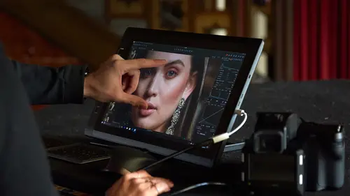
Let's have a look at landscape stuff and use some various different tools to create these images. Okay, so I have a really nice image here I think from Colorado, from my friend Steve, Steve Gosling in the UK and it's a great subject to obviously convert to black and white. This is one I did earlier and we can use the black and white tool and we can use local adjustments and we can use the color editor and all kinds of stuff, so it's a really good example for the depth that we can go to for black and white. Now before making a black and white image, it makes sense to start with a good color image. With a good color image, I mean the right exposure at least. White balance not so important, but at least getting a decent exposure and contrast before we get too excited with ourselves and start converting to black and white. So looking at this image, it's slightly underexposed, so we can just raise that up a little bit and levels-wise, I just bring in my highlight and shadow points and mid-t...
one, probably lift that a bit of a sort of flatter start point that I can then make black and white and then we can think about the kind of adjustments that we want to do. So that's good enough for me for a stop point before black and white. So now to my black and white tool tab. I'm going to turn on enable black and white and then we're going to see what each of these various sliders do. I'm guessing that probably it's going to be a little bit of red in the rocks, so do I want to brighten those or darken them? I'm going to actually lift them up a touch. Yellow doesn't have a huge amount of influence, nor does green. Cyan's a bit of hazy bit in the front there, so I might darken that off and then blue, actually, we definitely can see the haze coming through there, so I might darken that off and then magenta, really, doesn't have much affect. So in some cases, they're very monotone color image that these sliders don't really do a great deal, so now it's up to you to fire in the contrast and drama that you need from using the other tools. So with this, I would probably use my Luma Curve once more to get a bit more exciting contrast and I'm kind of looking at this area. I know this is going to get too bright, but we're going to deal with that with a simple local adjustment. So on a bit more contrast there and more than likely some clarity as well and you can really see that. That then starts to define those nice or pull apart those tones between the mid-tones and the shadows so everything looks a bit more interesting. And then it's getting a bit too dark in the shadows, so probably what I'll do is go back to HDR and just lift up those shadows a bit like so. Now it's too bright in the sky. We've lost a little bit what's going on with our adjustment, so this is going to be a good case. We might get away with highlight recovery. Actually, we can probably just use highlight recovery to get that back, but it looks, the contrast is a bit mismatched here. This is looking a bit, kind of flat and it's looking a bit richer here. So what I might do, thinking on the cuff, is just do a little bit of extra clarity in the mountain range in the distance, so I'm going to make a new layer and call this extra clarity and let's invert that and then add some clarity and kind of zoom in a touch. So a bit more clarity just so these get a bit sharper and a bit more interesting, so I'm happy with that. So I am going to invert that back again, grab a brush. Probably not quite as soft as that and then I'm just going to paint in my extra clarity and I'm confident I can put a lot of this in, so I'm going to raise the flow up so that I pretty much just get the whole clarity adjustment straightaway. So if we turn that off, it's just giving it a little bit more extra bite to that stuff in the distance. So turn that off and on again like so. But I don't think the sky needs anymore. Do we have a spot? Yes, so let's get rid of that with the spot tool, another reason to stay and capture one. I believe that's dust. Let's try, yeah. Try to keep the, you can grab the edge of the ring to make it smaller or as large as possible, so try to keep it relatively similar, just a little bit bigger than the spot itself and you should find you get a pretty good correction for that. And then the last thing that we're going to do is a good old bit of selective dodging and burning, so lightening and darkening. So I add my lighten layer and I want to kind of lighten up these areas. So see these little brighter bits of the rocks, I just want to bring them up a tiny bit. So we pre-visualize by inverting our mask. Go to the curve tool and they're kind of around this area, so let's just lift them like that. Go back to local adjustments, invert mask once more. Take our brush tool, shrink it right down, and now I'm probably going to want to use my flow so I can just brush it into the areas that I want to have and hopefully, it won't have too much effect on the shadows because our curve is really happening in this top three-quarter tone, so even if I brush a little bit over on the shadows, it shouldn't really have too much effect, so I'm just going to brush away, right click to get the settings up. Might just brighten this little arc down here on top of that, maybe a bit more brighten up in the middle tones there, for example. So I find it very quick. With one hand on the keyboard, I have access to right click so I can very quickly make small brush changes and you'll see, when you right click, very clever thing that someone did, one of the developers, as soon as you right click and tap, your cursor is exactly on the size slider so you don't even have to move the brush. You know that as soon as you right click and tap, your cursor, no mater where you click, you'll see my cursor is always on the size slider. So that's why I find right clicking really fast to change the brush size because I don't really even have to look at the brush settings tool. I know straightaway I'm on the size slider, so it's a really nice little efficient touch. So if we just do a bit of more lightening like so, if we turn this layer on and off you can see it's just bringing up those brighter patches at touch and do I want to darken anything? Maybe a tiny bit. Let's do darken. Pre-visualize by inverting our mask and I want to darken just our shadowy bit or just some of the rocks, so let's just take a little curve like that, invert the mask back, go back to our tool, and then I can just, almost like, increase the contrast by darkening down some of these areas like so. Not much, just a little touch. So now if we turn this off, just darkening down a few patches like so. If we opt-in click, we can see what all of our local adjustments have done. And if you remember, before we converted to black and white, I think we had, this was kind of a, I can't remember, like a blue haze, but if you want to control things like that, if we take our color editor and let's just pick over here and you see it's picked up the blue, and then if we zoom in a little bit and say, play with lightness, you can see we can just control that part of the image quite nicely with the color editor as well. So even though we're working in the color editor, don't forget that the underlying image is color, so you can still use all the various different color tools to influence that as well, so that allows us just to tweak that range quite nicely as well, although I probably want it brighter, I would say. And there we go. So if we just crop this a touch, I think. So if we remember what this looked like at the start, option click, so that was the color image and then that was our final black and white. Quite a long way different from color to black and white, but by the use of a whole bunch of local adjustments, all the different techniques we saw, we can easily make a really nice, dramatic black and white image, but staying in capture one. I think that's the really important thing. All right, so with people, this is going to be a relatively short, simple one I would think. I think with people, we've got some nice head shots here form a good friend of Bruno in Australia, Bruno Conga One, a really nice guy which I have to say, all the people sending me images have been a lifesaver with this course. Otherwise, you'd be looking at my family pictures and wonky landscapes. Anyway, so if we go back to the black and white tool tab, again, do we want to do anything with this shot before we go to black and white? Remember, a good black and white image starts with a good color image. It's really nicely shot. Looking great out of the box. The only thing we could do is just tweak, bring her highlights in and maybe just play with mid-tones and pretty much leave it at that and then go and turn on black and white. Now mostly with black and white, what you'll find with the skin tone with people is that the red slider and the yellow slider is going to have the most affect, so these two kind of in combination you'll be able to use to control the density of your skin tone. So do you want a nice, high key conversion or do you want to bring the density down and make it a bit lower key as such? Sometimes, you might be lucky. You turn on enable black and white, it looks fantastic, you'll go and grab a Luma Curve, put in a little bit more extra contrast and job's done, so. But occasionally, you might just find that you want to play with the red and yellow sliders more than anything else and regarding what clothing they're wearing, of course if they're wearing a blue jacket and you want to just kill that down a bit or make it a bit brighter, then you can use those sliders quite nicely as well. So with this image, we really, we get a really super nice black and white without having to do a great deal. I might just play with the highlight slider bit, just to bring back a little bit of highlights. And then if we zoom in, I think for this example, super sharp. Look at that. Then we'd be pretty much good to go. What we're actually going to do in my other course, they're creating a workflow course, if this is something you do regularly, working with head shots and people, we can create some styles which you can apply to images like, as a batch and then do some local adjustments as a batch as well and then do some other workflow accelerators as well, so that's in the creating your workflow class. We can take what we've done here and then move on further for that for batch correction. In terms of local adjustments for this shot, I probably wouldn't do a great deal. I might just lift the shadows in the neck. So if we make a new layer and we call that shadow lift, again, I'm not entirely sure how I'd do that, so I would invert the mask so it's over the whole image and then I would probably, it's kind of a mid-tone, so I think I'd just lift that up a little bit and maybe open up the shadows as well. Not too much. So probably mostly going to be with a curve. So if I do that, that just kills those shadows a little bit. Go back to the local adjustment, invert mask once more. Grab my brush. Probably have to be a little bit more careful here because I don't want to go over to her jacket, so a smaller brush, nice low flow and then I can just lift those shadows a little bit and same over here. Not that they're super bad, but it's just, we can do an easy fix, so let's just take those shadows out like so. If we turn that local adjustment on and off, we can see what we've done there. Let's just go a bit bigger and then blend it in a little bit better with the neck like so. So very simple, maybe a few skin tone touches you might need to do like we saw with the earlier shots for dodging and burning. We could do the same thing. So if we just wanted to lighten the nose a little bit, let's say lighten. Let's invert our mask once more and it's just a little bit dark there, so that's kind of sitting around this point, so we could just lift that up a touch. Invert the mask back. Nice low flow once more and then we could just lighten that ever so slightly, and then just a little bit of the shadow under here. So if we option click our reset button, we can see before and after, so just a few simple changes like so. If we option click the whole shot and we can see our color version and then our black and white version like so. Any questions on the head shot? A couple of questions regarding some technical things. Okay. Is there a shortcut to adjust brush size without right clicking? Yes, so we can do. Well, you can do a couple of things. You can use square brackets. So it's the same as Photoshop, so if you're used to using square brackets in Photoshop, you can do so. If we do Shift + [, we can change our hardness of the brush. If you don't like using the square brackets, if we go to Edit, Keyboard Shortcuts, and I'll just collapse this down so you know where to find it. So Edit, Keyboard Shortcuts is here. So if we go to Other category and Local Adjustments, you'll see all the various different brush tweaks that you can do with increase and decrease like so. So as I said, I personally don't find it slow to right click because you don't even have to look at the dialogue because as soon as you right click, your cursor is bang on the size slider and it's easy to change it. What you can also investigate if you want to, if yoU are a Wacom user, I never found this as fast as right clicking, but I know some people do. The jog wheel that we have on the Wacom tablets, you can actually tell that to do multiple key presses, so you can use your finger to slide the wheel left or right on the Wacom to actually make the brush smaller and larger, so that's another option you could think about, but you'd have to program into the Wacom software driver to tell Capture One that when you rotate right, that you're going to do square bracket and when you rotate left, you're going to do square bracket. So by using the jog wheel, for example, that could be another where you could do it. The third option, and this is the more luxury option, is that Capture One is compatible with a bunch of input panels from a company called Tangent and they make kind of hardware decks like keyboards on steroids, if you like, which are primarily used for the video editing industry, but it's all compatible with Capture One and one of those decks has basically a big jog wheel if you like, like a big, what's the best analogy to use? Like a trackable, I guess. And you can use that trackable and you can roll that trackable to change the size if you go left and right and you roll the trackable up and down, which changes the opacity and I have an outer ring around the ball which changes the flow, so you've got access to all three controls in the palm of your hand, so it's a really super nice addition. Obviously, this kind of equipment is premium price as such, but if that's something you're doing a lot, if you're doing a lot of continuous sort of local adjustment work and you need to have that tactile touch for changing brush size, those kinds of hardware input panels are great. So that's the Tangent element system you can look up and all of the systems from Tangent are compatible with Capture One. So we can look at some street things Great. As well, so just a brief one to finish up. I mean, I would probably say that the rules for street photography and black and white photography is pretty simple. But again, we start with a good color image, we enable our black and white, play with our sliders to see what those densities are doing, and I do it in a really unscientific way. I just grab the slider, pull it back and forth, and see what it's doing to the image. So in this case, I want to darken up those tones, so I'll do that. The yellow tones, I'll darken those down. Nothing's really happening with green, nothing's happening with cyan. If I missed it, nothing's happening with cyan so much. Blue, it's actually lightening up the foreground, which we don't want, so let's just darken that and magenta is not doing nothing. So as I said, I'm really unscientific about that part. The more science-y bit comes when we start to play with curves and local adjustments and so on, and I think that the street side of photography, this is where you can get really nice options by using the dodging and burning techniques that we've taken before. Another thing that you might like to sort of experiment with if you don't want to go full black and white but you want to go near black and white, a combination of the color balance tool. Let's pull that one out and the exposure tool can give us some really nice options as well. So this image already has a color grade on it, so if we option click, you can see that's without a color grade and width, but it's actually got a heavy reduction in saturation as well. So let's reset that to zero and then, say, that's the image without the color grade as it came out and then the image with the color grade, but a combination of the color balance tool and then really taking the saturation down gives us another option aside from split toning. So split toning will only tone our shadows and our highlights. Whereas with the color balance tool, we've got shadows, mid-tones, and highlights. So if we, as I said, kill off almost all of the saturation, we can then exercise our little control wheels here and then we can get almost kind of near black and white tones and looks, but just by using this tool in a different way. And I tend to go for this kind of color grading myself quite a lot. It's not black and white, but it has that kind of monotone sort of look to it and we can do really nice things simply by using color balance tool in combination with the saturation slider. One of my sort of favorite two pets to just play with these two things and I think that gives you another tool in your toolbox aside from black and white, aside from split toning. We can then do really nice color grading just using that very simple combination of color balance tool and saturation tool.
Class Materials
Bonus Materials with RSVP
Ratings and Reviews
Peter Hudson
This is fabulous - even though I use Capture One regularly I always learn something new from listening to David and this is one of his best - if David is the teacher then get the whole series is my advice - well worth the investment
user-940746
In this class David shows what editing can be done in CaptureOne and when it is time to use an external editor. There are lots of features in the program that David brings out to make the editing quicker and easier. The class also shows how much can be done in the program without going to an external editor, thus saving time and effort in editing. As usual, David presents the information in a manner that is easy to follow.