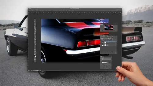
Lesson Info
2. Compositing with Tonal Range Selection
Lessons
Class Introduction
01:05 2Compositing with Tonal Range Selection
15:33 3Compositing Water Bubbles inside Bottle
16:36 4Compositing Clouds Behind a Bottle
12:29 5Textures and Layer Mask Adjustments
18:45 6Making Water Look Realistic
06:47 7Adding Realistic Bacon to Your Image
09:00 8Realistic Scaling for Compositing
06:57Lesson Info
Compositing with Tonal Range Selection
started out with some stock photos from Adobe Stock, our friends over at Adobe and I decided to do some fun stuff with water bottles water, because what makes them so interesting is that they look great when they're shot. But try to make it look like you can actually see through them and make the image behind actually look like it's part of the composition rather than just on top. So what we're gonna do is we're gonna start off with our water bottle here Now, in order to be able to be working with this water bottle just a stock photo and of course, it's shot on the white background. I'm gonna need to take the white background out, and I could put a selection around this entire water bottle. But I've also got my shadow down here for my reflection. And I want to be able to have this so I could get the curvature of the water bottle but still be able to see what's going on through that with this blue cast. So what I've done is I actually took this piece of metal and this is an illustrator ...
file of all things, and I brought it in as a smart object. And if you haven't used smart objects before, the meta been benefit of smart objects is that when you bring them in as a smart object, they aren't edible. If I go when they try to erase or use my paintbrush er at the pixels, I can't actually go in and manipulate the actual file. So why do we use something like this? Well, because this is an illustrator file I can bring in and in as a smart object, and I can scale it up and down as many times as I'd like without ruining the quality of the image and in order to bring in on object as they earn image as a smart object, it doesn't have to be just a illustrator file. It could be a Photoshopped pile as well going to file and you can choose open this smart object and we go in and open something. As a smart object, I can navigate to you where my file is, and it'll asked me how I'd like to render this, and when I bring it in, it opens up is a smart object. Now, what's awesome about this is that I can scale it up and down, up and down, up and down hundreds of times, and it never degrades the image. And that's quite helpful because if I'm trying to position something and I'm working with my file and I can't quite get it in the right place, I don't want to keep zooming it in, up and down, up and down. And I'll show you what happens when we DOJ just take normal image. And we scale it up and down to copy this image here in my document and take my copy and I'm going Teoh, render this and right click on my layer and I'm going to go ahead and rast arise my layer here. So rast arise my layer. And now this is just a normal photo shop layer based on pixels. The way you know, it's a smart object you'll see in the lower right hand corner, this little teeny smart object icon, This layer, while it looks exactly the same here isn't a smart object. So I'm going to go with him to scale this down, and then I'm gonna hit return and then scale it back up. And when I scale it back up. You'll see that every time I scale it up and down, I lose quality of the image. After a scale it up and down enough and I zoom in. I see that I've just lost all of my sharp edges and it's gone because every time I scale up or down, it has to recompose that image. So it's just like wrinkling paper. You can never get it smooth again, and the more you do it up and down, the worse. It gets well, with smart objects. We don't have to worry about that, and you can tell that it's a smart object. When I go to transform, it has an X in the middle of it. So if I go and I transformed this down to be super small and I transformed this back up again to be really big, when I go ahead and hit return, it renders it exactly okay. I can do this 100 times and I never lose the quality of the image. What's even nicer if there's an illustrator file? So Inspector in here and so I would like to take this really cool illustration and I would like to make this look like the glasses being ripped open. But in this metallic fashion, so that's why have This is a smart object, and you could spend a whole class on smart objects here. We're just going to show you some putting stuff with it. I'm in a position. My meddled ripped opening here on top of my bottle. And now what I want to do is I want to make it look like the glasses actually being ripped. So the highlights in the shadows of this rip I want to capture, But all this brushed metal and stuff I don't want I could go in with my mask and try to mask out all those areas. And then I just have this piece of metal sitting on top and then I could go. We could adjust the opacity and my blending boats, and it kind of fades in and nothing really works. Okay, There's no selection tool that I'm gonna be able to use to go in here and select this because there's a lot of subtle shading and highlight elements that I want to capture. So this is where we're going to get your into a whole new world. And with this, I'm going to need to isolate just this layer. So a trick when you're in your layers panel to turn on just the layer you're working on, hold down your option. Key an option. Click the I unjust that layer that's gonna turn off all of the other layers. But it remembers which ones were often which ones were on, and I can option click that back on. So option click that off turns off all the other visible layers and then option click turns it back on. The reason why we do this is because I'm gonna enter into my channels here and whatever layer or layers were active. I'm going to see all of that information in my channels, and I want to specifically work on just this section or just this portion of the image alone. So we turn off all my other layers Now, if you haven't used channels before channels or what I call the ingredients that make up the image. So with layers, you have images that are stacked on top of each other, very much like a layer sandwich. You got your bread and your bacon and your beat and your tomatoes channels air the ingredients that make it up. And so I could go in and I could see the red and the green component of each one of these, and I can see they're slightly different colors in there. But this is these are the ingredients that make up my image. I'm actually gonna use my channel as a basis for a selection which may seem completely foreign to you. That's why we have this video. So what I'm gonna do is I'm gonna go in and I'm going to click on a channel here. And because this is pretty much looks like a grayscale image, all of my red, green and blue channels are gonna look like the information's virtually the same. Now, the one thing that I don't want to do is I don't ever want to go in and adjust on this channel, because whatever color channel I'm on, I am going to actually be changing the makeup off that color of the channel. So I go in here and adjust or do something right on the Blue Channel is going to stick out like a sore thumb. So what I want to do is I want to be able to go in and I want to duplicate this channel, and I'm gonna treat this channel as a black and white image. So I'm gonna take this. I'm gonna right click on the channel, and I'm gonna duplicate this channel. And we're gonna do this several times during this sub session so we can see so I mean it. And here is my actual copy of the channel. Now, a channel really is just a black and white image. That's all it ISS, and it's just representing information in the file. So what I'd like to do is I would like to boil this down to the essence of what I want to see and what I don't We're going talk about masking, but with masking black conceals and white reveals. So on this what I want to do is I want to get this just to the essence of the shadows. I literally want to break this down to give me two shadows because the shadows are basically the defining elements of what this is if you break it down to just the shadows. So I have my channel here, and it's a copy. Don't ever adjust on one of the existing ones. Always make a copy. This is a black and white image. So I'm going to do a levels which is just a command. L and I'm going to adjust this, so I'm going to get it down to just the essence of the shadows. So if I take my highlight slider and I slide it in, it's gonna take all the lights and make them lighter. If I take my shadow slider is gonna make the darks and make the darker And then I can slide this back and forth to get the essence of the actual ripped metal ongoing. Exaggerate this because I want the shadows that give it the shadow portions and the curves right here. Now, I don't want to go too far because I still want to capture all of this right here, and I'm gonna click, OK? And now I'm gonna go in with my eraser and I'm going to go in with my eraser. Said it 100% my softy razor, and I'm gonna go way, and I'm going to erase all of this extra information that I don't want. This isn't relevant to the actual rip. And I'm gonna get this down, and I'm just going to erase the whole thing. So I get rid of all that, keeping all my shadows and highlights there. And I'm going to break this down too, just the essence of my rip. Now, I can leave a little bit of this information here. I'll zoom in really close. You can see I could leave some of this in if I wanted to to kind of help blend it in. But the reality of it is if I'm getting down to this point, this is the essence of what's going to give me the building blocks of just this basic terror and reveal. Okay, now, this is my channel. What do we do with this now? Okay, it isn't. The layer is just one of the ingredients that makes it up. So what I'm gonna do here is really weird. I'm gonna turn this into a selection and these air why channels are so fantastic because no selection tool that I have the magic wand the lasso tool will allow me to go in and allow me to select this without making it look like I've taken a pair of scissors and just cut around this. What I want to be able to do is I want to be able to select this based on its total range and not on the actual shape, and that's where the channels come in. So what I'm gonna do is I'm gonna hover over my channel that I've made a copy of, and I've created a lot of contrast by using my levels have made the brights brighter and the dark starker have made it a lot of contrast erased any information that isn't relevant to the actual makeup of what I want here in the curl. And then I'm gonna hold down my command key and the hand turns into a little selection. I'm going to command click on my channel. And when I command click on my channel that is going to go and that is going to select any pixels that are going to be in existence. And of course I had will have my selection. And it's going to select all the darker pixels because that's the only thing. It's on there now. When you go when you do a selection here, it selects the exact opposite of what you want. You can see the marching ants going all around the screen. So of course, under the select menu, I'm going to make sure that I go and select the inverse. So just my section of ripped paper is highlighted. OK, go back to my composite here. Very important that you go back and click on your RGB composite because when you go into your layers again, you're gonna want to see your full spectrum of your image. I'm gonna go and I'm gonna turn my water bottle back on. I'm going to turn my metal layer off here because I actually don't need that anymore. I've gotten what I want from the tonal range off my channel. Now I have what looks like a selection here, and that's my selection. I'm gonna go to my water bottle. I'm going to create a new layer above the water bottle, and this is going to be the rip in here, and I'm to take my selection and I'm going to fill it with Black to go ahead and give me that look and feel of that rip. So the shortcut. I've got my default here Teoh, my color picker set toe black in front by white behind. I got my selection active. I got blank layer selected here. I'm gonna choose option delete and it's going to fill those colors. I know. Completely bizarre. So here's something that we don't talk about very much hit command D for delete so we can get that I have ever seen in a photo shop. When you will have the little message comes up. It says less than 50% of the pixels are selected. It will give you that. So here's something about selections that you don't hear people talking about. I can go in with my selection tool very easily, and I can just go in and say, OK, everything selected. It was like a pair of scissors. I just cut it out. But what they don't tell you is that you can actually select depth of the pixels instead of just you know, it's looking a ring of pixels. Well, that's what we did when we went in our channels. So pixels that are 100% black are fully selected. Pixels that are only 50% black are only partially selected, so we think of selections going all around the edge. When you get into channels, think of selections is actually selecting deeper into or not selecting deeper. So the lighter areas in here if we go to the lighter areas, they barely get selected, so they're barely selected. So when you fill it with something, they barely get filled. When you select a black pixels or the very dark pixels, they're mostly selected. So when you fill those, they filled mostly with black. It's a very different concept to have to think about. But the great part is is that now I can get the essence of that rip and that terror just by going into the channel and picking up just the shadow portions. Now with this, it looks very believable because now I've got all these shadows, which is exactly what it is, and I'm going to go sent this to multiply so that it's going to look better with that darkness on there as well. Now, if I want to go in here and I would like to mask out certain areas so that I could show this rip and actually have it, like, clear behind there, I could actually go to my water bottle, and I could set my mask on the water bottle. And with my brush tool active, I could go in here. And if I paint with black on my mask on the water bottle here, I could actually open that up and I could actually see the color coming from behind. OK? To actually open that up. And I could very carefully go in. And I could kind of paint this, which is hiding my water bottle so it makes it look like it's coming out. If I turn this off, that just looks like I have a hole in my water bottle. Okay, so it kind of messes with your mind when you do that, I'm just gonna turn this mask off for now. We'll leave it at this. So what's cool is that I now have this rip on here, and it looks like it's coming out of the bottle very easily. Pretty cool, huh? I know. So that was the first step of really cool things. And it's like, Wow, that's amazing. That would have taken me forever. It did? Yep.
Class Materials
Bonus Materials with Purchase
Ratings and Reviews
Tomas Verver
:) Some nice ideas about how to make advanced compositions. I don't use the channels for things Jason does. I don't use often the channels for selecting though. I liked the ideas the instructior has for nice compositions. Is it a complete course? No, is it still fun and nice to view when you have an account for full acces? Yes it is!
Oscar Javier Gallardo
Awesome! i learn a few cool tricks that definitively i'm going to use on my next projects. Thank you a lot.
Kimberly DeVos
Jason Hoppe is so easy to understand and explains things so well and in an interesting way. I have several of his Photoshop and Illustrator classes. He's an awesome instructor.