Lessons
Day 1
1Class Introduction
05:10 2Direction of Light: Setting The Mood
07:57 3Metering
34:21 4Understanding Dynamic Range
13:46 5Understanding Histograms
22:37 6Effective Size: Hard vs Soft Light
09:29 7Understanding the Inverse Square Law
19:41Light Modifiers and the Shape of Light
34:14 9Controlling Light with Grids
22:28 10Watt Seconds and Other Important things
14:15 11Color Theory Part 1
19:55 12Color Theory Part 2
35:23 13Calibrating your Monitor and Printer
27:38 14Mark's Lightroom Workflow
22:07 15Exercise: Purpose Worksheet
34:03 16Failing with Purpose
13:22 17Example: Prep Shoot for Testing
40:37 18Special Request: Pricing
58:05 19Creativity: from Idea to Product
41:26 20Sharing your Ideas: Making the Plan
05:58 21Working with a Team (Snapfactory)
28:40 22Working with Models
27:30 23Commercial Shoot Workflow
10:36 24Q&A
07:12 25Set Up Studio Environment
13:46 26Planning The Live Shoot
21:29 27Dialing In The Lighting
18:13 28Q&A
15:49 29QuickTestShot
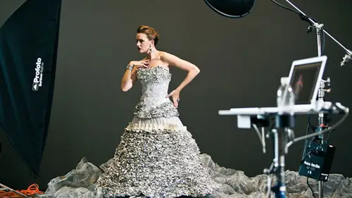
08:52 30Photoshoot Foil Dress With Carly
34:17 31Lightroom Workflow
26:23 32Q&A
14:21 33Preparing for the Second Shoot
16:30 34Photoshoot: Deep V Dress With Michelle
40:12 35Photoshoot: Closeup With Michelle
14:24 36Photoshoot: Tether Tools Table
09:29 37BONUS VIDEO: Lunchtime Q&A
11:21 38BONUS VIDEO: Quick Ad Mockup
01:18Day 2
Day 3
Lesson Info
Color Theory Part 1
And we want to talk about color now um we're gonna start here with a question with a question all and by the way just a note we have all of the stuff that I'm about to tell you is in the pdf handouts and those pdf handouts can be a lifesaver for you because we're going to talk about a lot of stuff with color and of all the stuff that I'm I'm talking to you about today we need that screen out right here um of all the stuff that we've been talking about, I think color could be my most I'm really excited about color stuff so we're going to start with this question and that is what are the primary colors so I'm gonna go to you guys from our know you're cheating don't look what what what do you think are the primary colors and everybody online I want you to just like put it in there what are they so you guys are going to look at this and I just wanted sort of a tally of what the primary colors are so if you say from art class we all know red yellow blue primary colors raise your hand anybod...
y online? What are they saying anything anybody say red yellow blue nobody is saying love yellow buddy yeah that's victor creative red, green, blue uh way yeah so we have red green blue too so what do you guys think you leave us alone says green blue yellow, green blue yellow any guesses red green blue so you're thinking all right so the question is what what is it what yeah that the answer is can I can I give you one that much yes. Okay mccarthy photo says actually it technically depends on the color space is that correct? Sort of yes, I know what he's saying I enjoy it we're about to uh yes so it's not the color space but it is the color type so there's two different things that happened there are uh there are colors that are reflected okay, so light comes through wherever it hits something and then uh colors reflected so that our things like magazines print billboards anything that that is a physical pigment in con paper thing you have reflected light and that color is different then the other type of color and that's the color that is projected things like uh monitors colors coming out colors coming out of this college coming out of your tv colors coming that way anything is a light red green blue are your primary colors and so we have this right here this is called subtract of colors so it's attractive colors and this is going to get fun so hang with me on this so subtract of colors or the ink pigments right and the primary colors for subtract of colors are sigh in magenta and yellow cyan, magenta and yellow in fact I have them appear on the screen so um cyan, magenta and yellow so we have science that the, uh on the lower left her here science we have magenta at the top we have yellow with the lower right now if you look closely yellow the opposite of yellow is blue see that the opposite of yellow is blue if you look at magenta, the opposite of magenta is green and then if you look at science the opposite of science is red, red, green, blue. The other thing is, when these all mixed together, you get black so you know this from finger painting when you're in elementary school and your finger painting and you get all the colors all muddied up dizzle turns to black mush, right? Maybe getting finger paint but I figured all mush. So these guys right here they called subtract of colors because the more color you add it subtracts color from that and you're going from the color to darker to darker all way too black. Okay. In fact, if you've seen, uh, printing like newsprint and stuff, you've probably heard of something called c m y que sai in magenta yellow and black that's where that comes from that's how printing works okay the thing is what we see and how light travels in what our cameras capture is exactly the opposite of that it's this red green and blue now look read the opposite of red is cy in green magenta blue is yellow you see how these are opposites their exact opposites and the crazy thing with this is re are in a dilemma because we capture rgb our screen shows us rgb we retouch in rgb but when we print seem like a when we publish it seemed like a and so uh I don't know if you've experienced this if you guys online have experienced this but you will have a really cool looking image on your screen and you print it out and what you see in print looks nothing like it does on the screen the reason is there's this translation that has to happen it has to be translated from your computer to the print or from your computer to the photo printing place and that those colors have to be basically reversed and so we have to figure out a manage all that so that's the very first part of color theory is just understanding that there's this distinction between additive color and subtracted color additive color is called additive because when you add all these colors together you get white so subtracted color you add it all together you get black additive color you add it all together and you get white if you ever have a chance to go to the theater yes I'm sorry yes no that's all right, I just wanted to mention because a lot of people in the chat room are asking about this hand out and where they get it and so I just wanted to let everybody know that this hand out comes along with the purchase of the course so that's how you get it if you purchased the course you logging and then you can download color theory down yes we've just dipped our toe into color theory at this point so we have additive color we have some attractive color um if you ever have a chance so I have uh about thirteen years of theater experience so used to work in theatres and travel and do live shows and all that kind of stuff. And so if you can't go to a not a movie theater talking about like you know, whatever but the real theater if you ever have a chance go and check it out and they're going all have this thing called a cyclorama or psych for short you've probably heard that term used in studios that comes from fear and it is a large white thing that encloses the back of the stage and so it's called the psych it used to be a semicircle then it just became flat and then studios used them and that's where sight comes from cyclorama and on the cyclorama if you ever go see a really cool play you're gonna have colors that change constantly if you've ever been to a stage show a play of some sort the background colors change all they have like red and blue and pink and everything in between and the way they do that if you look at the back of the stage or maybe up on the baton in the on the top there are lights red, green, blue, red, green blue, red, green, blue, red, green all across and the change all those colors they just mix those three colors and they could get any color of the rainbow really cool so go uh check out a theater and you'll see this over and over all right? So we want to talk about the color wheel and if you ever were in art appreciation you probably saw this color wheel we're gonna dig into this because there's a lot of juicy stuff in here um and trust me this this all is has a direct tie to commercial photography. You really have to know this okay at the top of the color wheel and we're looking at specifically looking at the color wheel four at additive colors the color will for additive colors is slightly different than the color wheel for subtracted colors the distribution of where those colors lie are not the same in fact, I'm going to try something to see if you can see this and go back to my desk top there's a little thing that you can download from if you're a mac person sorry pc people just oh my god it's one hundred eleven and phoenix did you see that uh okay um so right now what we're gonna do is we're gonna look at this thing right here this is called the uh color wheel so on this we can say I want to see red yellow, blue a subtracted colors or I can say I want to see red green blue additive colors notice what happens here there's red at the top we have green over here blue over there notice where yellows lying where the green starts see that right there watch what happens it'll shift when I go to red, yellow blue that shifts the distribution the color shift that causes all kinds of problems because if you take a photo and you have yellow here when you make a print if you've ever been in photo shop and you get all these kind of crazy things do you want this to be a perceptual shift or whatever you know in that print dialogue what it's saying is hey, you have yellow that's here on this color wheel but when we printed out it has to go down here somewhere and it might be in uh a medium like uh newsprint that color doesn't even exist like it can't even reproduce that color and it's saying how do you want me to remap that yellow how where did I put that so you have to be to control that if you don't know that there's two different color wheels and a distribution is different than that makes no sense at all so this red green blue red, yellow blue thing is is is pretty impressive okay this actually you can get this from a website called color jack it's free and I think it's just called wheel I think but color jack dot com it's got all kinds of color theory stuff that's where I got it if you're on a mac you can get that yu can install the widget if yu want t see this whole thing actually eyes a web based form and in a second you're gonna understand what all of these things are as well okay that's where we're going next is this ok? So let's go back to our color wheel so zoom this back out shrink we present this oh lion and so cool all right so we have at the top of this color wheel red and if you look closely there's a zero degrees on there so when we measure color on the color we were always doing it by degrees and so we want to say what is the opposite of red well, the opposite of red is science. That's at one hundred and eighty degrees difference. That's the complete opposite. Now, if I go back to this seal, these three colors mix the opposite of red is science. It actually works. So one hundred eighty degrees is always gonna work like this. And if you mix those lights in real life with color gels, they will look like that that's how they actually look. So the opposite is a one hundred eighty degrees. Then we have things that are at certain points on this wheel. And I'm just noticing that this is backwards, so I need to fix it. It should be oh, sixty percent on the right. It should go clockwise. So, um, sorry didn't catch that. So, um, these air backwards, they should be the other way. Thirty percent on the right. So they should go thirty, sixty, etcetera that way. But you get the idea. So, uh, primary colors are always at one hundred twenty degree differences. So in a three hundred sixty degree will the primary colors are going to be at one hundred and twenty degrees, two hundred forty and zero that's how they will map and then they're complete opposites are going to be any in between there, so the secondary colors we're going to be it sixty and, uh you know, one eighty and three hundred so these were actually going to be opposites complete opposites of each other so that's how that will work and what you can do then is you can start describing things uh in the sense of does this match with this and does this color work with this mathematically? And so if you're like me and you don't know how to dress yourself, you can get a color wheel and you could do math and you're gonna figure out what matches to what, which is really, really cool, so we're gonna keep rolling on this there's um interesting stuff that I want to show you, but before I get totally to where we are, um I need to talk about another thing here on the color wheel regardless of which color will we're talking about. We have, uh, colors that are considered warm colors those air, the red hues, yellow hues and we have colors that are considered to be cool colors there's the blue hues. Now uh, this could be very confusing, especially when you start talking about color temperature because color temperature and emotional temperature are exactly the opposite of the opposite and so color temperature, blues or hot and amber's you're cool, so this hang out just put it away for a second forget about that for a second, okay? We're we're talking about emotions and what works and what makes people happy and what it makes people sad so cool colors are called cool colors because they have a calming effect and they're cool because in nature we see things that are cold physically and they tend to be these colors ice water so like that blue okay horizontal things like flowers and fields of green that comus are in the cool color range warm colors fire fire right? Read things that are aggressive red and purple and yellows and so's things that we need to uh give us warnings those are all the warm color colors and so we have this uh this thing that's happening so before I go on I want to make sure that we haven't lost everybody out there in the internet tubes so what do we have questions before we keep chugging there are so many questions. Okay let's let's do some questions now because we're coming up on a break and we make sure we get these in okay. Um well people are asking about your workflow from shoot to printing that's coming. Okay, that's coming. All right, um let's see, does mark supply magazines with his own seem like a converted photos or does he just leave them rgb okay, so for any magazine work uh, that I've ever done um and in any major uh, any major ad campaigns in national campaigns that I've ever done, uh, the company the agency that hires me always as their own art department and so I shoot and create my own specific I c c profiles, which we're going to get to it a little bit um, I give those to those guys their art department handle all of that, so, um if I was printing somewhere where I had control over how the printer's worked, I would probably then supply all of my customs stuff, but in general for nationals, you don't do that kind of stuff you haven't art department does for you um and so I haven't really had to work with that, okay? And I just want to give a shout out that question was from philip three studio, okay, we'll follow up on that is so what about people that aren't shooting national ad campaigns or doesn't who don't have an art department that are going to do that for you? Right? That's probably the majority people and most of those chutes that we do, we don't have in our department just standing by don't give that impression we don't have that way have michael, so he doesn't want stuff but way have to have proper calibration for your screen, for you prints and for your camera and so after we do all the color theory, we're going to put it into practice with the color workflow and you'll start seeing why having workflow in place like light rumor aperture is very, very important for accurate color, and so we're going to show you how to calibrate the capture we're gonna show you how to calibrate the screen, and I'm going to show you how to calibrate the printer as well. So you have to calibrate everything from start to finish to get accurate color, and we're going to show you how to do that. A quick question for you is, um, from nick ray is that what's referred to as out of gamut when the color cannot be reproduced? Imprint yes, absolutely. So I'll see you during the break if I can get a three d model of of a color space or gamete, and so, um, different things have different gametes there was our screen can only show so many colors, they can't show all the colors of the rainbow. This monitor right here can only show so many colors. Uh, a magazine can only shoot so many colors and so um, like newsprint is horrible with reds, reds don't print very well, and so you have to really be careful about how that stuff works you've ever purchased a high end photography magazine you'll notice that they're always very expensive they're like twenty five or thirty bucks, sometimes more than that, but they're printed on really nice paper. The reason for that is if they printed on normal magazine paper, the process doesn't allow all the colors to come through. It doesn't look very good that's why photo books are so expensive because they have to use a different kind of printing to make all those colors show up. If you've read a lot of scott kelly's books specific to photo chopper light room, he'll show examples in the text he'll say you can't actually see this because you're limited by cm like a printing, so you'll have to do it on your own printer to actually see this work because he knows as most knew, that it seemed like a is very, very limiting, so yeah, it's sort of here's what I can capture, but what I can print is not the same, so it's very important to understand that because when you're if you're shooting an ad campaign or whatever for and, you know, it's gonna be a newsprint have to be really careful what you do with your colors, because if you have all kind of really high saturated colors and you won't have a lot of details in there, it's just gonna it won't work it's gonna fall flat so a lot of questions are coming in about the calibration stuff, so I think we could yeah, the calibration stuff we need to finish the theory first, okay, so we need to do multiplication and division before we go on trigonometry. So um one of things just a note for that so hee you know, I've done I don't know how many tutorial videos online it's approaching three hundred something like that and people write in a lot of e mails every day and one of the things that we see a constant theme um across over the years is there's a set group of people that you don't want to be that set of person and that is the person that is so excited that they want to skip from point a to point z without doing point b c d e f all the way in between what will happen if you graph some of that the principles of z but not enough to be proficient in that? And so professional photography is a discipline that's that's the only thing really that separates a professional from an amateur's the discipline you know, there's the vision and all that stuff? Absolutely but you're gonna have somebody with terrific vision with no discipline and they will not be successful professionally, so I know I'm often attention but the answer is and not to insult that person but um, we've got to make sure that we get the foundation first before we get to other places. Not just with color, but with everything.
Class Materials
bonus material with purchase
bonus material with enrollment
Ratings and Reviews
Brian Geoghegan
Mark Wallace, Brilliant at what he does, so clear to understand, he is amazing, well done Mark great workshop, I learned so much. Thank you, kind Regards, Brian from Ireland
Sean
Mark really knows his stuff. He was very well prepared and Mark did a great job teaching this course. Mark went through all the steps from beginning to end in great detail. He also answered questions from the audience an online viewers which helped fill in any blanks. Great course.
a Creativelive Student
I loved this workshop! Many things I struggled to understand about exposure and many other things became so clear! Just wow!
Student Work
Related Classes
Portrait Photography