Lessons
Pre-Show
08:08 2Keynote Intro
29:57 3Working with Text
33:34 4Placing Objects in Keynote
17:26 5Shapes | Effects | Customizing Themes
58:27 6Keynote Effects
21:11 7Object Builds | Transitions | Animations
16:43 8Keynote Animation
22:06Lesson Info
Keynote Intro
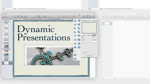
firing up my apple brain. So we're gonna get into that. And it is keynote for creatives, but its keynote for everybody. And that's kind of what I like about the program is that it's it's pretty easy. And actually, I think it's actually harder for creatives because we like to dig in and do everything and the first thing you're going to notice about this. And if you've used it, or if you've used Apple IBooks author here, their nose is very similar to that as well. One of the things that these two programs have in common. It's that first Bolton Apple program. It's very dragon drop, and it's very much pre made. That's based on templates. So sometimes you can't get in and digs deep, as you'd like to see just going to keep that in mind. But that's actually a positive, I think, even as a designer, sometimes we have to realize, well, maybe Apple put it together so that we can just do it really quickly and not have to be stumbling over the application. And that being said, I think it's a really...
easy program to pick up the first time I used it, was the day after it was released. Originally, remember what year that was? Maybe, 07 I don't remember, but I was asked about three hours before Ah User Group Mac User Group if I could present it. And I said, I have it on my computer. I will learn it really quickly and I did at dinner while we're all out of dinner. And then I presented and somebody said, How long have you been using that? And I seriously looked at my watch and I said about two hours and they said, How long have you been using power Point? I said, I've never used power point before and so I was able to get up and explained how it worked and do a presentation. It's just that intuitive. So I like that about that is that can kind of put a lot together. There's a lot of it that isn't into it. You could put intuitive. You can put a lot of stuff together, but sometimes getting into the meat of it doesn't always make sense. But it will. Hopefully by the end of the day, that's the plan. So I'm going to jump right in and start looking at some of the things that we that we work with in Kino. There's gonna launch the program and I have the the menu bar appear. There's nothing else much showing I have a couple different ways I can open up a program. I love that it's his new or new from theme chooser. The great thing is, they go to the same place. If I do, it opens up my thing chooser. Or if I choose from theme chooser, it opens up the theme chooser So two ways to get to the same place. You know, whatever it is you want to do, Commander. I'm sorry, Command and no control. And it's a Mac only program. Remember that today there's no PC commands today. All right, so anyway, we opened up. We get presented with these themes. And if you notice this is actually keynote 09 Yep. 09 were in 13 09 I'm kind of hoping at some point this gets caught off to something newer. It hasn't been updated in a while. There have been some incremental updates, but nothing huge and revolutionary. But that being said, it's still really works really well I really like it. I'm just really hoping to get a new version with some new bells and whistles. We like bells and whistles. Right? All right. So we come in here and we get our themes. And if you are using something like Apple IBooks, author, this looks very familiar to is Well, the biggest thing difference I think between the two is that we can have multiple themes in one presentation. So we'll look at that as well. So you also can change. You can go back and change your mind. Unlike an IBooks author, you can't change your mind. So at least there's a little bit more leeway with this. I say I really like this theme. We're gonna start with this one theme, and then it's gonna We might decide to change your mind afterwards. But basically what I do when I'm picking out a new theme If I if I'm not really familiar with FEMA ready and these air again just the themes that comes shipped with the program, you may have a few extra. Some of them you can actually buy individual ones. We'll talk about where to get those later as well. These the ones that ship with it. Usually what I do is I find one that looks kind of good, and if you roll over it, you kind of see all the different masters that are available for that particular theme. So I just roll over that. The nice thing is, they even put a table in there because these are all formatted for you there, pre formatted and charts, and we just come over and look at the different photo layouts that are here. Some of them have way more photos than others. For instance, this blueprint one I really like it because there's a lot of different photo layouts. If I'm doing something with lots of photos, I'm gonna pick one that has several different photo masters. It's like a roll over that till I find one that I kind of like, if you want to just start from completely scratched, here's white. Basically, it has texted. It has some very basic tables and charts in it, and a couple photo pages as well. That's again just choose one that we like. I mean, actually, start with this Kyoto one here. I was gonna click it, and the next thing I need to do is choose what slide size I want to dio. So in my in design classes, I'm always saying, Make sure you know what happens down the road from where you are when you start. It's important. Here is well, even though we can change it later, sometimes involves a lot of tweaking. But ask yourself, Where is this going? What are we doing? This 10 24 7 is pretty much a standard, even though most laptops and most computers are now widescreen. That is not, ah, widescreen proportion. Eso, that's, you know, just a three. A 4 to 3 proportion so but that's pretty standard for a lot of projectors. So if we are actually doing a presentation, we're gonna project it. We might want to use 10 24 7 68 What will happen if we put it on a wide screen presentation is it will just put black bars or gray bars down the right and left hand side. So it's just gonna what's called pillbox it down the side. So again, think about where it's going. If it's going to go to an IPad. 10 24 7 68 is great because that is the proportions. Even if we go with the rent No. One, we can use that because it will double it up. It will just size it up to size. So we always want to be thinking about where that goes if you know where it's going. If you don't choose one and hope for the best. Eso 10 24 7 68 Excite is good. It might just put it right in the middle of the screen. We can also make it bigger, but that's gonna lose some of the resolution that's on there. So basically, I'm trying to make it as big as possible without getting it on a screen that's gonna actually cut it off. That's actually worse to me, to have something cut off than to have a little bit of black, either letterbox or pill boxing on the side. I can also open recent files if I want, and I can open existing files from here, or I could just do, you know, don't find a Kino file on my desktop and double click on it to open it. But again, I just come in here and then I choose a thing. She's that I've chosen my size. This is just my viewer for my templates, just to see what that looks like, right? So I'm gonna go ahead and just click choose, and it's gonna go ahead and open up. And we already have text in here ready to work with. That's the great thing. Everywhere we work, there's already something there, you know, there's little placeholders we'll see throughout the day. There's text holders, everything like that. So we can just go ahead and put things in there. What I usually do as soon as I select a theme is I'm gonna come up here to the Masters, pull down menu, and I just want to see all the different options that I have available in this theme. If I start looking that and realize that's not what I wanted, I thought there was more pictures or whatever. I might just go ahead and change the master right or the theme right now. And I could do that in the theme chooser compared to say, actually, I hate that one. Let's try. This one here is gonna apply that theme. Now when I look at those Masters. That's all I see, right? So I go ahead and change that on the fly before I start something to keep in mind. If you change the theme in that way or you could reopen, you could close that. Reopen a new document if you change it here. But you had more than one slide. It would automatically add to that theme to it. Because if you have at least two slides, unless you have two masters, two different themes apply to your document. So that's something to keep in mind. If you do want to separate themes in there, you can do that. But you need to have at least a Zeman e slides available as masters that you want. I'm sorrys themes that you want in your document. That makes sense. All right, So anyway, I just usually do this till I get when I like. I might even just close it up. Let's not save that and we'll open up another one of some. Sorry, I will come in here and open this up. Open up a new one and just choose another theme. Can you incorporate in tow one. You can incorporate as many as you want, so long as you have as many slides as you want themes? Yep. So you can put, you know, 20 of them if you want to. Yes. I just opened up a new one. The other thing you notice is that I'm cutting off my slide here and down here in the very lower left, we have a magnification slider. I'm sorry, menu. So I'm gonna go ahead and choose that 75%. So it fits in the window because I want to make sure I can see the edge of my slide. Especially if I want something to come to the edge of the slide. I might want it to bleed off. I might wanna pull it past the size of the slide. I'm gonna do that in this theme. I've sometimes need to work really small so I can actually see what's happening. The thing you can't see is the upper left and the top. I c can't get over their unfortunate can't move it over to see what's over there. That could be kind of a pain. Sometimes when you want things running off the left hand side of your page, you really can't see, I'm sorry. Left side side of yours, your slide. You can't actually see what's over there. But a lot of times I do have to make it really small just so I can see what I'm doing. 75 is gonna work for this presentation here. So when I after I view the Masters here, I can also view the masters over here on the slide viewer. And by default, you see the slides that air in your document and there's one to start with. It automatically creates one, and it throws in the master that it thinks you should start with, which is usually the title. So I'm gonna go ahead and grab this little handle over here. Just pull this down and underneath there or where my masters live. So these are the same masters that we see appear in the master menu. And if I look a little check box next to the one that's a sign to this. That's the title and the subtitle. When I click on it, I'm now in the master page because I see my guides. I see this some text frames set up here. So that's the difference. I'm clicking on the master slide are really clicking ones, or I come down here and click on the document slide itself. So that's kind of where those live and a lot of times I just keep those hidden until I need them. Just a nice way to keep that out of the way. I can choose what's being shown by choosing the view menu so I can choose the Navigator, which is what I have right now so I can see my documents, slides and my master sides as I create them. I can look and just see an outline, since we'll just have the name of the slide. Or I could come down here and just look at the slide itself. No way to really navigate around or I can see them in a light table formats. I'll see all my slides all at once, and I can rearrange them pretty easily from the Theus slide table. Come back here to Navigator so I can actually see my slides and my master slides. All right, so that's kind of where the slides are going to start working with slides in a little while. I just want to kind of give you an idea of where they live and how to access those. The other thing you're going to use a lot is the inspector. And if you've used any apple product like pages or IBooks, author or even numbers, we have this thing called the Inspector. And that's what Apple does with their panels. Right? So we've had panels on our adobe products today. We're gonna work with inspectors. When I click on that, I get this massive panel with tons of icons across the top. So I'm just gonna go through each of those kind of what they are. We're gonna go into each one in depth as we get to that point in the in the presentation. So to start with, I'm gonna go here to the document inspector and click on this, and this is document wide information. And the thing we already set was the slide size. We could always change this. Like I said, if we were working along, we decide that it needs to go on a 800 by 600 monitor or something like that, or we need to go on really high res one. We can change it from here if I take that 10 24 board 10 24 7 68 and change it to eat by six. That doesn't look bad because that's the same ratio. If we change to a different ratio, we might have an issue might look a little strange. And, of course, 75% doesn't fit in the window any longer. We have to make it smaller. It looks all right. But it did some weird cutting off here. So that's something you want to keep in mind. When you start with one of the the preset sizes, it will put the correct version of that theme in there for you. So you want to start with that stuff starting with one and changing it. Or if you change to a custom size, which you can maybe know specifically what that needs to be, you could go ahead and put in a custom size. Now, you could do that also from the beginning. When you start, this is a good idea. Say you're making a presentation instead of, ah, presentation. We're going to stand in front of a group and do a business presentation or something, because what we're going to talk about today or things like creative uses for that trade show Booth presentations, putting a little movies inside your website or on your portfolio or just some sort of self running demo. Maybe you're gonna run it on an IPad for your clients. You're gonna show him all the work you can dio, and you're gonna put it into a keynote presentation that you put on your IPad. So again, we might need a custom size for that. So especially if we're doing, say, a website, we just need a little custom viewer and only needs to be safe 400 pixels wide or something like that. We would set that up from here or from when I started the presentation. Don't put this back to 10 24 7 68 will bring us back to 75%. So it fills up the screen for us in here. I've got normal presentation. I could do hyperlinks only or self playing. We're gonna look at that when we start exporting that out later. So we're gonna look at that when we get to the point where we've got a presentation, we're gonna play it or we're gonna record it make a movie of that to use. All right, so we have some other slideshow settings. This is if we're actually running the slide show, right? So I usually don't do much in here other than look at the size that will come back to this as well when were playing, but from us. But I'm gonna soon we're actually going to take this and make a final product with it. We're probably not going to be playing it directly from this computer to do our presentation. The next one is the slide inspector. Or if you're sitting on a master slide, it's going to change and call it the master slide inspector. And it's different, depending on what slide wrong back to our documents slide. And he knows it says double click to edit. We click on that. We can double click and start typing, right. If we don't type anything, I hit play. I'm just gonna jump out to places how we keep checking throughout the day. Every time I do something, I click play to make sure it's working like I expect when I click play to look at the slide show. There's nothing there. I'm just gonna hit escape to get back out of that. The reason for that is this is just placeholder text, so it doesn't show double click to edit. It's waiting for you to put something in there, but let's look at what that is. Under the slide Inspector, under the appearance tab, we've got some things that we can choose. First of all, we could reaches the theme from here, so they're arming the master from here. We've got a lot of different places to choose the Masters from. This is one of them. The other thing that I have is it says in this slide, the way this is set up because again we chose a theme and this is how we're gonna create stuff throughout the day. We're probably not gonna create stuff completely from scratch. Were almost always going to take another element that's already there. And use that because a lot of them will see our like. I call them magic elements. I don't know how they make them. There's no way to actually create some of these magic elements, but you can take one from somewhere else. Make all the changes you need to it. Make that your default and work with it or build it into another theme, but you can actually create it. We saw that with IBooks. Author as well is that they have these things that did magic things. There's no way to tell it. Okay, put the magic here. It just it's there. You copy it. You repurpose it from somewhere for somewhere else. So that's one of these are here the title in the body. If I uncheck that the title goes away and I'm doing that again on this slide, I could do it on the master slide if I wanted to, I could change it so that Master never has that title frame that's there. That's better than deleting it. I could grab it and they're selected and then hit, delete and make it go away. But I'd rather deleted from here because if I decide I do want it back, I just click it back on and it's there again. It's one of those magic elements. It's tagged as body. How did I do that? I didn't do that. Apple did that and there's no way to change it. It's just a body tag that's there on a title tag that's here. I can change what it looks like, what the sizes, where it sits, all that. But I can't take away its its little magic tags that it has. I do the same thing with some of these other items, like slide number, that's I can go ahead and add a slide number. Hopefully, you can see that down here, but there's a slide number down at the bottom. You can automatically know your slides us well and again, the slide number is built into the thing. Turn that back off. The other options I have. I can do things like image bill. I can change the image fill either on this actual slide or if I go to the title armed to the master slide on, Come here, it decide. I don't like this image that's filling the background noise. I can't grab this image. I can't put this image anywhere else. This image is part of the theme. Once we put something in there, it becomes part of the theme, so that's something to keep in mind when you're creating stuff throughout the day. If we decide to put another image in there and we save. It is the theme that becomes part of the team and it's available for use where it is, or it can add another background as well. So I can play with this image, Phil. And generally I'm not going to start changing. The background feels very often, mostly because it is built in there. I don't want to lose it. If I change it, I can't put it back. I could undo. That's about the only thing I could do. But it can't just put it back because it's kind of magically they're already. There's no way for me to copy it. It's just kind of built into the theme that's there. What I might do. If I don't like this theme or this background, I might put another image on top of it or something like that, just kind of mask it. But I can choose things like how it fits in the frame. Right now. It's scaled the fit or I can choose ah whole do background. If I have a file available for me to do that, for the most part, I usually come in here and turn on and off titles body. If I don't like what's there. Of course, the name of this slide is called Title and Subtitle. So having my title and my subtitle is actually a good thing Toe have otherwise I might want to rename it or we do or duplicate that slide which will do in just a little while getting back to the inspectors. Just want to kind of go through and show you what each one's for this one is for creating builds and animations. We're gonna do that this afternoon. We're start adding movement to our slides and getting it to automate, moving in and twirling and all the great things that Apple does with all the transitions and everything. So we'll do that also back. I'm sorry. On the slide trends on the slide, inspector. That's something else we have. Our transition's gonna talk about that How slides transition from one to the other. This is our text slide. We're gonna talk all about text all the different things that appear in tax later on. Anybody that knows me knows I like text. We're going to show you how we handle text in keynote. Over here we have the graphics inspector, So when we start putting graphics inside here, things that weaken due to graphics metrics. Inspector kind of goes along with that. So we got some more information about the actual something that's on the page. I select something on the page. It tells me where it sits, what the size is, what the actual name of that file is, which is really nice. So I've got a lot of different options that I'm doing for different graphics on that page. We're not going to spend much time on tables or charts because, frankly, we're doing keynote for creatives, not keynotes for accountants, right? So play with those I encourage you to look at. Those are a lot of cool things with charts and tables. If you do have to do tabular and chart type information, it's here for you and again. The look of the charts and the tables are built into the theme. So when the people created the theme, they said, This is what we use for the charts and tables and hopefully matches really well to the theme that they've built. And again, that's all changeable. We're gonna look at hyperlinks and do some interactivity. Later on, we're gonna be able to do things like interactive maps. So that's something else to think about when we're creating. How are we running this presentation again? Not just where is it going on what size is going to be? How are people interacting with this presentation? Is it a presenter standing up on stage, clicking through with a remote or tapping their keyboard? Or is it going toe run by itself on an IPad or an LCD display at a trade show? Or is it going to sit on an IPad or something else where we have toe tap or click on it to the people using it, actually get to do the navigation? Or is it going to be self running? So again, think about that, because when we start building hyperlinks and interactivity, we have to decide I initiating. Is the user initiating that interactivity, or is it just automatically happening? And the last one is quick time. So we're working with audio and video. We use the quick time inspector. Now it's a lot of flipping back and forth between inspectors, and it's kind of a pain. What you can do is you can hold down the option key and click any inspector that's on here, you automatically get a second inspector. That would be great. Is if we could. You know, Doc, please. Together, here's my adobe brain saying, Wait a minute. I think we could dock these together. No, we can't do that. In fact, we can't even change the size of them. They just grow and shrink as needed, which of course, is kind of cool, except that sometimes we just want to shrink him up and get him out of the way. So basically, my desktop usually looks like this when I'm working on keynote. I've usually just got things all over, and I spent a good chunk of my day moving them around. So unfortunately, that's what we have to do a lot of. But it's better. I think they're trying to flip back and forth between all the inspectors like to have to move, especially when I'm doing graphics of the graphics and the metric one open at the same time. And I just move all those all those around the other panels that are up here. I'm gonna close that. The other panels that are up here by default are media colors and fonts. So media is pretty cool. I'm gonna just click media and it's gonna open up a link to I photo so automatically, if you have photos in I photo, And if you have albums and I photo, we can see that we can get to those photos really easily through there. And when we start placing photos later in the day, I'm gonna show you not just how to get through the I photo, but other ways to place and get graphics inside your slides. Right now, I just know that you have access to your eye photo libraries. You also have access to your ITunes library and also your movie folder. And any movies that Aaron I photo as well are so any media that you want if it's in one of the Apple products, you can get to it right from with side inside this media browser. But again, we don't have to do it that way. We can grab it from the finder. We can grab it through a menu item, just want to show you that that's where the media folder lives. Also on the menu bar, you've got this whole Manu Bar across the top. I can change what sits up here. What I see because I notice there's a couple that I like to use that aren't here. So they're either not here by default or they've been pulled out or whatever. So I want to add in the tools that I use all the time, and I want to delete once that I'm never going to use I'm not gonna use tables and charts. Well, they shouldn't be taking up space because obviously these icons are big and they take up space. So I'm gonna go over to the view menu and come down to hide toolbar. Just hide the toolbar if I want. Now I have more room, which is great because maybe 75% was just not the right size and I needed to say, Say, fitting window instead. Almost exactly the same. So I come in here, I can come back and bring back my toolbar. I can also customize that two of our under the view menu and choose customize toolbar. With that, I get this huge choice of icons that are here. Right? So I have new slide. I can do that. The 30 new is already here. Delete slide. It's not when I have I could go ahead and put that in if I want, but the ones I really want, I want mask. I use mask all the time and we're going to use masking a little while. I'm just gonna drag this in and put it where I want it. Just add that item. I could also, if I decided I wanted the default toolbar says right down here dragged the default setting to the toolbar. So I grabbed this whole thing and drag it in its now the default set. So I just dragged that in. If I don't like something, I could drag it and drop it off. And I can't do that while I have not, in this view, to a bar, a customize toolbar panel so I can just drag things off. It just wants to use the tool when I click on it. But if I'm in here, I could drag anything. I want off. Let's get rid of table just for fun. So my stick this instant Alfa back in there. We're gonna use that later today. Also could use the mask tool. So like having those. So I have to go find them in the menu because those are a couple things that are really sometimes a little difficult there, like three menus in. So put those up there, so I have really easy access to those. So again, anything else that you find that you're using a lot. Make sure you have up there in the toolbar, so you don't have to keep going to the menus and you don't have to keep searching for what you're looking for. I'm just gonna click done. Now, I have the tools that I use the most, and I removed the ones that I'm not using it all. So far, so good. Just a little getting comfortable with via the space that's in here. The next one is the color panel, the color palette. I'm gonna click on that colors. And if you've used again any apple product this should look pretty familiar to you. Have your color wheel, right, So I can come in here, and I could just drag around until I choose a color that I like. And again. One thing you want to make sure is you don't have anything selected because you may be changing the color of that. In this case, it's a photo. I'm not Someone's gonna de select that. But I can drag around until I find a color that I like. If I find this color, I like this color orange here you might have noticed. I like orange is my favorite color. I'm gonna drag down the slider. It's going to get darker. It's not a different capacity. It's just a darker shade of that particular orange. So again, I could just do this visually until I find something I like. I also could use the sliders and I can choose an RGB slider. I'm probably gonna use RGB probably gonna you seem like a in my case for printing. I'm not going to print this. You can, but I'm not going to. We're probably gonna display it somewhere on a screen, so I'm going to stick with RGB. The nice thing about that is RJB is that wider color spectrum. So I have options to make this really bright and beautiful and not have to worry about these color shifts that we have to when we go to print. So I'm gonna play with all the colors that are available to me in the RGB. I also have some other pallets that are here. So Apple has some pallets. Here's your some colors that they've created some named colors with some crown names as well. We also have the box of Crans. This is my favorite. I love the box of crowns. Look at that. Isn't that like fun? How we used to pick colors? We have the big box of 64 crowns, a little sharper in the back, right? That's kind of reminds me, but I like that I love the fun names that they've given him Burn and aqua and cantaloupe. Who wouldn't want to use cantaloupe? Kranz. Right? So I like the box of crayons, except that you're pretty limited. I mean, obviously got three greens to choose from. That's about it. But I can, because sometimes you just need a quick color and we could always change the color. Afterwards, I can grab a color here and go back to the color slider and then kind of moving around. Decide. I wanted a little darker and maybe a little bit darker on the slider as well. Let's go back and just choose a good one. Here she is. Chan Gering can't imagine why I picked that and come back over here. And we also have the spectrum slider. If we just want to move our cursor around or find a color on the spectrum down at the bottom, we have opacity capacity for the color, and this is something you might see a lot when you have colors, especially when you're working with something that has been assigned a color from a theme, you'll see that there's a little diagonal line across here. That's because we've given the color and opacity so as we slide that it's just changing the opacity of the color that's here. Keep in mind you could have a capacity of this color. This is 72% of this orange. You could apply it to something, which then has opacity applied to it as well. So that's something to keep in mind when you're looking at it going have this square that I made 72% orange. This one is also 72% but looks lighter. It's because it's 72% of the 72% so just keep that in mind If you see this in a color box, the color box appears in different places. Text and things like that. The strange horizontal or diagonal line that's here. That means that the color has opacity applied to it. Bring that back to 100%. Once I find a color I like I can mix colors right now, but I want to save them for later. I can just drag this just click and drag on the little square. I'm gonna drop it down in these little white lines, these little white boxes at the bottom, and I'm actually gonna pull down this teeny, tiny little button that's here at the bottom. Get more of those. That's pretty cool. So have a whole bunch toe work from So those air just our color wells. So we just put colors in there, So usually what I do is else it and make color combinations and say, Okay, I really like this color that's here. And I would like those two colors to sit together, so I just kind of keep those together. If I want to remember what two colors I use together, you know, So I just come around and play with colors. I'll put something over here and then decide. I want, let's say, a gray. Let's go that nice gray from the crown's. I don't drag that down. What kind of just put color combinations together? So I remember which ones I used, so the cholera was there. Unfortunately, they're not like named or anything, so I can't give them clever names. We just dragged them off of the crown's or the sliders or whatever, but least they're there for us to use over and over again. When I goto apply color to an item, I can just drag that on to grab it here and just drag it into a frame. Let's actually create a a shape really quick. We'll do shapes in just a while. I'll show you that shape that's hidden back here, but I can't just grab that and drag it on top and change the fill that way. Now there's a lot of stuff applied to that. There's some opacity applied to that shape, but adding color is pretty easy. I can either do it from the well down here, or I can drag it from up here. That's one thing to keep mine. Make sure that whatever color you've clicked on actually shows up in here because that's how we apply color. Two things. It's the color panel has a lot of stuff available to it. I tend to push this up a little shorter, just so it's not in the way again. So it's pretty much messed up my whole theme there. Let's make a couple changes that put that back where it was, so I go ahead and save those colors for future use.