Overview of Tools for Architecture in Photoshop
Lesson 3 from: Where Art Meets Architecture: Post-Processing using Lightroom and PhotoshopMike Kelley
Overview of Tools for Architecture in Photoshop
Lesson 3 from: Where Art Meets Architecture: Post-Processing using Lightroom and PhotoshopMike Kelley
Lesson Info
3. Overview of Tools for Architecture in Photoshop
Lessons
Class Introduction
02:32 2Image Preparation in Lightroom
07:52 3Overview of Tools for Architecture in Photoshop
12:52 4Combine & Merge Images Simply
10:50 5Handling Common Problems in Architecture Photography
12:44 6Common Global Adjustments
07:57 7Advanced Architectural Processing in Photoshop
21:52Lesson Info
Overview of Tools for Architecture in Photoshop
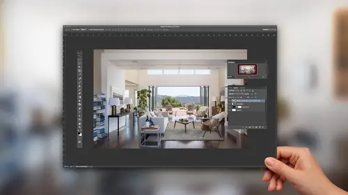
So, what I'm gonna do now that I've kind of explained the tools that I'll be using, and these are the tools that I use for every single photograph. I don't think there is any occasion where I'm in Photoshop and not using those tools, and I feel like I've mastered that part of Photoshop, but the rest of it is so unknown to me, but those are the tools that I use for architecture. You need to come to terms with them and the goal of this class is to get you up to speed using all those in many different ways. So, let's jump back into Lightroom. I have my base image, I need to start looking for problems that I wanna solve with this picture. So, like I said, I think our interior is slightly too dark and our exterior is slightly too bright. So, I'm gonna go back into Lightroom and I'm gonna select an exposure where I think my exterior is properly exposed, and I wanna leave this a little bit brighter than a properly exposed photo. I'm just focusing, again, on this exterior light right here. I w...
anna leave this a little bit brighter. I think when architectural photographers properly expose their exteriors it looks a little bit wonky, so my preference is to leave it a stop or two brighter than normal, and I'm just going to right-click, edit that in Adobe Photoshop CC. That should open right up and I wanna stack this on top of my first layer. So, what I'm gonna do is I'm gonna select my move tool right here like I just mentioned. I'm gonna hold Shift, I'm gonna click, and I'm gonna drag that on top of my working document. I can close this and get rid of it. And, lastly what I need to do is I wanna grab an exposure that's gonna help me expose for this interior. Again, we got black hole situation here. We gotta take care of that so I wanna jump back into Lightroom again, and I'm gonna find an exposure that I think works for the interior, and that I think is gonna be my fifth bracket here. So, I'm gonna edit in Adobe Photoshop CC and I'm gonna Shift click with my move tool, drag, which will automatically align it with the rest of my layers, and I can close that unused document. So, now you may be asking, okay that's fantastic, but why don't you just use an HDR program, or just blend these all together? How are you gonna get to where you're going? And, the question is I don't wanna, the answer is sorry, I don't wanna use an HDR program because I hate when software thinks for me. It always tries to go too far. You can't have fine control over the little details and generally, most HDR programs like Photomatix and Enfuse, they might work for landscape photography where you can, in my opinion, generally get away with pulling and pushing the shadows, and you can get these funny, painterly looking pictures, which some people love. It's just not my style and when you're shooting for an architect or an interior designer, and they want the colors to be accurate, and they want nice crisp lines, if you're using something like Photomatix, you're gonna get these, I call it the Harry Potter sliders. You're gonna get this Harry Potter looking image where everything is way oversaturated or you know, way haloed out, and some people love the look of that, but for architecture it's not what we're after. So, people are like, how do you blend this all together? And, the answer is layer masks, and this is the thing that I find most confusing, so this class is really gonna focus on helping you better understand layer masks. So, I've made a quick little PSD file, which will explain exactly how layer masks work. So, this is an example of a Photoshop document for something that I would generally consider fairly normal in terms of my work. So, this is again our base layer down here. This is kind of a mirror of what we're working on in the other document. We've got our base layer down here. We have our brighter layer here and then we have all of our adjustment masks, like curves for contrast, and I've got a color adjustment mask here, but when I use these masks, what's happening is I'm gonna stack my layers on top of one another, and in order to get, for example, this brighter interior to show up over this darker exterior, I'm gonna have them stacked. I'm gonna go ahead and click this button right here and this is the add layer mask button. And, this is the basis of everything that I do. I'm gonna add a layer mask to this top layer, in this case my brighter, my brighter layer, and what I wanna do is I wanna reveal that darker exterior out the window. So, by selecting my brush I'll be able to non-destructively erase and reveal parts of this mask. So, imagine two layers, I'm just hiding parts of one to reveal what's under the other. So, using my default colors down here, black and white, and my brush. Again, I've got a big soft brush. Using black, I can hide, let me stack these so you guys can see, very generally I can hide this brighter layer. That was what it was, that's what it is now, and reveal what's underneath it. So, I'm basically like, think of it as me punching a hole in the top layer to show what's underneath, just using a brush. And, again, if I switch my colors, my foreground color to white, I can paint that right back in. So, this is non-destructively erasing and revealing between two layers. And, again, I hope that helps you visualize exactly what a mask is doing. So, again, I'll select my brush, my black brush. I'll put these on top of each other. I will hide that overexposed layer and reveal what's underneath. And, this is again, very quick and dirty just to kinda drive a point home. So, I'm just gonna do that throughout my entire document. This is, again, the essence of my process over and over, and over, and I can do that with contrast layers. I can do that with color adjustment layers. Again, I can add a mask and I can hide, and I can reveal, and I can take a harder brush, and I can punch a hole right in that mask, and work on my file that way. So, you have an immense amount of control, rather than just trying to erase a top layer destructively and then you get maybe five steps later, and you're like, oh God I don't like that, I wanna undo. You can't undo it. With a mask you can always go back and undo your changes. So, that's kind of a quick visualization of a layer mask. That being said, I'll switch back to our working document and we're gonna start kind of attacking our problems here. So, we have our base layer. I'm gonna turn these guys off by hitting the eyeballs here. I'm gonna rename this one, "Base layer". I'm trying to keep things simple and when I'm working I'll often get up to like, 10, 20, 30 layers in a document. So, naming is super important so you don't lose track of where you are, and confuse yourself. So, just double-click on that layer. Rename this to "Base layer" and I'm gonna go through. I'm gonna rename, I'm gonna double-click on Layer and that looks like my exterior, so I'm gonna rename that "Exterior", and I'll hide it. Layer 2, turn that on, that's gonna be our interior, and here we go, I'm gonna start blending this all together. So, here's our Base layer. I'm gonna, I think the first thing I wanna do is get my interior in shape. So, I'm gonna click and drag my Interior right on top of my Base layer, and I'm gonna turn that on. And, I'm gonna add a layer mask, but instead of just adding a layer mask and trying to hide areas that I don't wanna show, I'm gonna use a little trick here. I'm gonna Alt click on this add layer mask button and that's gonna fill that mask with black, which is like I just said, is going to hide everything, and we're gonna use our white brush to reveal that Interior bright layer. So, this is what it looked like and I've added my black mask, this is what it is. I still have that layer there. I'm gonna select my white brush and I'm just gonna start painting in. Whoop. Back up a second. Gently painting in with my white foreground color. Oh, that's too hard, so I need to make my brush soft. So, just like I can use the brackets to make the brush smaller and bigger, I can hold Shift and bracket left to make the brush softer or harder. So, if I, there's a very soft brush, there's a very hard brush. So, using your brackets to go left and right will make the brush bigger or smaller, Shift bracket left and right, you can make the brush harder or softer. So, again, soft brush. I'm gonna just very gently, oh, again. Soft brush, very gently start painting in that interior, being careful not to go over that exterior view, which I'm gonna paint in with an other exposure. And, you can be pretty messy with this, you don't have to be perfect 'cause again, we're using a soft brush. We're gonna have nice, seamless transitions from shadow to highlight, and again, I will turn that on and off so you can see very simply, we've brightened up that whole interior. And, now I think like I mentioned, our exterior is way, way, way too bright, so I'm gonna do the same thing with the Exterior layer. I'm gonna turn it on, I'm gonna Alt click, fill that layer mask with black, and start brushing in the exterior, but the problem that I immediately encounter when I do this is that I'm getting this haloing all up and down this pillar. It's inside, it looks like a mess, it looks like someone took a match and kind of lit it on fire, and we don't want that. So, in order to combat that, I can change the opacity of my brush. So, you can come up here to the top of Photoshop, this menu bar, and you can drag this slider left to right to change the opacity. So, here is hard brush, 100% opacity and then I can change my opacity maybe to, let's try 30%, and that will tell Photoshop how much of that layer below to let through. Again, that's a little bit better, but I don't want that hard, hard brush. I want something nice and soft. So, I'm gonna use my brackets, make my brush nice and soft, click on my black layer mask, and I'm gonna zoom in a little bit so you guys can see. And, just like I brushed in that interior, I'm gonna gently brush in some of that exterior view at the 30% opacity. And, we're starting to get some detail coming back. And, again, you can be very, very gentle with this and you can switch your foreground and background colors right here, and you can remove some of that excess that you've painted to keep things looking accurate. And, I think I've bled too far over this railing. You can see it has that black, burnt out kinda look. I'm just gonna paint that out very gently to keep things looking natural, and soft, and well blended. Alright and now you can start to see the difference in that way, way over exposed picture, compared to this more properly exposed exterior, which actually shows us what's outside. Alright, so this is looking pretty good and this is our... A pretty good general blend and I'm gonna start kinda tweaking it a little bit. So, I think our interior looks good. I think I wanna start tweaking, like I said tweaking, I wanna clean up the messes that are these vents and the exit sign, which is right in our face, super distracting. And, again, I'll show you guys what we started with and what we ended up with, and since I think we're, for the most part, done with our exposure blending; I will hit Command + G and group those two together, and I'll just rename that group, "Blend", and you can turn this on and off, and see what we've come from.
Class Materials
Bonus Materials with Purchase
Ratings and Reviews
user-748e5c
First, note to CreativeLive: Please include experience levels (beginner, intermediate, advanced). I think the bad reviews were because people expected a more advanced class than this. That, and that some people expect mind-blowing revelations in merely 70+/- minutes. This class was jammed pack with great information. I was looking for this exact information so it was perfect for me. Plus, Mike Kelley's teaching style is easy to understand. Any class taught by MK is worth watching, he always has useful insight and nifty shortcuts.
Chris Murray
not only is Mike Kelley a genius, he is the Bob Ross of architectural photography. It's got a real "Lets just add some happy cars here and some happy people there" kind of a vibe. What a killer tutorial. Thanks Creative Live and Mike Kelley.
user-fd7ce6
I really enjoyed the video as I do with all Mike Kelley videos. The different way to use the clone stamp as well a lot of little trick he did were great to hear. However, I completely agree with Nicholas, it would have been nice to see the image that they showed on the cover, as that is a scene that I'm far more likely to encounter.