Lessons
Understanding White Balance, Color Balance, Hue & Saturation
10:31 2Manipulating Color Balance
02:28 3Working with Hue & Saturation
12:44 4Black & White Adjustment Layer with Tint
03:43 5Simple Color Correction
03:37 6Toning with Color Fills
05:56 7Split Toning with Gradient Maps
18:56 8Realistic Toning with Gradient Maps
05:58Lesson Info
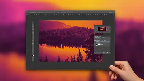
Working with Hue & Saturation
But let's look at that hue saturation. So we'll again go to image adjustments. Will tooth hue saturation? And here we see the huse lighter. Remember, it's not a circle, it's flat. So if I take the huge lighter and I drag it around now we get crazy things happening in the image like a green sky and a hot pink scarf. Starfish. That's obviously not the way nature built it, but we can do that. I am photo shop if we went Teoh. So we're taking the existing colors. And what this is telling us is that we've skewed it 82 degrees around the color wheel. So the minus 82 means traveling one direction. And I never remember one clockwise, the others counterclockwise, whatever. So minus 82 degrees is one direction, and then plus 82 degrees would be the other direction. So that's what that means. And that is why, if we dragged us all the way to the left, that looks really awesome. Actually, then we get we're minus 1 80 and if we drag all the way to the right, where plus 80 it looks the same now, we r...
ealize it's the circle, right? That's why plus 1 80 minus 1 80 are the same because they're connected at the top. So this could be kind of fun. You know, it's not everyone's cup of tea to do wild manipulations of color, but not every adult meant that you make has to be wild. Some of them can be really subtle. Sometimes you might just want to take an image and skew it a smidge. So that's one way to drag this. So we're taking existing color and skewing it. Another option within this dialogue right here is we can actually wipe away all of the color and replace it with a single tone. So our single Hugh excuse me. So if I click the little button down here that says colorize if I click there ha, no, all the colors wiped away and I can choose whatever Hugh I want to replace it with. So, you know, maybe I'm a c p a fan. I can go into the orangey area over here of the rate the rain, both lighter. I call it we can go in there and now we have a C p a. Look, the saturation slider is gonna let us boost the intensity of the color. So the saturation is kind of like another word for intensity so we can raise the intensity and make it a much richer, brighter, uh, orange. Or we can drag it all the way out. And then we basically have, like, a black and white photo. Okay, the lightness slider. Just if you're curious, it basically fade your image to black or fade that too. Toe white. It's not like if you're thinking, oh, lightness. I can use that to adjust exposure. No, you can't. Sorry, that's not what it is. So this is just gonna allow you to basically fade the image to black or faded to white? But there are so many other ways to do that that, honestly, I don't know if someone has a brilliant use for the lightness Slider. Bring it on. I love to see it. You can accomplish the same effect in many other way than you have a lot more flexibility. But it's here, I guess, if you need it. So another thing that I should point out about when you're in these, um, different dialogues, I don't know if anyone mentioned this yet, But if you really let's say you just really whack this out and you're like Oh my gosh, what have I done? How do I get back to just square one? You can hold down the altar or option key, and then the cancel button will turn into reset so you can just click on that and then it will return to normal. That that could be very handy. Okay, so we'll go ahead and cancel out of this. Let's take a look at an image. Here is one from the white balance thing that I showed you earlier where I shot in a bunch of different settings on. But this one is a little green, a little red and green. Actually, I think I've already adjusted it. There we go. Now it's looking a little more red, so the shadows, particularly in this area, are a little heavy on the red side so we can adjust this with color balance as one option. Another thing I should point out is that there's more than one way. Of course, as I'm sure you're realizing, is more than one way to dio everything in photo shop. I mean everything, even like the simple things that you think you don't need more than one way to do. There's probably 12 ways to do so. I'm just going to show you the color balance. Wait here, Um, because that's simple. But keep in mind, there are other wave and there is no right way. There's what works best for you, I think, Andi, sometimes the really complicated ways are the only way that you can achieve a certain thing. And sometimes I mean, there are times when I've messed with color that I've done all this complicated adjustments and nothing is looking good and out of pure desperation. I reached for the auto command, which I'll point out to you is up under image adjustments. Oh, actually, right here, image, auto color. Out of desperation, I've been like banging my head against the death and finally, unlike fine auto color and I click on it. And then Photoshopped nailed it, and I think, why didn't I try that first? But I didn't try it first, because years of very intent taught me that it doesn't always work very well, so I kind of blew it off. So I guess what I'm saying is never completely write off an option because you never know when that's going to be the one that gave you, so it helps to have a lot of tricks up your sleeve. So here we are. And let's try this with color balance. So we'll come up Teoh image adjustments and we'll go to color balance. And like I said, I feel like this is pretty heavy on the red. So I might do take the slider here because this is the red, but I'm gonna pull away from the red now if I go too far, obviously gone too far, so we'll just go a little little bit. And I I think that that's still heavy in the shadows. So I'm gonna click the shadows, toggle down here and then maybe try a little further and maybe I'm gonna add a little yellow because you will also find that color because it's really interconnected. It's not separate, like the lighters would lead you to believe you might correct the red. And then you sort of introduced another problem. And maybe now it looks, you know, to blue. So that's why I'm adding yellow here. I should also point out I'm relying on my eyes right now, right? And I'm looking at my screen, which is different than what you're seeing on the monitor, which I'm sure is different from what folks at home are seeing. And there are ways to mathematically do this empirical bably through this. Um, but I have found in doing it that way that I didn't like the results as much and it didn't It just wasn't what I wanted. So I guess there's a difference between color correcting for the numbers, like for a perfectly mathematically balanced image versus color, correcting for what makes your soul happy, right? And I go with my soul so I don't do the I don't work with the numbers, but you do need to make sure that you know you're equipment's playing nice with your lab or your printer or all of that kind stuff. Ah, in order for this to really come together for you, So I'm gonna push that a little more towards the yellow, and then when I'm happy with it, I would go ahead and click, OK, And if we want to see a before and after I compress commander Control the to toggle back and forth. It's pretty subtle on the monitors, but on my screen it's really noticeable. Another thing you can do to toggle back and forth is if you go to your history panel from the window menu, go down to window history, and this keeps track of everything you do in photo shop, so you can always go back to see what it looked like when you opened it by clicking up here. So here's my original, and here is what the image looks like after I apply to color around. If we go back when you do this, we can also apply that same color balance. For those of you who have more experience with layers, you can do the same command as adjustment layer. So at the bottom of the layers panel, there's this little yin yang button down here. If I click on that, you'll notice that color balance is an option. Here is well, so it's the same as before. Here's our sliders. Um, so if I drag this down and I go back to the shadows and we'll add a little bit of yellow, there we go. I've done the same thing, but now it exists in its own layer, whereas before I just applied it directly to the image. So now I can toggle it on and off by just clicking the eyeball, the visibility of the layer So I can see here what I've done. And I can also let's say I've overdone it. If I want to just edit that, then I can just double click and continue to tweak it. Okay, so it there's an advantage to doing it this way in your layers panel, but I don't always go for that. If I'm just doing a quick color balance, then I just come up here and do it this way because there's a keyboard shortcut for that. Ah, under image adjustments, color balance. You'll see the keyboard shortcut is commander control. Be so if you do it a lot, you can do that with the keyboard shortcut. If you want to have the flexibility toe, edit your balance later, then you want to do it as an adjustment layer. Any questions on that before we move on? Okay, all right, let's talk about getting creative with our color, so that's a little bit about how the color is captured and a little bit about what goes into it and how we can correct some problems. But it's more fun when we use color in a creative way, rather than just fixing problems and trying to make everything line up nicely. Um, we can have fun with it. So there is a lot of different ways that we can do this. The first thing we're gonna dio is adding a photo filter to the image. So though they're found in that same adjustment layer icon, so the bottom of the layers panel we'll click on this and I'm gonna choose photo filter. And there's all kinds of options. There is warming filters, cooling filters. There's red filters, orange yellow blob, blob under water filters. So, um, let's see. Let's just go with we'll just go with only warming filter. I guess you can adjust the intensity by taking the density slider here and dragging. It ranges from 0 to 100%. So it's adding just if you photographed the scene with a warming filter and Frontier airlines right, so a knife color gel in front of it to just warm it up a little bit, so the They're a little more realistic kinds of adjustments in here. Um, so I would encourage you to experiment with that. It's pretty straightforward. Your properties window here will open, and then when you're done with it, there is no OK button. It's not like there's a cancel. And okay, because this is an adjustment layer, so we're never applying it. It just exists. So OK implies that we're, like, approved check, right? So this is not approved. It just is. So when you want to get the panel off your screen, you can just click to close it, um, and go about your business. And then if you want to make adjustments, you simply go back to the adjustment layer and double click this icon right here, and it will pop it back up. And then you can say, Oh, no, What was I thinking? I want to tone that down a lot or whatever
Class Materials
Bonus Materials with Purchase
Ratings and Reviews
Sara C. Madsen
Nice little class. Very basic. Perfect for beginners.
a Creativelive Student
Very, very basic. Strictly for beginners.
user-9f5c01
Khara is very personable and engaging. But I do think people should know this is NOT a color CORRECTION workshop. This is a basic course in that it provides a very brief overview of the pshop functions that can contribute to color manipulation. She does go most into gradient maps.