File Intake and Organization in Photoshop
Lesson 1 from: Best Workflow Practices for Architectural PhotographyMike Kelley
File Intake and Organization in Photoshop
Lesson 1 from: Best Workflow Practices for Architectural PhotographyMike Kelley
Lesson Info
1. File Intake and Organization in Photoshop
Lessons
Lesson Info
File Intake and Organization in Photoshop
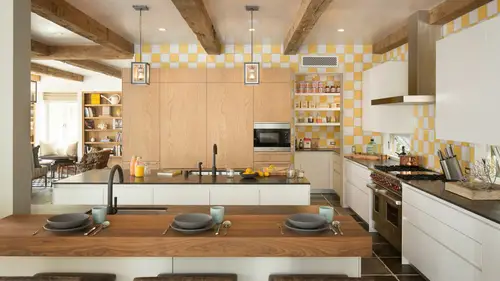
What I want to do first is explain this picture and how it kind of arrived at the final image, which I will show you over here. Uh, this was shot for until your designer down in orange county, and, um, they're took a significant amount. You can see me kind of dancing around the room there of lighting and bracketing and photoshopped compositing to get it to look the way I wanted it to look, and I thought it would be a good example because it illustrates a couple things that people often struggle with, and that is really capturing the view and the natural feel of the room without kind of blowing it out with flash, that sort of thing. So, like I said, I just want to show you how a proper my files and light room and how to get in the photo shop and how we get to the finished image. So first things first, I want to explain to you kind of my work flow here, so, like I said, this is for a new interior designer, and what we have is a room right next to the ocean. I'm like fifteen feet off of t...
he beach, and she was really adamant that we capture not only the mood and feel of the interior, but also, of course, the exterior and the ocean, and if we properly exposed for the interior you can see I've got my highlight alert turned on our windows and view quickly go to hell in a handbasket so my job as an architectural interviews, photographers the kind of combine all that so that you get the best of both worlds you get the outside, you get the inside so what I've done here is I've gone through and on every time I'm shooting I will bracket you know five or six photos from four five stops under exposed until four five stops overexposed and here's the first shot that I took which is a cz you can see the interior is very under exposed the exteriors about where I wanted to be I know I want the exterior to be properly exposed what those rich blues so I kind of exposed for the exterior and left the interior to do what it will and from there added one stop of exposure to every shot that I took. Of course we're on a tripod. I tell people that a tripod is the sharpest lens and architectural photography nothing is as important as a sturdy platform for your camera and I keep going through and bracketing and opening up the shutter speed, so I started that like one sixtieth of a second now route one thirteenth and then one sixth and then a full second and on and on but at this point as you can see it's completely blown out, so the next thing I'm going to do is add some flash I liketo add flash to kind of clean up the natural light at some contrast and punch and texture, especially on the furniture, and give some directional light and lift the shadows like as you can see here, this is one thirtieth of a second, and if I go to the one thirtieth of a second ambien exposure everything's kind of underexposed inside, so I'll add flash in different parts of the room, and then I'll remove myself from the photo and leave just the good the good deaths and that's kind of what I want to teach today is how do you wrangle these files into the finished image? So I'm just going around flashing, bouncing into the ceiling, trying to fill the room with light, and I kind of have, like an archive of thousands of funny pictures of myself looking like a goon kind of like just flashing and my underwear is hanging out and everything, but I've got tons and tons of shots like that, and then obviously we have to make sure the color is right. Because this is actually what the color looks like straight out of camera, which is like this gross vomit green kind of thing I'll touch on that a little bit and I don't want to show you of course have put all together into this finished image here, so that's kind of how I how I shot it in my approach to it, so what I want to go through is how I get the files from light room into photo shop, so the first thing I'm going to do is I line them all up, I'll start with my bracket images all the way at the beginning of the siri's so that's kind of my starting point and that's going to my base image what I'm going to build off of then after that, I will put my flashy images next to that and then finally I will have my color correction image and when I'm done, my finished image will go at the end so it's kind of a stack of images they're all lined up left to right like a timeline you can follow myself through as I shot and as I composited, so the first thing I want to do is get these ready to taking the photo shop and there are a couple of tools and like them that I used to kind of just tame the files a little bit to get them you know, right now, the dynamic range is all over the place, and I have the raw files and find me so I might as well work with them because they're goingto have far more latitude in terms of dynamic range and color and pushing and pulling them. They wouldn't photo shop once once there are rats arise. So I'm going to look, and I want to see, like, one of the good parts of each picture. So in this first one, I see the good part here is that window view, so I'm just going to edit this quick, like, dramatic for the window view, disregarding everything else I'm gonna zoom in on I'm going to pretend this is my picture. I just want this beautiful horizon with blue sky blue water, and I'm just going to edit it very gently in light room to get it to look how you envision it would in the final image, so add a little bit of contrast ah, touch of saturation, and I'll bring the highlights down, so it kind of takes on some of that dark blue ocean ocean mood that we know so well, I'm not going to touch the shadows because I like the blue kind of being darker, um, I like a little bit of clarity. And I think the colors look pretty good on that, and then the next thing I'm going to do was think about what the next day when you want to use is, and I'm thinking that this year, even though these highlights are blown, this is looking to be a good starting point for what will be the base image. That is what I will build off of to make my final picture. So I'm going to see what happens if I pull the highlights down a little bit and it cleans that up nicely, and you can see if I undo that highlight adjustment. Uh, the couch is completely blown out. I don't really want any blown out parts of tens on the look you're going for. But for an interior designer who carefully and meticulously, like chose the fabrics and furnishings, I my personal belief is don't blow it out, you know, she spent hours upon hours for us in this place, making it looking at keep the colors there. So I kind of bring back the highlights just so that we get the natural color of the of the furnishing and as you can see with the highlight alert turned on, all those highlights are gone, so this looks a little bit underexposed, and I want it back up and go. And answer the question that will never do we come up is, why don't you just not light it and do all this crazy compositing and just use the highlight and shadow slider? Well, this is about as properly exposes we're going to get without any lighting, so as you can see the history, graham is perfectly kind of in the middle with the bias to the right hand side, so it looks like it's properly exposed. But if I bring the highlights all the way down and I bring the shadows up a bit to kind of make it more correct uh, the window, he was still very muddy and hazy and gray and kind of gross, because there's some things detail that we're just never going to get back in the shadows like it just it's going to start to get noisy, you can see the crazy noise down in here, and you're not going to get the great contrast that light and gives you so even though you know you theoretically can pull the highlights and shadows to make the image better, I try not to. I just tried to bring it back as much as I need to to get all the highlights and check and all the shot is where I want them before I go into photo shop. So I'll do that like I said, I think this looks like a good basic much so I'm going to read it one start it's just my little weird way of remembering what I'm using so if I'm going to use it in the composite I will read it once are you could have it you can use colors you can use a little note pad whatever you're going to do, I'll read it one star and then this one there's some good things about this picture as well I kind of like the warm, bright natural sealing this all looks like it's far, far too blown out and I kind of like lee you know, you start to see some of the texture in the lighting that directional light that gives depth and papa hate the word pop but it gives depth and popped all objects in the room when you see those shadows I like to keep the shadows in there we're starting to see some shadows I'm gonna keep this one so I'm mark that one star as well. Like I said, I love the ceiling with stolen was really starting to look like it's, you know, a spread in the magazines so I'm gonna keep that this one is just kind of a safety bracket this is kind of way overexposed, but what I do like is that I begin to see the fireplace detail and we see those she picked out there's, beautiful, beautiful glass crystals in the fireplace instead of wood or metal or some kind of funky gas fireplace, so I might use that one and kind of drag out the five places. So see detail in there, and in that case, I'm going to see a little more shadow detail, so I'm gonna bump the shot was just a little bit on that exposure, and then we get into me running around with my white and just going crazy. It looks like I'm going insane, but there's some what of a method to it? I want to kind of emulate the natural light, and if we study this room, you see that all the lights coming from one direction and if I were to stand behind the camera and blast that pro photo into the ceiling, it would wash out any kind of depth or texture or believability to the room. So all the flash pops ideo are going to kind of come from that side just to keep the the texture, the mood, the feel of the room. The brightest thing is where the eye is going to go, and we want the I think, oh, right, over the furniture. Right out the window because that room I mean, that view is one of the best parts of the room, and even though it's thrown into designer, the view is really integral to capturing the feel of the room so her potential clients who's going to put on our website they're going to see like she did this amazing room art on the ocean if they haven't ocean housing get the same kind of fuel from itself, keep the light kind of like it is in the room naturally and kind of emulate your stroke could do that accordingly. So again I'm standing where the sun is coming in and bouncing a light, trying to get some light from front to back um here I am again trying to listen shadow and this is a great example of using the light to kind of balance I've kind of left b couch properly exposed and the curtains properly exposed and we still have the view. But obviously the problem is that we have a reflection in the glass here hoping I'm not going too fast for him to slow me down and, uh on and on we go walking around, flashing just making sure that I get different parts of the room and that I'm always not in the way of everything so I can always take the two halves, line them up and photo, shoot myself out so that's me flashing everything, and then the last thing that I do before I finished the shot is take a giant color checker card. This is the x right color checker classic it's like fifty or sixty bucks could be more now, you know, the things that I was going up, but a very worthy investment and what I'm going to do just to show you how they call it correct things before I go into photo shop is I will use the color checker card and then it says pick a target mutual night room, so we know it's a solid gray, we can click on that and we have gone from it's like a kind of greenish growth color to what we know is a pretty accurate representation of the colors in the room, so I'm not going to use that frame and anything on what I'm going to do is just select all, and I'm going to apply that white balance adjustment all the pictures before jumping the photo shop and that'll give us a good starting point. I tell people that unless you're in a studio to get perfect color interiors is so difficult because as soon as sunlight comes in, we have one light source the sun is going to come in is going to hit a blue couch, going to hit a red couch, going to hit a green whatever. And it's, just going to instantly start going crazy with the color. So I get a good representation off of this color checker and then in photoshopping, tweak it even further, because, like I said, you're never going to get perfect color. One shooting architecture, unless you're in some kind of studio set up.
Class Materials
bonus material with purchase
Ratings and Reviews
Andres Gomez Salazar
This was perfect for me because I have a lot of experience with the shooting of the files to start the postproduction with, but My skills on doing the retouching after the shoot is not so strong. This was good, clear information. He talks of the workflow, the tools, how to do things in more than just one way, connecting the shooting, the editing and the retouching all together, putting information in a context. This was so far the best class I have bought from Creative Live. Thumbs up for Creative Live and Micke Kelley on this one.
Rachelle R. Vetter
It's a course by Mike Kelley, and so of course, it's awesome!