Lessons
Day 1
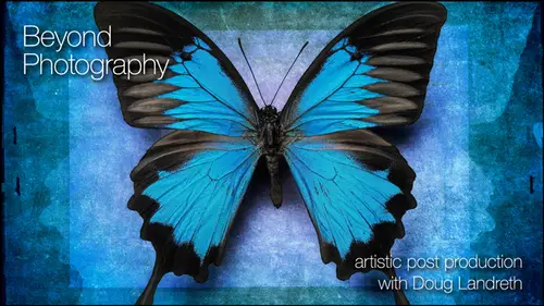
1Introduction & Prelude
29:20 2Looking Beyond Photography
27:08 3Creativity vs Technique
09:55 4Lightroom - Part 1
1:11:40 5Lightroom - Part 2
41:05 6Photoshop - Part 1
1:01:58 7- Photoshop - Part 2
56:31Lesson Info
Lightroom - Part 2
who shoots in raw. Okay, Ron. Good. Um, two guys work in eight. Better. 16 minutes. Eight. I'm gonna change your mind. Um, let's just open this in, um, for shop. So with eight, um, digital Digital's ones and zeros Um, there's in an eight minute file. Eight bits means there's eight on off switches to describe the color in that file, and they can be on or they could be off. They could be one or zero. So there's and there's eight on off switches for that particular for that particular color in that particular pixel. So in an eight bit file, there's eight bits that's described the green. There's eight pits that describe the red. There's eight bits that described the blue. There's 256 different combinations of ones and zeros. Among those eight bits that described the color you take 16 bits. You just double the amount of on off switches, and that goes to 16.5 1000 different combinations. Something like that to describe the color. And that's important because if I was to take this image and, ...
um, I'm going to duplicate it, and I'm going to, um, image mode I'm gonna change the duplicate to eight bit, okay? And I'm gonna run curves layer on it, okay? And I'm gonna kind of tweak it out here. Nice. Good at something like that. Okay, um, Fausto, look at the history, Graham. Okay. It actually might be good to convert this. Let's, um well, but I want to see it bigger. Getting bigger. Okay, see this sort of fork comb effect down here, Those air tonal values that no longer exist because what we did is let me bring up that adjustment. What we did is to get these tones to be black. I mean, we're gonna go further to get the stones to be black, and these to be white. I'm actually taking and pulling apart that information to spread it out from 0 to 2 56 And so this is a map of all the values from on the left side, zero or black all the way to the right side, which is 2 55 to 56. And if I if there's not all that information in there to begin with, then I pull it apart, then it's like it's missing information in those gaps. That's going to show up in your picture as banding if you notice in your picture with the J peg or on an eight bit, and you're applying a lot of curves and layers and everything to get the color just right. And if you open up your history RAM and see a bunch of spikes, if you apply a smooth grading across that you're going to see the break in tones, that's not gonna be smooth. If you apply that well, let's go to window to 80. Copy. That would be it. Okay, so and let me just make sure, yeah, so this 16 bit. So let's do the same thing. Let's tweet this out. Let's adjust it. No spikes because we've got 16.5 1000 tones is showing spikes until it redraws when it redraws boom. So it's got essentially 16,000 tones to map into based on what your telling it to do Okay, as opposed to 256 that you want re mapped. If you take those 256 and remap them and stretch amount, you're gonna missile that information and it's gonna degradation your file. If you work in 16 bit, you've got the luxury of the program saying, Well, yeah, You know, I got hundreds of tones to fill in that gap. So you're not gonna to see you're not going to see any perceptible degradation or banding, so thank you. Actually, probably easier to see and luminosity. Let's go back and look at our other one. Anyone? My point is yeah, don't don't apply and curve like this if you're working in a bit, unless you want a special effect, Okay? You know, maybe that's the surprise turn in the road that you were looking for. Okay, More memory. Is that why people use 8/16 or Yes, yeah, the And beware your storage demands Your file stories demands. Just went through the roof tenure. You're layered. Photoshop files just became enormous. And smart objects as well are gonna You know, smart objects are the original file put into your new layered file so that it travels with it so you can open it back up. So lots of things that I'm talking to you about today that are gonna may tax your system but are worth it. It's you know it's for art sounds. So when you open the when you open, the file is inherently eight bit. When you open up a rock you want from my camera, or do we need to convert it? That's my first question. Second question. Joe foto Que would like to know if there's any filters that you've come across that don't work in Photoshop in 16 bit. Yeah, there's some things that you can't do. Yeah, a lot of the filter menu, Um, isn't you had adapted to 16 bit, but I don't rely on a lot of a lot of those filters, so it doesn't really impact me too much. You know, a lot of the techniques that I use are gonna are not based ast much on filters as they are adjusting luminosity, contrast and blending of of imagery. So applying a specific like artistic, you know, filter tiu a layer, you may be restricted, and in that case, you copy the layer to a new document converted to eight bit. Run your filter, copy it back into a layer in your layer Document. Man, you have the filter effect. No. And you're not pulling or pushing. I mean, you're running a filter on it, you're not pulling or pushing. And hopefully, you know you're not going to sacrifice. You're not gonna be running then subsequent tones or anything on it that it's gonna heard it. But that very rarely happens to me and it they stay in 16 bit pretty much to the point. I mean, even through printing, you know, flattened them printing on pretty much in 16 bit. Save him is a 16 bit. Do you want to save it as the DMG Stoller? Do you have a well, when you're saving DMG is just the raw file. So you're you're raw file or your DMG file. A DMG file is just your raw file. When I open it in photo shop, it's no longer raw file. It's gonna be a PSD file or a tiff file, and it's gonna have layers associated with it. And when I flatten it and print it, it'll be a tiff or PSD um, file. So very I mean, yeah, you can't then save a layered document out of Photoshopped into a raw file. It's just not raw anymore. It's packaged Bank its goods, Yes, and then the importing the importing you always when you're importing from your camera, you always want to make camera setting and see what you want to be familiar enough with your camera settings. So you're shooting in raw, and when you import, make sure that it's not being converted to a bet, and it'll come in 16. Dammit! Most cameras, I believe, are capturing in 12 or 14 bit. And so just the process of the interpolation in the the processing that goes through to interpret late from the Bayer pattern into actual color are to be or whatever, Um, become 16 bit. Thank question from Adelson Media in the chat room. How big of a scratch disk do you recommend for these types of creations? And how large is the PS scratch drive you're using now? Yeah, you know, that's one of those bits and bytes and technical questions, and as much as you can get, um, I just upgraded is like software and hardware bigger, Better new. Yeah, I'm sorry your budgets are going to suffer for your art, but just tell your spouse it's for the art. You know you're sacrificing for the art. It's big, you know, and it really depends on your work. Maybe your work is precious little, you know, four by five watercolor prints that don't need much except a little bit of juice. And then it doesn't matter if you're putting together, you know, a file like the pelicans or the community here. This guy, you're talking some overhead and it's you can do it with low overhead, but it just takes a little longer and you have to be patient. So that's my advice on that. If your output, they've asked, is going to be more on the on the Web, same thing. Would you still export it for the Web? Web Web is pretty much all based on S RGB color space and so color space color space. The one that everybody's works on the Web is s RGB SRT B is the smallest little color space, and it's kind of a universal on the Web. So when you export images out of light room or in Photoshop is safe for Web, you'll be saving A P and G or a J peg, and you'll want to save it in S RGB. That's kind of the universal, and you'll know what it's gonna look like when it shows up on the computer. Um, I work in the largest color space I can. If I'm passing off a commercial job to clients, I give him Adobe RGB. Um, it's sort of a universal. And everybody I mean, it's a standard Printers, printers work within everything else. Pro photo RTB You can't even see pro photo RGB because you know no monitors monitors is just now becoming capable of showing most of the gamut of adobe rgb. So the description of color you know, if if this is this is s rgb, it's got all the colors. And if you've got some exotic colors, they're getting clipped. You can't you can't display them and you can't print thumb if they get out of gamut from this little small color space on this RGB adobe RGB bigger so you can almost see all of adobe rgb on the monitor. But all that information is going to shrink down when you output to print as well, and this is getting into a whole color management issue. My philosophy is that I want my files toe live in, You know, I want to give elbow room for future technology I think. And I mean the advancement of this whole industry and art and science is moving so fast that I think in five years I'm gonna be able to see what my proto my pro photo profile looks like on screen. And I'm not gonna be sacrificing because I saved it in Adobe RGB. I'm not going to clip those little exotic colors that I might fall in love with in the day five years from now, when I will be able to see him on the monitor and print them on whatever we're printing on in five years from now. So that's that's my and when your motion color and stomping on it as hard as I do, I just like to give it room to squish out a little bit. Can I ask, how do you send them to your print lab? Eight Better 16 bit S R g B or Adobe. Yeah, I do all my own printing because I'm a control freak and and so my lab asks me for the highest amount of information that I can give it. And so, yeah, I'm actually soft proofing with the paper ink profile that I've either downloaded or purchased. You can get custom profiles made for your ink paper combinations. You print out a target, you send it to somebody, or you might have color calibrating equipment. Hardware that can measure color patches said that you calibrate your printer to your monitor, so first you take a hardware calibrate er calibrate your monitor for known values, and they are lab values that it's working with. Then you take and have a profile made for your printer inks and paper combinations, so you'd have a different profile for every different paper. And if you're using different inks, um, for different printers and so that when you what you see on the monitor is close to what you you know, it's close. Possible what you get on canvas. And when I'm printing I soft proof. It just means that in photo shop, you can look at your file. Don't want to get out, but you can look. You can view the image based on a proof set up, and you would actually load a profile, which is your printer and so efs in 9900 with you know, um, B F. K. Reeves. I think it's what the's prints are printed on. So I would select that as my custom proof set up. And then I would go view proof colors. And it shows me on the monitor what that profile will look like when it's printed on the paper. And it's pretty close. And then when you print, you have to You have got to tell it that that's the printer paper combination to use that prayer profile. Okay, I lost my way. Light room questions. How we doing? Did I surprise anybody with anything new things you guys air deer in headlights? Look, I have a light room question from Is Marcello, do you keep all of your images in the same catalogue and light room? Um, and does this not get slow? And when do you start a new catalogue? Yeah, you know, do as I say, Not as I do. I, uh Yeah, I have, You know, I like to see everything I've got. So I have a master light room catalogue, but I also have specific catalogues. If I'm shooting a commercial job, will have a catalog for that job. So e mean this I'm running a light room catalog just with the materials that I use in this course here. So that's such an individual thing. There's, you know, the best way to do it is the way that works best for you. Kind of a thing. Large catalogues can get cumbersome if you have different bodies of work or different categories of work. You know, Definitely saving them is individual catalogs. Um, well, we're great. I'm looking forward to the day when we can go, you know, open numerous catalogues in light room at the same time. Don't be. I would love that. Um, And I you know, it's probably not far down the road. Who knows? So good question. Oh, yeah. When you're creating masks in in light room, is it Does it any, uh, are there any painterly things that you can edit those masks with? Or do you thank you for Just reminded me of something that I can show you. Great. Well, there's a couple of things that you can do in light room. Um, you said painting mask. I never really showed you. These top tools appear at all so up above the pallets, you've got a couple of tools. Everybody's probably already familiar with the crop tool. And there's a couple of things. And even in the crop tool, that's kind of cool. You can see if I remember how to do this. I think you cycle through. Is it the okey? Let me to look. Yeah. Oh, is it? Oh, yeah. Okay, so as I'm key Oh, you'll notice the's crop grid lines change. Do you see the little overlay? So there's the grid there said Let me give you a little bit more real estate. Okay? There's the rule of thirds. There's the center weighted rule of thirds. There's diagonals. There's this off center. There's the magic. Um, Spiral. What is the magic proportions? It has no, about this. This is Leonardo. Oh, boy. I might be stepping in mud here, but this is that the It's like the perfect proportions if you look at his Leonardo da Vinci's man. Um, all the relationships of nature based on this proportion, and it's like one 0.41 or something like that. So as not see Fibonacci sequence, we're talking about the Fibonacci sequence. Maybe. Maybe I just know it. Is that beautiful? You look at a Nautilus shell. It's that if you take the measurement of, you know, the the arm to the I know what it is that to the hand to the fingers. It's that magic ratio. And that's the magic ratio is a wonderful thing. And, um, that's why this is included in here. You guys can't see that. Very well. Let me on the Internet says 1.6141 point 614 The golden ratio. Thank you, Community. Awesome. Yeah, And it's called one The Golden Ratio or the Fibonacci sequence. Golden Spiral, Golden Spiral. We say I'm learned something today that I love it. Okay, now, what was he gonna show you before I carry away develop module and up above? So that's the crop tool. There's some meat things, and cycling through with the oak a man can just give you some quick visual cues is to how you might want to format things. So as you move this end, you can see that you can kind of, you know, I mean, if you kind of aim that in that way, you know, you've got that relationship happening and it does amazing things, and then you can go reset. You can save aspect ratios you can crop and straight, and if you want to correct angles, you condone. Draw this angle lying down so that it's Compper. Perfectly plum. Um, click on that double click to reset, so a lot of things that you do crop straighten. Here's some of the cool tools. This is actually a greedy int tool and ingredient tool you can use to effect exposure, brightness, contrast saturation. Let me go to my grid and find something with more tonal values. You, um, big files. Good This work Cool deaky takes you to develop financial self in light room. You can apply not only the global corrections that all these panels allow you to do specified color corrections that the hue saturation layer conduce. But you can come up here and make local corrections. With this Grady INT panel, you can affect exposure, brightness, contrast, saturation, clarity, sharpness and or color. So if I want this top part of this to be dark and let's let you know, let's kind of burn it down just a little bit. I might sort of take an educated guess about where I wanted to be. Click on here and drag and it's darkening the top, so that's kind of cool. Um, it's a local curtain local correction that you can do that's not damaging pixels. That becomes part of the metadata, and you can build up all kinds of things. You can twist it by grabbing that center line with your mouse and holding it down. Once you have this Grady int in place, you can make all kinds of other adjustments. Let's take and ramped down the saturation. Okay, take the color out. What's fuzz it a bit. Let's just take that clarity down little bit. Brightness down, a little bit more contrast up. Make it dark. So pretty cool little tool in that respect. Um, so when you close that panel, that effect stays on there. If you want to adjust it, click on the panel again. You'll see this little dot That's your radiant. We haven't done anything permanent. We can still change it so I could make the great into shorter radiant. I can make it a longer Grady int. So this is full effect up here and no effect down here so you can make these adjustments and you can put it anywhere you want in your picture. Very cool. Okay, that's the Grady int tool, which is one, um, local application that you can make adjustments with the other one. Is this called an adjustment brush? So the adjustment brush, um, comes You scale the brush here, you determine how much feather that brush has got. You can click here to say, auto mask came. That could be important if I wanted to bump up the saturation of, say, this particular can if if I went and bumped up the saturation in the, um, color panel down below, all the yellows would saturate If I just want this one, I could come in here and say, Auto mask, Let's some double click lips. So, Aiken, so you can save the settings as a preset as well if you come up with an adjustment or brush that you like. But let's click effect sets everything neutral. Now I'm gonna increase the saturation. I'm not coming here, and I'm gonna take it to that. One can write their paint that in now. I can come back in here and ramp it up so you can see the difference that it's making. And it's just local to that and it really hasn't affected the building in behind because I had auto mask on. If I want to see what the mask looks like, if I hold the mouse without touching the mouse down, if I just hover over the dots, it shows me where that's being applied. Cool. Okay, so that's autumn. Ask, uh is the density you can control the density of the breaststroke and the deal is is you get done, you wanna change it, you click on it and you can, you know, do other changes. There's even in a race. So with that selected, you can come in here and a race around whatever might have been affected too. So you have a lot of control with this. The other thing, this is that you can access third party plug ins to do some things I have. Ah, couple here so I can open this file up in Adobe. I Sorry, Nick. Color effects, which I, which I use, I'm you know, there's a few things that I like a lot about that. So I'm gonna edit a copy of this and stack it with the original, so I'm not going to change anything I'm just going to make a copy. It's gonna prepare it, and it's gonna go open it In that interface, I'm gonna make changes to it, and it'll save it back into my light room library. And I don't know how long that's gonna take, but any questions while that's happening, we always have questions, Doug, do you always I want to get a good one. People are asking quite a bit about why you would choose to do these Grady in adjustments in light room, as opposed in photo shop. Um, it answers the same question and on Lee, if I know that, that's something that I'm gonna want to take a look at it sometimes. I mean, if I'm preparing a file unless I'm going to be doing ah layered art piece for a lot of images, I might not have toe take it outside of light room. So I may want that control in light room just because I am not going to be doing any layered work in photo shop. Um, if I open it in light room is a smart object. I can always deal with that, Grady. And typically, if I'm going to be working on some composite and so forth. I might make some tonal adjustments with that because I know that that's how I want the image toe Look, when it gets in there and I'm not doing any damage by bringing it in, um, with that on there, that's when. Really? Is there a typical time frame that it takes Doug Teoh finished start and finish a project? Um, some up. No, no, some of them go together really quick. Um, I tell everybody it starts with a nice glass of red wine, and, you know, who knows? Uh, some of them can take several months. I showed you the palm tree images where I'm outlining individual leaves. Others just, you know, challenge me for a long time, and I'm working several in it. But it's not solid. It's as thean separation strikes as Theo. Ideas formulate you work on it, sometimes they happen. Um, you know, in a day I can spend, you know, if I burrow into my photo shop hobbit hole and don't come out for 67 hours, I might come out with something I am. Tomorrow. I'm going to take a raw file and work without a safety net and just see what happens. So you guys can take watches. I apply all this stuff live. So anyway, so yeah. So here's a file. You could like this total contrast thing. You can really crunch it up. You can say save without having left. But Photoshopped really, With the plug ins like this, there's and I have on one software makes all their sweet. You can use export command to export into their suites as well. And then you end up with different effects. So if I was to go back to the grid, I have two files there now. One has the effect on it, the other it doesn't Let's take a look and I'll get it so you guys can see it big. So here's the one with all the details crunched by that little plug in total contrast that I use, it's still refreshing. And then this one without so pretty cool, you could do a lot this way. Doug s for show had asked the chat room how you access the golden I mean, the light room, the O key on your keyboard. When you're in the crop tool, you have your crop tool selected. If you just click the letter O it cycles through the different grids that you can use to view your image. Okay, so there's the crisscrosses that I guess it's a little easier to see on this image. Tell you what, if I, um, let's take the brightness way down there, but Okay, there you can see it. So if I go oh, you can see the different ways that you can view it And they're just reference guides, you know, visually helping the I move through your image. This might be a real good tool to use when you're cropping something. Now I think Let's satin and I say, If you're shift, click. Yeah, so if you shift Oh, it changes the position of that around. So it's flipping it. Okay. Wow, there's a lot in there. A lot of stuff cooking underneath the surface, so light rooms is pretty cool that way. Or my the questions on light room. So we've talked about the develop module, the the library mob troll, the print. You know, this is not a pretty class that's a whole weekend seminar in and of itself, but it's pretty cool thing you can create Web galleries in light room. Comes with a bunch of templates. You can actually, um, show what the Web templates are. Fill in some of the information right here. Um, talk about, you know, setting your colors everything else and then exported or uploaded. If you've got if you're online to your server, you can actually uploaded to an FTP site and have enough have a web gallery ready to show people your last shoot. Okay. And a slideshow. Montreuil. So but library and developer, where most my work takes place. Okay, Doug, can you show us in light room where you would choose eight or bit light room is going to work with the files that you give it. So you're actually on Lee going to be concerned with that when you open it or export it? So if I If I want to export an image, um, that may be done, or when I say that, Really? You know, all my files are already 16 bit, and if I go to edit that file in photo shop, it's gonna ask, um, it's going to open up in 16 bit, and everything is viewed in um, light room as 16 bit, but you've got I mean, if you're if you have in your catalogue images that are a bit they'll open up is a bit if it's not gonna make him 16 bit, so there's no choice to be made there. The choice is gonna be when you want to, you know, ship him out if you want to export the file. And thank you for asking that because this export is a you know, it's a big deal. You're gonna You don't want to send these files places after you've done things to them. Um, you want to go through your library? I have these finished pieces in my light room library, and I want to put it on the web or send it, um, someplace to do something with. It gives you that option. If I want to email it, it gives you thes choices that you'll make. Says OK, how do you wanna Where do you want it? Where do you want to export it? You can choose a specific folder, your desktop, same folders original. Do you want to add it to the catalogue? Because what you're going to be doing is taking the file, and then you're gonna be changing. If you're sending somebody a raw file, you're gonna you can send them a raw file. But you can also send him a J peg or a tiff from that, and it'll convert it file naming. You can rename the file in here. And then this is the file settings where you make those choices J peg psd original D N G. So this is where you would make some of those choices. So if you're gonna send somebody a tiff, you can tell it what color space and what bit depth and you won't have those choices if you aren't, are you know, if you don't have 16 bits to send its not gonna send a 16 bit. So that's where you would set settings. So you've made you've made a smart catalog for the, you know, international photo contest that you're entering, right? You've got you've got that. So you go into select that collection. So let's ah, flowers for the gallery. All right, so I'm gonna take all these and I'm going to send them the email to my gallery, so I'm going to say file export and then choose how I want to export. And I want to export him to a specific folder or the desktop, and then you can choose. And you can make a new folder in the finder saying, you know, contest entries. Okay, um, you can rename them if you if you don't want to Your file names in there, you can just say entry one entry to or if they have specific naming conventions. A lot of contests do put your last name in there and whatever. Whenever you could do that, you could say J. Peg, you could say quality of 70 and s RGB. Or if they have a limit on file size, you can say cinema J. Peg. They don't want files any larger than you know, um, 500 K or whatever. Okay, so you can you can make those adjustments here they want all the these images are all different sizes in your library. They want him height of, you know, 1000 pixels, right? You can say width and height fit, or you can exact dimensions or the long edge. You can say, you know, the long edge wants to be 1000 pixels at 73 d p. I. You can If you have small files already, that may be smaller than what you're attempting to export. Make sure you click the don't enlarge because then you're gonna get bad results. You can choose to sharpen for the screen. You can him you can embed your mate a data and key words. You can watermark the images and you can. Actually, there's a watermark editor in here where you can create the watermark and post processing this. What? What do you want to do afterwards? Do nothing. You can open it in another application, and then you can go in and choose male or your mail program. Okay? And it'll size those pictures from that smart folder to scale change their color profile tests. RGB making the right size. Put him in a folder, Adam to the catalogue and open them in a document in mail work. Done. You're taking a coffee break. You thinking life is good? I invested in the latest version of White Room. It's all good. Doug shows me. How so There you go. So that's a great thing. Smart collections export key wording development module sharpening noise reduction local corrections with the paint tool. Um, and you know, the presets, the history, all that. So this is probably a good time to break. We're gonna head into the, uh, locker room and come back out swinging photo shop.
Class Materials
bonus material with purchase
bonus material with enrollment
Ratings and Reviews
a Creativelive Student
This was my first class and I loved it. Will certainly be back for more. Looking over Doug's shoulder as he creates beautiful art for me was priceless! Also, BIG thanks to B&H for their support of CreativeLive!!!
a Creativelive Student
Thank you for the opportunity to take this course and for intrducing me to Doug Landreth's work. The pre-course PDF just blew me away. I'm even more excited about the upcoming course after feasting my eyes on some of Doug's painterly photo images.