How to Add Haze in B&W
Lesson 8 from: Black & White Photography Post-Processing in Lightroom CCSerge Ramelli
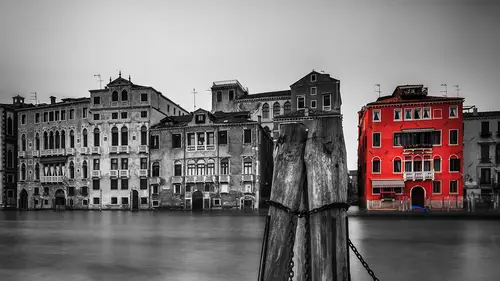
How to Add Haze in B&W
Lesson 8 from: Black & White Photography Post-Processing in Lightroom CCSerge Ramelli
Lessons
Establishing Black & White Tones & Processing
06:14 2How to Make a Simple Black & White Conversion
04:06 3How to Leverage Local Tools for Black & White Conversion
11:32 4How to Make a Black & White Panorama
16:03 5How to Master Presets
01:32 6Landscapes in Black & White
05:12 7Black & White Long Exposures
06:08 8How to Add Haze in B&W
10:13Lesson Info
How to Add Haze in B&W
Let's go and do a different style in New York. This was one of the day when it was raining all the time in New York. Raining, raining, raining, raining. And so I had. My daughter was an umbrella and and I was taking photos, but that they were was pouring rain all day for eight hours. This is the I think that they were about the most photo that went funding to the book, including this one. And so that's, um, the view of Brooklyn, I believe from the man Hannah. That's the Brooklyn Bridge that you see. But I'm sitting under the Maranon Bridge, shooting the Brooklyn Bridge something like this, but I'm not a new IT expert. Although I've done a book on New York, I'm probably one of the person in the world who knows the least about New York. But just on a book about the city, this is crazy. If you think about it, eso on this one. I want to do a difference time. I want to go the high key black and white. What I mean by that is, I am. Instead of going to see how it looks like a black and white ...
already. It's crazy. Haven't anything. I mean, there's just no collars on the bad weather. That's why bad weather equals black and white. So on this one, I'm gonna put in shadows, but the highlights and going this way I'm gonna go the other way. I want to make the highlights plus 100. And I'm gonna make strong whites not to blow everything, but like we had the limit and I'm going to go here. So I got my blanks here, and what I'm trying to do is there was a lot of haze and someone when you do contrast, it takes the haze out and I want to bring it back And hes can make really cool black like my photos. So it's the opposite where we've done so far instead of going, you know, the very contrast away I'm going to go the hazy Wait, So I'm gonna take this tool here, and I'm gonna make a greedy int, and I'm gonna go here now if you think any of these menus here and for example, this one like D. Hayes is gonna put everything down to zero except the haze, the whole idea of D. Hayes was to take eight out. So if I go right, it's gonna take hes out, Which is really weird in this photo. But if I go left is gonna add some A's. And I think I like that on this one. I want to add a lot of Asia on top and I want to do something on the bottom. I want toe, maybe not that much. And I still have not converted the photo in black and white. A looks like a black and white because it's just no callers. That's why you know, when I hear for the weapons say, Oh, you know, nice sunset or no nice colors? Yeah, I go shoot black and white. It's so great. So no, I added age locally here on top, here at the bottom, and I'm gonna go into the HS cell called Black Line. I'm going to my conversion and on this one, she didn't do much, you know, because it was hard, any color, so I can play around with this, and I think I went a little too strong on the haste there. But that's fine. I can always go back. Okay. Here. There's some color happening. So which way should you go? Show you go right or dark on that yellow witty, which the rule of thumb is create contrast. So if I go here, like if I go a little bit right, I'm creating a bit more contrast Green. Okay, Aqua. All right, Blue. Okay, purple. And I'm just, you know, looking one after the other. All right, so that's my black and white conversion. I'm gonna go here. I think I went a little too far. For some reason, the hay slider is really powerful. So minus 40 it was kind of crazy. Okay, but we need some kind of contrast. Something that a contrast with the rest. If it's hazy everywhere, you know, then there is no where to look at. You know, you just the eyes doesn't know where to look at. So that's a good question. Where are we going to go on this? So one thing you can do that's kind of easy is use a black slider to make you black starker, but that's not always gonna work out. That's not always going to do the trick. Actually, here you can see the range. We're obsessing Europe on this, like, on the window. And I was reading No, maybe not that this one was not raining anyways. But I can think of brush and I'm gonna try a couple of things. I'm gonna try to make Brooklyn a little more in contrast, like the bottom off, and see if that works nicer or not. So and if you're not sure what Slater's you've got going on, just pick anything like exposure. Everything's gonna come down to you except exposure. And ah, usually I paint with white and I'm painting was dark, and I'm like, Yeah, that could work. Let's write something else right through to just the boat. So on the boat, you don't have to just lower the exposure. You could just like, for example, as a contrast and lower your blacks and pain the boat, even mawr. Okay, I think I went a little overboard. She gonna hold on the option key that becomes any razor on this one. I'm gonna make sure that the auto mask is not on because it's just too many things going on. Like you want people to feel. What's the boat? What's the Brooklyn Bridge? It's not gonna work okay. And you get also going there and really, like, just paint. You know, you can just paint the boat and make it really dark, and, uh, to make it, like, sort of stand out. Oh, yeah, it is. It was raining and see We can see the rain here against I can see the rain I can see the rain and ah said etc before the brush stroke after several. But I want to make this stick out. Let's see if we can do better than that. Let's see if we can play around with the the white, Okay, the winds and the blacks. All right. And, um, let's go again on Brooklyn and see if we can have just a little more contrast in Brooklyn. So and it's really a trying their process to try to find the right balance to make the foot interesting limb or maybe a little more clarity a same time. And that couldn't that would work that kind of cool work. But I think I'm gonna make it stand out even more. Adding contrast, making the photo even brighter a little bit. Something like that, you know? You know what? I really don't like the idea that booking is like that. So I'm just gonna So if you want to know where you brushed, you can just overseas here, that's on the boat. And that's in Brooklyn. I can just raise about Brooklyn and leave it like this. Okay? And let's see the backslash key before after, maybe for the more interesting in it. And there's a way to go about black and white. I think on this one I might even go more crazy, like even brighter there and even a doctor on the blacks. If you make the foot of the exposure brighter and the blanks darker, it's just gonna make a much bigger contrast. But I really want a different contrast between the boat and the Brooklyn Bridge, because it is what's going to give it its distance. OK, any questions so far, my question would be, Have you ever used the nick filters? This? I think it's so, Yeah, I have used them for years and since a light from added this brush minus like they haven't technology called the U point. Technology is great, but honestly, I find, like from better Yeah, I find like you better because the U technology. You click on something, you make a circle and then you have different sliders. I find it as less precise than the brush in a circle that I can minus out, and and so I find it. Plus the presets. Preset is a huge part of my black from white workflow, like I just pulled a full on. Just click on the preset, and I like this so I didn't expect it. Preset makes the black and white so I mean, I think the big plus between the dollar people says, What's the big best about light room between Photoshopped and night room? The big burst. One of it, like I remember seeing 100 videos that tell gave like why you should choose light room over just Photoshopped Enbridge on One big thing is presets. We can do presets in Camaro, but there are painful toe import when it's really easy with with with a light room and you cannot save any local adjustment, which is really bad. And, for example, if you want to know how to instill appreciate it. So you do get my bonus preset on my website to insult preset is really easy. All you have to do is go toe light room preference and you see different times. Here you go to the second time called presets, and and you have something called show light from presets folder. When you click on that, it shows you're going to light room. It puts you liken, sort of like a confidential part off your hard drive. Make sure you can see the sub folders. And now, light room is really appreciate baseball. You got presets for everything. What you're looking for is developed presets. You see here the folder that we created earlier, Cold, uh, eight underscore she lbw with all the preset is right there. So you have to do is drag and drop the Fullers I'm giving you and they will. You re Starlight room and they will be there. So again, light room preference preset. Sure it. In principle, you don't have that in Camaro. Looks like the Adobe team was not, you know, hyped on pre Said they wanted you to do a light room
Class Materials
Bonus Materials