Lessons
Class Introduction
03:40 2How to Get Traffic to Your Online Store (With One Simple Marketing Action)
16:56 3But I Don't Have Time to Blog
12:36 4Setting Up Your Blog (as Quickly as Possible)
15:35 5Hot Seat: Choose Your Blogging Platform
03:32 6How to Turn a Social Media Post into a Blog Post
19:59 7Challenge: Turn a Social Media Post into a Blog Post
02:17 8The Role of Blogging in Your Business
21:15Creating Ideal Customer Profiles for Your Blog
18:30 10Hot Seat: Ideal Customer Profile
18:16 11Choosing an Angle for Your Blog
16:59 12Hot Seat: Choosing an Angle for Your Blog
05:14 13Challenge: Find Blogs to Inspire Your Content Strategy
02:46 14What Should You Blog About: Content Ideas for Your Blog
21:48 15Choosing Your Content Mix
01:47 16Hot Seat: Choosing Your Content Mix
06:58 17Creating Compelling (and Search-friendly) Post Titles
13:18 18Using Images in Your Blog Posts
22:51 19Tutorial: Creating Product Round-up Images for Your Blog
11:14 20Challenge: Brainstorm Your Next Four Blog Post Ideas
01:44 21Hot Seat: Four Blog Post Ideas
09:48 22Tutorial: How to Put a Blog Post Together
10:21 23Promoting Your Blog Posts
14:57 24Getting the Most Out of Your Blog
10:25 25Hot Seat: Blog Critique
06:22 26Measuring Results and Maintaining Momentum
25:37Lesson Info
Hot Seat: Blog Critique
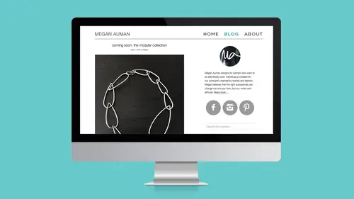
We are actually going to do a little blog critique and take a look at her site. So, let's talk about, we're gonna come back to your sidebar. I wanna talk first about your individual posts and how to optimize those. So we are on your blog right now. So, okay, we've got, here's a link at the beginning, right? So what do we have here? Featured collection, we've got a link, I'm gonna scroll down, we've got an image, which works really well. This is a really good solution to like, this is clearly a horizontal image. This is clearly your image designed for Pinterest, right? The one thing I would say about this is that even though text helps on Pinterest when things get found, I actually think the text here really sort of takes away from the coolness of the shot, right? So if I were a person who was looking at things on Pinterest, I might click on this, but I'm also not sure that I would re-pin it, because the text actually interrupts the image. So what I would probably do if you were making ...
these in the future is I would either move this text up above the image, or down below it. Yeah, usually I put the text near the top or near the bottom, Okay. but this one had a bunch of ugly ceiling in the middle, Aahh, all right. So I kind of covered it up. Fair enough, 'cause me, I'm like yeah, but I wanna see the ceiling. I would probably still move the text on that one. Sure. All right, so now, kind of looking down. So this is a pretty detailed post. So perfect, look at this! So right here, we have a call to action. Very nice, I'm assuming this goes to your retail. Look at that, perfect. I have no complaints there. All right, and then, look! Look how good this is. We've got a little bit of share buttons, and then we have this really nice Don't Miss Out. Excellent, I have no complaints on that one. All right, but let's look at another one just to make sure that we are linked to 'cause that's not a specific product, right? So we've got these emerald fun facts, perfect. Goes right to the product. We've got another call to action. Somebody here's been-- I've been listening to-- Somebody's been listening, and I like that. Fantastic, okay. So that's good. So I feel really good that you're optimizing your individual posts the way you should be. All right, so let's take a look at your sidebar. Look at that, lovely image, little bit of about, where does this go? So that goes to a collection, so the one thing that I would say is that right here, underneath your bio, I would add something to an about. Okay. So that it actually goes somewhere. The other thing that I'm not convinced about is that, because then this wear some sunshine text doesn't really so much make sense, like it sort of does, but I think that I'm not sure that I would put that, because I don't really know what that means. Sure, you don't know that it means the shop. Right, I don't know that it means the shop. So if I were actually using this text in this context, I might actually send it to something like about how you make it. Like you talked about there's a video of how it's made, so I might send that there, and then literally do a link that's like "Shop Jewelry Online." Any time we get clever with our links, people have no idea where they go to, and people don't like to click links if they don't know where they're gonna end up. So, we're gonna change that one just to say, "Shop Jewelry Online," and then maybe the other link is something like "See more about me and a video of how it's made," or something like that. And I don't know if that's on your About page or not, or if it's somewhere else. I think it's somewhere else. Okay, then you've got this, we're talking about something we're probably gonna be changing, That was my older call to action-- Right, we were talking about changing that, Yeah, we need to get rid of that. And that's fine. And then you brought recent articles in here, which is good. So this is how Shopify lets you do related posts. You can't do them at the bottom, but you can do them in the sidebar and that looks good. So you've got some related posts here in our sidebar. Did I see any social media links in our sidebar? Not in the sidebar. Okay, so you may want to-- Oh, they're at the top. But those are share links, not links to your thing. So I would just add some links to your social media profile somewhere in the sidebar as well. I know that I think they show up at the bottom, they show up somewhere in here, but it's not a bad idea to throw them higher up in the sidebar as well. And then, let's see, let me check my cheat sheet here. We've got links for other posts. I think everything else is good, just maybe fixing up the links to the shop and the About and the video. All right, and then lastly, we've got a link to your About page in your navigation, and a link to your shop, perfect. That's super clear, and then our footer we've got, oh, you've got your join now there. We've got our links to social media, we've got our links to everything, perfect. I feel really good about that. But while we're here, I wanna really quick take a look at your About page, because I wanna see if you can think about maybe adding, oh, there's the video. So, I wonder if you wanna move this up a little, just because your process is so interesting, like it's a pretty long scroll. One of the other things that I want you guys to think about, and I'm gonna say this really to you, because I know you like to write long, it's that nobody reads anymore. Like, let's be honest. Part of the reason that I pitch and advocate like, "Write short blog posts," is because no one reads long blog posts unless they're actually actively seeking information. And even like those info marketers who are like, "Read long blog posts," I'm like, "I don't have time to read a long blog post, "just give me like the details so I can move on." So in this case, I think this is good, and then like it's, it starts to get a little wordy. So I would maybe bump the video up, and then keep this text further down, so someone who's really, really into you, they can keep reading-- But break it up. But break it up with that video. That's the only other thing I would change. But you're getting there, and I think you've been doing that over time, right? Making that evolution, so perfect! Thank you. Thank you!
Class Materials
Bonus Materials
Bonus Materials
Ratings and Reviews
Trang Le
I don't agree with Megan's assessment that writing a how-to process will only attract your peers and competitors, not your ideal customers. I know a lot of graphic designers who post design tutorials frequently and it only helps raising their profiles. Writing a how-to post doesn't have to be like shooting in your foot because: * You don't have to share everything. There's more to great designs than knowing how to draw a certain thing. Composition, color, typography etc all come into play. * Even if you're given a step by step tutorial, it's very likely that you will stumble into a lot of issues or it takes you too much effort and time to complete it and it's better to hire a professional designer. Web building tutorials are everywhere, but web developers and designers still have their places. There's a big difference between knowing and understanding. * Even if you're professional designer, sometimes it's better to buy from your colleague than to make it on your own because no designer is excellent at every aspect of design and for a designer, time is as much valuable as money. For example, web designer may need to purchase custom typefaces from a font designers, and reading a blog which indicates that the writer knew his stuff will inform the web designer to make a rightful decision. Other than that, the course is rich information packed with a lot of actionable strategies and real fact about the blogging landscape.
Varvara Lyalyagina
I went straight to Polyvore and created a blog post. Not as fast as Megan was talking but who cares the blog post created and this is the best result of the training. http://hometocome.com/2017/05/plany-na-leto-2017.html Feeling super motivated. Megan makes it sound easy to complete and absolutely not overwhelming. This training is like a fresh air. Thank you!
a Creativelive Student
Lucky me! I stumbled upon this class and watched in live on air last night. I've now bought it! There is gold in this class and totally recommend it to anyone. Megan is so easy to listen to and I'm looking at her other classes too! Thanks Megan. You just made blogging a lot more fun! x