The History of Book Design
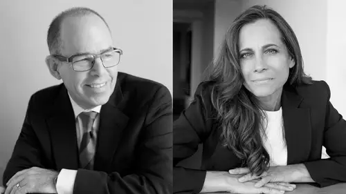
Lesson 2 from: Thinking Like A Book DesignerJessica Helfand, Michael Bierut
The History of Book Design
Lesson 2 from: Thinking Like A Book DesignerJessica Helfand, Michael Bierut
Lesson Info
2. The History of Book Design
Lessons
Introduction
06:13 2The History of Book Design
24:15 3How to work with Grids, Grid Systems, and Text
15:33 4Approaches to Art Book Design
41:26 5How Magazine Design Engages And Entertains
23:52 6Approaches To Fiction Cover Design
23:12 7What Makes a Successful Book Cover
14:57 8How to Approach Cover Design for a Series
24:23Detailing Book Anatomy Part 1
19:28 10Detailing Book Anatomy Part 2
13:08 11Approaches to Fine Tuning Typography
18:37 12Abbott Miller: Personal Book Project–Case Study
04:27 13Michael Bierut: Personal Book Project-Case Study
21:16 14Jessica Helfand: Personal Book Project–Case Study
15:57 15Best Practices in Book Design And Final Q & A
10:40Lesson Info
The History of Book Design
We're gonna do a quick dive into history, and let it be said as a caveat we could do six hours on history that's not what any any of us signed up for, so this is a bit of a cursory overview, a primer, if you will. We wanted to just sort of take you back to where books began, and where books began, of course, centuries and centuries ago with the Sumerian tablet, and for anyone who's interested in that, there are scholars far greater than Michael and myself who can talk about things like the erasable text, and you know, the Lascaux inscriptions on caves, but the idea that mark making existed before paper was something that could be easily distributed is something that it's worth bearing in mind. Yeah, and, you know, as designers, one of the things we do to the degree that we're actually involved with putting marks on paper, there's a tremendous act of confidence and optimism in that. What you're doing is sort of saying implicitly, these things are important and they're worth sharing an...
d I want other people to see this and I want potentially this thing to outlive me, this is from the 18th century BC or something? Yeah, so a long time ago. So and here we are looking at a picture of it today, it still exists, so whoever put those marks on that stone was thinking that he or she wanted to communicate with other people and we look at it now millennia later and that won't happen to everything you design, everything I design. Particularly if you design it on Snapchat. The design of Snapchat (audience laughing) is designed not to do that. A bit of a concern Yeah but, For future historians that aren't gonna -- but, but, but, yeah, so. But I think you know it is typography, and typography, our friend Ellen Lupton who will speak about it in a moment, once said that, typography is the common currency of graphic design. So it would be remiss of us to not bring this up as a thing we need to look at. It's often said that the first book was the Gutenberg Bible, these are examples of pages from the Gutenberg Bible and from early what they called Incunabula, early examples of printing, these are taken from the Yale, Beinecke Rare Book Library at Yale where you can see one, there are several, I think there may be one at the Huntington library here in California. And this is the moment where book design became mechanized. Became mechanized. And you'll see, you'll see, it was no longer done by hand but is done with moveable type, something that now we take for granted, the idea that we don't have to hand-write or draw every character as it comes out, but that role that technology plays in design overall, whether you're a product designer an architect a fashion designer or a graphic designer, is a theme that'll run through everything, And the reason the next slide I put up is of Bibles, is that I think that over time, after the Gutenberg Bible was introduced as the first example of moveable type, Bibles were the go-to vehicle for making books. And this is something, if anyone's interested in design history, and particularly the students watching this, it's important to not disassociate the artifact from the time it was just produced, so the degree to which liturgy and ecclesiastical knowledge and the church as an important social construct in the world existed means that Bibles were vehicles for books that were extremely important. On the left there in the corner is the Washburn Bible by Bradbury Thompson. We'll be speaking about him again in a moment, but -- That was done in the, It was done in the '80s. '60s, '70s, '80s yeah, early '80s, 1980s. It's about this big, but you know, that's a Josef Albers print I'm pretty sure Yeah. I mean so this was somebody Yeah that's Josef Albers. Who was looking to combine there, yeah. the age-old tradition and sort of majesty of biblical language and knowledge with something that actually manifested as a very modern form, so, in a sense it's -- And 100 years ago, that's, it looked like that, it looked more like a circus thing, Right. Because it's all about kind of trying to, what do you need to engage an audience with the text, right? And very centered, and so when we go to something like this, I mean, this is an example of the birth of lithography, which is only interesting in the history of printing because it meant we could actually replicate things more quickly. So graphic design junkies like all of us love these things that are on the right, which are called broadsides, and so anybody who loves typography will just start salivating when you look at these incredible things which were not of course done with any computational support, they were done on a letterpress, finding the type, locking it up. Metal type wood type, ink. Metal type wood type. But, but, this idea that type can be its own form of evocation and illustration is something that we're gonna come back to a lot today. They might not all look like this, but I think it's a great thing again to come back to this idea of design of typography as a common currency of graphic design. So now we're gonna move quickly through the 20th and early 21st century and move on from here but we wanted to just talk about some highlights, so Michael would you like to talk since I can't see We've got the early Modernists from the first part of the last century, Rodchenko and Piet Zwart, they began, again, I think driven partly by the possibilities of lithographic reproduction, realized that you could combine type and images in more provocative, aggressive ways, you could kind of use typography to mirror the way that photographs were working, you could combine shape and letter forms to make pages dynamic, so no longer is it centered and neat and polite, even if it's, has loud wood type, it doesn't have to be locked up anymore, but it's the pages are much more active, much more -- And if, they're saying, Provocative. If it's not already evident to you, I'm sure you've already figured this out, but I just wanna say, like, the scissors was their friend, right. (Michael laughing) these people were actually (laughing) extremely analog but like the minute you get away from your computer, every once in a while, it's not terrible to work this way. Yeah, no, no, there was experimentation, doing things you weren't supposed to do with the machines, using tools that weren't usually used to do this sort of work. We haven't included it in here, but John Heartfield, who was a famous sort of dissident early 20th century German collage artist was very interested in making these subversive political collages about Hitler. And when his collages were first exhibited in Germany, the curator said you must include the newspapers from which you cut the paper, in conjunction with the collages, because the public will not understand where these images came from. Right, which is such a fascinating construct when you think that like, we need, you can contextualize that, I can say they used the scissors and not Adobe Photoshop, but in the old days, it's actually interesting, again, in terms of history to think about how the tools at any given point that were available to us had a deep impact and influence on the things we produced. And then W. A. Dwiggins who is credited by some people for the invention of the term graphic design you know was a, like an early theoretician some of you I know are familiar with design writing, design criticism, he was one of the first people who sort of tried to codify what the principles of page layout and graphic design were, and sort of just goes to show you, even as, you know in Europe people like Piet Swart and Alexander Rodchenko were doing these extremely experimental things, this tradition of classicism still endured, parallel to it, side-by-side. Right so this is the 1920s and '30s and they're kind of goofy, these book covers, right, it's kind of like, I'm just gonna do a little, like, we need type, we need a subhead, we need pictures, we, it's like, so it's very like, (Michael laughing) it never occurred to him then, (audience laughing) and they're wonderful and they're iconic illustrations of the kind of work that happened then, but they're not exactly revolutionary in terms of pushing the boundary in terms of what a book can be, and so what you get to next is people who start to do just that, and this is an interesting thing, we added this slide because there's a wonderful initiative on Kickstarter right now called the Bolted Book by our friends at Designers & Books, I'm just gonna do a quick shout-out to them because they have taken this book which is really like a museum in paper, there are spreads that open up in three ways, there is something that the futurists, who were a very revolutionary, early sort of World War I era Italian group of artists who were interested in what they called parole in liberta, which means words in freedom. So the idea that you would do this, and then you would do this, and then you would do this, and then the entire book is bolted, right, so it becomes this kind of artifact, it becomes this kind of piece of sculpture. And what someone like Depero was doing, was he was saying look, we live, we are modern people, we live in a modern world, we're surrounded with machines, and he was thrilled by that, and so he's like, why are we binding books like they did 100 years ago, 200 years ago, we should do it in a way that modern people would do it -- And this was the machine age. The machine age. The beginning of the machine age and so there it is, the bolt. And they're actually reproducing this so you can actually -- Bolts and all, bolts and all. Bolts and all, exactly. Then we get into this kind of interesting thing, so this is Jan Tschichold and Jan Tschichold is known as the person who really got people to start thinking about what he called asymmetric typography. He's credited with many things, but one of them is being the designer of the first paperbacks, and we're gonna come back to this in a few moments but this idea of the series and how you actually take something that looks like one publisher did the whole thing but in fact you're referencing different authors, so what is same and what is different, how are you balancing what is variable against what is constant? What is the line between what is universal and what is unique? These are all principles you might say have everything to do with design, they're very beautifully illustrated I think in this series and we'll show a few other series later, and then there's this great quote by him because he was apparently something of a, what would you say, Yeah. How can I say this in polite language, Michael? He was a rather superior person about his design. Yeah, yeah, no, he was a real connoisseur, he was rightly respected, but he, he said, you know, "The master is permitted to break the rules, even his own." I can say especially his own. Yeah, but you're not, You're not allowed, none of us are, the master is allowed. but he is. (audience chuckles) So that comes out of that very kind of -- But you are all potential masters. Right, so, break all those rules. Break those rules. But not until after the end of the day. (Michael chuckles) You'll see throughout the day that tension between what are rules and principles, and when you're allowed to break them. Alexei Brodovich, who was a fantastic magazine designer who worked through the middle of the 20th century, designed a number of books that are remarkable because they really, every page is sort of done almost intuitively, they're, and he plays these marvelous games with, you know a model with a very long neck here, juxtaposed with a column of type with one initial cap, he just would do these things, almost kind of creating, these, page after page of like one-off beautiful balanced compositions, I've looked through this book many times trying to figure out what the grid was or how he was actually making it all work together so beautifully and I think the only way he knew how to do it was to do what, this picture you see here on the left, he would lay out the entire book on the floor so he could see the entire sequence at once, he would just walk around, move pages here and there, realize these three spreads work, the fourth didn't. And this is still a method that I would argue It's a fantastic method. Yeah. Any serious book designer I have ever known does this. Yeah. They might it on the floor they may do it on the wall, but you have to print it out, you have to look at the sequence, and then you move things around, it's actually quite enjoyable, maybe not great for the trees, I admit, but I think when you're doing any kind of publication, he understood that the rhythm and the sequence and the hierarchy and the balance and the narrative of these things depended upon looking at them visually in a sequence. And it's so hard to do that when you're on a screen all the time, isn't it? You know it's like, you need to get into it and see that level of detail on every page, but what's so easy to forget when you're in that mode is that this is gonna exist in a sequence, and your reader, may go forward, may go backward, may open in the middle and kind of flip through the pages, may open at the back and work his or her way to the front, right, and a great book that really is kind of well-resolved visually can work in all those different ways, provide the reader multiple points of entry, and someone like Brodovich was the master of that. He made his name as a magazine designer, we're gonna be talking about magazine design as well, a little bit, but I think because of that he knew he had to arrest his readers' attention, like at the, you know he was always like, I've got one chance to do this, no matter where they open it, I want to kind of get them into the story, right? And I think there's something else that I wanna add, which is that he approached the design as theater. So at a time, think about this, it's 1959 this book comes out, he's working in the '60s, late '50s and the '60s and he's looking at a post-war very buttoned down, very corporate almost fascist design world and he says, you know what, maybe pictures and words can actually have a more companionable relationship. Maybe there's a reflection from one side of the spread to the other, maybe I can actually work with that, and I think he was really the pioneer in this. Others will do it and we're gonna show you some who did, but he was we think a really seminal figure in this. And next comes Paul Rand, so some of you may know his name, rather a household name, big logo designer, ABC, CBS, Westinghouse, Colorforms, Goodwill, UPS, none -- IBM. IBM, none of these logos have fundamentally been changed since his inception, he worked alone in a little house in Connecticut, charged exorbitant fees, only worked with the top guy is the most important thing he ever taught me, like, don't deal with the middleman. Go top guy and things get done quicker. But he starts to look, and again, I could do six hours with Paul Rand, but I won't. He starts to look in the '60s and '50s at repositioning formal elements on the page, creating pictures out of shards of geometry, looking at the juxtaposition of a photograph to a letter form to a title. Understanding how color works in concert with the entire composition, and of course at the end of the day, how a book jacket transmits the value, the content, the spirit of what the author intended. So, these are just some examples of his work in the '60s that, and there's many, many more of these, but you can see, so we're going from Brodovich and his kind of serious elegant black and white play of photography to this incredibly magical, mystical, playful world. And it's no mistake, this guy really knew how to design logos, right, because you look at some of these covers, this one by Jean-Paul Sartre is called the Devil and the Good Lord, and that's what it says there, but before you read those words, you see Satan's pitchfork here, you see a halo there, you know it's gonna be about the juxtaposition of good and evil even before you read a word at all. That's the way a logo designer thinks and he's taking those same principles and putting them in the world of book design. And never shied away from using his own handwriting, which, you know, might not always end well for people, but for him (audience laughs) it seemed to actually be a tool that worked very well. And then at the same time, there's always been a strain of eclecticism best exemplified by in the '60s by a firm called Pushkin Studios that was led by Milton Glaser and Seymour Chwast, two amazing designers who are with us today. Just as I think Rand used his own handwriting with such confidence, Glaser and Chwast are both amazing illustrators and have always combined typography, illustration, design, and image-making just to tell stories, and in an environment that some of their contemporaries were getting more and more minimalist and rigorous in the Brodovich vein, black and white grids, serious white space, they were exuberant, you know and they were kind of dedicated to, in a way, carrying forward that language that you remember from those Broadsides that Jessica was talking about. You know, kind of really, book covers really saying look at me, look at me. And they also, it bears saying, not all designers start as illustrators, but the ones who do have this additional skill set. Yeah, and I -- And so they were a little bit fluid on the subject of are you illustrating with type, are you illustrating with an image, and how do they work together. I mean, Michael and I were looking at these images and putting this together yesterday and saying they look so redolent of the '60s to us, and that kind of Peter Max, 1960s Magical Mystery Tour Beatles, it was an aesthetic, but they very much made it their own and they were also both editorial people who cared about politics who cared about how the expression of the formal language they developed really benefited people that were just not the author but maybe and so there's posters and all sorts of the things they did but as book designers they were, I think, very agnostic on the subject of whether words or pictures were the way in. And they were dedicated to not being specialists, I think a lot of times, today more than ever, students and young designers and even older designers kind of make a decision, or sometimes their instructors make the decision on their behalf or they're told by grown-ups, you know, if you want to get ahead, decide what you're gonna do and specialize, and become known for doing one thing, and I think, if you're gonna be a designer, that advice is a potential trap. You can make that choice and you'd be successful in making that choice, but you need to be open to the idea of combining things and combining the skills you have and kind of not being afraid of developing skills you're not sure you have, and I think no one, you know, people like Milton Glaser and Seymour Chwats are somewhat unclassifiable, you wouldn't go to them for one certain thing, they could come, they could respond with typography, they could respond with drawings, they could respond with a combination of those two things and they did. I think it's fair to say they probably never sleep. Also this is like the level, (audience laughing) Both very, very busy people. There's the word prolific and then there's the word pushpin prolific, and I just think, I mean, material's amazing, a lot of it's online, you can see it for yourself, and they're both still around and making work, and it's really an inspiration for all of us. And then again, toggle back and forth between designers who I think are expressive in the way they work and the ones that are analytical. So, Muriel Cooper who was a brilliant designer who spent most of her career working at the Massachusetts Institute of Technology, MIT, was a poster designer, a book designer, became an early advocate and theoretician about the relationship of computers and computer-aided design and the way that type and the screen could interact, but when she was designing a book, she was very, very, kind of rigorous and rational in the way she would do it. This is a famous book called Learning From Las Vegas which was a study of the architecture of Las Vegas as an example for contemporary architects who were trying to learn how to get out of the, what was perceived as the sterility of modernism. And so she had tons of pictures, tons of text to work with. And the architects, Robert Venturi and Denise Scott Brown apparently hated this first edition. No they hated the first edition, yeah. It's iconic, because 1972, this was extremely modern and kind of forward-seeing. Yeah so they had many objections to this book that, but one of them was they wanted the book to be as plain and ugly as the front of a Las Vegas casino sort of, and I think Muriel Cooper was just fundamentally kind of unable to do that, you know, she just wanted to do something that was a perfectly worked out well-oiled machine we're gonna talk about grids later, you can sort of see the grid, it's pretty explicit, the grid that she's working with there, right, and the big concession she made to their desire to have something kitschy kind of coming forward that expressed Las Vegas was on the cover, there's a picture of the Las Vegas strip, and it's surrounded by sans serif typography which is printed on a glassine slipcase that goes over it so she's sort of like taking kind of the ugliness of Las Vegas and framing it with the beauty of modern typography and her authors did not appreciate that, every edition that came after this one reverted to something that was very plain. And this thing is now a huge collector's item and was, you know, sort of pre-eminent as a kind of progenitor of the kind of modern things that would happen later, but in its day, 1972 may not seem like it's that long ago, but to do this in the '70s when, you know, the age of pulp fiction and not terribly interesting books I think was really significant. So we can do a quick run through the next couple of decades. Louise Fili who's got a wonderful show up in New York if any of you have the chance to go see it soon, prolific, amazing, historical, sensitive designer. Really brought in the '80s this idea that typography could be this evocative form of illustration, extremely elegant, very well researched, the kinds of things you wanted to put on your coffee table, I know I did when I was a student, just like I would, anything she did, I wanted on my coffee table because they were so inspirational and beautiful and she continues to do work like this. So that I think was a bit of a departure from the kind of studied iconic architectural let's just move a little forward with the grid work that we just showed you from Muriel Cooper, and by the time you get to the '90s and the aughts, you've got Chip Kidd at Knopf who's one of many designers that you'll see some films today from some of his colleagues there, who's really coming back to this idea of book design as theater, of how the book cover can tell almost in prologue form, the beginning, pierce the veil between the viewer and the beginning of a narrative. So, obviously we're going to talk a lot about this today, how books are things we judge by their covers. How much do you give away, how much do you articulate, how much do you mimic what you think the author wanted, what do you do if the book's already been optioned and you're (laughing) dealing with the film company who has their own views of that that the thing can't be red or can't be black. So very playful in terms of illustrative, immersive, dramatic compelling narrative and also another prolific maker, and then. Then there's a whole body of work that actually interrogates what a book is, you know, books like every other kind of design object kind of have conventions that make them understandable to us as books, could have covers, they could have pages, pages are bound together in a specific sequence, but then through history, people keep pushing against those conventions. If it's bound does that mean it has to be glue and string, or could you use bolts? The pages, do they have to each be intact, or can you cut into the pages, so you can reveal the word beyond, can you have them fold out, can you kind of provide, sort of I think as Brodovich was trying two decades earlier provide an experience that was really an active one where you could go forwards and backwards, and I think, you know, the work that, that designers go into when they do something like book design is sort of respecting both the conventions of that tradition but kind of not taking any of them for granted, and being ready to do what's necessary to have the material really come to life. And sometimes it's helpful to do sort of a deep dive into what the barest component parts of the book, the letter forms, the columns, the grids. These are books that are taken from a very interesting design firm in London called Visual Editions, the one on the left is a book by Jonathan Safran Foer and it's my understanding that Safran Foer was involved in this. So thats's kind of interesting, when a writer does not believe that the actual product of his or her efforts is so sacrosanct that it can't be re-envisioned in context, collaboration with a designer, like, could you actually evoke a different story, could you magnify certain aspects of that story, so that I think going forward, I mean, there's book sculptures, there's experimental things students do but the idea that writers would get involved with designers to think about what that book can be as a sort of sculptural provocative form is a very exciting thing that hopefully will continue. Our quote on that page is from a writer, Aldous Huxley, who says, "Words can be like X-rays, if you use them properly. "They'll go through anything. "You read, and you're pierced." And I think it's the role of designers to kind of heighten that effect. How do you take those words, read them, kind of come to take them into your own heart and figure out how to make them as powerful as possible on the page.
Class Materials
Bonus Materials with Purchase
Bonus Materials with RSVP
Ratings and Reviews
Leonie Holzman
I had an opportunity to be in the live studio audience for Thinking Like a Book Designer. The session was rich with content, taking us through the whole process of what goes into designing a book as well as interviewing top book designers in the field. I also appreciated the lively exchange between the presenters Jessica Heifand and Michael Bierut. As someone who over the years got burned out as a graphic designer, feeling more like a machine than a designer often times, it reminded me of why I was drawn to become a graphic deisgner in the first place.
Sonny Pham
I had an opportunity to attend this amazing workshop by Michael Bierut and Jessica Helfand. I was gained information about the history of book design, the do's and don'ts, and even insight on the industry itself. It was a surreal experience! My favorite part of the lesson has to be when Jessica and Michael interviewed other artists about their books, with an very in depth analysis on their design choices and process. After seeing Michael explain his design process for his book, I bought it after the class was done. Definitely worth the money for the lesson, and will be back for more!
Anna Pankin
Very engaging and informative class! My only 2 recommendations for the creators (if they read the comments) would be to add a pdf file of the presentation available to download (since it has all the references and visual examples) and, as someone below already mentioned, it would have been nice to actually see the magazine and book pages close-up just as they were being discussed in the videos. But overall I loved the course and the lecturers, who are a true inspiration.
Student Work
Related Classes
Graphic Design