Lesson Info
14. Your Visual Style Guide: Brand Colors
Lessons
Day 1
1Creating Your Logo in Illustrator
18:16 2Why Branding Matters for Your Business HD
21:24 3The Core Emotions Behind Your Brand
45:28 4Great Products are Key to Strong Brands
25:35 5Does Your Product Generate Emotion?
31:32 6Finding the Core of Your Product
22:18 7What Does Your Brand Stand For?
32:52Naming Your Business & Products
20:58 9Creating Your Tagline
32:32 10Creating YOUR Brand's Story
35:45 11Sharing Your Customer's Stories
20:37 12When To Tell Your Own Story
20:44 13Your Visual Branding Basics
26:27 14Your Visual Style Guide: Brand Colors
24:05 15Your Visual Style Guide: Your Logo
26:41 16Telling Visual Brand Stories with Photos
29:24 17Brand Photography & How to Protect It
44:45 18Creating Your Complete Brand Package
37:44 19Your Branding in Print Materials & Online
46:38 20Implement Brand Strategy Quickly & Easily
20:44 21Brand Strategy: Where Do I Begin?
33:47 22Making Branding To-Do's Manageable
20:34Day 2
Lesson Info
Your Visual Style Guide: Brand Colors
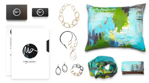
Once you've created that mood board now you can use it to create the visual style guide for your brand, so we're going to take those images and those things we were looking at and translated into the actual color palette font logo, all of those things. So what is your visual style guide and that's really what it is this collection of colors, fonts, logo's images and language and anything else that tells you about the overall style of your brand, what we're really creating here is a tool, so major companies are going to create these visual style guides because they might have lots of people working on their brandon anyone point they've got advertising, they've got web developers, they've got graphic designers for a lot of us is just us, but it's still becomes a handy tool to rein yourself in right? Because you're creative and suddenly you're like, oh, but today, you know, I I know my style guide says this, but I really, really love purple, right really love purple today were like, no wa...
y go back to the style guy look at what we've got there and then the other great thing about creating this is that if you do need to work with a graphic designer, if you don't have the skills to do your website or your logo design by creating this visual brand guide you can go ahead and present that to a designer so you've already helped them out this is the vision that I want for my brand so I'll show you mine you can have an example of kind of how this works and then we'll talk through all of these elements for your brand so when you're putting together the brand style guide, you're gonna have your fonts and you want to be really selective here and we'll talk about fonts more in a minute but you can see I use kind of have helvetica new light is my main fund and I'll use the ultralight or the bold and then every so often I used as an accent handwriting and it typically this is not my handwriting here but it's my you typically my handwriting I'll use that as an accent fun you're not gonna look at my website and see my hand right for like three paragraphs of gadhafi that's really obnoxious but all uses an accent you'll see it comes up in my logo's and then for me the main colors are white and like a ninety percent gray if we're being technical benjamin moore's deep space is my cut grey of choice but something kind of in that range and then you can see I've got a serious of accent colors so I'll use other shades of black and gray where it makes sense and then this sort of muted blue green and you can see all of those colors if you go if you remember the mood board that I showed you, those all pop up in my mood board so you've got your funds, you've got your colors, then you're gonna have other key elements of the way that you style your brand. So for me, name presentation is important. My name khun b all caps or all lower case if I'm referring to the business, it's never capitalized it's of thing that's important to me in my mind distinguishes the brand for me is the person on other really big keys to my brand it's, matt or satin finishes never glossy, glossy does not exist in my world, and these things are really important to know these air those little details that are really key. So I think in monica's case you might be the opposite. It's never matter, son it's always gloss years just always covered in glitter glitter everywhere, right? And then for me, there's that there's a subtle use of texture, I'm going to use texture, but not in a really crazy over the top way, but sometimes it can I'll use it to break up big fields of white or gray, and then you've got your logo options, and I'm using a couple different local options here. Actually went through uh a logo redesign this year so if you look at the bottom the mega nomine where it says make a statement every day people were asking where do you put your tag line? Sometimes you put it right in your logo um you know, I started with this, you know, hand written a version of my name and that was a decent place to start and I use it a lot it still works in certain situations, but what I found was that I needed something that could kind of be a shorter, more visual, punchy logo, which is where I came up with the element and you can see I use it in in two different ways I can use it by itself or I can use it set into a circle so now I know that if I need a logo in a situation, those are my choices, right? So that's what you're really going to dio with your visual brand guide us you're gonna give yourself all of these elements the fonts, the color, the logo and any other presentation notes that you need so to start on your visual brand guide you're going to come back to your mood board and you're going to figure out what's already there that gives us some information to work with and we kind of talked through some of this with our group here so what key visual elements appear on your mood board and what key visual elements don't appear the things that don't appear are as important as what does so if we take a look at mine again you can see what appears got contrast hardness but with texture it's very urban it's black and white and gray and cool colors and what you're not going to see is primary or pastel colors that is not a color palette that's gonna pop up in my world you're not going to see things that have this kind of like over softness or femininity there's not going to be not putting in like pink and sparkly and there's nothing wrong with that it's just not my brand it's cathy's uh you're also not going to see things that are really traditional or country like it's my vibe is much more urban and industrial and again no super shiny there's no there's no crazy it's all that matted texture happening so if you know this just based off of your mood board you can start to put together your style guide really easily you know so I think for you sarah we didn't see with the exception of that bright green but it's still a warm green we didn't see any cool colors years is really based on those kind of the stages of the fire and that nice grey so that's important I think to keep no in your branding all right, so let's establish your visual got style guide let's figure out what's important for you so we're gonna start with color and color can be a really powerful way for people to remember your brand you know, really iconic brands people can associate with them based on their colors you know what that is don't make a sound I'll see uh that one might be a little harder still it's still food service I'm starving. How about that one? Tiffany yeah that's tiffany blue right there, suzy certain colors or color combinations become really iconic for a brand and while you may never have tiffany blue or blue baton red you might I still get to a point where people are thinking of you and associating colors with you and that's really what we want so choosing your brand's colors you want to focus on one or two main colors that's it it should be a combo of one or two that are always going to be your primary and this is gonna be an interesting challenge for you, sarah because we're talking about a broad palate here. Then you could have your accent colors and again stick to a limited color palette. So unless you have a really compelling reason to say my brand is the rainbow it's probably not it's probably something a little more kind of tone down and then make sure they're choosing colors that did the emotions behind your brand so cathy is all about happiness? You're not using blacks and grays I mean you might use black is a pop but you're not using it as a color that's really critical to your red using something brighter and happier right? Because that's what we think of only think of happiness and you do want to avoid colors that air strongly owned by another brand in your space so here a jewelry designer I wouldn't make your main color something similar first well, you can't make it tiffany blue they own that color but I wouldn't go similar to that right it's going to be hard to own that because someone else in your space already does and I think that's something that we see a lot where you know people get in these habits of oh everyone else is using that color and I love it I'm gonna use it to and that just cause your brand to blend in don't you ran to stand out so we kind of talked about it a little bit but if you're gonna identify kind of your main colors in your accent colors monica, what would they be and you guys can share on line two if you want my mean accents will remain color and then your accents so that my my main color would be the black, the black and gold and then the accent I think that I should have won accent that I keep us a staple and then one that changes with the trends or you know, so what do you think about me for that one accent? Probably something along the lines of that gray, purplish blue ish, you know, kind of tent, yeah, and, you know, when it's funny I'm actually looking at you and what you're wearing right now, and I'm sort of wondering if a shift to like cream instead of the pure white might also be interesting for your brand, I think that's something you have to play with a little bit, you know, I'm just looking at it, you, right now and you, what you're wearing feels so upscale feels like the embodiment of what we're talking about right now, so we're just gonna pull your color palette from your might also be a color palette that I like to totally biased, but I like that idea of maybe thinking about a cream instead of a white, it might feel more, you know, like when you would pick like the cream wedding meditation over because I'm your mom, she did that right, right? Because, you know, she got when she got marriage had that nice cream instead of the like, really garish y it totally something to think about like it, cathy what do you thinking? Main colors and then accent? Well, I do like black and white because they do a lot of contrast and gold is kind of hard to depict in terms of you know yeah and it's hard to get that when it's not actual metallic sheen it looks yellow looks yellow right s o actually, I was I really like peach and I think it can also be kind of adult ish and also remind you of a child I neutral but peach could be understand I'm wondering that's got enough pop for you? Yes, he and I really like pink too, but it seems so I don't want it to be defined by pink is pink is such a strong color, right? So but maybe if you kind of stayed in that like peachy pink mammal you did kind of like the blast wiped with the like muted dusty pinks and peaches and they that could potentially work for you. Yeah, I also like green because they think it's just very natural and kind of brings you back to like a natural element but that's what time it feels brand yes so I think I think it's okay like green with me it has to come into the brand and I think based on what we looked at with your mood board, it does feel a little bit off brand to you and the other thing is you know, when this is something that I think applies to you know, both you and sarah is that the color palette of your brand might not necessarily be the color palette of your product so like you use the gold but that might not be the colors that you use in your brand died because it doesn't translate in quite the way that you want sarah so what are we thinking for your main and then your ass so I love the gray that smoky but not a cool great award, right? Yeah, toby not tope yeah, you know that one dry warm gray that like in the in the color if you ever had those like the colored pencils it's the french grey something it's a little dormer yeah, yeah, yeah like that warm it with a and like a chocolate brown with red I like red but I wanted to be an accent so you're s o then your accent. So if you've got that warm gray and like the chocolate brown than your accents become the the red, the orange and that like yellowy green that's not too much as your accents no, I think those air used sparingly remember accents, air sparing you know they're they're very and I think if we're looking at your kind of proportions of that the red is going to be the accent that's used most, then the kind of armed yellow, then a bit of that green is that's my favorite color short truce is my favorite color, so and I think you can use it sparingly because it makes sense for kind of the story that you've crafted so we can figure out, you know, wait, you went where that goes, but I think you could pop in here there, and I think there's something too, you know, if you're trying to people to think about moving through these transitions, that's a really hopeful color, I think that's important to kind of have those little glimmers of that hopeful color there for your audience. Awesome, yeah, I mean online it's interesting because virginia creepers saying, I'm being really inspired by this pinterest mood board exercise, not inspire events saying my main colors are hot pink and black, which really is funny because I'm not a pink person at all. But then they said they use accents are gray from charcoal to light gray with gold and silver accents on they feel that these colors allow the photos from the events they're creating feature the client's color choices. To help them or pop, sorry to help them pop mohr and being visually appealing to the potential clients I like interesting on dh then may studio says, I actually tried to do a mood board last night, but I discovered I don't really have a clear direction in emotion for my brand so that they've really discovered that by following this course so that they were finding that actually quite difficult on you, and then the flip side might be if you're kind of stuck in that area is start from that visual and so sorry pulled together the images that just resonate the most with you and then ask yourself, what's the emotion. What emotions are you seeing in those images? A lot of people sharing into some of the same colors that are in the studio ordinates thinking about hudson whole day says thinking pink and brown d the dream missus, I like vibrant purple, but I'm not sure of the second color and it's okay to have one color is your main color to you don't have to do a two color combination, so like he like that vibrant purple, own it, and then you could mix in your accent colors, too, because you're probably not going to do like the entire background of your website and vibrant purple. You might but it depending on your brand it's hard to say but you know go ahead and own that is your one main color and then figure out, you know, kind of build the accent palate around that on the county arts is saying neutral earth tone browns and greys what they use with a blue turquoise accent nice awesome I like you guys need to start sharing those mood boards for the gallery because I cannot wait to see all of this stuff during break I'm really excited awesome. So now let's talk about your fonts and this is you know this is an area that's a little bit harder for us to talk about because we're not pulling up funds but you really want to stick to one main font family and one accent fun that's it to to all my graphic designer friends are like yes please tell them to um you also want to avoid outdated gimmicky over the top fonts no comic sands know times new roman if it's if it's the default don't use it now times new roman no pope iris that one makes you feel like you build your brand two thousand and then forgot about the world uh so you know if you're not sure about fonts, hire a graphic designer or ask a graphic designer um you know, talk to someone about fonts because it can really make or break things and then you want to make sure that you have permission to use your font commercially so don't just go in google free fun like why like that? Because I might not be a commercial license, so you just want to check on that to make sure that you have permission to use it because you'd hate to get in trouble for infringing on you know the copyright of someone's fought and that have to change everything that you're doing and then make sure that you pick an easy to read font for the copy on your website so there is a small possibility that the copy on your website is it might not be your main font or your accent fun, but I would highly recommend that between one of those two between your main or your accent one of them should be easy to read easy enough that you can put it in a block of text. So are you guys using any specific fonts right now? What do you guys using? Monica sweet cheeks is done in lily script um and then all that accent stuff is in the clicker script and then like the my red or whatever, I don't even I say it that standard the myriad or miria you like see these things you're like, wait, I know that word, huh? And I think this is a case for you where you might have to re evaluate those sponsors about total names. I think that the the sweet cheeks name font is a little a little cute c for where you're going with the grand gala agree? So you'll you'll kind of make some switches there for sure. How about you, kathy lately I was using caramel caramel guy over and then the italic persian and then the in persia, actually, you're using all the versions of that. Yeah, yeah, but it's hard sometimes on certain platforms like blogger things, they only give you four. We're gonna address that issue later anyway. I mean, yeah, yeah. So and you feel like that fought really kind of gives you that happiness quality? Or do you need to bring something in that's a little? I mean, you're you're using your handwriting in your art. So that might just plan as your other font anyway? Yeah. That's. What? I had a question for you about that because you you said that you used your signature and things. Did you just do that on photo shop and then just pds f it or resize it into, like, a fun? And I love that you asked that question, so I actually draw everything. Either I draw, I draw on the ipad, and then I actually bring it into illustrator to create a vector file so you can actually go in because that's really what you want to do it. And the reason for that is that the vector file lets you scale up or down so you could take something. And if you need to make it as little as the fabric on, which is that little icon next year, girl, it could be that big or could be big enough that if you wanted to make a billboard tomorrow, you could do a show and that's. Why we don't just take it in the photo shop. So, yeah, that's. The way that I would do that is bringing into illustrator vector rise it and then and if you're really committed to wanting to actually type with it, you could then go ahead and have it made into a font. There's some services that do it, but they're not great, like if you have a fuck if you connect your letters together, which is how you write and I right. The cheapie make your own fun versions don't work very well but you could hire someone to do it okay depends on how much you want to be able to use it yeah, I was thinking of just a glimmer of gold to be with my writing you know you have something like that I would just pull into illustrator and and you break your file you up and you just use your pen your stylist I use um like a silas and I actually drawing on my ipod I don't know I don't have a walk on so I just brought my ipad and bring it in there but I used the silas and use a drawing up. Yeah, well thank you, it's really easy it's a really nice way to do that if you're using your handwriting as an element what what program did you use on your ipad to sorry I just use the pay I think I just use the paper app okay. Yeah oh, you just draw a straw. I just yeah, well, good to know. Thank you. Sarah. What about you? Are you using fonts are you kind of were going? We'll work on that. I mean, I have my my logo which was made by a graphic designer a few years ago and but I obviously need to just redo that anyway so well, because you're probably going yeah, you're starting for us your only through a probably a name change so right awesome are they saying sharing a fast online yes and in fact georgia and guarantee on seemed to have won by a landslide it seems to be the two that most people are using but others the same scam a janis saying she's doing the same thing she's scanning her own handwriting so she has her own you nique phone yeah, and one thing you keep in mind is you know again so this is an area where you can try to differentiate a little bit so for hearing georgia and gary mon come up a lot the savvy ones if you're hearing that and going let's pick something different right? Because we were really trying to differentiate ourselves so I mean she never questions saying I have several products within my business should my business name have a certain font on the products that I carry have other funds? I wouldn't I would keep some consistency there so I would pick and it and it might be that you know the business name uses one fun and the products used the accent fun, but I wouldn't go off and feel like you have to use one fund for every different product because that's really where we're going to start to lose that brand recognition then a great question so then when you're creating your style guide you also need to figure out what other key elements are important to your visual branding are there going to be textures are there going to be patterns? Are there other design elements that you need to show a motif something like that know what's really important? So we talked about the chevron for you monica is there something you're going to kind of keep you think moving forward or um well, we have chevron and quatro foyle and I think that I'll probably ditch the chevron and just keep the quattro foil okay, so you're and use that is it as a design element? I think so awesome how about you um transitions? I feel like it I like to keep it I stick with the black and white a lot but I just like to keep it different sometimes it's stripes you know? So you're playing when those yeah playing with it to keep it just interesting and knew all the time but always kind of maintaining that black and wait okay? And you probably don't have any quite design elements yet that you're still don't so working with going to have to start from scratch and that's okay, I won't be fun and it will be fine I think that's you know another thing to keep in mind here that this is an opportunity to play again you get to really, you know, start from the ground up and and reimagine what your brand might look like so the visual brand guide is going to help you develop consistency because as we remember ah brand is an emotional connection repeated over time so we've really been talking about this emotional connection piece and especially because now you guys are probably doing this work either for the first time or you're really reevaluating your brand so we have to get that piece down but once we get the elements we have to focus on that repeated over time part we have to be consistent goes back to that idea of you know when you're meeting someone and falling in love with a person they'll do something and they might do something the same way and then if they do something that seems really inconsistent or out of character that really changes the way we think about them and we're like hold on this person isn't what I thought who they thought they were and the same thing happens with your visual brand elements so obviously if you go through a big intentional redesign we get that right people get makeovers sometimes it's timeto evolve and spruce things up but if you know sometimes you use this font and this spot on the spot and then you're like chairman was that fun or it's like a black and gold black and gold black and gold purple and green today but then tomorrow I'm black and gold and then I'm like pinkett aren't for something. You know, you can't do that. You have to have that consistency. So the brand guide really lets you keep tabs on that, and when you're not sure and you have to make a decision, you go back to that brand guide got today. It really like purple know the brand guide says this. Remember, like you just like purple today, because it's fun, that's for your hair, you can change your hair, you keep your brand consistent. That's, my rule.
Class Materials
bonus material with purchase
bonus material with enrollment
Ratings and Reviews
a Creativelive Student
I was drawn in immediately. Megan's ability to tender precise, goal-oriented, and REAL life experience-infused information is what captivated me the most...AND...I logged in 30 minutes late on the first day of her class. I am excited to know that her course is STILL available, and on sale a couple of days after it aired live. TY CreativeLive for this opportunity; it is truly a gift to myself which will keep on giving...I have often used storytelling to build my brand, but Megan's guidance has given me a structured approach, which I really needed. Paying it forward, and sharing her amazing course with others will be a joy, as I feel an obligation to others I know, and those I have yet to know, all who will benefit from her plethora of carefully cultivated information. Her use of emotional connections to build a brand, and to reach a solid audience based on one's authentic voice is clear, clean, and easy to follow. Thank You Megan Aumen!
Visindie
This is such a great class! Great content, great advice, great examples...great, great, great!! I'm so happy that I have a clear path to create a great brand for my business. Very empowering! I especially love the bonus information, especially the video on how to make your own logo in Illustrator. Exactly the information I've been looking for. Great job, Megan!
Laura Captain Photography
I'm in the process of launching a creative business and this class was what I was looking for. With procrastination and indecision cast aside, I will now confidently plan and carry out a productive and well organized branding strategy of my own. Before this class I felt somewhat confused and overwhelmed by all the miscellaneous branding information I had been trying to piece together. Even though I already knew some of the information she covered in the class, she put her own spin on it, gave some great examples and put it in an easy to follow plan. I particularly liked the segments related to naming your business and social media branding because I had a lot of questions on those topics. I'm very excited to get started with branding my business and I'm so glad I took the time to go through Megan's class, it will be so worth it in the long run. A big shout out to Megan, I love your business branding, your jewelry and your teaching style, great work!