Compositing Model: Cut out and Color Matching
Lesson 7 from: From Shoot Through Photo Editing: Building a Composite in PhotoshopAaron Nace
Compositing Model: Cut out and Color Matching
Lesson 7 from: From Shoot Through Photo Editing: Building a Composite in PhotoshopAaron Nace
Lesson Info
7. Compositing Model: Cut out and Color Matching
Lessons
Class Introduction
07:08 2Shoot: The Book Scene Background Shots
24:51 3Setting Up and Testing for Model Shots
24:00 4Shoot: The Model Shots
17:11 5Culling Images and Merging HDR Shots
13:31 6Compositing Background Images
15:39 7Compositing Model: Cut out and Color Matching
23:43 8Making Shadows Realistic in Photoshop
25:03Lesson Info
Compositing Model: Cut out and Color Matching
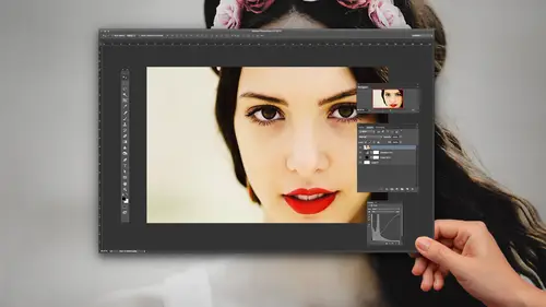
I think we're in a good place for now with our background. We're ready to start bringing in our subject. So as we do, I'm gonna go back. We're gonna open up Lightroom again. There we go. I'm gonna go ahead and filter this by our flag, by our picks. And we're gonna choose the image of Adrian that we actually want here. To do this, I'm gonna make sure to zoom in to 100%, so we can actually see what image we want. And we have a lot of options here. I like that, that's really, really cool. We have a lot of options. So, if we get one of these composites in, and we decide we don't want it, we can always change it. That one's really nice too. Dang, Adrian just ... He's got a look about him, man. I just wanna photograph that guy all day. He's so, yeah he's perfect. Adrian, you're perfect in every way. (laughter) This class just got a lot more weird. Yeah, he's awesome though. He did such a good job. Cool, I like that image. I think we're gonna start off with that one there. So, what we're gonn...
a do, we're gonna right click here. And I'm gonna go down to edit in, and then we're gonna edit in Photoshop CC 2015. And it's just gonna pop it from Lightroom, straight into Photoshop. Alright, cool. And now our fun begins. So I actually don't need this entire frame. So I'm only gonna grab part of it. I'm gonna use my lasso tool, and we're just gonna do a very quick cutout here. This is, again, just ... We're gonna obviously cut him out a lot better in just a minute, but this part of the composite, we're just gonna select that area. I'm gonna use my move tool, and then shift, click, and drag from one document to another one. And that's where Adrian comes in there. Alright, let's go ahead and there we go. Close that out, and hit fullscreen on this guy there. Alright. So now what we wanna do is, we're gonna change our opacity, and we're gonna get Adrian in the right place. So I'm gonna focus in on his feet to start off with. Just to make it look as though he's actually walking up. There we go. To make it look as though he's walking up the stairs here on this image there. Alright, cool. And we may wind up cutting off part of his foot there. We'll see as far as scale. How does he look as far as scale goes to you guys? Does he look about the right size, or should we make him a little bit smaller? A touch smaller. Little bit smaller? Okay, cool. Now to do that, we're gonna hit command-T. We're gonna take our little control point, and I'm actually gonna bring it down to his feet, because his feet are in the right place. We positioned them with the stairs. So I'm gonna hold the shift key, and the option key as well, to make him a little bit smaller. Now if we want him to look, if we want the size of those stairs and these stairs to match, he's gonna be right about that big. Alright. Cool. So there we have Adrian in the right place now. Let's bring him up a little bit. There we go. But you can see from one stair to another, we're just kind of matching. There we go. And where this foot cuts off is at the right place with the other stair. Can you guys see how they kind of blend together there? Alright, cool. So now we wanna go ahead and cut our subject out from the background. And to do this, most accurately, we're probably going to be using the pen tool. But to give us a quick preview, we're gonna try using the magic wand tool. The reason we put a gray backdrop when we photographed our subject, is to make our job cutting him out a lot easier. And you can see, if we had a brick wall, or something like that, or a regular room behind him, it'd be quite a bit harder. But for now, we can use our magic wand tool, and I can just click on our image. Now, if you do select out an image, like I'm selecting this area out, and you can see it actually selected way too much. It selected not only the background, but also inside of our subject. So we're gonna bring our tolerance down quite a bit, and that just basically selects less of an area. So, if you select too much, just bring your tolerance down. You're good to go. Alright, cool. So let's bring our tolerance down just a little bit, and then you can always, if it doesn't select enough, just hold down the shift key, and add to your selection. And that's a really good way. There we go. And I'm just holding the shift, and clicking a few times around our image, and that's just helping to add to our selection. Each time I hit shift and click on our image. Alright, cool. And we can even do the stairs here as well. We might not need to use the pen tool, which would be nice. If we can get this all with the magic wand tool, and then a couple of refine edge, then that'd be really great. Save us some time. Alright. So that's a decent selection around him. His feet aren't perfect, but that'll work for now. So we're gonna click on our layer mask tool. Alright, and now we need to invert our layer mask, so we're gonna hit control or command-I, to invert our layer mask. Alright, and let's go ahead and get rid of the stairs underneath our subject as well. Alright, and we can zoom in. Now, I'm seeing a couple of things here. I wanna kind of point out a few things. First, the stairs that he's on are a decent bit less saturated than what's going on here in the book. You can see there's a lot more color here in the book, than the stairs that he's on. Not only that, but the darks are quite a bit darker here in the photo of Adrian, than they are in the book. So, if we need to bring the darks down in our book photo to kind of match that, we wanna make sure we do that as well. We don't wanna have really dark shadows on our subject, and pretty light shadows on our background. Those wouldn't match. Normally they would have the same shadow levels. So you wanna make sure those two things match with a composite image. Alright, cool. So we'll just paint this area away. There we are. Alright, and I'm just using my brush tool to do this right now. Alright, and you can see our edge is not perfect around our subject there, so we are gonna use a refined edge, just to clean up that selection a bit. Alright. And for this area, I'm gonna use our polygonal lasso tool here. And I'm gonna basically just make a point right up there on that part of the edge of the book, that stair right there, and then another point right over there, because that's the area that we actually want to make sure that he's cutout from. And it looks like we need to maybe move him a little bit forward, in order for that to work, because of where it actually cuts off with the stairs. Alright, so let's move him a little bit forward there. We're gonna go back and transform this selection to be right up there. Alright, perfect. And then on my layer mask, I'm gonna fill that with black. So where the page ends, that's where it cuts his foot off as well. Alright, very cool guys. So this is the start of our composite. Basically, he's not perfectly cut out here. Things don't really look that bright. This is just where, this is our starting place. So, what I need to do from here, is to make this look a lot more realistic. We need to make sure ... Right off the bat, I can see that the darks on my subject are a bit darker than the darks in my book image. So we're gonna get started off with that. Now, also, some things that you can do to kind of help yourself out, whenever you're doing a composite image. One of those things is, I'm gonna grab an adjustment layer, and we're just gonna go up to where it says black and white. Alright, so a regular black and white adjustment layer. Now, if your image does not work, especially when you're compositing, if your image does not work in black and white, then it will not work in color. And it's actually a lot easier to make a black and white composite image, because you don't have to worry about color. Color is a huge, huge thing. So, I would always recommend, whenever you guys start composites, I would always recommend turning your image into black and white. That way you can focus on your shadows. You can focus on your highlights, and you can get those right. And when those are right, then you can focus on your colors. But, start off in black and white. It's gonna make your job much, much easier. Okay. Very cool. So, starting off in black and white. What we're gonna do, I'm gonna grab and adjustment layer here. We're gonna go up to our levels adjustments. Okay, and this is underneath our subject, by the way. Right? So I don't really have to worry about affecting our subject. What I'm doing is I'm just matching our subject. That's too dark. That's too light. What we wanna do is figure out a place where it looks like the shadow levels in our image actually match the shadow levels of our subject. And we can see, that's a little bit too dark. Working right about there, we're getting to where those actually start to blend together. And it should be pretty obvious. You should be able to just look at the image, and see what makes it look a little bit more realistic. So, working on our shadow levels here, really does make the image a lot more, it brings them together. Now, the reason why I'm making my shadows darker on my background image, instead of lighter on my subject, anytime you capture darks with a camera, and try to bring those lighter, you're gonna lose a lot of information. That's where grain and noise and things like that start to come in. But if you have a good exposure, and you make that a little bit darker using curves or levels, then you don't run into the same problem. So, rather than trying to make the shadows on my subject brighter, I'm gonna make the shadows on my background darker to match him. Cool. Now, if we were, let's say we had a couple more hours to do this, I probably would have filled in the light with, maybe used a slower shutter speed when photographing our subject, so we would get a little bit- so the shadows would be a little bit brighter on him as well. But, that's, because some ... There's always gonna be something that doesn't go perfect during a photo shoot, so that's what Photoshop is for, adjusting your exposures. Things like that. And, there we go. So you guys can see how working in black and white, it made that very obvious, right? It's like, okay, cool. He needs to be a decent bit, the background needs to be darker. Alright. Now we're gonna do the same thing with our subject. So, I'm gonna make an adjustment layer. We're gonna go to curves. And now, instead of just adjusting this layer, because it's gonna affect everything at this point, we're gonna hit option-command-G, to clip this curves adjustment layer just to Adrian. There we go. So if I need to just adjust him, we can do that. So I have a lot of control over my background, as well as my subject at this point. And looking at it in black and white, I'm able to see, okay, this is what I need to make my subject fit in. And I am gonna make his shadows just a little bit brighter. And I can affect my highlights as well, as well as my contrast here. Alright, so you can see I brought my shadows up a little bit brighter there, because I wanted my background to not be as dark. We'll maybe bring our shadows just a tad bit darker there. There we go. And now I'm gonna be able to adjust my levels to kind of fit what's going on with Adrian there. Alright. Pretty cool. So that looks great in black and white. Now I feel pretty good about this. Much better than I did before. So, basically, these two layers, we went from this, to that, really quickly, and he blends into the background a lot better. And this is in black and white. So, that's a start, but as soon as we turn this back into color, you're gonna be like, whoa, that looks horrible again. It's because our colors don't work, right? I know that my light levels are looking good, as far as our image goes, but a levels adjustment layer will also, most of the time, affect your color. Now I can change my layer blend mode on my levels adjustment layer to luminosity, instead of a normal layer. And that's only gonna affect lights and darks. It's not gonna affect colors. So we're gonna do the same thing with the curves here. Affect luminosity, not just color. Or not color at all, rather. Alright, so there's our darks and our lights. So, now we have our colors. Now we have a different issue basically on our hands. We have to work with our color here. So, just like we did a black and white adjustment layer, and that helped us kind of see our light values better, right? We're looking now at just lights and darks. We have another couple cool techniques to actually help us out with composite. The next one, I'm gonna grab a solid color adjustment layer, and we're gonna go, let's just go like a really bright green here. Now we're gonna change our layer blend mode down from normal to hue. Alright. Now it might be a little confusing why I did this, but, basically if I have this green color, and I have my layer blend mode set to hue, what it's gonna do, is it's gonna change the hue of everything in my image to green. So now I'm not looking at, you can see the hue here is more of an orange. This is a red, this is a blue. I'm actually not looking at the differences between colors at all. What I'm effectively viewing is the differences between saturation. If one area has more green in it than another area has, then I know that the color there is more saturated, because it's all greens. Now, I'll show you why that's important. Oftentimes, when you composite images together, your saturations won't match. For instance, if this guy was that green, you'd see that the saturation would need to come down. If he looked like that, he obviously doesn't fit into that scene, right? So, having this layer set to hue will allow you to adjust your relative saturations to match the different parts of your image. Alright, so we're gonna do the same thing here. We're gonna bring a hue saturation in for my background, and I'm just gonna lower the saturation just a little bit to match our subject a little bit better. So you want, it's kind of the same idea. You want it to look ... You want your image to look good in black and white, and you want your image to look good in this mode as well. And that's what we're doing, is we're basically eliminating different parts of color. So we have our light values. We have our hue. And we have our saturation. So we're eliminating different parts of that, and that's helping us to- there we go. And that's helping us to color blend these images a little bit better. Okay, that looks good. Now, we're gonna change this from hue down to luminosity. And now, what we're viewing is our relative saturations. Does this help out at all? I know it's probably a little bit like, whoa, this is so weird. Basically, it allows us to analyze our image, viewing it in different ways. So, black and white is one way of viewing it. Now we have a different way of viewing it. And I can see, check this out. How easy is it now, to see the color on his face, versus the color in the book? It's so easy, right? Let me zoom in a little bit more. You guys can see ... Well, this definitely has a lot more magenta in it, and his face has a lot more yellow in it. Can you guys see the difference there? Let me just see if I can enhance that for you a little bit, because it might be a little bit ... I'm gonna bring up my saturation a little bit there. Okay. So now, oh that looks cool. Looks like I'm Predator. (laughter) Now we can see the color in his shirt there, and the color on the book. We have a lot more magenta in the color of the book. Now remember those light sources are supposed to be the same, right? What is lighting our subject is actually supposed to be the same as what is lighting our book. So now I know that this has a lot more yellow in it than our book does, so I need to adjust the color that's in our book, to more match what's going on in my subject. So these views just kind of enhance the differences between color there. And that allows me to make some adjustments. Okay. So on our background layer here, we're gonna go to hue, saturation. There we go. We're gonna target the reds. And now I can start shifting these, and we can see, that gets it farther away from the color that's on our subject. If I bring this to the right, this gets it a little bit closer. And right there, it's starting to look a lot more like the color that's lighting our subject's face and skin. Can everyone see that? It make sense why I'm doing that? It's pretty cool, right? Instead of using your eyes, and being like, why doesn't this look right, you can actually enhance this and be able to tell a little bit easier. So that's cool. So, we viewed the image now in black and white, and we viewed it in color, but now, check these out. Do remember just a second ago, when we had that visible, and this was there, and the hue was wrong, and the saturation was wrong, and our color was wrong? This is how it was just a couple of minutes ago. Doesn't look right at all. Now when you look at something like this, it can actually be really tough to be like, okay, I need to bring my saturation down two points on my subject and I need to change my hue three levels on my background, and I need to bring my brightness up. It can be really different, because color is so complex. Photoshop has the ability to render hundreds of millions of colors. And color is made up of value, which is lights and darks. It's made up of hue, and it's made up of saturation. And the combination of those three is incredibly complex. So, by turning it into a black and white layer, I stripped it of all color. So that's the first thing we did, was we took care of our light levels. Okay? The next thing we did, we turned this layer on, and that allowed us to view the image with relative hue, and relative saturation. So then bringing these images in, allowed us now to start blending those a lot better, to where the relative hue, saturation, and lightness from our background, matches what's going on in our subject quite a bit more. Pretty cool stuff, right? Yeah, cool stuff. Alright, so we can see our composite is looking quite a bit better now. And, this is without really any adjustments here in Photoshop. There we go. Let's go ahead and click on ... You know, our curves adjustment layer, I think our shadows could be a little bit brighter. Or sorry, a little bit darker, so we're gonna go ahead and do those. Alright. Now we're gonna go ahead and refine the edge around our subject here. So let's click on our layer mask. We're gonna zoom in here a little bit, and I'm gonna hit shift-command-R, and that's gonna allow us to refine this edge. Now I can actually paint with the refine edge tool. Sometimes it does really well with this sort of thing. Sometimes it will do that, which we don't want. So I'm gonna hit command-Z to undo that. So I wanna get rid of this kind of feathered edge here, the fuzzy edge. So we're gonna bring up our feathering just a little bit. There we go. And that helps to feather it out, and then I'm gonna bring in contrast, which helps to actually smooth it back out again. Alright. So a combination of feather and contrast will help make your edges quite a bit nicer most of the time. Here's the original. You guys can see it's really, really gnarly. And here's the after. It's just quite a bit better. So it basically, it feathers that out, giving you a lot, like a smooth transition, and then it tries to sharpen that transition up, using contrast. But instead of using this to sharpen it up, it uses a nice, fuzzy edge. So, that's a really good way to soften your edge in Photoshop. And then if you wanna just bring your contrast up a little bit more, it'll help make you're edge a little bit sharper there. Alright. So that's one technique you can use. You can also use ... You can also use something like the pen tool, to cutout your subject as well. And we'll just do that with one little area, like here on his leg. How many people here have used the pen tool before? Okay, a couple. Pen tool is a really great tool for creating selections. And if you guys are serious, or getting into compositing, and cutting things out from the backgrounds, I would highly recommend learning the pen tool. It's not too difficult. Basically you just click and drag in the area that you want to make a selection. So let's try cutting his leg out real quick. So I'm gonna just click in this direction, and drag. And basically I'm clicking and dragging all along this leg here. So click and drag here. Click and drag here. And you're gonna see, it's gonna make that curve for me. So that's obviously wrong. That's wrong. We wanna do something right about there. And that's gonna help make the right selection there. And anytime I'm cutting someone out of the background, I usually will use the pen tool slightly to the inside of the subject. That way we avoid things like haloing. Alright. And in this case, I actually wanna cut it off there as well. Alright, so let's start off with that as a selection there. And we're gonna start with that. We're gonna right click here, and I'm gonna go to make a selection. We'll feather this by just about .5 pixels. There we go. And on my layer mask, I'm gonna hit shift-delete, and we're gonna fill this selection with black. Cool, and it's just gonna make that invisible on our layer mask real quick. So you can see, there's the before. And the after. Basically, what our magic wand tool, with some selections was able to do, and the pen tool. So if you guys are serious about compositing, you can get a lot more control, and much better selections using the pen tool. So I'd highly recommend it. And you can ... We have some great free tutorials on PHLEARN, on how to use the pen tool. Alright, shameless little plug. (laughter)
Ratings and Reviews
Steve61861
Tremendous course. Loved getting an advanced course from a great teacher. I learned a ton of useful things in this course and am certain that I will be viewing this course over and over. Worth twice the cost! Thanks Creative Live!!!
AmandaReese
Love love love this class! So much fun and informative.