Lesson Info
19. Pie Chart and Adobe Illustrator
Lessons
Day 1
1What Is an Infographic?
21:55 2Creating Adobe Illustrator Shapes
40:48 3How to Edit Shapes in Adobe Illustrator Part 1
17:41 4How to Edit Shapes in Adobe Illustrator Part 2
24:33 5Simple Adobe Illustrator Icons
46:07 6The Pathfinder Tool and Adobe Illustrator
28:06 7How to Create an Icon Part 1
25:40Icon Design Tutorial
29:19 9Rotate Tool and Adobe Illustrator
30:44 10The Shear Tool
44:27 11Adobe Illustrator Swatches
33:54 12Adobe Illustrator Effects
29:17 13Adobe Illustrator 3D
20:41 14Typography and Adobe Illustrator
34:37 15Illustrator and Text
32:18 16How to Make a Grid in Adobe Illustrator
18:12 17Adobe Illustrator Grid
26:52 183D Icons
17:42 19Pie Chart and Adobe Illustrator
18:01 20Bringing It All Together and Becoming an Infographic Maker Part 1
40:36 21Bringing It All Together and Becoming an Infographic Maker Part 2
44:48Day 2
Lesson Info
Pie Chart and Adobe Illustrator
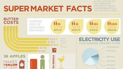
So now, here's what I'm going to use for creating...I want to show how much electricity is used in a grocery store. And...well, maybe this goes over here. I don't know. Um, see? That's how it happens. You start messing with things. So I'm going to do electricity use here, and I'm just going to grab a new headline here, and... Wow, I spelled it correctly, didn't I? I did. Alright, I think that needs to be made a different color, as well. Okay. So this one, what I want to use here is, I want to use a pie chart. Okay? So I want to be able to break this all out into sections of pie. Now, if I try to do this with a circle, and tried to go through and divide everything up here, it wouldn't work very well. I could certainly try, but if I'm going to be doing my circles here and I'm going to be getting some kind of dimension out of this, again, I'm going to be doing a flat one, so I'm not going to be able to do my little towers of cheese wedges, but I want to be able to do this and make it look...
kind of cool. So, what I'm going to do here is, I'm actually going to use the chart-building feature that Illustrator actually has. The chart-building feature is right here, so I got my Column, Stack, Line, Scatter, Area, Pie Chart, everything else, right there. Automatically built-in. And in something like this, this makes sense to use the tools in here to build this, and then go in and tear it all apart and make it look good. So I'm gonna draw my graph, and up comes this thing that just absolutely terrifies me. It's like...looks like some type of spread-sheet thing, and it's like so not creative. Okay. So I'm going to type in the percentage here, and I click tab here, 57%, 6%, 5%, 5%, 5%, and I click my little check box and there's my percentages, like so. If I want to break this all apart, so I can actually edit all this stuff, I actually ungroup it, Shift + Command + G, and it says, okay, it's still a graph, so you can still edit the contents, but if you break it all apart, it's now just gonna be the shapes. And that's like, do you wanna be able to access that spreadsheet, and it's like, No way. I had enough. So there it is. So now what I want to do is I wanna rotate my graph here, so that I get something that's going to look visually pleasing when I begin to break the content apart here. And I don't know if I want the large half on this side or the other side, depending on where I'm going to put this, but I think I'm just going to tuck this thing right over here, and I'm going to put this in maybe right here. So I'm going to keep the content right here and probably make that the size of a column right there. And with this, I've got that information and I've got to ungroup, ungroup, ungroup, and break everything apart into its own individual selections. Certainly get rid of the border on the whole thing, 'cause I don't want a border on any of this stuff. And then I need to go through and I need to choose my colors as I go through so that I can make this visually interesting here. And so, let's see, the biggest one I'm gonna make blue. This next one I'm probably going to do the yellow, the third one I'm going to go ahead and do the light blue, the fourth one I'm going to do the darker yellow. Fifth one, maybe the dark blue. The light blue here I didn't select. I kind of see if this is going to work for me here, so... Like so. I think that's gonna be the dark one. This is gonna be the light one. Something like that. See how that's gonna work for me. Nah, I don't really like those color combinations at all. And...so maybe I just keep it all blue, so if I keep it all blue... I think I'm gonna have to go through and kind of lighten the blue as I go around, I think that's what I'm going to do. So I can lighten the blue a bit. I'm just gonna go straight up here and lighten the blue. That needs to be the same color as that one, so I drop 'er right there... wipe it up... Ooh. That needs to be that, needs to be lighter. And that needs to be that one, and that one's gonna be really light, but not quite. Okay. Yeah, I like that a whole lot better, that looks a whole lot more delicious. Uh-huh. Okay, now I want to change this whole thing so that I've got all this information, and this is going to be Gotham as well, and I've got that information, and I kind of like the light version of that, or even the thin, on how that works. Now, what I'm not going to do here is draw arrows to all these points. There is nothing worse than having horribly done connector points, and then going ahead and rotating the copy so it comes off here like this. I'm going to show you what not to do, 'kay? I'm not going to do this and draw the line off here, and then say, Okay, you know, that's what I want to have there... That's really annoying every time I do that... and then turn this whole thing so that I've got this and it comes right off here. Now, 'kay? Horrible. What's even worse is taking your object here as well, and then going in and drawing all your lines like this, so you got this line here, this line here, this line here, that line there, that line going over there, that line going over there, and then this line all the way down here. Looks like garbage. 'kay? Is there anything else you'd like me to show you on what not to do? So, with something like this, I'm going to create a nice, big headline, 'cause I want something that's going to fit across these two columns here, so that it basically segregates everything, and it makes it very clear where everything's gong to fall. Okay, there it is. Electricity Use. Gonna make everything bigger here, and I'm just going to current it a little bit more, get rid of this extra spacing in here a bit. Okay. I like that as a headline, that goes here. Now that I've established my entire graph right here, I do like this. Going to go ahead and make this a little bit bigger right here, keep that fitting in there. I think this one would benefit from kind of like the cross-hatching on this stuff, so I could keep this the same but kind of do the cross-hatching. I think we have too many colors going on here, but we're going to address that. So now we have little call-outs here. So 22% is spent on lighting, and that's going to be right here in this portion. So I'm gonna go and I'm gonna line up absolutely everything, and not only am I going to line up everything here, but I'm also going to make sure I put it into the mode where everything is going to fit where it's supposed to be. So this is going to be down here right there, and then Heating, Cooling, Ventilation, so I'm going to say that's the 6% right there. Okay. And then, gonna take all my copy, I'm going to lead the whole thing out, and I'm gonna park it right here. And now all of my connectors are going to come off at fixed angles, so I may reduce this in size a bit... Sorry, I'm just going to call that fridgeration. I don't have the space. Whatever, you know? Little bit of creative license. So here it is... They were saying in the chat rooms it was misspelled anyway. (laughter) Good. Yeah, referidgeration, yeah. Good. Like I told you, I admit the first time, I can't type. I can spell, can't type. Can't do both. So now what I want to do is I want to pull my little connector lines. And when I pull my connector lines, I want everything to come out here. I want everything to literally come off here, just like this, and that's exactly how I want these lines to be. So these lines are going to come off just like this, every single one of them, and they're going to come to a certain distance, and I'm going to pull that all, and I'm going to duplicate, duplicate, duplicate, right there. Of course, I really should go ahead and I should duplicate that directly down so that it doesn't step off. Okay, now what I want to do then, is I then want to go ahead and use my angled connectors so that they're going to come and they're going to point to specific locations. So with something like this, I'm gonna want to go in and 22% is for lighting, I'm going to come over here, and I'm going to go directly into here. And I'm gonna take my line that I have, I'm gonna go to my Stroke here, and I can go ahead and I can put an end on it of something that's going to be very relevant, like a circle. Okay? Something very relevant and it's going to show me exactly where that item is. Great. And now what I'm going to do is, I brought this over here, and I've got this amount for refrigeration. And so, if I take this and I bring this all the way over here, I can bring this so it kind of comes in line with this... gonna select just the ends so I don't keep pulling both ends there. Boom, it intersects. Eyedropper tool, suck that up, And I want that. Apparently it doesn't go ahead and give me... oh, I know why, because it should... Nope, doesn't pick up the little dangling participle at the end. There it is. 'kay, there's my point. Now, once I start getting these things bouncing all over the place here, I wanna go through and I want to establish a very definite pattern of where these things are going to fall. So, I have one here and one here. I would most likely want all the other ones to fall here. So I'm going to go and, of course, if I put this...if I copy this one here, that's not going to be a problem because the refrigeration can go right to this point, right there, that refrigeration can work. Cooling, if I do that right there, that can work, but you see it doesn't really line up exactly where I want it to be. I'd have to do a little fussing with it. Heating, right here, clearly falls where it shouldn't fall, and then, of course, this one, if I do this right here, this one doesn't work at all. But I've established a very rigid grid structure here, So with something like this, what I'm going to with this, is I'm going to take each and every one of these lines, and I'd like them to fall right in the middle of my object. So when I go through here, I'm actually gonna... Sorry, I used the pen tool here, and I'm going to create just like right angle bends, okay? So I'm gonna go in and I'm gonna turn off my little end right there. No end. None. And I'm gonna take my direct selection tool, directly select this, and I can take my little pencil tool here, zoom in and I'm going to draw so that fits right up in the middle of that section there. 'kay? And so it comes in, but it's going to point right to that specific point. I'm gonna put the end on this. This is a little bit fussy to do, takes a little bit of time, but when I do this, this is what I end up with. So, of course this line is a bit long... I'm gonna need to go into Preview here so I can actually see what I'm doing, and then I'm gonna bring this back so that it lines up perfectly. This line ends needs to come up here, and it needs to fit right in there in the center. 'kay? So the line comes in, and it doesn't angle or anything weird. I'm gonna do everything in a very tight grid structure. That's gonna come up, and that's going to point to something... in fact, it should actually come up here and point to this right here. Move that up a little bit more. So we see the structure that we have. Unfortunately it violates this whole portion right here, so what I think I'm gonna do here, is I'm actually gonna bring this over, and I could do this like at 45 degree angle so it fits at a perfect 45. So this comes up, and it comes up and over, and again, this little end point has got to be right in the middle with everything else, and this line also has to fit so that my connector point... and I may just do this as well, just bring this over so it's a perfect line... and then use... trying to get the perfectly straight line after you've moved it is really tricky. I'm not just close, I may have to re-draw it. Yep, I'm gonna have to re-draw it. So I'm gonna take my connector line, draw it down here, and I'm gonna take my connector line, I'm gonna draw it down here and I've got that. Now I've got to switch the ends of my stroke, right there, okay? Cool. Because what I'm trying to do, is I'm trying to very specifically line it up in the middle of my portion right here, so that everything lines up right where it should here, it lines up right in the middle of my type, but also, too, I want everything to fall right in the middle of my graphic here, so that all these are lined up, but I have a very specific target of where these things are going to fall, too. 'kay? When I do this, and I create a very visual place where everything falls, it's a lot easier to see where these things go and where these things connect to... I don't know about this angle, I think just doing it at an angle would work a little bit better. But I'm gonna grab this... I'm actually gonna use the same one as I did for here... Copy this, move this down as well. And then this one I may actually just bring right up into here, instead of going through this whole rigamarole. I may just bring this one over, make sure that spacing is complete, bring it right to the end there, and then this one, I'm gonna go and I think I'm just gonna just draw the line right up here, so I got that. Stroke, flip the ends, right there, move everything over so that it lines up, make a longer line right here. Takes a while. So that fits right in the middle of what it is that I'm doing, that method. This end snaps right to everything here. Now, when I do this, what I'm trying to do is I'm trying to make sure everything falls in a very deliberate pattern, and everything works. I don't like this little jagged thing here, I think a little 45 degree angle would work better, like so. That may work a little bit better. But I just want to make sure that everything visually falls where it should. And little pointers, and stuff like that, when you do this, hopefully it turns out so that when you look at something like this, you're like, Oh, that makes a lot of sense. I realize that these all need to become the dark blue, here. Right there, and then those need to become that, and then the strokes need to have little ends on them as well, like that, I need to make it a little bit darker blue on that so they read a little bit better. Okay. And that may be a little bit too dark of a blue. Ah, blue it up a little bit more. Okay. Dark enough they can still read it. There we go. Gonna switch my end on this one. For some reason Illustrator has this weird thing that if you flip the ends where you draw, it flipped the ends. So now I've got my little call-outs here, I think those call-outs need to be made a little bit bigger. 'Course, once I make the call-outs bigger, then of course I'm gonna readjust everything, because now they're gonna appear in different locations. As call-outs get bigger, it shifts the entire line. That's right, so there it is... I need to make this 125%, there we go. And of course, see how it throws it off a little bit, now I've gotta go through and make those little connectors a little bit better. But now I've got my information here, so that the connectors kind of draw to this as well. Not ideal when you're trying to do a chart like this, but we've got a lot of things going on. So this may be one of those ones where, you know, this chart works fine, I may pull stuff apart, yeah, to go ahead and use it, or, you know, maybe rotating the chart a bit may help. I don't know if it will help, there's a lot of information jammed in there. But for the most part, what I've got is, I've got this space and I've got this nice little bit of information all put together that I can then put into a nice little nugget here, and it creates a nice little infographic. Now, it wouldn't be nice to go ahead and put like a little plug or something here because you never know with electricity, or something like that, so that could be cool. If you wanted to do little icons for all of this stuff, that would be really easy to do, wouldn't it? Uh-huh. 'Cause we've already got our little waves for ventilation and heating and cooling as well, 'cause you could do hot waves, cold waves, you can do little cooking waves in the pan, you could do a little light bulb, as well. Yeah, you know? You just never know.
Class Materials
Free Bonus Materials
Ratings and Reviews
Kathleen
I'm not even through the second day yet and I'm thrilled with this class! Only thing, I wish he would go slower BUT then again, if he did, we wouldn't get SO MUCH information. I'm glad I purchased the class so I can go back and replay to my heart's content. Even though this class is based on creating infographics, the wealth of information is perfect for any project using Illustrator. I do wish he would have shown how to work with corners (for example) for those of us who do not have CC (I'm in CS6) so we could learn the "hard way without widgets" and the easier way with widgets. Jason is very funny and I love his direct approach to getting the job done while knocking a clients socks off. I look forward to many more classes taught by Jason.
a Creativelive Student
Another amazing class from a man with a seemingly unbelievably clear mind. So great at conveying the concepts of the program so that you can effectively learn actual methods but also walk away with enough information on the way the software is organized so that figuring out a solution to a design challenge, on your own, is light years easier and faster. i am thrilled with the broader grasp of the possibilities i learned. i could go on and on. It is absolutely a class worth taking whatever your level of expertise.
Rozlen
Loved the class, learnt so much from Jason even if he talks a little fast sometimes he is still very funny and makes it look so easy, would love to buy his indesign class too love watching him, excellent teacher.
Student Work
Related Classes
Design Projects