Lesson Info
1. What Is an Infographic?
Lessons
Day 1
1What Is an Infographic?
21:55 2Creating Adobe Illustrator Shapes
40:48 3How to Edit Shapes in Adobe Illustrator Part 1
17:41 4How to Edit Shapes in Adobe Illustrator Part 2
24:33 5Simple Adobe Illustrator Icons
46:07 6The Pathfinder Tool and Adobe Illustrator
28:06 7How to Create an Icon Part 1
25:40Icon Design Tutorial
29:19 9Rotate Tool and Adobe Illustrator
30:44 10The Shear Tool
44:27 11Adobe Illustrator Swatches
33:54 12Adobe Illustrator Effects
29:17 13Adobe Illustrator 3D
20:41 14Typography and Adobe Illustrator
34:37 15Illustrator and Text
32:18 16How to Make a Grid in Adobe Illustrator
18:12 17Adobe Illustrator Grid
26:52 183D Icons
17:42 19Pie Chart and Adobe Illustrator
18:01 20Bringing It All Together and Becoming an Infographic Maker Part 1
40:36 21Bringing It All Together and Becoming an Infographic Maker Part 2
44:48Day 2
Lesson Info
What Is an Infographic?
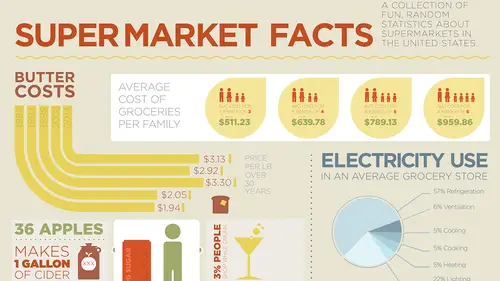
Here we are, creating infographics using Adobe Illustrator. Just a few little things before we start off, we are using the most current version of the Creative Cloud which is the Creative Cloud 2014. If you are using older versions of Illustrator, there are lots of things that will still parallel to what I'm talking about. But I am going to point out some new features with Illustrator that have just come out with this newest upgrade and ones that have come out over the last year when Creative Cloud has come out. So starting out with what makes an infographic? What makes it work and how to bring it all together is my nice little presentation. So of course, gotta make a nice presentation that looks like an infographic. And how do you create it? Well, what goes into an infographic? Why do they look so good? What makes them compelling? And a really good infographic, you should look at it and say, wow that looks fantastic. And it's funny 'cause I've done a lot of research online and there w...
as one person online that had actually shone how to make infographics and the end result was really quite awful. And it's like, ouch. So here's what it is, how to put it all together. Well the short of it, an infographic tells a story and it's basically taking data and putting it together so that you have a great story that's a very visual and engaging story that the reader can look at, have no idea what the story's all about but the image or the content is going to draw you right in. Once you get drawn in, it's a very easy way to explain data, quantities, money, time, charts, whatever, but in a very visual, simple and easy-to-understand way. It's all about telling a story. And you've heard good stories, you've heard good narrators, and a really bad narrator can really mess up a story. A hard to follow story is really difficult so a really good storyteller should be able to tell the story visually in a simple, easy, structured way. And this all comes together with the use of icons, words, letters, color and a very structured layout. Once you put everything together, the visual representation can be very interesting and engaging, even if the subject matter is extremely dry. It's representation of data. And I'm sure you've heard stories before, told by somebody where you fall asleep and other people can tell the story and the narrator can be so interesting and engaging, it doesn't matter what the story is, you want to sit there and listen to that person. And that's what an info graphic is. So, infographics, we use icons. And I cannot stress this enough and we're gonna see several different examples of icons coming together. An icon is a graphic representation of an item. It's not meant to look exactly like the item. It is going to be a simplified translation that's meant to be broadly understood. If I'm going to show you the picture of a camera, I do not need to show you the picture of that actual camera with all of its functions and features. I need to show you something that's going to be simple, it's going to be straightforward, you look at it, not overly complicated, breaking it down to its simplest items and render that so that you have a simple, straightforward icon that virtually any audience could look at that and say, this is what it is. This is not an illustration, it is not a photograph, it is not a drawing, it is literally an icon. So when people say, you know this is very iconic, it means, it's there and it represents in every sense of the word and captures the essence. So I've got this nice little bird here. It doesn't matter what kind of bird it is, you look at that and you don't say, oh, that's a microwave oven. It's a bird, I get it. It's a bird. Nothing else. Simple, straightforward, that's what an icon is. Keep it simple, keep it easy, don't have to make it complicated. And that's where people get caught up is they try to make it too complicated. They try to make it very specific. Not what it's all about. Keep it simple. Didn't I mention that before? Let me go ahead and say it again. A broadly understood icon is the best way to visually show what's being represented. Simple, clean, easy-to-understand, not a lot of detail but just enough to make it universally recognizable. So here I've got a little test tube. Can mean a lot of things. Doesn't matter what's in there. I can tell there's measurement. I can tell there's action going on there, simple, straightforward. Does it look like an actual test tube? Sure. Does it look like the test tube I was rendering it? Nope, it's just an empty, looked something scientific, bubbly, measurements, something dynamic, something going on. Again, you look at this and you don't say, hmm, that looks like a toaster. Plain and simple. Another thing that I see quite often that is interesting is when people get into creating infographics, you want to make sure that you have this same narration point of view throughout the entire story. And this is made extremely clear as I teach a lot of students. They tend to mix two dimensional and three dimensional icons together because they will go and they will get a visual representation online and they will try to reproduce that object in the exact same dimension. Well when you mix the dimensions, when you have two dimensional and three dimensional objects, you start to change the narration point of the story. If everything's gonna be three dimensional, make everything three dimensional. If it's all gonna be two dimensional, make everything two dimensional. Always think of the infographic as telling a story, the narrator, the point of view. If you're going to narrate the story, you're not going to go into different points of narration. Keep it all exactly the same. And you'll recognize this even with really well done, visually interesting infographics, you'll see that some designers will mix two dimensional with three dimensional. It's a very easy thing to get into. Because you go online, you search for a picture, you find out what it is and you try to make an icon out of that and you forget that you are dealing with a flat or a dimensional object. Not a problem. If everything's gonna be three dimensional, make it all three dimensional. If it's gonna be two dimensional, make it all two dimensional. Just keep in mind we're telling a story. And with every story, you always have to have some type of outline so that you can put this all together. You don't just sit there and start putting things together on the page. So my background is actually in Swiss graphic design so there's nothing more fantastic than a nice grid in the morning, okay? And this fantastic structure allows you to layout your content on the page and include a certain amount of space for each item on the page. The things that are gonna be more impactful, you can create a larger space. Things that are gonna be less impactful, a smaller space. But you're gonna break this down into a grid structure. So you basically create your outline, section out your data, be able to put this in and together, but following a grid structure. So there is a kind of randomness but a controlled randomness. Here I've done a grid structure and I've broken it out. And so I've got some equal heights there and I've got three columns here. Some are two, some are one but they're all gonna visually follow this grid structure. If you don't have a grid structure, you're storytelling is not going to be as clear. And a grid structure does not limit you, it actually helps you because it helps you to define the space and therefore you know where your boundaries are. We're gonna show you how to build a really simple grid structure and how to work with this. You've gotta lay out your story first before you can even start telling the story. Then everything can come together. I love grids, hopefully grids will become your friend too and we're gonna show you how to do this, simple, easy and make it look great. And then there's the use of the fonts. So the fonts are the actors in the story. You've got your narrator, which is your overall feel and the fonts are gonna be the actors. So who are you gonna cast in the role of the acting? If you're going to tell a story, how do you want that to be? And there's a lot of great fonts out there. There's so many fantastic fonts. In general, I use sans-serif fonts for infographics because they tend to be a little bit more clean. They give a very grid-like structure, they tend to be a little bit more rigid but I also like to choose fonts that have weights that are going to be similar to the strokes of my objects. Lot of different fonts out there. The wrong font? Think of it as the wrong actor. When you cast somebody in a role that isn't right, it's not going to tell the appropriate story. Even though the story may be interesting, you want to make sure that the font is absolutely correct. So I was gonna use Papyrus in here and I decided, you know, I just can't do it. Even as a joke, I can't even do it because the joke would be so bad. So I got something that was kind of like it. And fonts are extremely important. And we're gonna walk you through how we can go ahead and we can do kind of like a font casting call. And it's a technique I learned years ago and it's actually so cool that you can actually put the fonts on the page and within minutes, you can actually tell what the best actor is going to be for your story. It's absolutely awesome. And it's so simple and I can't stress that enough how simple this is because we complicate everything. But we're gonna make it simple. And then you have to throw a joke in there, because we aspire to be the best, you know (laughing)? By the way, making that little spire, so ridiculously easy. You can't believe how easy that's going to be. So easy that even Adam our director will be able to do it? Oh my gosh, I mean he do it with his eyes closed. But wait a second, his eyes are always closed so that's... (laughing) And then, use of color. Color, absolutely. That's going to create a real visual impact there and with the color, choosing the right color. And it's not just a matter of randomly going in and choosing a color, it's going in and using a whole bunch of different tools that we have to go ahead and choose those colors, complementary colors, split complementary colors. And the biggest thing when you're doing any type of graphic here is you don't have to use black for your type and your outlines. I don't use black for any of this stuff. I actually use tints of black. The headline's 80%, the body copy is 60% black only because it creates a lot of contrast with what we're doing. Color is great, if you want to go ahead and have something that's impactful, you don't have to go in and use 100% black. Just because it's always been done, doesn't mean it need to be done. If you're not good about picking out colors, there's great things out there that allow you to pick and choose colors. And I actually have a cool app on my phone which'll allow you to do that. It's done by Adobe, fits right in. We're gonna show you how to get colors, create colors, put colors together and actually pick the right colors. And of course in the end of it, you want to go in, you want to make your infographic look really cool. This is an infographic I did, because if you're in Seattle, one of the things that we talk about all the time is traffic and weather. 'Course we have horrible traffic and our weather here is pretty boring. Doesn't get that hot, doesn't get that cold. Sometimes rains, little bit of snow, crazy things. But this is an infographic that I did, people's perception of weather and threw some rain and some sun in there. Of course we picked a Seattle gray and the green because the sky is gray and then everything kind of gets moldy in the wintertime on our cars, houses, roofs, things like that. So the appropriate colors there, going through, creating a visual impact. That's the grid structure and picking the right font to get the actors, get the voice, have the narration come across. All two dimensional icons there. This is actually really simple, folks. This was a 45 minute project, right there. So, we're gonna show you how to do all these techniques, create, build, all the way on through. And that's what we have. So, the one thing that I want to show you, that this class is not, anybody can do this, okay? This is not an infographic. This is the chart from someplace that we cannot mention on the air. You can turn this into an infographic that make it look very interesting. Just because your application has a chart-making tool, doesn't mean that it's going to be anywhere near as good. Horrible narration, bad characters, bad costumes, the whole thing. So, we're gonna start right now with Illustrator, jump right in. And gonna create a new file, and start from the very get-go. If you've never used Illustrator, you're gonna learn a lot. If you have used Illustrator, and you know a lot of these tools here, we're gonna show you a whole lot more. Just gonna walk through a really quick setup here so that we can get the interface and a few things dialed in. The Creative Cloud has gone in and set your interface so that it's a dark background with light type. I prefer the opposite, so under my Illustrator Preferences, I can control the look of the user interface to bring the background back to light so that you can have everything dark on there as well and get that set. Going in and setting a few other Preferences here too, going into our Units and our increments, general information here, but I'm going and doing my graphics, I like everything to be measured in inches. But obviously when we're dealing the stroke of our containers, and our lines, I want everything measured in points. And also my type done in points as well. So I'm going set the General to inches, so measure my containers that way, everything else in points. And that way, when you create a new document, everything will actually be in inches instead of points there which may help you out. One little note too, if you go in and you set your Preferences before you have any other page open, you will be able to go ahead and set your Preferences so that every document you create from here on is going to have those Preferences set. So that's just a nice little tip right there with your Preferences. And we've got our document. So being able to work through the tools here and have access to the tools, a new feature that just came out in the Creative Cloud 2014 version is this. Now for years, we've been able to go into our Illustrator file and we've been able to click and hold and click on our tools and then with my mouse held down, I've been able to go and click on the very right side of my fly-out to do what's called a tear-off. This is a unique Illustrator feature and this has been around for a long time. But I generally do this for my drawing tools because not all the drawing tools have shortcuts. I could make shortcuts but I haven't. But I like to have my drawing tools readily accessible here and there are a lot of them. And I can have a lot of floating panels. And this has been going on for years in Illustrator. So it's nice to have those little tear-offs there. 2014 update give us this. Under the Window menu, we have the Application bar, Control bar and such. And I can go to my Tools section which allows me to go in and create a New Tool Panel. And this tool panel allows me to create a new tool panel, just gonna call it Creative Cloud 2014. It's one thing I can't do is type. I will never teach a typing class. Here's my new panel and it's totally customizable. So any tool that I'm gonna use on a consistent basis, I can create my own tool panel. So I can simply grab those icons and put them right into my tool panel right there and I have all my tools in my tool panel. And this is a saved panel, if you go under the Window menu under Tools here, when I save that, I can easily call up that specific tool panel. I can have as many panels as I want. If I'm doing some type of drawing, I can create a tool panel with all those tools in there. So with that, I have the ability to now control everything I want because like Lens Flare, I never use. Some of these other ones I use but I use very rarely. Okay? So I know I'm gonna use these shapes right here and so I may just go and include all those ones in there for quick and easy access to whatever it is that I need. And then I can close out all of my little tear-offs here and have everything readily available. Plus, I have my Fill and my Stroke readily available there as well. Because if you've ever used Illustrator, inevitably you've got the Fill and the Stroke switched, you draw something, you mean to apply the Stroke or the Fill and you apply the wrong one which I will do, just to make you feel good because you'll do the same thing and I do it too. So that's a new feature there. Window, Menu, Tools, setting up a New Tool Panel and anyone that you set up, resides right here in list. Nice and handy, floatable and you can put it in any direction that you want, creates a little mini tool panel. Awesome. Couple other things with Illustrator. Pen Tool, and I know a lot of people get frustrated with a Pen Tool, we aren't going to be using the Pen Tool very often if at all during this two day class. And I know people are like, oh my gosh, I though we were gonna learn Illustrator, the Pen Tool's an integral part of it. I love the Pen Tool. Absolutely love the Pen Tool, it's great. The problem is, when you start introducing the Pen Tool, we start getting into more of an illustration. This is all about construction. Simple icons, all about construction. And I'm going to show you tons of basic construction techniques so that you can build virtually everything. The Pen Tool is awesome, love It. But when you're getting into basic icons here, we don't need to use it very often, surprisingly enough. We need it for illustration, but this is not an illustration class. This is creating icons and infographics. We'll use it very rarely. So for those of you that want the Pen Tool, (inhaling) not the class for the Pen Tool. Quick question? Yes. So Matt Panda wants to know, should we all be creating work spaces like this? Is this your best practices workspace for building infographics? Everybody works differently so I build with this so that I can have these things readily accessible. In reality, what I would do is I'd actually go under, I would setup shortcuts here onto the Edit menu and I would actually setup shortcuts for the stuff that I'm gonna use all the time. This little window right here is a fantastic thing to have. But what it does is it requires me to stop what I'm doing and go over and select the tool just like I always have. Once I go under and I go on to the Edit menu and I set my Keyboard Shortcuts here, this will allow me to go in and actually set my tools. So I can set my tools here and I can use the tools or the shortcuts here for the tools that I'm going to use all the time. Now currently, we've got the Rectangle is M and the Rounded Rectangle has no shortcut there and the Ellipse is L. Nothing for the Polygon Tool. But if you ever wanted to create a shortcut for this, you could go in and do a shortcut and say, you do Y for the Polygon and it says, hey, this shortcut's already used by the Magic Wand Tool. Okay, well if you don't use the Magic Wand Tool as much and you select things in a different way than the Magic Wand Tool, that's fine. If not, I can go clear that and say, Okay, you know the P Tool. Well that's for the Pen Tool and that's a shortcut that I can't deal without. I have to have the Pen Tool. So you know, if I do the N, yeah maybe that works. And so the Pencil Tool, you know what? I don't use the Pencil Tool very often so I'm going to use N for the Polygon and I can set this up this way. Any time you have these shortcuts, you can save them. They're in your application and you can make them and use them. So in that case, I recommend the shortcuts but if you want to go in and use this panel too, it's a great way to do it as well. Best practices is make it as simple as possible, focus less on the application, more on your work and the quicker you can do that and the more efficiently you can do that, I think the better off you're gonna learn. So that is one of the new features here. There's also a couple of other new features that we're gonna get into that they have added. In the Creative Cloud version of Illustrator, they added Live Corners. And in the Creative Cloud 2014 update, they've actually gone in and they have created Corner Widgets which change the functions and feature here which we're gonna cover completely and it's a very different way of doing this. Now if you do not have Creative Cloud and you're running the last version of Illustrator before the Creative Cloud, this whole Live Corner, Corner Widgets and all that other stuff is a real limitation because we're gonna show you why it's a huge limitation. If you've ever tried to resize a container with rounded corners it'll flatten or stretch the corners. So this is a huge improvement right here. That's one of the new features. And then also one of the newer features to you is the Pencil Tool and how it's been revised to make it a whole lot easier to draw. If you're a Pen Tool person, the Pencil Tool may come in and start to crowd out the Pen Tool a little bit. We're gonna show you that as well.
Class Materials
Free Bonus Materials
Ratings and Reviews
Kathleen
I'm not even through the second day yet and I'm thrilled with this class! Only thing, I wish he would go slower BUT then again, if he did, we wouldn't get SO MUCH information. I'm glad I purchased the class so I can go back and replay to my heart's content. Even though this class is based on creating infographics, the wealth of information is perfect for any project using Illustrator. I do wish he would have shown how to work with corners (for example) for those of us who do not have CC (I'm in CS6) so we could learn the "hard way without widgets" and the easier way with widgets. Jason is very funny and I love his direct approach to getting the job done while knocking a clients socks off. I look forward to many more classes taught by Jason.
a Creativelive Student
Another amazing class from a man with a seemingly unbelievably clear mind. So great at conveying the concepts of the program so that you can effectively learn actual methods but also walk away with enough information on the way the software is organized so that figuring out a solution to a design challenge, on your own, is light years easier and faster. i am thrilled with the broader grasp of the possibilities i learned. i could go on and on. It is absolutely a class worth taking whatever your level of expertise.
Rozlen
Loved the class, learnt so much from Jason even if he talks a little fast sometimes he is still very funny and makes it look so easy, would love to buy his indesign class too love watching him, excellent teacher.
Student Work
Related Classes
Design Projects