Lessons
Day 1
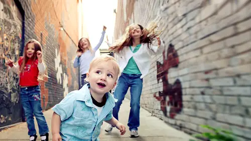
1Introduction
08:01 2Posing Rules
1:14:17 3Clothing Review - Step 2
32:36 4Location - Step 3
12:50 5Mood Management - Step 4
12:06 6Point Lighting - Step 5
11:34 7Technical Settings - Step 6
10:08Composition & Framing - Step 7 & 8
04:29 9Details and Expression/Spirit - Step 9 & 10
29:05 10Urban Shoot Challenges
22:36 11Photograph Critiques from Students and Audience
14:44 12Shoot: Bedroom with Baby Desmond
16:25 13Shoot: Bedroom with Alexis
14:02 14Shoot: Bedroom with Joseph
14:17 15Shoot: Bedroom with Alexis and Mom
13:34 16Introduction To Lessons 17-23
19:07 17IntroductionComposition and Framing
50:19 18Relationship Dynamics
13:49 19Park Shoot Challenges
1:08:19 20Critiques of Students and Photo Contest Submissions
37:31 21Editing Urban Shoot Photographs in Photoshop
24:42 22Shoot: Rooftop with Madeline
39:46 23Shoot: Rooftop with Aiden and Angelina
25:05 24Introduction To Lessons 25-37
08:21 25IntroductionShoot: Rooftop with Destyn and Ursula
21:45 26Shoot: Rooftop with Rowan
23:58 27Shoot: Rooftop with Mom and Baby
17:06 28Shoot: Working with Motion with Destyn
09:02 29Business Scorecard - Part 1
29:04 30Business Scorecard - Part 2
35:31 31Shoot: Living Room with Ari, Eli, Zoe - Part 1
36:24 32Shoot: Living Room - Ari, Eli, Zoe - Part 2
17:54 33Shoot: Living Room with Baby Maria and Mom
18:05 34Photo Contest Top 20
20:58 35Contest Winners
07:06 36Workshop Overview & Photographs from Shoots
14:19 37Q&A with Tamara and Final Thoughts
18:48Day 2
Day 3
Lesson Info
Photo Contest Top 20
And what I'll do is as we step through these these top twenty we'll talk about what what made it so striking hand white stood out on little shits that you could come center not wrestling you know what I could do a full image critique but necessary little things that you could consider shifting teo even make it something that's even more striking for you all right so uh here's one of them uh so for a few different reasons we really liked the lighting and the feel on this we liked the leading line and the way it went in it was kind of a striking overall with color and toning little tweaks that I think would have been really interesting is kind of our subjects position in the frame if we had captured her kind of walking into the scene can you guys say I love that it was like yeah if we had our walking interesting from the to the right and back a little bit as if she's walking into this delicious scene that would have been even more striking and a little bit of fill light on the front in t...
erms of lighting up we do us and good lighting on these colors I'm going to go off this monitor not mine but on my monitor if we even have a little bit more fill in the shadows that makes a difference to to kind of feel like everything's you know kind of lustrous um, so that is one of our top twenty congratulations, another fantastic image uh this one is it? When I talked about center composition being more striking, this is one of the things I'm talking about where it's right in the middle and everything around it it's not so much that the images and in the middle the subjects in the middle it's kind of the whole scene and how it's set up this is one of those atmospheric shots although there pretty strong to the foreground in an image like this, I love it and I love how it just goes back and we lead into that house um to put more emphasis on the subjects I think I've been interesting if he'd been a lower camera angle just a little bit of a tilt because we wouldn't have want to lose that line going away back and then of course some feel like going up so could really focus in on those expressions in that interaction uh there's a little baby on the beach there's a lot to be said for capturing again the theme of this company contest with summertime joy there's a lot to be said for capturing that boca and that twinkle on the lights um and it's obviously a sweet little subject uh if this image had been pulled back a little bit tilted to the left you see this uh then again one of the things we want to think about every time we're taking a photograph is what is the story like there's a whole story that happens in here and the story here is kind of her setting and where she is if she had been sitting in a white seedless paper in a studio it wouldn't nearly bit of striking the story is a lot to do with her surroundings I should do that image earlier of the three locations it makes a big difference where they are and I would have liked to seen a little that till but overall we really love this image uh sweet directed to cash out every person as we go we can treat them we see the date stamps justin justin is ochoa photography o c h o a york ochoa there there was a whole bunch this that we loved obviously right out to get you go right in to your subject and I think she's very striking subject very sweet face I like the little pose onda of course I like the catch lights and the rim lighting on the hair in terms of the composition I'm really happy with the composition I think it's it's really nice we could have maybe gone down a hint on the bottom but that's just being nitpicky um one of the other things that might have made a difference here is you can see that upper left hand corner I can't tell that have been yet or just where we go off the field and it gets a little dark, it would've been nice to either had that be a little more even or taking it out completely. Um but the other thing I would have noticed is from a dodging and burning perspective, she's a little bright in the face andan possibly especially pretty non metallic foil. We might have lost some of the highlights in her face. They might have been a little bit broken, so I would have just loved to tone that down a little bit on our face. Serv ice face a little bright for me turning that down would have been even more interesting, but just a beautiful image. Uh, so cute. Arianna valerie foul allergy looks like esso obviously. Okay. Baby's whispering secrets what's not to love doesn't love babies and secrets s so there's a lot that's very sweet with the looks and the expressions. And certainly what makes this image is the one little baby coming into the other toa what looks like telling a little secret? Certainly shooting low and kind of coming up in the ground is a really good choice here, I think from a composition perspective there, you know, smack dab in the center, we've got really lovely milk key light all the way around them, and in fact, we have some lens flare in the bottom left hand side of the frame. I think that in this case adds to it we all know that lens flares come a long way. It used to be the one thing you won't avoid at all costs, and now a lot of people added into their images and post or try really hard to capture it from my perspective, because of where the baby's air looking, which is to their left, I wouldn't have mind this this them screeched over a little bit in this frame, kind of starting a little farther in on the left, so we could have seen more of where they're going. Uh, um, I didn't see a watermark on this or, uh, a title, but maybe if somebody sees that we could, we can speak to it. Um, but obviously, expression is power paramount here, as is shutter speed, excellent use of shutter speed. I'm I'm a big fan of the show every drop, especially when you do things like this or you want it like nice and chloe, but I think there's something about this that really shows action um, obviously was a lot of life in this image, it kind of screams the subject line of summertime joy which is fantastic little things that we wanted to fix us about if I were shooting this in front of an audience with the spray hose um I might have said hey, can we do something to block that light on her right side of her cheek just we don't have a secular highlight popping off we have a print little things like that and I either whereto had her completely centred focused or a little bit room on the top and going over just to kind of optimize where she's looking one of the two things member we said if it's not completely center focus we want it to be a little bit more in one of those acts points uh but just so much joy and so much fun um a very striking image for that I believe this one that one was from dana pew dana thank you. Do you um uh so jen cooker photography that's awesome. Um that looks like what my children looked like very frequently when they're not even eating ice cream you know, so this is this is definitely in the vein of exactly what the contest is it's very fun it's very spirited. Um obviously the little stains on this you have two options you could make this black and white make this color color works because it showcases the staining on dh then obviously that color of his eyes and the shirt and the brown with the background and the brown of the chocolate ice cream. All of that actually spoke to me quite a lot in terms of what I think makes this image interesting if you notice a lot on images if you did kind of look through, I've posted image a day for the last ten days on my facebook page and my google plus you could look and just see them all right there there's a lot of ride to them but many of the color images have a certain kind of color palette to them and there's a reason I select him that way it's because things like this are very attractive to me. Andi, I like this is the same exact boy sitting right here. I had a red and green checkered shirt. Do you feel the difference? That's where clothing makes it impacted an effects color palette so this one is very well done this one s o on this image obviously love the costume you love the fact that I think is pants or a button or I don't know what is going on up with his outfit but it speaks uh pretty strongly to what you see um obviously the back leading in the fields of gold kind of feel really lovely from an angle perspective. We wanted me there turning in towards the camera we want to pull the camera all over this because that was that idea of bouncing in the frame and bouncing out of the frame there's so much that's really fun and write about the civic those small shifts would make a huge difference um do we know who shot this one? This one was generally bernardini all right, she's very, very good job again. I like the contrast here in terms the colors and the lighting it's lovely just a small shift and some bounce and feel like would've been really cool. Uh oy uh I don't know if this is called but that's what it should be called so on this one again remember we just talked about this palette it's funny to see this again the blues and the soft grounds in the beige is but they're really lovely together on dh that's that's a lot about what they're interesting to me it's a muted color palette and that works for the softness of the scene it works for the baby the same image that had been bright and vibrant wouldn't have been as welcoming or warm you know I mean s oh, I like this very much uh once again in terms of framing this he's looking straight out this way I would have loved room here this would've been one of those images that's really nice as a panoramic could you imagine him in the right access point and it going all the way out? It becomes a completely different image and very much easily frame a ble one that that I would want to sell so there's a lot here that's, that's really good. Just small shifts would have been pretty cool. And this image was from cathy poulsen. Ha ha! I miss my dog. Um, so this is I'm assuming this is ah, dog looks like a dog to you rescue the expert that looks vaguely like a dug approximately uh, okay, so obviously I have a soft spot for pets and kids that's why he's trying so hard to get a dog and he arrested a great job. Uh, but I have a lot of fun posing children and pets together, and I do that often if I ever have a chance at a dog, even if we're going to your pound weaken, grab one. I tried to you because I think that they have they not only bring a lot of spirit into an image of themselves, but they bring something else out in a child that you don't normally see. Walking downtown with my daughter in san francisco the other day we pasta someone carry a dog and her whole face change oh, can I be your dog? You know that there's something that comes out and I see some of that here in terms of like you know this stop uh certainly in terms of the composition I think we lose something by losing the nose I want I want the nose that knows is a very big part of the dog s o this same image pulled out imagine it's pulled out a few inches on top and bottom um and then tilted just a hair so it's more angled to the right the camera's angled a little bit more to the right again two inches on top two inches on bottom and and then a little more toning to the black and white and it becomes a whole different animal uh see what I did there and teo and that image was by lisa haul good job lee said oh it's not just dogs no cats are there to uh very very sweet in terms of this interaction um I like the fact that you don't normally see snugly cats I don't know why they're very snugly uh but in images they're very they're very much usually dogs so I think this is really cool to things here I would have you know how we were up on the roof um and we were using diffuser I took a one photograph of rohan that was really beautiful and I loved it and I looked at the back and I said, the only thing that's not working here is we've got a hot spot on his right cheek. We have light diffused but it's not defused enough. We have the same thing going on with this little boy's right cheek that's a hot spot that will show up as a broken highlight on a print. Um, and what I want to do is make sure that I'm very careful to bring my brights you know, I have to be pretty bright, but not so bright that we lose that detail eso a diffuser any sort, even a bed sheet, you know, kind of held up for a second for fun makes a big difference here. Of course, we're talking about the difference between a photograph for fun and then making more of a portrait. This is what I would do to have it be a portrait to be I have everything all the contrast exposure held uh, the same thing that I mentioned earlier in terms of your interest, your point of interest in your focus right now, they're in the bottom kind of to the right, but not necessarily enough camera tilts give me that cell to camera angled to the left but pulled out a little bit so we don't lose the cat's tail and we could even show the tip of his feet it's it's striking what a difference those kind of things could make so that would've made a big difference. That picture was by italy service covic thank you, lisa I loved her kitty and your dog I mean baby child. Uh okay, this is marie mass uh those air four bubbles are they not? How'd you get something that was on the floor? I guess you just lay on your belly and blow them that's pretty cool. Um, the lighting on this is really cool. I love those little, uh, the one thing that's neat about bubbles you see bubbles a lot in imagery. Um especially kids, they just go so well, they're chasing them. It's very fun. I liked how these replaced lower in the frame that was really interesting to me, and it kind of made it look pretty cool with that that light popping and translucent reflecting so they all have all these different color toning and the toning goes with her outfit, which is I don't know that's on purpose, but I like it. Uh, we've got the backlighting here, which again adds an extra element. I don't mind the speculum highlight of a soft backlight, so, uh, the only big shift I would have on here is that I just think the whole roll image could be a little smoother um sometimes you could just smooth out a little bit in terms of the face and the hands kids tend to be just moving and going and all that stuff and they've got like, a little red patch here and this that and just a little softening around the skin tones and stuff and then the violet kind of magenta feel that is in her hair and a little bit on the edges and staff have got a little bit of that chromatic aberration happening with hand that might just be the lo rez that might be just low res so don't take my word on it, but, uh, again a little bit of a skin softening would make a big difference on that. Do you see what I mean when I talk about that? That little fringe okay, um, but otherwise a very soft, um inviting image. Ha ha. Uh, it's so funny, I haven't image just like this of my little girl when she was like, two, um looking underneath and a white frilly dress so I'm a little partial to the play find feel of this again. The palette is really lovely. The soft, muted colors, the soft dress if you can create a portfolio that's a mix of kind of softs and bright contrasts and deep and, you know just that blend is very appealing um in terms of this image one of things I think what made this image just really stand out is if the little girl and turned her head towards the camera imagine the same exact shot same exact frame everything the same camera ahead turn towards the camera looking directly into the lens with hopefully that fill with a bounce right up I don't know how cloudy it was but if that phil what abouts right out we wouldn't have needed any sort of reflector or phil flash um and can you imagine what a different shot it isthe it would've been you know? So I say get what you get get the shot and then try for attention that one was by melissa climb great job melissa klein okay, so the first thing that strikes you about this strap it's uh shot is obviously the perspective yes you're low you feel like you're coming out of the water like a nip seeing a scene I like that very much I'm a big fan of silhouettes they're very cool the toning on this is obviously quite quite striking as well the deep purples and the light blues very interesting to me I like how it's position I've talked before about if you're going to have them center composed make sure it's a striking shot I think with this you could do a center composition um two things that might have made this even more compelling is coming down on that top literally about two inches. I think after a while you don't need all the clouds up there about two inches down to bring your attention further right into your subject. That would've been a great thing, the other thing that I try to do a lot on silhouettes. Um well, just a side note I do like the shutter speed used here quite a lot because I like the way those those drops kind of connect like little cords going up. I like that quite a lot. Um, the other thing that I try to do all the time with silhouettes is because the point of them is that you are not showing any detail on purpose of your subjects. They're just outlines or figurines you really want to emphasize the space between the vig arendse so the little boy had his hands up in the sky, you know, uh, the fingers outraged or something like that, he would have had a lot more animation that brings a lot of animation into the scene versus because you can't see his expression at all you don't know am I having fun or not? For all, you know, he's crying and screaming his hand in arms, aaron, but its hands out shows that he's into it, and then you get that nice little detail that would have had a nice impact as well and I have made people toss babies up so many times just that image was by ramon itch and love the job ramona um okay, cool we just had a lot of um in the whole contest we were thousands plus images we had a lot of really interesting color palettes chosen which I which I quite appreciate it s o I'm this image I think the one of the cool things is the props I don't know if they are they're props of the props that were fought brought in but I like to think that those were their props and then that's even cooler s oh, I like the vintage feel of that and the fact that the toning matches matches the vintage feel of the props um and I also like that the composition is such that the boy in the back is kind of looking down and he's looking up into the left and then we have some speaks to go there two things that I think I would shift a little bit is I would have loved us in the shot from farther back um because I want to see the edge of the teddy bear I want to see the bottom of the wheels I want to see a little bit of the ground I wouldn't have mind a little bit of a lower perspective shot farther back um and the other thing is if you look right at damage your eye goes to the little boy the teddy bear on dh then you can go one of two places up to the boy in the back or to that figure in the back that's red or orange I'm not sure what it is I would have liked that just kind of muted down in post processing so I didn't have that distracted me and that was by shelley's amok great job, shelly zuma uh okay love the expression very very much um I like the fact that on this image uh the toting that was chosen we've got the lips of the same color is the shirt I mean that's just cool we try for that right? Uh this works is the centre composition very much I wouldn't mind a little bit more edging a little bit more uh grass to the left or the right in terms of a panoramic shot um but I love the expression I love the look I like the way he's holding his arms up. I think two things that that could be done in the next time this images shot is uh positioning the clothes, clothing, moving things down I would have pulled that shirt down really quick and then made that something that was fun as well on dh then a little bit of fill light again that dark light you get really commonly with children just to fill that in a little bit, or just softened it in post. And that one was tanya mercado. Tanya mercado. Sweet little face. Um, uh, clip capture, create photography. Um uh, watermelon, I love like that children don't care what they're wearing and that it's so mattered by whatever they're eating. It's just there's a relationship, a very sweet image. I like the really like the hair and the eyes and the peek through the peak through sort of look going to the eyes and the looking up. I like that very much again. Another really great color palette big fan of that I talked before about if the toes or there feet are really close to the camera that can often be a no no in this case, there's so much that saying I'm at the beach. I'm a little kid. I've got sand in my I beat that it's part of the image I want that I think it looks really cool. Um, if I'm to adjust this image, I talked about horizon lines with horizon lines. I either want them ramrod straight. Or want them dramatically tilted. But a little bit off makes me feel like it's, a little unfinished. So I would have loved this image either straight in depth or tilted even a bit more, um, and then and then moved a little bit more on dh. Then, if you look at the layers in this image, where our lines are, lines are the basis of sand and at the top of the water. Um, and you could have done something where we pull back a little bit more and had it like almost a neopolitan sand water sky. And that would've been pretty cool on a straight, straight horizon line with the subject in front.
Class Materials
bonus material with purchase
Ratings and Reviews
Judi McCann
I really loved these videos and am grateful to Tamara for her clear teachings and her ability to relate her ideas in an instructional setting. She's extremely thorough in her explanations as to the how's and why's. She's got a super sense of humor, too, which is nice. I would very highly recommend this class.
Charlene Goldsmith
This is my first creative live course, and I was really sceptical that I would be getting my money's worth. But I can honestly say that this has been a brilliant investment. Not only is Tamara amazing, but the content is fantastic. I feel like I got more than I bargained for as I even learnt some things in Photoshop I didn't know. Big double thumbs up!
Mari Sierra
Tamara is so good at what she does... Plus funny! This class was great and I learned so much from her... It's one of my faves and in my wish list!