Photograph Critiques from Students and Audience
Lesson 11 from: Children's Posing GuideTamara Lackey
Photograph Critiques from Students and Audience
Lesson 11 from: Children's Posing GuideTamara Lackey
Lesson Info
11. Photograph Critiques from Students and Audience
Lessons
Day 1
1Introduction
08:01 2Posing Rules
1:14:17 3Clothing Review - Step 2
32:36 4Location - Step 3
12:50 5Mood Management - Step 4
12:06 6Point Lighting - Step 5
11:34 7Technical Settings - Step 6
10:08Composition & Framing - Step 7 & 8
04:29 9Details and Expression/Spirit - Step 9 & 10
29:05 10Urban Shoot Challenges
22:36 11Photograph Critiques from Students and Audience
14:44 12Shoot: Bedroom with Baby Desmond
16:25 13Shoot: Bedroom with Alexis
14:02 14Shoot: Bedroom with Joseph
14:17 15Shoot: Bedroom with Alexis and Mom
13:34 16Introduction To Lessons 17-23
19:07 17IntroductionComposition and Framing
50:19 18Relationship Dynamics
13:49 19Park Shoot Challenges
1:08:19 20Critiques of Students and Photo Contest Submissions
37:31 21Editing Urban Shoot Photographs in Photoshop
24:42 22Shoot: Rooftop with Madeline
39:46 23Shoot: Rooftop with Aiden and Angelina
25:05 24Introduction To Lessons 25-37
08:21 25IntroductionShoot: Rooftop with Destyn and Ursula
21:45 26Shoot: Rooftop with Rowan
23:58 27Shoot: Rooftop with Mom and Baby
17:06 28Shoot: Working with Motion with Destyn
09:02 29Business Scorecard - Part 1
29:04 30Business Scorecard - Part 2
35:31 31Shoot: Living Room with Ari, Eli, Zoe - Part 1
36:24 32Shoot: Living Room - Ari, Eli, Zoe - Part 2
17:54 33Shoot: Living Room with Baby Maria and Mom
18:05 34Photo Contest Top 20
20:58 35Contest Winners
07:06 36Workshop Overview & Photographs from Shoots
14:19 37Q&A with Tamara and Final Thoughts
18:48Day 2
Day 3
Lesson Info
Photograph Critiques from Students and Audience
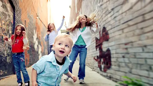
Okay so expression we have expression and I love expression we have a three so we have a triangle formation which is fantastic and we definitely have moved in spirit and I love that things that we can shift a little bit obviously when you have photographs of little kids with sunglasses it's really fun if you were to do a whole session you only want those for a few of them but it certainly is a nice lifestyle lifestyle slices really interesting that way um one of the things that I would consider for an image like this is I do like how it's a triangle you could do something where you square it off more significantly and the triangle within the square is a really interesting dynamic to do so you could have something where the image is squared off very square um just to call more attention to that I never go on previous mode where his crop it's hardly an edit isn't it uh tools yes. Okay, so then something like that now do you see what a difference that makes now that brings us right in to ...
what we're what we're looking at what we're interested in um also I think for an image like this what could be really compelling is making it black and white um and the reason why I would love to see this image in black and white even though the colors were really fun and spirited what I want more emphasis on is the expression because the expressions are fabulous, and if we go to black and white, what we do is we minimize the contrast in patterns and all the things going on and little things like even though we have a little dirt on the shirt but that I think that's what that is like, little dirty shirt on over my kids, that's what it would be, but that kind of goes away a little bit and then things that we're talking about timeless and not necessary showing logos and graphics and stuff like that, you could also bring a lot of the emphasis in towards the face and pulled the rest out of focus. So then we really have and you could get in while you're shooting, which would be literally just adjusting your aperture so you have a more shallow depth, the field and you are close enough to your subjects where it's right on their faces or you could do it in post through the lens blur option. You just basically lasso a section right around the faces you'd have a feather that was pretty, pretty generous amount of feather so it's not a tight line of effect, and then you'd lens blur the arrest of the area, so it was a lot softer, and so what I see happening is by adjusting the crop adjusting the style so it's in black and white and then bringing the focus right in the face is you then take this into really like you can't help but go right to expressions and that's the best part of this image and that's what we want to see and I believe this image was rebecca's is that correct? So their faces does that make sense to you david questions about that now that this was my daughter and a couple of her little friends and you know at a ball game and do you have a couple where they're all looking and smiling which was shocking they did that together how did that happen? But I thought this one was fun because it's you know I just said them being silly yes, yes and I love that and that is what you want to emphasize that's exactly the part that I want to come out the most because it's the most striking and often with um you know when you do have candid moments that they're fun and silly and it's not like you call the friends it's okay, now I want you to wear this which is a lot of the cool stuff we get. You can minimize distractions by simply making the focus more here and you could do that through cropping and and style izing it to black and white thank you very much which one's your daughter pretty smooth crazier in the left love that howl of it alright so, um here we have let's see and who's assembly this no you know what I saw the c l a and I thought normally food right now I guess by the way I love that your name is pronounced her last name dizon it's not dixon. I like that because my last name's tamara lackey and but apparently it used to be like a but then they americanized it I married into it it wasn't mine to begin with but I'm like why did you do that? I really like okay I liked is all I'm saying right? I like that better. Okay it's got nothing to the photo I'm just saying I like your last name uh so uh awesome expression again I love that you guys were doing so well on expressions s o a couple things here I would love also cropping is just really really big if you think about it if you look in this image which again I really like the toning too like the toning I love her catch lights I love thee the warmth ah lot so one of the things that I would look at is if I think about where my subjects composed in my frame and and the centre of focus is right here, right that's what we care about obviously the arms have a lot to do with it too, but it's mostly here where would you say they are? They're kind of a little off center, right? They're not in the centre and they're not in anak cess point and I would love to see them be in one place or another actually love center composition when it's really striking and bold and has has a big impact but if you think about the where the viewer goes, when they look at an image of you goes in a certain way and they go out a certain way that's that's how we look at things and if we go into their eyes and they're kind of looking off a little bit to their left we could kind of out of it fairly quickly if we were to just simply do a crop where we put them a little bit more in that kind of sweet spot for composition um we then have a lot more room for the viewer to go in and out do you see that? And then what we have is this fantastic triangle composition a cleaner look where we kind of go read in and we know we're going in if something's not centered and it's not an accident point if it's kind of off on either the left or the right it's a little floaty like you kind of float a little bit in that space and it doesn't feel as anchored this feels a lot more anchored to me I feel like it looks like a more substantial composition um and then the only other thing I would do in post which I think would be really tough to do on the spot and again I do these often imposed if I can't get in the spot is the little boy his left eye's got a great catch light she's got really catch lights I'd probably want to emphasize his right catch light just a little bit a silly little thing that won't matter in a small print massively will notice it in a twenty thirty so things like that but otherwise I love the toning and I love the faces and all that stuff the patterns obviously contrast a little bit they don't go is well together, but I think you clean that up by toning I think by softening the toning and it's not so high contrast it's a little bit of a softer saturation of color I think that helps manage it a lot was that on purpose? Well you're brilliant um what do you think about that? Just the simple crop and then cleaning up the catch lights for him no it's great the composition and it helps you lead into it and I like that you said where you do it on purpose. Either go one way or the other. Either make it center or make it a third. Yes. Yes. Yeah. Because floating in the middle feels like floating. Um, so it ends up being kind of a big difference between that versus that. All right, lovely. Thank you for this family. Okay. I'm saying that right to write family. Um, so we have a new and she may be it's. So funny. I noticed, like, the who? The person is that a picture of all of her stuff? And then I looked at the image after, um, okay. I love our little baby howls. This baby, this is just before her first birthday. Okay, says just walking not quite, not quite as much. Just standing. Yeah. Uh, so I love the full top to bottom. I like the brightness of agree. This is obviously not the winner. Okay, um, and then the and I like that we actually have catch flights in both the eyes. Um, one of the things that I think would help improve this is the angle from which it was shot. If there were a way to kind of move yourself to get either directly in front or have the child back at you I think the angle of view is just it's kind of neither it's not directly at you and you're not directly in front of her and so it's a little bit off because it's not exactly a profile but it's not exactly straight at you and I think kind of choosing that would have an impact um I think also if you think about where the eyes are as they fit into the frame their little lo foran upper third but so we were to come down a little bit on that head space that would have an impact to, um the other thing I ha just knows that the way the feet are they look like a colt like a baby cold to coming out of, like, learning how to put their probably feet and in terms of the posing, I think you don't have an opportunity to really pose this child you just need her to stand, right? Yeah. So you know, I think a couple cute ones where you're straight on and you show the unbalance and you could do a series of that with more posing which is sitting down and then kind of move the feet around and things like that uh that would have an impact to but again it's interesting that the first three in a row crops could make a big difference in terms of composition and and then the angle on that one would would also clean it up. I think with the the other thing with baby spaces that I think we see a lot is it's really common to have, like little marks and bubbles and red marks and that's so so common, doing a couple minutes of of literally just a soft touch, not like a hard core glamour shoot retouched, but just a little soft retouch um, what I find, especially when you're outside and even if you've got really good lighting, but when you have cloudy lighting, um, it's really common to get little dark circles here that don't exist otherwise, because the light's coming down and you're dropping a little bit of this right here and little kids, especially babies, but even little kids have extremely soft skin right here. Excuse me, extremely translucent light skin right here. And so you find darker skin, sometimes under the eyes or the blue skin or the shadow more frequently, children that you do otherwise. And so the fix for that is to have a fill light fixed that's the feel like the point of the film light is too soft in the shadows. So if you had a reflector on that image and it were tilted down just a hair those would have been gone if you saw in the urban shoot we would have the same thing with the when we were in the bay area because that light was about with the grey and the reflector help soften those shadows so I think having a reflector on that makes a big difference too and then just a little softening of the skin and then shifting angle to be their straight on or completely in profile on purpose any any questions about that that's one of my own personal quick critiques is I felt like my my fill light wasn't at the right yeah um philip makes a massive difference in terms of helping your subjects to pop and to be more flattering and then with her her mom was to the to my right so that's where I probably left yeah so either have her with you or you jump over the mom yeah yeah okay thank you very much. You guys were so brave um okay so this was ah contest right? This was from the critiques and I believe this was from someone by the name of guadalupe guadalupe okay unfortunately a bit of a low res image I can still see it just fine but that explains some of picks elation I'm sure it wasn't shot that, uh love what facebook condone our images sometimes but so obviously we've got great expression it this strikes me as an image where not necessary on purpose but the way she was moving ends up being this delicate lovely situation with our hands um I love this and that's a lot of what you can get when kids are very lost in what they're doing like I said with her arms swinging you're moving about I think the competition composition is getting her eyes or halfway down the frame but the green but she's kind of a down and low so she's really close to that oxygen actually she's a little bit lower than in the middle the frame's a little bit closer to that bottom right access point which I think is good I think actually what would be even better is if we could stretch out the left part it looks like this was cropped a little bit until a bit more of a square if we had pulled out the left a little bit I would actually like this better imagine this little bit a slightly more panoramic with a little bit more to the left that would even out where she is in the composition on dh then the other thing do that exercise we talked about where you squint a little bit what you see umm what I see is a speculator highlights behind her they kind of pop I love that kind of golden sort of light but if you can't fix that while you're shooting, you can soften the dramatic effect of effective speculum highlights in post by simply doing a little bit of it either burns, you know, burn tool or actually picking a color really close to the bright white and soft soft saying it with a little bit of a paintbrush s o that is a way to make it, so that doesn't pop so much because you definitely want the expression there in her eyes with that lovely catch lights what I do see a little bit happening is with that bright, bright toning around her and I suspect it's underneath her that bright, I'm not actually there, but I think she's in a water park kind of situation or sprinkler, andi, I think that what we're seeing is a lot of bounce of color cast coming up to her right cheek. Do you see how it's like read a magenta and oranges that's really common around bright, colorful plastic things? So when you're in a park on a slide when you're playing with a little tractor when you're in a water park, light, of course, will emphasize reflection. That's why you get more sunburn when you're on a boat versus I'mjust safely it sure. So what's, the other thing with color casting, if you can't separate, are enough from the color cast without losing the moment. You can also do a little cleanup of that color casting and post by selecting the area on the face, doing a wide feather, and then de saturating a little bit of whether it's more magenta or read or whatever it is just to kind of control a little bit of that bright casting. Obviously, you can also go into black and white, but I think one of the parts that's really exuberant about this is all the bright colors I really drawn into that s o I would rather just kind of fix the problem area in terms of color casting and again time after time after time, some of these issues that seem really small on a computer or when you put him on facebook or when they're in a small gallery for your client suddenly becomes igor miss when they're printed and and that's, what you learn so well by printing a lot of your work is that you start to see these things really quickly. You say that color cast that looks like nothing will look like almost like a patch or a tattoo on her face when it gets big, so you want to kind of clean that up before you go in.
Class Materials
bonus material with purchase
Ratings and Reviews
Judi McCann
I really loved these videos and am grateful to Tamara for her clear teachings and her ability to relate her ideas in an instructional setting. She's extremely thorough in her explanations as to the how's and why's. She's got a super sense of humor, too, which is nice. I would very highly recommend this class.
Charlene Goldsmith
This is my first creative live course, and I was really sceptical that I would be getting my money's worth. But I can honestly say that this has been a brilliant investment. Not only is Tamara amazing, but the content is fantastic. I feel like I got more than I bargained for as I even learnt some things in Photoshop I didn't know. Big double thumbs up!
Mari Sierra
Tamara is so good at what she does... Plus funny! This class was great and I learned so much from her... It's one of my faves and in my wish list!