Lesson Info
35. Airstrip: Location Shooting Q&A
Lessons
Class Introduction
04:29 2What is Cinematic Lighting?
06:42 3Motivated & Practical Lighting
07:41 45 Cinematic Lighting Tips
04:53 5Low-Key & Upstage Lighting
06:26 6Control Your Fill Lighting
05:18 7Show Depth In Your Image
13:24 8Pre-Production for Cinematic Lighting
22:42Grip Tools: Clamps
08:41 10Grip Tools: Apple Boxes, C-Stands & Grip Heads
10:53 11Grip Tools: Pins & Portable Gear
04:50 12Grip Tools: Scrims, Silks, Flags & Tape
13:52 13Grip Tools: Wind and Haze Machines
04:07 14Grip Tools: Unusual Tools
04:47 15Grip Tools: Filters
11:05 16Grip Tools: Q&A
15:04 17Theater Shoot: Concept
08:03 18Theater Shoot: Pre-Production Considerations
08:48 19Theater Shoot: Lighting Gear
04:27 20Theater Shoot: Motivated Lighting Considerations
26:47 21Theater Shoot: Lighting Walkthrough
20:45 22Theater Shoot: Capturing The 1st Shot
27:37 23Theater Shoot: Hero Shot
21:47 24Theater Shoot: Capturing In The Seats
21:48 25Airstrip Shoot: Concept
05:49 26Airstrip Shoot: Pre-Production Considerations
19:31 27The Haircut: Location Specifics and Motivated Lighting
13:17 28Working With Scrims On Location
06:34 29The Haircut: Getting the Shot
24:28 30The Haircut: Shooting Plates
08:21 31Staggered Planes: Location Specifics and Motivated Lighting
08:10 32Staggered Planes: Getting The Shot
08:23 33Capturing Plates With Talent In Background
16:26 34Airstrip: Environmental Portraits
07:01 35Airstrip: Location Shooting Q&A
22:05 36Using Plates to Create a Pano in Lightroom®
16:08 37Transform Tool
04:50 38Post-Processing 1st Theater Shot
09:48 39Retouching Details in Photoshop®
13:09 40Color Grading in Alien Skin Exposure X3
06:27 41Post-Processing Theater Hero Shot in Photoshop®
08:11 42Creating a Spotlight in Photoshop®
05:31 43Adjusting Color for Cinematic Lighting
12:28 44Post-Processing: The Haircut
12:08 45Coloring the Sky and Removing Modern Building
05:10 46Creating a Pano Using Plates in Photoshop®
17:12 47Developing Cinematic Portraits in Lightroom®
07:29 48Retouching Cinematic Portraits in Photoshop®
08:57 49Color Grading Cinematic Portraits in Alien Skin
13:20Lesson Info
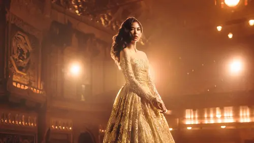
Airstrip: Location Shooting Q&A
I believe at this particular point we are gonna take some questions on the shooting. So, Victor asked, would you worry about no catchlight in the eyes? Do you ever go for that, or not go for that? So, I mean I tend to try to make sure the catchlight's in the eyes if I can help it, especially if I'm doing close up portrait work. This is a really big light source and chances are it's there, you know so it's there. You also have it there, right? I like it, I think it adds a sparkle to the eye and I generally would try to put it in both eyes. So a quick little trick if you happen to have it in one eye and not the other you grab your healing tool and you can heal over and that's a really good way to salvage a missing catchlight especially if you're lighting a lot to the side. So I'm a big fan of them. I don't think it has to be any one specific kind of catchlight, or you absolutely always have to have it but I do think it does add quite a bit of life to the eyes. Eyes can get very, very...
dark and they almost look like, you know, in the possession movies where the eyes black over. That's usually what I'm trying to avoid so I like the sparkle. I think it brings some life, a little bit of liveliness to the eyes and so I always like to have something in there if I can. Obviously in these really far away shots or when they eyes are, he's pretty squinting, I don't think you're gonna see it very much, but you know, especially in the really far away shots. Something like this, like you don't see the catchlight there so I don't think it matters too too much. Yeah? Cosmo asked, I understand what lenses do with compression would you explain a little bit more about how compression fits the vision that you have for these shots? So it's kind of a very similar thing that I was talking about with the theater shoot, and that's a great question. How does lens choice fit the vision of the shot. All the technical decisions are meant to help move the idea a little more smoothly down the river, and I didn't want something that felt very, very distortedly wide. And the reason for that, like a little bit wide is okay, but I didn't wanna go super crazy wide, 'cause if you really think about it when you look at historical photos of that period do you really associate photos of that time to super crazy wide angle lenses? You don't. You generally associate it to something that's a little bit more of a standard focal length. And so I wanted to treat it as something that was a little bit closer to what you might see with those kinds of images and so they're shooting 35, probably maybe most commonly at the widest. 35 to a 50, different formats. You know, you're looking at everything from like a 35 ml to a medium format. Sometimes larger but not really but that medium format, very shallow depth of field is super commonly used in those kinds of images and so I wanted to create something that felt like that. Like one of my big points of inspiration for this particular series, although it's not 100% totally tied into it is the old Alfred Eisenstaedt images from Life magazine. So my favorite Life photographers and there's a series that he did, it ran on Valentine's day in the 40s and it's this tiny little one off series on like one or two pages but it's so beautiful and it was couples saying goodbye at Penn Station in New York, old Penn Station. And so what he would do is he would kind of sit there with his camera really quietly and he'd photograph them from the waist without making movements and it was just photographing soldiers saying goodbye to their wives or girlfriends. And it's a very emotional thing. And it's this really beautiful collection of images and this beautiful old story. I loved the romanticism of what those images were trying to portray and the side of the story that they were trying to portray and so that was like, the look and feel to the images that I want. In an early version of where we were potentially going with one of these shoots we were looking at, I've mentioned this a couple of times, a vintage train museum and it was gonna be that same idea. It was gonna be the couples saying goodbye at the train, right? So I love that romanticism of what some of those images would show, I mean we associate a very specific kind of look and feel to these kinds of images that we already have. So either they are very, very stylistically almost like celebrating it, and so they're very stylized almost to a point of celebration, or they are oftentimes the total opposite of that and if you call back to like, Cappa's version of the D-Day landing and those kinds of images and you look at how life was covering World War II back in the day it was oftentimes very honest and sad and full of all of these things that comes with war. And so I felt like this kind of stuff could at least allow us to look at the perspective that was a little more personal and outside of that more somber realm, and kind of speak to a little bit of the romanticism of the period. Not specifically to what was actually happening but more of the romanticism of the time. When taking period photos like this, this is sort of on the same topic, do you consider the lighting considerations of the time that you're trying to replicate? So I do love studying the way photographers used to work back in the day. I think when you understand what they were using and what their process was it goes a long way when you want to try to call back to it. So, if I am trying to create an image that looks and feels like a 1950s Avedon It makes sense if I understand how he would light. Or what tools he was using when he was lighting. Or it makes sense if we're doing an Irving Penn style what would he do? Well, he would put someone really close to a window and angle the background to change how that looked. Avedon would get a relatively hard light source and bring it really close. A giant big floodlight. And so I actually have a collection of really old Mole-Richardsons with the floods and the fresnels at home because there's a quality of light to them that a lot of modern lights just don't share, they don't have and it's because they are really large bulbs in big modifiers and they're cumbersome and they drain a lot of power and they're hot and they're uncomfortable but they do look different and so I like breaking them out and playing with them every once in awhile because you get to create something that feels a lot more authentic to that period because you're shooting the same way. I find that a lot of as photography evolves and modernizes there are certain techniques that are sometimes lost with how things used to be done and I think it's really valuable if you get to explore it. One of my most favorite possessions is this series of workbooks from a, was a mail away photography program in the 60s. It was called, The Famous Photographer School and it was this whole mail order curriculum that was put together by, it was Irving Penn and Richard Avedon and a slew of other super crazy famous photographers of the period. And it would be like, alright Irving Penn how did you light this? Well, I put him next to here and I did this and I turned this and here's the camera I used and the lens I used and here's how I processed the film and I shot it overexposed and it was high contrast paper. It breaks it down. And so once you understand kind of how they would approach things it's so fundamentally different than how we do now. We have so many lights and so many tools nowadays. But it was like, well what did you do? Well, we had a spotlight and a floodlight. I want it softer, great point it at the floor, point it at this piece of foam core. They didn't have softboxes as much. So, I really think it's valuable if you get to spend a lot of time exploring what they would do 'cause they were able to create these iconic, breathtaking images with a whole simpler range of gear. And I just think it's really valuable and fun if you get to play with it. Do you think that using higher ISO or added grain in post would help sort of with the ambience and trying to create that from older cameras? Would you do that intentionally? So I'm not a huge fan of what the higher ISO will do. Like the digital noise. It doesn't tend to look as close to grain, but I regularly will add grain to an image. I do it anyway, especially if I'm doing a lot of composite work. I find that it can help seal stuff together. So what you'll see, I'm gonna zoom in really close, there you go. So I mean this has got noise on it, or grain. I just think when you're adding it as opposed to relying on it for high ISO it tends to look a little bit better. Yes, yeah? Could you tell me why you went with medium format versus the full format camera? I mean, it's the camera that I shoot on all the time. I'm a big fan of the latitude of the files. I shoot a lot of really dark scenes and a lot of dark images and this particular sensor gives me a whole lot of flexibility in the shadows and I can regularly push and pull the shadows. If I'm shooting at 100 ISO I can push it and pull it four to five stops usably, and so it affords me a lot of extra pliability in the file after the fact. It also is really nice when you are shooting in really dark scenes. It handles low light much better because the noise is relativity smaller to the sensor size so you get a lot of extra leniency when you're shooting in low light. Now, that's not to say that you can't achieve this exact same shot with a full frame camera. If I pulled out a full frame camera and a comparable focal length lens and took the picture it would look the same. You really wouldn't notice a huge difference in terms of how the shot looked. I just like the extra flexibility of the file after the fact. Yeah? Victor asked, would you consider three point lighting for the shoot? You could. Stylistically it would look more like the old movies and that was why I steered away from it. I was going for something that felt a bit more like the illustrations and the paintings of the time. If I wanted something to look a bit more kind of stylistic you definitely could go for that approach. But, you know, in addition to that my goal was to say, this is the total polar opposite of the other shoot. I wanted to kind of illustrate the fact that you can achieve cinematic lighting with one light instead of needing 11 to show you the total polar extremes of what this can produce. And so again, it's just a matter of approach. So, you know, cinematic lighting is a component, but there's also a cinematic nature to what you are putting in front of the frame. That also helps sell this particular set of images to that cinematic look as well. Could you just speak a little bit to the fear of missing out. Like, not overshooting when you're in such a cool location. The fear of not overshooting? I mean, yes, but it's like, so you plan your two shots and then you have that extra time. Or going into it not having a plan is kinda different than just being like, let's just shoot whatever and see what happens. Yeah, I mean listen, I definitely find I do both. With this kind of stuff because there are so many moving parts and there are so many things that can go wrong I tend to really over prepare for this level of production. And I also find that when you are preparing a lot it makes you a lot more receptive to the happy accidents because you're not trying to just get the baseline constantly. You're like, oh I have the baseline. Now it's just like I can be a little bit more creative with what it looks like and I can tweak things once I know I have this safety net. And so that's my approach when I'm doing this kind of stuff. This whole series was the, let's screw around and just make some shots. That's what this was. The third set of the theater shoot was meant to feel somewhat similar. I didn't quite have it locked down as much. I got to rush through it a little bit and approach it from something that was a bit more of a running gun situation. This was the same thing. I mean I think we shot this whole section with both these guys in probably, I wanna say like 10 minutes ish. It wasn't that long, the actual shooting. And so it was a few minutes with each. And it was just like, alright you stand here and I'm gonna move around you and I wasn't linked sitting on a tripod during these shots. I was moving around, going up, down, left, right. And that's why there's a whole lot more of a variety in what these shots look like, but I know that for my hero images, my anchor shots, I've got exactly what I was planning to do. You always wanna leave yourself time if you definitely have that option but if you're out of time you know, you need to make sure that you have that too. What I also like about this kind of stuff this was shot at three o'clock in the afternoon I think, something like that. And it's about overpowering it and making it feel like end of day which I thought was kind of cool. This is, it's like three o'clock in the afternoon. We've talked about it a little bit but could you talk more about how you can separate a subject from the background especially in a low-key portrait maybe without a hair light. Yes, so there are a couple of ways if you don't want to use a hair light that you can achieve separation. One, you can very simply have different levels of brightness for your background and subject. So, dark shirt light background, light shirt dark background. That gives you separation. If you're in an environment focus and depth of field is a way to achieve separation. If you don't have a extra light, a reflector around back can help carve out a little bit of definition so it doesn't reflect or mirror. Tall assistant in a white tee shirt. Any of these things can help you get that. You can also compose it in a way that gives you separation. So, light subject dark background, dark subject light background, also extends to parts of the background. So let's say someone stands in a doorway where there's light coming through they have that frame. Or maybe they are framed to be in front of a window, or framed to be in front of an empty part of the wall. Like there compositionally you can also create that contrast to help you out with separation. And so, here in these I used predominantly focus in a lot of them, but also this has a light, these don't, so it's really executed by focus. But you can also see like, he and this is a bit lighter than the dark part of the plane that is behind him and so it helps create that separation through contrast. We got a question about lenses. Why did you not switch lenses for the portraits? So, I really like that lens for environmental portraits. I think it's just wide enough that it shows me a good amount of the background and that was kind of the entire idea of this. I wanted to utilize the background. So if I switch to like a 90 ml I shot the entire thing like this. I don't think you really get where he is. But with the 50 I'm able to get a bit more of what's happening. I actually don't think the lens is a particularly flattering lens when I am super close like this. And I like this one but there's distortion in it, it's not incredibly flattering, but I think it's fine for even half, full body and even bust shots if you're showing more of the environment. So, I like that. It's just a medium length lens. I think like a 35 to a 50 I really like for environmental portraiture and it's just something that I have found allows me to show context to where the subject is without being super crazy wide distortion. Bernardo asks, Chris do you use a specific white balance setting to help in post production or make that easier or do you fix it all later? It absolutely depends on what the image is. In the first shoot I went for something that was a little bit cooler and a little bit blueish. In these it's a bit more end of day. So I was going for something that had a slight warmer tint to the images and that's whey these look a little bit different than the earlier ones. I went for something a little bit darker, a little bit warmer that has a slightly different vibe to it. So it absolutely depends image to image. I don't usually have to make sure colors are absolutely correct. Like I'm not shooting product, I'm not shooting catalog. I don't need to make sure a dress is the exact right color, I can be creative and I regularly change the colors of things all the time. There are certain considerations I make when it comes to color and that is when dealing with things called, memory colors. And a memory color is a color that you automatically have an association to in your mind even if it's subconscious. And so your preconceived idea about what that color is affects how you see it. And so when you see something that you are already familiar with and it's wrong it creates a jarring thing in your head. And so, like skin color, even though there is a wide range of skin color across the world, like we know if we're looking at skin and it's got too much yellow or too much magenta or too much red in it. Like we know when it doesn't look right even though there's a wide range, if something's wrong with it we can tell in our brain. And so skin color is always something that I wanna make sure I get as close to real or natural as possible. It's brightness and darkness of skin tone as well as human saturation. Like, I really spend a lot of time making sure skin looks like skin, and so you can kind of see that. Even though the color looks kind of cyanish or warm or whatever, the skin still looks and feels like normal skin. And we find that when we are shooting skin a lot of times it over saturates anyway, like that's a pretty common thing, and so I'm usually dialing back that color a little bit to make it feel a little bit more natural. Things like logos, the sky, when the sky doesn't register as blue, when it turns into like, that turquoise color that you see in fashion editorial and stuff sometimes, you automatically know you're looking at something that's a visual fantasy, and so it automatically registers as, this is not real. So, skin color, the sky color, logos, things like stop signs, maybe like a New York City taxi cab. Like these are all things that we associate specific colors to. Any food, like any food needs to look like food 'cause then it looks weird. So these are the colors that I'm keeping track of in my head when I'm processing the images, but I wanna make sure they look as close to what I need them to look like as possible. And so this is a, yeah that's what I'm thinking about when I'm working with color and these kinds of tones.
Class Materials
Bonus Materials with Purchase
Ratings and Reviews
Bruce Walker
This course is simply terrific, and I highly recommend it. Firstly it arrived at the perfect time for me as I am soon to do a studio shoot very much in keeping with a cinematic or theatrical aesthetic. Secondly it's taught by Chris Knight who I swear is like a long-lost twin brother. :-) There are so many parallels in the way he thinks and works to my own style. So I avidly watched this as soon as it was available for anytime streaming. This is the first time I have made extensive use of the CL iPhone app, btw, and I love how it pretty much enabled me to seamlessly switch back and forth from desktop viewing to my iPad that I carry around the house during the day. I was able to make coffee and still carry on taking in the course, uninterrupted. The content is fantastic, delivered succinctly yet entertainingly. Some material and ideas are already in my repertoire and were reinforced and validated by Chris' demonstrations. But he also introduced a lot of ideas and methods new to me and very welcome. I was particularly glad to see how practical it is to stitch a series of tripod shots into a wide pano. I have been afraid to try that but I will now be using that in my next shoot, for sure. As alway, his post production practices revealed all kinds of tips about Lightroom and Photoshop I didn't know. Negatives. The volume level mastering is iffy. It started out at a decent level then midway through one of the early lessons dropped so much I had to turn up my sound system to compensate. And as I write this one lesson (34) is missing and in its place was a duplicate of the next lesson (35). I expect CL will have that fixed shortly though (I sent support a note).
Jeph DeLorme
One of the best classes I have viewed at Creative Live. Definitely worth the investment of time and money. The pace of the class allows you to learn extra tips and tricks throughout the process. Great instructor, highly recommend this class to anyone looking to step up their creative game.
a Creativelive Student
excellent class in all regards. outstanding instructor with experience in complicated cinematic shoots but who also is willing to thoroughly cover the basic nuts and bolts. i wish all creative live classes were of this quality.
Student Work
Related Classes
Lighting