How To Apply A Summer Blockbuster Color Grade
Lesson 4 from: Color Correcting and Creating a Cinematic Look in Photoshop CCJesús Ramirez
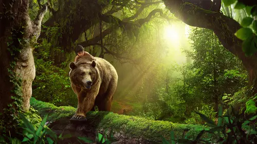
How To Apply A Summer Blockbuster Color Grade
Lesson 4 from: Color Correcting and Creating a Cinematic Look in Photoshop CCJesús Ramirez
Lesson Info
4. How To Apply A Summer Blockbuster Color Grade
Lessons
What Is Color Grading
08:43 2How To Make Color Corrections Using Curves
06:10 3Crash Course On The Curves Adjustment Layer
05:41 4How To Apply A Summer Blockbuster Color Grade
04:55 5How To Make A Selective Color Adjustment Layer
02:27 6How To Apply A Retro 50's Color Grade With The Selective Color Adjustment Layer
08:45 7Color Grading Techniques
12:58 8Color Grading Tips
05:20Lesson Info
How To Apply A Summer Blockbuster Color Grade
we're gonna start with luminosity. I'm gonna fit, fit the image to screen and I'm just gonna place this. I'm just gonna let it float there. For now, the first thing I want to do is set a little bit more contrast. There's no writer, wrong colors. There's no writer Wrong contrasts again, depending on the story that you want to tell. And in this case, we want to make him seem like an action hero. So we're gonna make it not only have the tool orange effect that we talked about, what we're gonna give it some contrast, so I'm just gonna click and drag. So if I click on the line here on the curve, I had a point. If I drag it down, it makes the image starker. And the way you can think about this is when you add a point the value on the bottom, uh, notice others ingredients. There is a great in here, going from white to black, uh, vertically, and then grading, going from black to white horizontally. So the greening here at the bottom is you can think of it as your before value, and then the gre...
ater here on the left hand side. You can think of it as your after value. So if I click here, this point here, if I follow the line straight down, is this shade of gray. But if I click and drag it up, it's no longer the shade of gray. Now, is this light grey here? Almost white. So that's how you can think about other points on the curve. Um, the before point Andy after, So I'm just gonna create a little bit of contrast there. Or you can use one of the presets something like medium contrast, and then make adjustments if you need to. Sometimes when you make adjustments the mouse, especially with a welcome tell that you're not as precise so you can select. Click on a point and used the up and down arrow keys on the keyboard to select them. Or you can use the minus in plus keys on the keyboard to switch between point. So notice right now, the point on the bottom left if the point that is selected if I hit the plus key goes to this one plus key again, go so that one plus key again goes to this one so you can go up and down the, um, curves adjustment layer and then use the arrow keys to make some final adjustments. So if you guys travel a lot and you are editing images on a plane, that's a really helpful keyboard shortcut. Um, so now we have some contrast in the image, and we can always come back and edit this. Now we're gonna turn on the color adjustment layer, and we're gonna apply the color grade that we are trying to give this image We talked about the darks being blue or teal, So I'm gonna go into the Blue Channel. And instead of just clicking and dragging, I'm gonna click on this direct selection tool I'm gonna click on a dark tone click and drag up to make it blue And then on his skin tone I don't want that blue tones. I'm gonna click and drag it down so it doesn't affect the skin as much. And be careful not to get the points. Um, essentially in a line, because you it'll create a weird effect. So I gotta make sure you have a smooth curve as smooth as possible. And you don't wanna have points that are too close to each other. And then you can go through the other channels and sort of enhance the effect you can went to the Red Channel again, click in the shadows and subtract, read to add scions Wanna click and drag down and I'm gonna click on his space and click and drag up to add some of that, um, some of that red back in his face. And of course, we could do the same thing with the green. Maybe had just a little bit of green, the shadows and some magenta in the skin tones and doing what I just did. You would just go and keep adjusting the points on the curve to create that thrill orange effect. Obviously, it took a little more time on this effect, but that's essentially what I did. Just adjust the colors of the adjustment. Excuse me, the points on the curves adjustment layer to match the effect that I was going for. How do you know when you feel like you're done with? I don't from the only person who has this problem, but I don't think I'm ever really done. Um, I think I just run out of time and you know, I'm not trying to be funny, but that's sort of what it is. I'm looking at some of the images I've been showing you today, some of the images using on screen, and as I walked by and my look at him, I think, Oh, man, I still need to do something to that, you know, even though it's now up on screen and you guys were looking at it. But I mean, just to give a more unanswered sort of finalizes. The question is, at a certain point, you're just not making things better. You're just making things different. Um, so I guess you sort of have to decide when you get to that point where you're no longer enhancing the image or just, you know, Now it's, you know, it's just a lateral step is not a step forward
Class Materials
Bonus Materials with Purchase
Ratings and Reviews
Hstrymkrs
I watched this class live, and I thought he gave great examples as he explained techniques. I have been wanting to learn how to color grade images, and I am very happy with the three approaches he shared. I feel I have a great handle on this look now. Thanks so much CL for bringing him to teach us.
Alissa Rosenberg
I am only onto lesson 6 but already I have learned so many new things that I really needed to learn about color! Especially how to use the curves layer adjustment with blend modes! Wow!! Such a great investment!