Why Study Color?
Lesson 1 from: Color for Designers: Exploration, Theory, & ApplicationRichard Mehl
Why Study Color?
Lesson 1 from: Color for Designers: Exploration, Theory, & ApplicationRichard Mehl
Lesson Info
1. Why Study Color?
Lessons
Day 1
1Why Study Color?
20:52 2Natural Awareness of Color & Playing
21:25 3Colors and Their Relationships
38:42 4Color Contrast of the Color Wheel
19:59 5Hands On Color Grids
44:31 6Color Illusion in Practice
13:10 7Interaction of Color Practice - Part 1
08:47Interaction of Color Practice - Part 2
18:27 9Illusion of Transparency
16:39 10Hands On Free Study Experiment
26:43 11Color in Action: Designer Pablo Delcan
26:37Day 2
12Color in Design: Tangrams
18:01 13Hands On: Tangrams
18:11 14Hands On: Leaf Composition
22:53 15Expression of Color & Opposites - Part 1
23:55 16Expression of Color & Opposites - Part 2
28:23 17Learning from the Masters
25:01 18Hands On: Cut Paper Illusion
27:04 19Everyday Found Color 2
32:02 20Colors in Nature with Rachel Gregg
42:39Lesson Info
Why Study Color?
Well, thanks for coming, everyone. Uh, I'm not used to having students who are so dressed up. This is great. I teach in the School of Visual Arts in New York City, and their students were coming in all kinds of clothes, Typically very casual on this will be a very casual Siris of exercises and lectures and and hopefully everyone's gonna have a lot of fun, and we're really gonna be playing today. So, um, we start with this. Why study color? And when we talk about color, color for a lot of people is very serious thing. And it's oftentimes very difficult to comprehend. We all have what I think to be a natural sense of color. We learned color based on observation. When were kids? We're taught colors. Uh, and so we all have Ah, very clear sense of it. And, um, here we're going to be talking about how to study color for designers and artists and artisans and, uh, do it yourselfers. When I think about studying color a designer, I like to think that I'm here to enhance my understanding of colo...
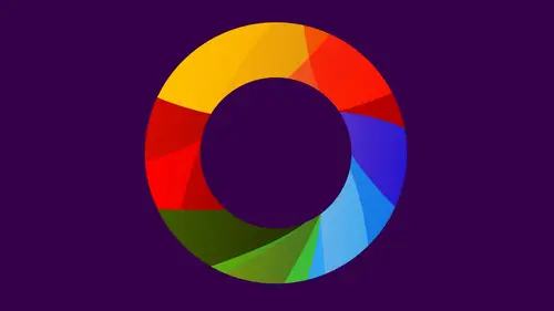
r and to gain confidence. And that's kind of what this is all about two is gaining confidence, becoming familiar with colors that perhaps you're not comfortable using Ah, becoming aware of colors that, uh, you maybe never have, uh, played with before And, um, talking about things from that point of you, I'm just going Teoh, go around here and we'll talk to each of you an opportunity for you to introduce yourselves. Christine is my t a. And I'll just ask for you. Um, why would you like to study color? Wow, a designer. I'd like to know what colors look the best, like which colors to match when I'm working on it. Maybe a print layout like this is going to make everything look too busy or how much color do I add? Or do I just keep it, you know, plain and have the photos be the color. And so it's always the mixing and matching colors that I find challenging. And I think knowing the right colors to put together is a good thing. And what would you say? Your favorite color is? Blue. So blue is, um I've read a lot of statistics about this Blue is, I think, 70% of the people on the planet claim blue to be their favorite color. How many of you would say blue is your favorite color? Yeah. Lose my favorite color to um Sam. Um so I am starting my own business in, um, home decor and design. So while I have my own personal aesthetic around colors, I've never done any formal studies of it. And it's just something I'd like to have a better understanding of and your favorite color Sierra. So I'm Sierra. I'm a designer. Um, traditional design print moving towards mobile experiences and color is something that often have Ah Thanh do time wit. So I'm looking boards and learning. So your workers mainly on screen Now it is notice RGB Yeah, so about a very specific kind of color model that you're working with and we're gonna be talking about these things in the class today. Different kinds of color models. RGB is ah is the color model that we're almost familiar with now. And one of things I like to say about RGB is there's no black rgb there really is. We make black, but it's the absence of color. Um uh, when your favorite color, um, it wasn't a blue family. But to teal Yeah, what I would refer to as Blue Green. Yeah. Okay, thank you. From online Richard. A fresh start saying their favorite color is Sean Shot. True's. That's kind of that's almost like that. Yellow is natural truth. Tetris. Yes, on the second would be salmon. Salmon. Yeah, So one of things about naming colors that I find interesting is that we tend to make associations. So salmon, obviously it's the color of the fish. Start to a seven nature where that name comes from, but salmon is a form of an orange. I would say it's probably a de saturated orange. Has a little bit of weight in it. Um, shared services. Ah, this is actually more yellow, then green, and I think she addresses more of a yellow green. But I like to talk about colors in those terms, so we're always looking at, uh, names of primary colors red, yellow, blue, secondary colors orange, purple and green. And if you're talking about something in between, those colors, like in between yellow and green will just say yellow green. It's a lot easier, and it's a way of understanding color that's, uh, more universal okay. Just kind of going on. Um, Price? Yes. So I am a interaction designer. So most of my work is in software, and over the past 10 years or so, the bar has really been raised on what software is supposed to look like and be really visually appealing. And so that's why I was interested in learning a bit more about the kinds of colors and things that I pick about what the devices air programs I'm working on. What is the color is actually expressing and how they playing together, My favorite color, probably Green Green. Wow. And how would you describe the color that you're wearing today? Uh, let's see. I would say I feel less bad about not knowing a more specific color after, uh, you saying we should really stick primary? Probably say read, uh, it's a little d separated. And, uh, yeah, I guess that's Describe it. So de saturated, it's ah color that doesn't have its much vibrance. Uh, it's I don't want to say dull, because it's that's maybe a negative word, but it's the opposite of vivid. So a vivid red would be like these lights on the cameras in the clock up there, a dollar red, which is this, and that's actually sort of a red violet. It's a little bit in between red and purple. And by the way, Violet is, uh, it's just another way of saying purple. You could say purple or violet. I tend to use those interchangeably. Welcome, Arianna. I, um, a fashion designer, and I also do business related things. So I'm interested in color for, like, understanding and be able to talk about sketches as well. A zoo understanding how things look like one color on like a screen and then look different in a printed photograph and then look different in fabric. Unlike understanding if there's any consistencies there that maybe I just don't know about. And what's your favorite color? Purple Purple? Yeah, like dark. Very vivid, like royal purple. Yeah, yeah, and And where does that come from? You think, um, I'm not sure. Most of my family has that as their favorite color, so it's possible that it just was always the best color. But like it's it's not like required toe have that as your favorite. You're part of my family, so I don't know. Purple is Ah. Um, I always have students whose color favorite color is purple. It's ah, color, that is I don't know. In my experience, it's the way, way down the list in terms of favorites. You know, blue is usually at the top. Purple tends to be more selective. Put it that way. But it is a beautiful color, absolutely beautiful. And the range of purples and violets, I think are fascinating. Your where, you know, very, uh, is a bright purple, but very light. Yeah. Do you have a lot of clothes in a purple? Yeah. Yeah. And in your work, do you, uh, create a lot of things that are purple? Not Not necessarily. So. I tend toe where a lot of reds, um and my design work is It's always custom, custom work. So we'll make it be whatever color it works best for the person I'm designing for. So ah, client would tell you that your they're interested in a particular color or like, a particular color, and then you work with that color. Yeah. So that's a very challenging thing, because once you have a set color, you know what we call him Branding a hero color, then you have to find other colors at work with that. That's one of the things we're gonna be talking about today. And, well, not just today, but throughout this workshop is how to work with colors in adjacent to other colors. Complementary colors split, complementary colors, warm and cool of area and slightly dark variants. That kind of thing. Great welcome. He's going down the list here. Uh, Jane Orange, Orange. Um, so I do work analog work inks and paints and then I creating artwork. And then I also organizer and do interior design with people. So a lot of finding out. How do people feel? Happiest. What color's really are they good drawn to and why? And what can we introduce in the home? But I've always sold a lack and just how to talk about color, the language of color and like what doesn't work like like the two of us. It's like to me, this is like jarring, but I don't know how to describe why it doesn't work to me. It doesn't work in my eyes, but it may be to you. It's fine, you know. I find that a Jason colors colors that are close to each other on the color wheel. A really fascinating um, and we're gonna come back to the color wheel later. Uh, but red and orange are right next to each other, and we can think of those as warm here, warm and your cooler. Yeah, so there's a contrast era called Contrast of Temperature, Warm and cool. And it's a way of thinking about color. That's really fascinating. I mean, almost every well, I shouldn't say. Almost every his yellow. We can't really think of yellow is being warm or cool, although as we move toward green, yellow green, we could say That's maybe cooling off a little bit cause it's in the range of moving toward blue. Orange is definitely a warmer color. Red orange is considered one of the warmest colors, so I find that really kind of interesting to start to think about those colors that are next to each other on the color wheel. And you said you worked with paints. I did, Yeah, yeah, So everything so far we've talked about no interactive design and digital display, which is kind of where things are right now. I love working with paints and with my hands and really mixing colors. That's one way of understanding how to make color is actually with paint. It's great. Thank you. Welcome. Thanks. Okay. And Serena, cream green. I've I love Yes, all of his way. Associate that with olives. A very particular kind of all of Is that your favorite color? Um, no, actually, I I'm partial to the blues to Blue Azul or Blue in particular. So I, um I do business strategy and I work with my clients to develop and refine, visit trudging, translate that into design for the print, the web and video. So I work in our GV and Sam y que and my background. I've had some training and art and design, but it's still a lot of self taught training, So I feel a bit sparse in my knowledge, and I'd like to kind of fill in some of those holes. I have a lot of students in my continuing ed classes at School of Visual Arts who, like yourself, are coming to color and design from a business point of view who are trying to get a sense of how to use color and how to talk about color in relationship to, say, design and other fields. And it's it's a great thing. And I think this workshop is going to make you more aware of color. Certainly. Uh, and not just for work, but also just for everyday life. Again. That's something we're gonna be talking about is how to integrate color and the experience of color and an awareness of color not just into our professionalized, but also entire day to day lives. Welcome. Thank you for Richard from online Garden Dog is saying their favorite color is a turquoise blue, which is kind of similar to what Serena was saying. I think that sort of as year of that bill. He's saying his favorite color is Burgundy because it reminds him of a peanut Moira Good. In a reasonable enough fresh start saying yellow green aura de saturated orange s matin is green defrost are not sure I'm standards. My favorite colors probably end 3.5. So I have to explain that on the month cell system over the months l system that means nothing to me but probably let me something good to Onda. A fresh start is a Pantone girl here so I think we're gonna get into all sorts of things there, Color Lover says. I like browns, blacks and greys as a combination typically so I think Maurin favorite color combinations other than more favorite colors. And I'm surprised nobody listed their favorite color so far as the brown that she likes well. Browns and blacks on Grey's was bitter greens well, O. J vestiges Coming is the greens and the browns for them. But those of their favorite so brown is, is Ah, it's certainly a color, but it's a mixture color, and every brown that we're aware of is a mixture of two other colors, generally or sometimes more. Um, some of my favorite browns are mixtures of orange and blue, and once you start to understand those various mixtures red and green, orange and blue, yellow and purple or yellow and violet, all of those colors are called complementary colors. And one of the keys to color mixing is to think about how to mixed compliments to create what we call chromatic graze chromatic brown's colors that have a sense of another color or temperament of the color in them. So a chromatic gray can have a reddish tint, a bluish tint, a greenish tint. And those are wonderful colors. Uh, painters sometimes will mix complementary colors like red and green together in order to darken the colors. Rather than mixing black with it, they'll mix the compliment. It's a really fascinating way of thinking about color and how to achieve certain kinds of colors and color mixing. It's not something we're going to really get into today. We'll do it a little bit on the computer. We're not gonna be using any wet media eso we won't actually have that experience, but and certainly for people who are at home. If you have wash or watercolor, you can mix those colors and try mixing something like blue and purple or blue. And I'm sorry, blew in orange together and see what you got. Uh, maybe intuitively, you're already doing this. You're mixing these colors to achieve these chromatic grays and browns and creating these rich kind of earthy colors. Okay, it's We continue. I'm just gonna go through this when I think about why studying color. I immediately go to, um, some of the experiences I had as a student when I was studying color and one of the principal color teachers on the planet, a guy who was a student first and then a teacher at the Bauhaus Joseph Albers. Give us this wonderful exercise where we learn about the relativity of color that is the the sort of lack of objectivity of color. So here we have two exes. They're both the same color. And as soon as we apply a color behind one of the exes, we start to see changes. And so what does that teach us? That there's relativity, that a color is never what it seems, that it always is dependent on its context. So as soon as we put that pink color behind the gray, it starts to change. And as we had this blue or this green color to the other side, it starts. It changed more dramatically. And now we see a really dramatic change in these colors. And if we hook them together at the bottom down here, you can see, in fact, that it is one color. But it looks dramatically different. And you can also say, if you start to stare at this, if you stare right in this area here, this is the key for all of these Albers exercises. As we'll call him, you stare there for maybe five seconds. You'll start to see that this color starts to look like that, and this color starts to look like that. It's a reciprocal relationship often happens with complementary colors, so we have a red and a green. Those are compliments, and the shifting of the X is fascinating. For me. That's really intriguing. And it's one reason to study color is to study that idea of relativity and how color is never absolute. This is a great quote from Albers from his book Interaction of Color. We're gonna be talking about this. Believe sometime today, um uh, later in the workshop. In visual perception, a color is almost never seen as it really is as it physically is. This fact makes color the most relative medium and art. It's very important to remember this, So if you are into branding and you have a hero color, one color that is really the symbol of your brand, the the identity of your brand, that color is going to change. Depending on its context. It is a very important idea. This is another great quote and another one of my main influences, Johanna Seddon. We're going to be talking about him as well. Uh, throughout the workshop, you unknowingly are able to create masterpieces and color than a knowledge is your way. But if you are unable to create masterpieces out of your A knowledge than you ought to look for knowledge. And I do love that idea of looking for knowledge, that's what we're gonna be doing in this workshop is we're going to be looking for color knowledge, observation. Looking at these colors, these colors that are on the table, these little pieces of colored paper, one of the best ways of looking at color, one of the best ways of looking for knowledge. So you harness it and is best known for giving us this wonderful color wheel, and he breaks it down and it's really interesting way. So we start with yellow. We had blue and we had read, and those are the primary colors with this in triangle, and we can immediately see that yellow is very light. Red is sort of a medium color enlightens and blue is a little bit darker. So right there we have an expression of contrasts of light and dark, one of the main contrasts of color theory. As we develop a wheel around this now, this is something we're all familiar with. We've all seen this before. Maybe even when we're kids, we start to see the color wheel. That's how we learn color. Often we see yellow here and now, opposite the yellow. Down here we see purple and purple, or violet is the mixture of red and blue. Orange is the mixture of yellow and red. Green is the mixture of yellow and blue, and green is the complement of red. Blue is the complement of orange, and yellow is the complement of purple. We see those compliments there, and then, as we get to fill in the spaces, so yellow, orange, blue, violet or into go these air mixture colors yellow green. Very close to this. You're actually more yellow, red, violet, blue, green and, uh, red orange, so compliments are opposite each other on the color wheel. The aim of such studies to develop through trial through experience by trial and error and eye for color. Joseph Albers again, and this whole idea of trial and error is very important. It's all a matter of experimenting. We're gonna be doing a lot of that in this class.
Class Materials
bonus material with purchase
Ratings and Reviews
Nabha
The course was great. Richard was a very good teacher, appreciating the students’ work and helping them expand and improve on it. I learned from that alone. I feel more confident in choosing colors, and hope to bring a greater sense of fun to my design work. Thanks again.
PETE
How wonderful to have such an experienced, thoughtful teacher, who takes educating others so seriously. The depth and breadth of his teaching skill is matched by his knowledge of the subject. I studied art in school, own some of the color books he recommends, and learned far more than I thought possible. And he does it all in such a kind, affirming, supportive way. What a calm guide. How lucky are we to have access to a class with him!
Joe Loffredo
I was concerned that I wouldn't like watching everyone work, but I found that it was the best part! It allowed you to see Richard's lessons being put into action by the various students, each of which is talented in their own right. And Richard is great. Knowledgeable, intelligent, and supportive, he's got the attributes a great teacher should have. I'm a painter, not a designer, but the class really helped me a lot. When I go back to the canvas, it will be with a much deeper understanding of color, and how colors interact with each other.