Lessons
Class Introduction
01:56 2Understanding the Basics of Color
04:10 3Color Contrast and Hierarchy
15:18 4Saturation or Vibrancy of Color
09:27 5Ground or Surface Color
07:32 6What is Color Harmony?
11:00 7Color Palette
11:11 8Set-up Chalk & Charcoal Demo
03:40Demo: Sketch Simple Still Life
05:48 10Demo: Establish Value Structure
09:06 11Demo: Find Temperature Balance
09:47 12Demo: Shadow & Highlight Placement
17:10 13Demo: Establish Dimensional Form of Object
04:49 14Set-up Watercolor Demo
11:50 15Demo: Establish Color Ground
05:26 16Demo: Establish Colors for Object
05:30 17Demo: Sketch Object onto Watercolor
03:20 18Demo: Color Subtraction & Value Range
04:42 19Demo: Color Blocking for Composition
04:25 20Demo: Establish the Shadow Tone
05:11 21Demo: Utilization of Opaque Color
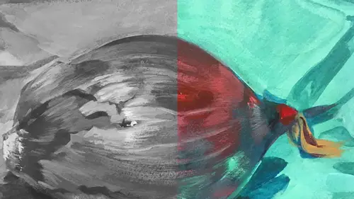
11:51 22Desaturate Image in a Picture
05:37Lesson Info
Set-up Watercolor Demo
Now I talked about stretching the paper and that's, I think it's really important because I don't like to work on a bumpy, wrinkled surface. I like a flat piece of paper. So there are two ways you can do that. One is you can wet a piece of paper. Like, this is Arches watercolor paper, 140 pound, hot press. You can wet it and then use brown tape across the edges, or in this case, I stapled it with a heavy duty staple gun, and I prefer it because the staples don't move. Sometimes the paper, the tape lifts. Oh, and it's maddening, but this doesn't move. But for the sake of, how should we say? Safety and comfort, these are rough. If I run my underside of my arm across that, that will probably hurt a little bit, so for practicality, I just do this thing where I cover all of it with tape. It's funny, it's like, I don't pay attention to all the sounds of all these things (laughs) until right now. (squeaks) But this is not where I'm ending the composition. This is purely for my own safety, and...
it's easy to do. It doesn't take much time. I also think that tape for wet media, you know, again, it helps. I drew a box to define the edge of that picture, but this one I will actually tape it off to keep the edges really clean. And there's nothing more satisfying than pulling that tape off at the end (laughs). One of my favorite parts. Okay, so there now, we're safe. This is just a board, kind of a plywood board. I see something that could give me a splinter over here, so I'm covering it up. Now this is an old board. I've used this a million times. I like old tools, I like things that are weathered, things that have a history like this beautiful ruler. It looks like it's from elementary school when I was in elementary school, so it's just a delight. I think as an artist you do want to surround yourself with objects that please you and make you feel creative and connected. If you're in a sterile space and there's nothing that inspires you, it's really hard to be creative. So in my own studio, I try to have cool little objects. It gets really cluttered then, which is another problem, but I have lots of inspirational stuff. Now we're measuring it this time so that the ratio of color will be the same. So it's eight inches by about nine-and-a-quarter. So I'm gonna try to make this also eight inches approximately by nine-and-a-quarter. And this is so we can compare these two, and I'm gonna draw this line here. We can compare these two images because the ratio of shapes of color or tone will be the same. If I make it a different composition, we won't be able to do that and I think that's just better for instructions, so nine-and-a-quarter. So MJ, just to get people up to speed with what we're doing, you've done the value sketch Mm-hmm. And now, what are you setting up to do again to compare the two? Full on color. Full on color. This is gonna be, this is gonna be the tougher one because there are a lot more things to think about. Think about things we talked about before. Now I have to deal with temperature, saturation, value, opacity, transparency, complementary relationships. (woman laughs) Keep it interesting, make it all work, and oh, oh yeah, remember the light. So it's like a balancing act. One minute you're juggling three balls. Now it's, well, a whole lot more. And this is where people get a little bit like oh my gosh, there's just so much to think about. But we're gonna keep this as simple as possible and I'm gonna work through all of the things we talked about before and show how they really do function beautifully in this particular way of if you align the hierarchy of contrast in all of these different elements, it works and it works quite literally every time and that's what I love. I love when something's go to, I know it's gonna work. Right. It's plenty of things that you know, there's no way of knowing whether it's gonna work or not, but that, some elements of color, you should be able to rely on. Now I'm gonna throw the masking tape around the edge for a clean line for this one, so the watercolor doesn't like, eek under it. And then I'll throw on top of that white tape and I'll explain why I'm gonna do that in a minute. So actually, I think I'll put the white tape on after I lay down the ground. This time I'm going to use a ground of vibrant color and I'm gonna assess it and we'll talk it through what would make the most sense for this surface. Okay, so this is the tape. Pull the edges to be super clean. Okay, so now I have to figure out what my color. My rectangle's a little wonky, but that's okay. What my color will be for my ground. And basically, I'm assessing the situation and I feel like there's a logical choice here, and the logical choice, well, let's see if you could figure out what the logical choice would be. So we have a red pepper, a purple surface, and a brownish orange background. What would be a good complementary color for these, do you think? What would be the opposite of all these? If you'd hazard to guess. Yellow? You're close. A yellow could work for the purple. Right. Right. But yellow and red, are they gonna do much? No. What will work with that red? Blue, green? Yes, green because green is the opposite on the color wheel, so since they've the opposite on the color wheel, it's gonna react (clicks tongue). Right, contrast. It's also gonna react to the purple because it's a complement. It's also gonna react to the brownish orange background because it's orangy brown, orangy green, they are secondaries that are also complements. They react to each other. So that's the best choice, and when I choose a brown, I'm always thinking about a brown that will react to what's on to of it, just like with the dragon pieces I think about what's going to make sense for the story, but what's going to react to the things I paint on top of it. So I am going to lay out some colors over here and I want to demonstrate, like we talked about, there's more than one red, more than one primary blue, and so on, so I'm gonna squeeze out. This is a rose colored red and it's actually called permanent rose. It's a beautiful color, it makes excellent purples because when combined with cobalt blue, or Prussian blue, or purple-y blue like my shirt, these colors make a beautiful purple. The other red does not make a beautiful purple and there's nothing. It's okay, cadmium red, it's okay. I'm not saying it in a disparaging way. It's orange, right? So if you put a blue with an orange, orangy red, what do you think is gonna happen? Blue and orange. Blue and orange. Yeah, what'll they do with each other, where are they on the color wheel? Apart. I need to go back to my color wheel (laughs). I know, we need a color wheel. But they are opposite. So brown? So they'll make a brown. Yeah. And everybody's like, why didn't it make a purple? It will never make a purple. Yeah. They do not function that way. They're not friends in that way. They say nah, we don't want to make purple. So I'm just gonna do two reds, a warm red and a cool red. Now I'm gonna do two blues. This is a cobalt blue, which is just like my shirt. Super cool and I'd almost define it as purplish. So I know that would make that, that purple I'm seeing, I think that that blue and that red, based on my knowledge, will make a beautiful purple. These two, not so much. I'll show you in a minute so you can see so it's not just me telling you, you'll actually know that that's how it works. Now the other blue, I'm just checking to see is it here? Antwerp, Antwerp is a blue-green blue. It's like your shirt. It's a very, I mean, look at this. It already looks different. It has a greenishness to it, so it also will not make, with either of these reds, a particularly vibrant purple. It tends to neutralize because it's the opposite on the color wheel. So the next yellow, we'll put a cool yellow which is lemon and a warm yellow. They're both primaries. Look at that, it's really cool. You don't feel heat really from that, especially if you look at it next to the cadmium red. And we'll just start with the primaries. I might pull in secondaries for punch, but let's just start with, I had said before, a limited pallet. I may not use all these colors, I may only use one red, one blue, one yellow, but let's just see. And for the ground color, we have decided on green. I am going to use, it's called permanent yellow green. Its just a really good green, but it's like this vibrant, beautiful, pre-mixed green that will make a wonderful underpainting for this, and I'll show you. So I'm putting this in the bigger cup because I have to make a larger surface of color. I'm gonna do one thing and let it sit while I'm mixing my ground color. I'm gonna wet the whole surface with just water and the reason why I do that is because if you, if you're doing any kind of wet media, particularly watercolor, to create evenness of color, to create a consistent tone, you put water on the surface first. The water will be your friend and help move that color around in a more consistent, even way and you will not see brushstroke. So I'm just doing that because I like the grounds to have some texture, but not to be super streaky, and I might have to dampen it again as I mix my color. I have a variety of brushes. This brush I'm using now is a square tip brush. It's about an inch wide. It doesn't matter what brand. These are great brushes for laying down grounds. I highly recommend you have this in your repertoire of brushes because if you don't, you're gonna have little tiny brushes trying to make a whole shape of color and it's gonna tend to have a lot of streak in it whereas this will be much smoother color tonality. Okay, so I'm putting what's called cobalt teal, which is another, it's a turquoise-y blue. It's a color that I love and it's going to add to this green and make it, I think, pretty interesting. So I'm putting the color into these cups which are good for mixing large quantity of color just there. I use tube watercolor as opposed to cakes because the cakes are so, are dry. I'm gonna use a mixing brush. Let's see if I have a mixing brush. This one's pretty good. The tube color is so dry, it's hard to mix a large quantity of it, it's just, you're not gonna get that, a massive amount of color. It's a cake, so you're pulling off a little bit of pigment every time you touch that cake. I am not a fan of the cakes. I think because I like to work with vibrant color, it's hard to get vibrant color when you're wetting a little cake and you're trying to pull pigment off of a hard, dry piece of tonality and color. It's just hard to do. Okay, a little more water. So I'm adding not too much water, just some to make sure that when I dip my brush in, I'm not getting a big wad of green on it in one section of the picture. And now I'm gonna clean my brush and I'm gonna do the same thing with this turquoise blue. Ah, what a color. I just love it.
Class Materials
Bonus Materials with Purchase
Ratings and Reviews
Anna Kotzè
I really liked the informal demonstrations and I also liked the way she set out her pallet with warm and cold colors. This was not only an informative class but inspiring. The casual and relaxed working style, encourage playfulness. Thank you for an awesome class.
Laura
I’ve had foundations in many of the color instruction that was presented here so the information was a very good revisit. I also think it was explained better in this presentation than in the other training I’ve had. I enjoyed listening to the lecture, thankfully they weren’t drawn out until you want to stop listening. The demonstration was best after we moved off the charcoal drawing (although that was interesting to watch) because using the paints really brought home to me the application some of the lessons learned. I wish that part would have been more robust so that all of the elements in the lecture could have been directly called out in the demonstration. The instructor was most effective when not trying to multitask too much. Overall, I recommend this course.
Robin B.
I had previously learned basic color theory, but this instructor took my knowledge beyond with layered instruction about value-contrast-complements-hierarchy, etc., and she does it in such a fun way with her own examples of work and great stories! I like her poise and confidence and think this series is a terrific value.
Student Work
Related Classes
Illustration