Lesson Info
4. Color Management Continued
Lessons
9:00 am - Color Management
48:13 2Skype Call: Joe Brady, XRite Equipment Specialist
45:52 3Lightroom and Photoshop Color Setups
1:11:17 4Color Management Continued
31:32 51:45 - Skype Call: Randy Hufford, Ink Jet Printing Specialist
30:55 6Color Management Q&A
09:44 7Color Correction and Q&A
47:41Lesson Info
Color Management Continued
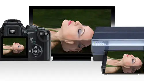
There's something important and photoshopped that you should know we were talking about converting to profiles and how important that is and how that's seamlessly done in some respects if you live in photo shop under the edit menu we have color settings we talked about that we have convert to profile we talked about that there's something here called a sign profile and a sign profile is something that he should never use it's a very dangerous proposition to color management when you assign profile it actually can change the appearance of the file just like you see now the one thing it doesn't do it doesn't change the color data what it does do it changes the appearance of the file so should we use it for the most part of the answer is absolutely not however assigning profile can be useful in advanced color manage workflow well, you are trying to change the schematic and I must say twelve years ago when we were kind of early in all this with skin tone and we were getting erroneous red s...
kin tones assigning a different profile would help we don't have that issue today so and the consultant some of the problems that I have found her people are assigning profiles to their images they might look a certain way but they're definitely getting erroneous results so I wanted to throw that out there because we have been talking about converting to profile signing a profile is a very different animal indeed so just because it's also during break I went to print out this picture of bethany that created the other day and as I look at the print and my display, I see an exact color match I'm so excited about this unfortunately, I was going to print out for your four images, but we ran out of papers that's when you just see this but I'm just so excited it always excites me and I've been doing this for a lot of years I still get excited when I see the image comes off the printer and it's right on target so I just think it's a wonderful awesome company will still love it. You will know it's not fully all the way down well, I will get home and printer one and send it how about I don't have a quick question for you that came up earlier that was about roll paper? Do you always use roll paper with this type of printer? Actually use cut sheet paper as well, which is easy to do and to do that you simply open this panel here is this in your paper in on dh just adjust this to the width of the paper, so back home I have a forty four inch printer, a twenty four inch printer, seventeen it's playing or thirteen inch prayers and my good friend kevin aims uses the fortieth forage printer to print eight by ten's on thiss saying things like why he's such a big printer? Because it's a really great printer but no, you can use cut sheets on this, which is a fantastic uh uh option. Thank you for asking that okay before break I mentioned this scale we'll probably talk about this a little bit later but this is going to be included in the folder it's just a simple scale but from the scale has heard two things that are important it's nothing but a grey scale so when you look at this on your display, you should see neutral color and if you don't, chances are it's not properly calibrated and actually I'll never forget teaching a workshop not far from here just a few years ago in the workshop we brought up this file on everybody's display and I looked at one of my students monitor and you couldn't see any detail from about two thirty one all the way up to two fifty five are from thirty three down it was all black, so we calibrated her display and all of a sudden you could see that entire rain so not only this calibration is it good for the prominent state of it also distributes the luminous data properly, so what I do with this file uh it's good to use when you're looking at your display but it's also good to print out on different paper types that are properly color managed things start to get an idea what to expect in the different tonal range is a swell going back to a year ago. I have five important tips for you to get predictable results, so as we know consistency is the key for predictable results. Our job is to get predictable results and it can only get that for a consistency. Are we going to get exact matching results? That's my question to you and the answer is no, but we can get predictable results, so getting exact matching results scientifically impossible get close, of course, and once we learned their forgiveness factor way can get what we think or exact results and that's what's important here five tips for you they're very basic concepts and the first is trial and error and that's where I came from was trial and error and I did a lot of trials and I've made a massive amount of errors, but I in doing that, I've learned quite a bit so trolley neera is always one of the greatest teachers education becoming educated in the areas that you need in there's a lot of education I think creative live is educational resource for may have been watching creative life since they started if you didn't know that and here's something that you want to do is the ben franklin system is defined, you're bottlenecks in trouble spots and what does that mean? Take a piece of paper and draw a line right down the middle and write down everything that's involved in your workflow and then define which areas are you missing? Which areas of the bottom in that quarter you're spending too much time doing and when you can define it that way can actually zero in and help you find a resolution either through education or finding it means to make that part of your workflow much more fishing efficient and better? This is probably one of the biggest to no latitude, no the latitude of what you're working with and what is that referring to when we used to shoot found and some of us still do shoot film found had a certain latitude ous far is exposure, contrast curb and there was a limit. So once you understood the latitude that film, then you could get predictable results because you knew the characteristics of how that found was going to react. When you look at digital, we have cameras that have an array of different matrix set ups that we can use, we have processing, we all have different operating system, so there's nothing con in there we all have a new way of different applications processing systems the way our work flows or set up in a gray of different output devices so the concept of being consistent is to narrow down on a specific workflow take one sector at a time, make that consistent and then graduate to the next matrix set up if you will in different set of rules that you have here but consistency is the key to get predictable results you want to start to understand the latitude of the characteristics that you're working with that's a mouthful to explain that, but in that respect it was easier back in the film days because we did have certain constraints there here we don't make your constraints and then take that to the next level after you're comfortable with that and then finally utilize color management color management today is pretty much seamless, and ten twelve years ago that was the promise color management will become less and less a parent in our work flow even though it's going to become in there. So what does that mean? Well, the manufacturers have now most all of them have now embraced color management and made it easier for us, which is a wonderful thing, so I'm excited to see that because adapted color management early and back when I did I was doing what they call backdoor profiling I was actually creating these patches that we did today with different labs and different pre press houses creating profiles and converting those profiles to send two the labs and I was so successful in that I had printing companies send me business because it made their job easier on the printing presses, so cut my digital teeth and digital pre press in doing this way. So these air five tips for you to help you get predictable results let's see, do we have any questions on the table about the five predictable five thing about anything? We talked about my weight on u s o not too many that I'm seeing coming in about the five steps that you just mentioned, um, there is a kind of a specific calibrating question here is here is what's important this's color management so let's go for ok, cool, so cpr, carpenter says, I've read on the internet that there is an issue with calibrating max and that money calibrate er's will not work on that type of machine. Can you speak to that? I'm not sure to give a good answer, because when you calibrate a device and I'm mac there's two things that you calibrate, the color temperature are calvin and hey brightness ratio so if you look at a monitor, there's a couple of things that drive a display, and that would be a graphics card, so if I'm not familiar with what graphics card is running and I'm at but that could be the limitation for calibration, but what I found through just observations is that most displays are calibrated ble with color way have problems would be in the contrast ratio or the tonal range or brightness scale that's where the biggest problems life pardon me and in my painting with that knowledge I would say that was probably the biggest problem if there is one with the neck as far as the color should bring it right into a predictable zone ok, so there you go. Um do you have any questions? Can are well, our friend eddie, I'm sorry I'm still be unclear about the no latitude I'm going pardon a servant of the unclear on your five tips you know you said about knowing your latitude yes, could you explain that another way? Because I'm still a little bit unclear as to what you actually mean knowing the latitude of setting that are any of your equipment? How does your camera what is your latitude? The camera when the latitude of your camera is great and mighty compared to what settings that you use? So the easiest way to describe that is stepping back to the film days when we had one color temperature we had one s o setting and we had to understand how that reacted to spec you're highlights and shadows and mid tones and once we understood the contrast cover how that film reacted to a particular scene, whether it was, uh, uh, an average seen arlo care high key we could then understand and get predictable results. We understood the latitude of how that film reacted. My suggestion is that you study the latitude of your tools that you work flow. We are all using something different. We don't use the same camera, and if you use the same camera manufacturer, we're not using the same camera model so there's different characteristics involved there were not using state operating systems, our computers, our output devices are lamp so there's, so much variance and everything we do, my hope is that you will hone in on what you are doing and understand the characteristics, the limitations and whatever with all those things. So once you piece that together with one sector, then you can move to a new sector and put that together and that's just my recommendation. Thank you. You're really great. You think? Thank you. Thanks for asking that, fran, as always, I'm sure that when people in our studio audience who are representing the internet have questions folks out there have the same question known thank you for that clarification for steve hamel. Dot com in st albans in the u, k if you print your images yourself, you had mentioned that you do sometimes send to a lab to finish it and he was wonder what you meant by that we have a lab in atlanta that finishes are work they will melt, they'll stretch our campuses they'll simply mount the images they'll cut them for us so it's a finishing land they do you know display work their display left they're not a photographic lab even though they do inject printing of course I do that so they don't need to do that for us but sometimes we deliver very large images judy just delivered a forty four bites seventy two inch print and they did the printing but they did the mounting and finishing for so finding a service to do you're finishing which is one of the partners is was what I meant by that and the name of this lab that we use in atlanta is called digital picture and they're an excellent resource. So one more question from creighton uh he says what is at his favorite monitor to work with and maybe can you speak tio what we should look for when we're making that purchase? Well, um my favorite monitor would be in aiso monitor um but there's great monitors out there dill has great monitors oh, look at my notes here, give me just a second lacey nbc is odell uh, they all have great monitors, but the one key that we look for in my mind for monitor is what they call the contrast ratio. So when that has a limited contrast ratio is not going to have very good information in the shadows or height range, so look for one high contrast ratio, as joe mentioned earlier, you kind of get what you pay for. So if you have a two hundred dollars monitor, you're gonna have a lot of limitations there and in my book, because this is the only way I can communicate with my livelihood monitor is one of the very important parts, pieces of equipment, of course, I decided, which we talked about from the very onset a few days ago. Equipment is so important to decide which way you're going to go with that in a monitor being the eyes to our images, I really want that to be the best it can be. Give me the best information for the least amount of money. So, outside of working on a powerbook, I recommend working with at least a twenty seven inch display are bigger, the bigger the displays I've found have better contrast ratios. Okay, great it's very helpful. Yeah, helpful. Thank you. Question from from took mall is this work for the works with the same that the same with other brands of calibration tools, right? Hey said he or she says, I have the spider brand calibrate our and I now we had talked about that earlier, absolutely spider is a wonderful product, and it is absolutely ah, great tool to use and does it work for? We've been talking about today, absolutely there's one anomaly that I didn't mention and it might be fortunate or unfortunate, and that is age of equipment, and the unfortunate thing about that is that we might buy into a piece of equipment ten years ago, and now we're we're changing operating systems to the point where operating system will no longer work with that piece of equipment, so we try to make modifications to make it work for us, and a lot of us do that. I understand that being near had to do that at some point, but what I have found, the fortunate thing is if we can keep up with technology together from ours, operating systems in our software, in our equipment, if we can keep those in the same rotating killed it's a much, much easier to maintain the proper type of workflow these days than trying to compensate for an adequate equipment are inadequate operating system or something of that nature. That's the importance of what you're doing and how you're doing, how important is your image ing work to you? And I know every single one of you it's of great importance is it is, to me, our question, yeah, I'm I'm not entirely sure of this is the right place to ask this question, but I know and I know in a lot of other photographers bump into this, too. When I put an image on facebook, it turns funny, looking not all the time, but sometimes, and it can be the same image will be printed and old. Beautiful. Is there a way that I can make a profile for facebook so that because a lot of my business comes through facebook and I have to have a little disclaimer, my images are prettier than this, I swear, it's, just facebook destroys it and kind of blame them. That is it's something that I'm doing no, but I'll give you the whole key right now, and that is the image that you put up on facebook needs to be in the color space s rgb, and if it isn't it's not going to look right. If it's in a sergeant, be, you'd be surprised how good it looks, so let s rgb be the only space that leaves your work flower and and light room when the export I always export j pegs and s rgb that's my rule the only exception to that is if it's requested otherwise and photoshopped using adobe bridge, I'll select images and then go teo photos put us up tools and used the image processor that was developed by russell brown and that is the most powerful processing engine and all of photo shop and it has an option there to click on j pegs in a button to convert this s rgb on the fly which is totally awesome when you're just starting out and you're not quite sure what to do with color how that's working and you're not calibrated it's a good idea to pay for that service at the land but once you have crafted your work flow and you know the color, you got it right you've got a calibrated display you love what you're doing then that's when you tell them to leave it alone and if you don't tell him to leave it alone and to two color correct it, they'll use their own methods and it might be different than what you like so my taste is different from other taste and you know something I've learned is that on the east coast the east coast photographers like a little warmer skin tone than on the west coast they like a little cooler skin tone so there is quite a difference and taste even in this country so that's a strange anomaly that that's been proven to uh I wonder why that is not sure but I'm tell you what and tell you this in the west coast the color of the sky is much more so another question this is getting specific again but I think it could probably help a few people out there so kim three says that she's using light room and costco profiles tio generate j pegs for printing ok and let's see her question is when doing large images do I resize it in light room in the light room printing module or the she let costco do the re sizing do you want to get into that at all? Yeah and every instance let cost of oh do the re sizing if you always send your native file size which is your normal file size that you've created pardon me costco will send that emma's through a rip to get to the right size okay, so you're better off not re sizing in most cases and the only exception to that is if you communicate with your lab and find out if they require that and most labs today do not require that and I applaud them for that. Okay so then the other part of that question was about p p I and what what the pp I should be set tio so pixels per inch once again made of resolution default setting in photo shop and I believe like rooms to forty it's just a default resolution a lot of people use the resolution of three hundred the larger when you sent images to the lab, the larger that image is the less resolution is necessary. For instance, if you're printing a twenty four by thirty the rip that sends that to that printer is probably going to use one fifty resolution a larger might even use less than that larger print, so in respect of heading that off at the past, always use your native resolution left the lab or the rip if you will mandate the resolution and size and sharpening as it goes to the printer. So in the proper workflow and most the labs or this way you don't have to worry about that aspect yourself native is the way to go lots of good info there thank you. Write a question from terry five four three two one does the calibration of monitor calibration devices like the eye one or the color monkey drift with time and require replacement of these devices in a year or two? So how often should we would be replacing our calibrate er's would have been fantastic question a calibrate er a ce faras device? Yes, the device doesn't necessarily drift, however the sensor in the diffuser over the sensor could become yellowed over time you can actually take that device and send it back to x right occasionally for recalibration they'll make sure that everything's cleaning this up too two standards but uh I would do that every couple of years the smaller devices I'm not sure uh haven't having problem with with my smaller devices drifting in that respect but that's a really great question let's see here cook esquire from milwaukee says I don't expect that this would be a problem, but if you start with a photo that has one color setting and create a smart object file that ends with a different color setting how do you need to do you need to do anything to align the two to make sure there are no problems in printing? I heard the question I understand it but I don't know the scenario I don't know when I start out with a smart object my color spaces in pro photo rgb when I end up processing it it's still in pro photo rgb so I'm not sure what uh if I understand the question well ok, all right we'll move on to the next woman from nico hot or maybe could aspire can elaborate on that question what calibrations software would you suggest? Since you can mix and match software with calibrate ear's? Can you, um well for instance what the device we used today it's designed to work with creating profiles for printers projectors in displays, monitors if that's the right question I think he's saying is there would you use a different software calibration software with a particular device? No, not necessarily know um however, some devices are limited. For instance, the color monkey display is designed strictly for displays. You can't create a printer profile with it. And also the color monkey display also comes up there's also a pro version that you can use the I one profiler software that we use today it's the same sensor with a more advanced software so you can use different calibration devices with different software devices and get different. Results are different options, if you will so yes, that is possible. And that is not quite ten years ago. You could use a variety of different vices with the variety of different softwares. And today that's not the case there more tune in to the manufacturer software these days. Um, before I keep going are you guys okay on questions? Okay, so beats for thirty five says on this is regarding outputting tio frg be via the photoshopped image processor. You ready? Okay. Um sometimes they say, sometimes I have several photos to output some in adobe, he says a g b and wondering if you meant rgb and some of which are already in s rgb um what will happen to the photos if I asked the image processor to convert them tio, srg be if they're already in a star, jimmy, that making making sense to you? Yeah, nothing will happen if you in that respect, but I am right now and adobe bridge, I've got some images and pro photo I've got some images and adobe and I've got one image that's completely intact and if I go to tools photo shop and I've got to hold my mouth certainly in my fingers not working right and then image processor this's the interface that I was referring to earlier and what's brilliant about this and let me find my mom elsa's nearly go I've got a mouse is working what's brilliant about this is that we can save j pegs we don't have to resize them, but we can and this is where the convert srg be option is there for j pegs, which I think is breaking, but at the same time we can also save tips or even pasties at the same time that are not converted to s rgb. But if you converted srg b two and s rgb it's simply not going to do anything, dad, okay, yeah, they're kind of following up and saying those photo shop apply some sort of algorithm again that re converts it are do you know if anything actually happens to the file or doesn't just say, ok, you're the same and we'll leave you alone? Well, you know, with that statement in a time you convert a color space, you're actually changing the numeric color data, but you're not changing the color appearance of how the image looks unless it's out again a color so let's not worry about elegant out a gamut colors any time you convert from one color space to another, you're changing the physical knew merritt properties of two continents on one limb in its data. What you're not changing is the way that image appears, so converting from one color space to another doesn't change the way the image looks necessarily, but it will change the numeric data and earlier, when we were looking at that dangerous part, which is a signing profiles, but I guess the safe part about signing profile is that doesn't change the numeric data, but it does change the color appearance. I don't think that should even be available unless it's an advancement button somewhere personally, okay, thank you.
Class Materials
bonus material with purchase