Lessons
Class Introduction
02:35 2Describing Color
04:21 3Color Settings
05:53 4Adjustment Layers Vs Image Adjustments
10:57 5Blend Modes
06:46 6Gradient & Layer Style
10:34 7Brightness Contrast Adjustment Layers
06:24 8Levels Adjustment Layers
29:58Auto Color Correction
04:13 10Curves Adjustment Layers
10:56 11When to Use Solar Curves
13:45 12Hue Saturation & Vibrancy Adjustment Layers
07:10 13Color Balance Adjustment Layers
10:12 14Black & White Adjustment Layers
08:39 15Photo Filter Adjustment Layers
08:43 16Channel Mixer Adjustment Layers
05:19 17Color Look Up
07:30 18Gradient Map
09:07 19Selective Color
07:09 20Review of Adjustment Layers
06:28 21Using Smart Objects
10:52 22Color Techniques Workflow
20:11 23Match Color Image Adjustments
06:36 24Change Hair Color
19:04 25Color Gradient: Libraries
04:45 26Adobe Capture: Color
09:04 27Even Skin Tone: Hue
06:10 28Color Adjustment: Curves
05:27 29Image Adjust Color Match
11:31 30Color Match: Curves
15:04Lesson Info
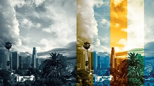
Color Balance Adjustment Layers
All right. I love me some color balance. All right, color balance, I'm gonna open up a couple things here. Let's just start with this one. All right, color balance, I like and I think I like it because I used to do dark room developing. So when you used to get to print your old pictures, color pictures, you had a color head that you used to do the actual process in the dark room. And I think 'cause of my photographic background, my brain likes this. So, in the color balance window, you have shadows, midtones, and highlights. And what it allows you to do is maybe I could say like a duotone. Maybe that's a good way of thinking about it. Making your own duotones. So here I have a black and white image. And I'm gonna add a color balance that's been zeroed out. It will default to midtones. I'm gonna go to the shadows. And let's just say we want to warm up the shadows. Warm up the shadows. I'm gonna add red and I'm gonna add yellow. Do you remember when you add red you lighten? When you add ...
yellow you darken. So the value's gonna stay the same. Gonna go to the midtones. I'm gonna say, yeah, let's get the midtones yellow. But I don't want them too green. So let's add some red to that. And then the highlights. You can either go to opposite direction with the highlights. So I've got warm shadows but cool highlights. Or you could do whatever you want. It's whatever your brain feels like. It's all taste value and what not. I think color balance, I tend to use it for movie effects. And I'm gonna show you a file like that in just a minute. But for photographers, I think color balance is an excellent way of doing color correction because I think y'all think this way. Y'all, y'all are in one little category. You photographer people. You can do this with curves. You can do the exact same thing with curves. It's just, do curves hurt your brain? Do you not wanna bother figuring out that weird busy A curve and you want to do it here? It's all good. And it's already isolated for you. So once again, it's the same function, just done a different way. We're going to Rome on a back road here. Think about it that way. All right, now, preserve luminosity is a very handy little function, and again, it's trying to preserve the tone, the light value. So if you have preserve luminosity, it wants to keep it closer to the original. Do you know why they have to put that own there? Because when you add red, you're lightening, so when you start changing the color, you're just like in curves, you're gonna lighten or darken the image. This puts a restriction on it in a way. And it says, okay, I kind of like putting it on color mode. It makes so you can't move it. So again, same, we're in Rome, we're having pasta. It's all really good. We just got there on a back road. And then just to mess your head up, you could put it on color mode here. And that's gonna change it ever so slightly again. So again, mode, layer mode is on color. I'm gonna put that back to normal. But that's Photoshop's way of trying to keep you there already. This might be, yeah, I'm gonna talk about this just briefly. For print production work, if you have to deliver a layered file, you have to deliver a layered file, you cannot deliver a layered file with adjustment layers and have it translate. Adjustment layers are mathematical code. If I took in a file from Adobe RGB into SRGB, the mathematical code is different. Oh, God, do you understand? This is a pickle. So you need to be very conscious of your color settings before you do your color corrections. If you cannot be conscious of your color settings because you got it from a client, there's nothing you can do about it, when you open the file, you want say, hey, Photoshop, go ahead and convert that for me please. Because it will get as close as humanly possible, okay? Just to throw a wrench in it, what the heck, right? It's all good. All right, so color balance, that's a basic color balance move. You could do it with curves, you could do it with levels. It's just, does your brain like it better? And now I'm gonna show you something else here. All right, again, this is the same kind of idea. This was a comp, that means it very, very, very rough. And I, I have to tell you, I kind of like using color balance as a way of deciding color quickly. So what I mean by that is, this was like the original design for the color. And the client was like, well, I don't know I might want it cool. And rather than messing with the curves and trying to figure it out, I was able to very quickly with color balance just I had the original up on the top. You can see it's a mask. It's just so we can see it before and after. I was able to really quickly go into color balance and really jack it. So I took the midtones and I swung them to cyan and blue. And the shadows I swung but not as heavily. And the highlights I did as well. And then I could say, okay, well, cool, that's original. This is with color. There was another color layer that was delivered that was orange. So I like to use color balance as a way of quickly designing. And then in the movie industry, you be how you have that Guardians of the Galaxy look? You have the Jason Bourne colors? There's these ubiquitous colors that we use. And it used to be you did the red version, the blue version, the warm version, the expendables. That's all that crazy fire orange color. Well, when you've done it for as long as I have, you end up keeping your color corrections with you. And you just keep using them. And sometimes you call them by the name of the movie you put them in. I'm sure I've renamed them so I don't get in trouble. So, what I have here is I have a comp for some television show. And with color balance, that's the original comp, I've gone in there and I've got a color balance. If I was really smart, I'd label this and give it something more than blue. There's a color balance, and I just want to show you what they are. It's just a gentle move. It's adding green to the shadows. And then cooling up the highlights, leaving the midtones where they were. That's one look. There's a blue magenta look. There's a purple look. There's a teal look, I like the teal. Teal's pretty. There's the golden color. Again, this is all color balance, you guys. So this is the opposite of what you've been seeing. The cool, this is now warm. Can you tell me, when you use this, is this shorthand for color to the client? Or is this a handoff the file to the client? Oh, this could be a handoff, it could be handoff. Okay. It could be a handoff. I think it's a little flat. But, yeah, this is perfectly acceptable. I wouldn't give them all of these, though. If that's what you mean? Yeah. Oh, okay, no, no, no, no, no. Oh, this is such a good question. Please, I beg of you, while you are working, do not presume that your clients have the same understanding of Photoshop that you do. This is a golden rule. Please do not ever give them something where they could do something like this and go, well, that looks horrible. That's green. Do not give it to them that way. There's one file. Send it, close it, flatten it, do something. There's another file. Bob, I don't know if that's your question. But I never, ever, ever, ever, let me say that one more time, ever give a file that has layers that are turned off that can be used in different combinations, because they will screw it up, I guarantee you. Ever, separate files. Now, that might seem like busy work. Like, why would you give 10 files? That's ridiculous. Just put one file and put them all in there, uh-uh, uh-uh. 'Cause, again, do not presume they know Photoshop the way you do. And communication, so, I have a story, I have stories. There was a movie, Gathering Storm, Albert Finney, played Winston Churchill. I'll never forget this. Driving by Sunset Boulevard, and his chin was completely in a wrong spot. Completely in a wrong spot. Because the file went to a printer. And they needed to make a size adjustment. And someone scaled something, and they had a mask unlinked. And they scaled it. And this is not like, oh, Albert Finney's chin is wrong. And I'm looking at a little tiny print. It was on the Sunset wall as I am driving by. And I'm like, oh, my God, that's my file, what happened? Because I presume people know Photoshop as good as I do. Or the basics. Color, absolutely dangerous. They will not know what to turn on. Even if you send the most beautiful e-mail with everything explained, hey, you've got options. You've got choices. You could turn one on, two on, three on. That e-mail doesn't go with the file. You could stick a text file inside this, and even then I wouldn't do it. So, I have a folder. I keep it in my bag of tricks. And it's got 115 of these in different types of corrections, and they're just canned corrections. And why I use them in my industry, it's kind of a standard. And it's a way for me to very quickly get what I need without, and the file is tiny because it's all mathematical code. You could have a million of these, and it's math. It's not pixels. And I can just drag it in. And I usually know, oh, yeah, that Expendables red orange would look really awesome in this file. Let me go ahead and drag that in, cool? Excellent, all right, so that's gradient map. I love, I mean, color balance, excuse me. I love color balance, I think it's lovely. I like to think of it as duotones and quadtones, even though that's not entirely accurate. But it's the way my brain likes to think about it.
Class Materials
Bonus Materials with Purchase
Bonus Materials with RSVP
Ratings and Reviews
user-6180b9
Another awesome course by Lisa Carney, packed full of information This course is really a comprehensive look at colors ... I learned so much, and even stuff I thought I knew pretty well, I found some pretty eye opening new information. I find Lisa Carney to be a wonderful teacher. When she has an important point to make she'll say her point, pause and then repeat what she just said, just to lock it into your memory. Fantastic. Side note: I signed up for the CreativeLive creative pass as soon as I realized how great all of Lisa Carney's classes are. I'd started to buy them one by one and quickly realized they are all wonderful. You can watch this class from beginning to end and get great information ... but to get the most bang for the buck you'll want to pause, hit rewind, get a cup of coffee, open Photoshop and try out her tips while you watch. There are sections I rewound and watched about 5 times, to be sure I understood all the subtle points. Lisa Carney is pretty amazing - she works really hard to thoroughly explain the process she uses to solve problems, and she never glosses over anything important. To cover a particular point, she'll start with a finished file with all the layers - and instead of simply explaining each layer like a mortal would do, she'll literally delete all the adjustment layers and start from scratch to show the process. This is incredibly empowering since it gives you an understanding of just how easy the process can be once you get the hang of it
user-93854c
This is an EXCELLENT class for Photoshop users! Lisa is very professional, knowledgeable and, also, a delight to watch and listen to! Not only that she explains the concepts but she also shares her own experience and her practical ways of using those concepts! Great, great class! Thank you, Lisa and CreativeLive!
Maggie Lobl
I am really enjoying this class! Lisa makes complicated concepts easy to understand. She presents various ways of doing things so that you have options and can use the method that best works for your own situation. She moves quickly through the material, which I appreciate, and I since I own the class I know I can go back and review material when I need to. I love her style and approach to teaching, as well as her real world anecdotes and the way she shares her experience, both good and bad examples from her career. I'm so glad I purchased this class!