Lessons
Class Introduction
02:35 2Describing Color
04:21 3Color Settings
05:53 4Adjustment Layers Vs Image Adjustments
10:57 5Blend Modes
06:46 6Gradient & Layer Style
10:34 7Brightness Contrast Adjustment Layers
06:24 8Levels Adjustment Layers
29:58Auto Color Correction
04:13 10Curves Adjustment Layers
10:56 11When to Use Solar Curves
13:45 12Hue Saturation & Vibrancy Adjustment Layers
07:10 13Color Balance Adjustment Layers
10:12 14Black & White Adjustment Layers
08:39 15Photo Filter Adjustment Layers
08:43 16Channel Mixer Adjustment Layers
05:19 17Color Look Up
07:30 18Gradient Map
09:07 19Selective Color
07:09 20Review of Adjustment Layers
06:28 21Using Smart Objects
10:52 22Color Techniques Workflow
20:11 23Match Color Image Adjustments
06:36 24Change Hair Color
19:04 25Color Gradient: Libraries
04:45 26Adobe Capture: Color
09:04 27Even Skin Tone: Hue
06:10 28Color Adjustment: Curves
05:27 29Image Adjust Color Match
11:31 30Color Match: Curves
15:04Lesson Info
Levels Adjustment Layers
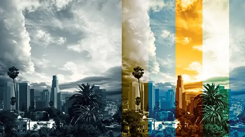
So levels, I'm gonna take a moment and talk about levels. I just wanted to show you this picture for a second. I love levels. I use them primarily for tone, not for color. You can absolutely 100 percent use levels for color, absolutely, I tend to not. I tend to do curves - colors, curves, CC, it all works out well alphabetically, but you can. One of the things you're gonna look at when we're talking about levels, this is a histogram that shows you what you've done. The one here on the left of your screen is the one that's been manipulated, and the one on the right is the original. It's a little hard to see in this image but there's a line going right through the center that'll show you the difference. I'm showing you this now so when we're talking about levels you can actually see what I've done. Here we are in a levels image. I feel like I should talk a little bit about the anatomy of an adjustment layer, and what I mean by that is what are you looking at? When you look at a layers pa...
lette and you look at the properties menu this little icon here to the left is the symbol for the mathematical code for the adjustment layer to tell you what kind of an adjustment layer you have and each one of them has a lovely little picture so you can see, that's a curve, that's a level so that shows you a histogram. When you're doing your color correcting on a job I would make a suggestion that you don't just leave your files labeled levels or curve or solid color, but instead you perhaps label it adjust midtone, or on a color layer if you were to do a solid color, let's say we did this red, we could call it, let's do a 187, zero, zero for example. If I were to label this and I were to deliver the job to someone I would call this 187, zero, zero and I'd label it that way. That way whoever comes along who has to pick up my job they will know that's what that color callout is. I think it's a really handy thing to do to communicate with people. In addition do you guys notice that has a dot in front of it? On my files, the adjustment layer for the level has a dot. On a lot of my files when I do an adjustment layer I do the option eight, which allows me to, alt eight for PC users, that allows you have just a little name, a dot, no big deal. If I were to make a new layer and put a square on it and hopefully in Photoshop you guys know that there is a command to look if you hold the control and the command key you can actually see what layer you're on and go to it, it's a navigational tool. Control, command, you click and anywhere that cursor is clicking if there is a layer it'll show you the name. Why I put a bullet point, an option eight, is all my color corrections are option eights. If I'm looking for, let's say I have a file that has literally 50 layers and that's nothing, that's nothing in my business, we've had some that are crazy, crazy, crazy layered, it's really hard to see where you're at, and oh I want that blue eye correction, or that waist tuck in, or whatever, if all the color adjustment layers are option eight, bullet eight, then you know what you've found. It's a really handy trick for production work. But I digress. In addition to your adjustment layer you will see you have a mask. It is imperative as we go through the rest of this course today that you see you are on the adjustment layer, or you are on the mask for the adjustment layer. Do you notice the properties window is gonna shift. And why this is really important is later on there's some corrections you can do that are a little automated and you have to know exactly where you are on that adjustment layer. In addition to the masking, meaning there's a mask, the other cool thing about the adjustment layers is there's a mask, which means you can actually use channels for example, and manipulate your mask. I'm gonna fill this with black. Now I'll fill it with white. I'm gonna do a crazy adjustment here, just some kind of whack-a-doddle adjustment. Whack-a-doodle is a technical term. So here is a crazy, weird very dark adjustment I've made, but I can now mask it in to only show where it's white on the mask. Again, as this course is on color and it's not on channel pulling and it's not on advance masking you might not know what I'm doing right now and that's okay. What I want you to know is that you can mask your effects in and out using a mask. How you do a mask that's another conversation for another day. You need to know that you can paint in or out any adjustment that we talk about, and you can do it in a sophisticated way or you can do it in a ham-fisted way, it doesn't matter it's all available to you. Levels, let's talk about levels. I'm just gonna go ahead and delete the mask here and I'm gonna reset. I just reset my adjustment layer by clicking the little arrow that goes around, ooh go back. With levels these histograms are really lovely, well I think they're lovely, and what they allow you to do is see where your points are, your white points your black points and your midpoints. A goofy, little thing about levels is that this is the middle gray right here, this middle gray delta dawn what's that flower you have on? Come on, one person in the room knows that song, please. Helen Reddy? Ah I'm so old. Alright never mind, anyway, Delta Dawn come on look it up goggle people, go do it goggle Delta Dawn. That middle triangle is the midtones the 50% gray zone and if you slide it towards the whites it gets darker, towards the darks it gets lighter. Do you see that? Darker when you want it, look I'm going to the white arrow let's go meet here we are, oh it gets darker. Middle gray taken towards the black it gets lighter. What the heck is that? For my brain that absolutely does not work, so in my 25 years of using Photoshop and I love levels I use it all the time, whenever I open it I'm always like oh I want to lighten up the midtones, oh bless America, I have to go this way, so don't feel bad if you have to do that, I have to do that. What this is doing is, this is moving the blacks in and the whites in, forget that little histogram jump you're getting there. Chris from tech is gonna help me fix that in a bit I'm sure. When you move the white arrow in, I know this is a little dry folks you're gonna get contrast to your whites, your whites are gonna expand into quarter tones when you move the black triangle in your blacks are going to move into the three-quarter tones. The bottom bar, what the heck, this bottom bar does kinda the opposite. What you do on the bottom bar, what was black you're now saying hey make that gray. It does the exact opposite, the top bar verses the bottom bar. I'm spending a bit of time on this because I use this tool all the time. I absolutely 100% love this tool. It's really important that you know top bar verses bottom bar. There are some printer people, or very techy people, who would actually be able to type in the numbers to know whether, I am not that person, I'm a feel, vibey girl, but some people like to color correct and tonally correct using these here. Anything else about this? I don't use it for color, full disclosure, however you can go into the reds and change the reds. Do you see how I'm bringing the darkest part of the red in? That is going to lead that picture to more cyan. That's more cyan. That's more red. You can do color, I don't think this is very intuitive, I'm going to suggest you write down color, curves; curves for color cause I think it's a little more intuitive, but I want to let you know that it's here. You've got green, again the same thing with green. Oh if you take out green you get magenta. Take out green you get magenta, and if you slide the middle value towards black you get green. That's green. Blue. Slide away from blue you get yellow, or get more blue. I feel like I should take a moment and talk about these colors real quickly. Let's take a little side note here, give me one second, I'm gonna open up a file and see if I can help explain color. We're gonna diverse here a little bit. No I'm not gonna open that; I think I will do it this way. You're gonna have to just bear with me here for a second I'm gonna make a little diagram for you. And hopefully you're all having fun, in fact, let's do it with solid color cause then I can reach these. This is just something to put in your notes, so you have, so that you know this is the direction to head. When you have red, bear with me for one second here I'm just gonna make a little demo. When you have red, the opposite of red is gonna be cyan. I think some people here are gonna know where I'm heading with this right away. When you have green, hang on one minute. When you have green the opposite of green is gonna be magenta. So on your sliders when you're pulling your sliders if you go away from red you're gonna get cyan, if you go away from green you're gonna get magenta. Blue it's going to be the exact same thing, blue and yellow. You just need to put this in your head somewhere and you'll always remember it somehow, by some fabulous something, maybe you'll take a screen capture of this right now, those of you watching at home, that's just in your mind anytime you go from red it goes to cyan, green goes to magenta, blue goes to yellow, RGB goes to CMY. Want to know something even cuckier? Anytime you go from RGB towards CMY it gets darker and that's gonna be your K, for CMYK. Anytime you go from CMYK to RGB, your image is gonna get lighter. If you add red, image gets lighter. If you add green, image gets lighter. If you add blue, images gets lighter. You go the opposite direction, it goes darker. That's going to be RGB to CMYK, think of the K as black. I know it's kinda color theory, but I think it's helpful when we're looking at things like the levels move. Here's a major use in my industry for the levels move, and that is for reducing blacks. I've got this little composition, nothing exciting it's this little bear thing I did. There's a background and here's the bear, and let's say you want to add some depth to this image, you want to have it expand, feel like it's moving away. A very common, ubiquitous way of doing this is to do a levels move, so you pick your adjustment level. I would suggest once again, name it option eight, levels to reduce blacks. A couple ways of creating depth or space is saturation, blur or density, you know when you look at a mountain and it's all faded in the background. How you do this is you just take your levels move, levels adjustment layer, and you grab the blacks the black delta dawn on the bottom, and you slide it in. What that's gonna do is that's gonna give you a lighter density, and then where you put it, this is the other thing to talk about, about adjustment layers, where do you put it in your piece. Do you put it on the top? Do you put in on the bottom? Where do you put it? I know there's a lot of confusion for folks when they're working in Photoshop, so as a general rule I try to keep all of my color corrections on top, on the very top for flexibility, but occasionally in a situation like this where I want to have depth I need to put in on the bottom. As we said earlier, there's that beautiful mask right there, and I'm gonna fill that mask with black. I want to reiterate cause this is really important you gotta know which property you're on. Are you on the level, the adjustment layer, the mathematical code, or on you on the mask? You gotta be definitive about pushing. I'm on the mask, I'm gonna fill it with black. By the way I use that quickie all the time, shift delete to fill with black, fill with the fill menu and I can fill it with black, or white, or gray. What I like to do on this is I like to take the gradient tool, and I like to have it on radial, do you see that it's just on white, foreground to transparent, and I just like to click and drag with white. Then you can fill it in. That's a real simple way of adding depth using a levels move. Yes? Does the stack effect the image differently if the stack, I guess the stack order, so you're talking about adjustment levels, adjustment hue saturation which you're gonna get into and these others. Does the order that they're presented, cause you touched on it earlier you said you use your option eight to put the little dot, and you were putting those adjustments up top first, [Female Presenter] Right. Is there a certain hierarchy of those layers that you use to effect your image in a more logical way? Yeah so this is a really great question, so basically if I can simplify that question a little bit, where do you put it? Where do you put it and why? Where do you put your adjustment layers? For this, it's a flexibility issue. What I mean by that is, if I'm composing a job and I'm working on this and I am not certain where I'm gonna put everything, so let me go to, I have a mouse, I have a lemur, I have animals, I have a bear, and let's say I want to move my grouping because I'm not sure. I want it to be flexible. That determines where I put my corrections, because the masking is gonna be at stake. What do I mean by that? This is a great question, it's a little complicated, I'm gonna show you an alternate way or why this would be a problem. Let's say, if you put it down below, then it's flexible. I can move that bear, I got a crappy mask look at that. Nothing. It's a blah, but it looks lovely. Sometimes a blah mask is exactly what you need. If I move this correction on top, then what I need to do is have a more specific mask. What I would have to do is take the bear, this is a really good question, take the bear, select him as a mask, go back to my adjustment layer, fill that with black because I don't want him to be effected, and now there's my mask. That was a crappy mask I selected, let me redo that. Oh live TV do you see what happens? You do crappy masks. I didn't select what I thought I selected. Command, click. Now I've selected the bear. Do you know that? If you hold the command key and click on a layer it will select its transparency for you? Very handy. Now I'm back on my adjustment layer called levels to reduce blacks, and I'm gonna fill with black, pardon me, and again I'm holding the shift, delete. Now I've masked out the bear and I can have that value, oh crap I need to do the little bear. I think you can kinda see the problems as they're starting, here's my baby bear, let me go find where baby bear is. Baby bear's in the eh, there's baby bear, and look at this, baby bear's got a very complicated mask, let me command click on that. That'll still work for me. Bob can you already see the trouble we're headed in? Yes. Now I've got this masked out and that's perfect, oh that great, but my client who, you know I want to say I love my client but today I don't love my client so much because they can't decide either or I don't know what I was thinking, I gotta move my bear, ah crap, now I'm in trouble. Do you understand? This is where the problem happens with adjustment layers. They're fantastic but you really need to know where to put them. As a generic Photoshop rule, I hope this helps, I think of building as a pyramid, so whatever's in back is in back, so the back scene is behind him, the adjustment layer that effects the back is behind him, so I leave (speaking in foreign language), I leave everything in its place, where it wants to be, and it keeps it more flexible. I try not to punch through. I try not to mask through. If you look at this mask here, I've punched through something. I try not to do that. I hope that makes sense, a little bit of sense? While I try to have a golden rule, which is all my adjustment layers are on top, I absolutely cannot do that. I try to, and I think what happens with Photoshop is, I hope this makes sense, it's kinda like a best practices. Ideally what I should do is all color adjustments should be on the top in case I have to change it, but occasionally they cannot be, and this is why. Did I mention before Photoshop is not linear, it's very circular? This is an example of that. Does that answer your question? A bit? Yeah? Excellent. Levels, let's talk about levels. I would suggest rather than brightness and contrast, you use levels. Let me close up this thing and we can talk a little bit about adding contrast. Honest to God if I had to tell you my three top adjustment layers I use, it's curves, levels and hue saturation, without a doubt. Rather than brightness contrast to do contrast, I would like to do it this way because I can see, I can see what I've got going on. Brightness and contrast you don't have quite the control, cause right here I can do this crazy thing where I can increase the density of the blacks right here, but at the same time I can say now as a group flatten them out. Believe me you'll want to do this on occasion. Same thing for the white; I can increase the contrast but I can basically say I really want this image contrasty but I also want to bring the whites down. A little more rare. The tendency by the way is to bring in the blacks, and I'll explain why we do this. Clients will want a file that's nice and contrasty like this but when you go to print, and you get too much print buildup ink buildup, it's gonna go to a magazine or flexo printing your blacks you can't have a certain density, and I'm sorry I can't remember the number I want to say it has to be under 288 for magazines, your black density, and how you fix that is you bring your black densities up at the end. What we will do is a social media file might be that, what you see there, the file for print might be that. That wee, little correction will be saved on top and that will be called, correction for newspaper, hopefully spelled right, hopefully you never know. Cool? Does that make sense? Levels, I'm gonna skip the color part of levels right now because I think I'd rather stick to curves for that. Yes I'm gonna do that for now, but we can go back to it later, perhaps. Another trick ubiquitous trick, I'm gonna show you right now, let's go back to history. While I go through these, we're gonna have section at the end of this course that actually shows working files and combination of adjustment layers used and what they're for, this is a little generic overview, but a very common trick to do, in movie posters especially, is you will copy your art, so I just merged that all up on a layer, and I'll do a super blur, it's not super cause it's good, it's just super cause it's a lot. Super blur! Let's say we do, I don't know, let's do 20 just for giggles, and then you put that on soft light, that layer that's blurred, you put it on soft light and it increases the density but it gives us this little softy vibe, and why folks do this I'm not calling anyone out I promise, is if you've got a composite and there's a lot of masking and whatnot, and you're not the best masker in the world, this does what we commonly call, "stepping" on an image. It just kinda steps on an image, however we've got a problem look how dense it got. That's a little (speaks in a foreign language). What we're gonna do is add an adjustment layer, we're gonna use levels cause that's what we're talking about, and we're gonna put a bullet and we'll call it, reduce density. Pay attention here folks this is a key one, you want to click on use previous layer to create clipping mask. That's gonna clip that adjustment layer just to that layer called super blur. Now, we're gonna do what we just did before, which was bringing the blacks and bringing the whites. Bringing the blacks, bringing the whites. I'm gonna have to do that a little more radically. Do you see all the density? That's the density before, this is the density after. Okay maybe a little more. That's alright let's not be afraid, we're gonna really bring that in. What you've got is, you still have the blur, let's zoom on in, you still have the blur, but you have less. You would not leave this on normal but I just want to show you what you've done what that adjustment. Do you see that? What you've done, I've done actually, that's the original, I've just reduced the density, and now I can put that back on soft light. It gives us this little kiss of blur-ness, or happiness, or lightness, and it doesn't change the density. Again, do you see how complicated adjustment layers can be? They're amazing. You've got the code of the adjustment layer, you've got a mask of the adjustment layer, you've got the mode of an adjustment layer, but then you've got this whole ability to clip an adjustment layer. Do you guys see that? I am holding the option key, or the alt key, and I'm clicking on the line in between the two layers. What that does is, as I've said, it makes the adjustment layer only effect the layer below. Look at that, oh my God. All that just for an adjustment layer. That's not even including a channel pull on your mask. Does that make sense? This is a density issue, and a way to do blurring, and a way to do effecting. The only bummer about this effect is that it does require you to make a full layer copy first. On good production skills, super blur was probably not the best terminology, I probably should have called it blur 20, so that if someone else had to come up behind me and redo the file, let's say to move the bear over, and I had to redo this someone would be cursing me going well what blur was that, why didn't you just put the name? So, Cristina Strombotne, and of course there's a million ways to do everything, is there a benefit to using the reduced density levels verses reducing opacity of the super blur layer? Oh my God yeah, that's a totally different effect. That's a great question. I just went through this with a client the other day. Good question. Let me show you. Just for giggles, and to keep this going fast, we're gonna blur this. What did I say? I said label your layers. Do as I say not as I do. Gaussian blur 20. Just for the sake of this demo I am gonna duplicate that and make a copy of that so I can show the difference. I'm gonna put a little mask on this. Right now we have two layers both of them doing the exact same thing. On the blur 20 on the bottom I'm gonna reduce that to 50% opacity. I'm using the quick key, five, when you're on an edit tool and you hit a number you get the opacity level, so I'm putting that at 50. On the bear on top I'm gonna go ahead and put that on soft light, and I'm gonna add my adjustment level. I'm holding the option key while I'm doing this. I am holding the option key while I'm selecting this level, that allows me to name it, oh isn't that a novel idea, reduce blacks; I have a thing about naming these things I think you can tell; reduce blacks, and it allows me to clip it all at the same time. Now I'm going to reduce the blacks. Can you see it looks different? I don't know on the monitor if you can see this, on a print file, this is a really good time to talk about this. On a print file verses a screen file, how things look, in my print world we're forever looking at a screen, and then we go to print it and we're like oh jeeze what's happening here, things look different. On a screen this isn't quite as dramatic of a difference as you will absolutely find on a print file. Before you close that, I was just curious if you could put the second layer on soft light so we could also compare that? The bottom one down here? Yeah. We have a minor problem which is it's effecting everything underneath so let me put an opposite mask on here sorry. There you go. What I have, I just had to switch the mask. This is on soft light, and this is with the adjustment layer. Keep in mind when you're effecting the density of the file, how do I want to explain this in English? Let's see. You not effecting the middle grays, you're only effecting the shadows and the highlights on the side. Does that make sense, the highlights and the shadows? So it's slightly different. This is actually a good point too, for most people and let's just say the truth here, for most people and the level of retouching they're gonna do, that change is so minimal that it doesn't matter. I will tell you the stuff I do goes on the side of the Sunset Wall it's on the side of the Staples building, it matters, it shows. For many of you out there in internet land you could have just done that, you could absolutely just put it on soft light and that's fine, but it depends on the level of resolution that you're looking at. If you're doing fine art printing, this kind of thing could matter. Does that make sense? Either way that your brain works is totally fine and cool. The other thing that I like about this function is I use smart objects a lot, and we're gonna talk about smart objects later on, and when you use smart objects and you want to do an effect like this, they're forever adjustable. So I don't want to just reduce the level of the file, I actually want to put a code on top of it.
Class Materials
Bonus Materials with Purchase
Bonus Materials with RSVP
Ratings and Reviews
user-6180b9
Another awesome course by Lisa Carney, packed full of information This course is really a comprehensive look at colors ... I learned so much, and even stuff I thought I knew pretty well, I found some pretty eye opening new information. I find Lisa Carney to be a wonderful teacher. When she has an important point to make she'll say her point, pause and then repeat what she just said, just to lock it into your memory. Fantastic. Side note: I signed up for the CreativeLive creative pass as soon as I realized how great all of Lisa Carney's classes are. I'd started to buy them one by one and quickly realized they are all wonderful. You can watch this class from beginning to end and get great information ... but to get the most bang for the buck you'll want to pause, hit rewind, get a cup of coffee, open Photoshop and try out her tips while you watch. There are sections I rewound and watched about 5 times, to be sure I understood all the subtle points. Lisa Carney is pretty amazing - she works really hard to thoroughly explain the process she uses to solve problems, and she never glosses over anything important. To cover a particular point, she'll start with a finished file with all the layers - and instead of simply explaining each layer like a mortal would do, she'll literally delete all the adjustment layers and start from scratch to show the process. This is incredibly empowering since it gives you an understanding of just how easy the process can be once you get the hang of it
user-93854c
This is an EXCELLENT class for Photoshop users! Lisa is very professional, knowledgeable and, also, a delight to watch and listen to! Not only that she explains the concepts but she also shares her own experience and her practical ways of using those concepts! Great, great class! Thank you, Lisa and CreativeLive!
a Creativelive Student
This course has an abundance of useful information along with professional tips based on actual field experience. This course is definitely one I will come back to from time to time to reiterate the information. For this reason the way it is organised is perfect to find information about a specific technique or adjustment layer. It is well composed with some humour and advanced information. Loved it and highly recommend it for people who want to deal with the little details and get things exactly the way they want. Not suitable for lazy or sloppy people who just want to get the job good enough for sharing but don't care about getting it perfect for print.