Real World Retouch Part 1
Lesson 4 from: Color Theory and Its Applications in Photoshop®Viktor Fejes
Real World Retouch Part 1
Lesson 4 from: Color Theory and Its Applications in Photoshop®Viktor Fejes
Lessons
Lesson Info
Real World Retouch Part 1
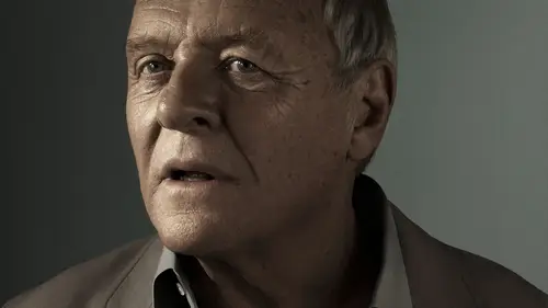
So I brought up an image. No retouching has been done to this image. So it's just like a Roth conversion. And I thought, What would be a very good exercises just to dry Teoh create like a color harmony based in this image, and then we can sort of apply it. We can use, like the tools kind of that I showed you in Ah, a car school that curves in photo shop. So I have this image up on it to help us. Let's get like, I have this kind of will. I know you opened it before, but let's open again. So with this color will, this is again the R Y B car will let's find harmony we can use on this image. And this is, I think, like a very difficult part because what you have to think about is like, do you want it to be night? Very like a contrast image? Because if I were to have, like, I have orange skin turns, I can have a you know, blue sweater. I can make the background like blue, uh, or deeper blue. And then all we see is like a face on do you know, like a floating had. That's why I would not do Ref...
rain doing that right now because too much the center of the blue wouldn't just take over this image, you know? So that's why I was thinking about how about doing, like, something three colors? Because I think that would be exciting once again, if you're looking at that like we have this kind of an orange turn, what we have on the image. So I thought that we could do many things right. We could have, like a like a deeper or in skin tone. Basically, Andi, then have the compliment really like a sigh in color. But why not go for, like, a split, complementary kind of thing and have and I'm going to just circle? It's Everyone can see it very clearly on a new layer, but it doesn't really matter if its nuclear like let's go like this orange, and you know the opposite would be like that. But we don't want that much of a contrast. So what I'm going to create is like have this split so I can have like, blue and green, and you see the great thing about that What we have in this image is already a blue sweater. So it's not Scion. It's it's blue, which is good because then we would only need to, like, change the background. However, we could do it like other, you know, the other way around. Like changing the sweat, sir, to green and changing the background to blue. It'll, you know, it comes down to, well, personal preference. If you're working for yourself on whether it would fit like in that certain theme, like the magazine or something, Andi Yeah, maybe what the photographer would like you to do as a re toucher, Basically. So, by finding the right palace, we can identify what we need right now. Here on, we can apply now, we could go about applying it like, you know, in a way, I showed you with the groups that I created, But I think we can just get over that and just basically get into this the way anyway we want right now because we don't have anything else to deal with. Like we don't have, like, you know, healings or anything like that. I think that sounds good. Now I have this question a lot like the problem with color grading. I know it's not color grading in steel images, but I think that's a very good term for that. People say that collaborating applies only to like motion picture, but I think anyway, what when I get asked like, What's the set up I use in the way, like, how do I have a my working in, like profile? Org B s rgb Adobe RGB a bit 16 bit? What is that? And you know, that's a very viable question. It's very important to speak about those things because with color as you stretch those pixels, you get like banding you get like picks, elation and just all those horrible digital problems you can get here because of that. It's just very, very important to start from, like a very good color space and image and what I would advise and this image I should be in. That same thing I'm going to say, is to use Adobe RGB, which is like a bigger color space than s RGB, which is like, you know it'll be RGB is like the color space of wide gamut displays that you know has been talked about in like a like a researcher at class technical requirements on the the reason. You don't have to go to profiteer RGB, which is like an even bigger range of colors you have there. Is that because just too big it's at this moment at this time. Currently, it it's No, it's not reasonable to do that. You know you have. It's okay to stick with Adobe RGB. It's big enough. It's huge enough to handle your parents and everything like that. The other thing is, you have to go with 16 bit. Obviously, if you if you go to Web, it's going to you. But go back to eight bits. But since we have Teoh stretching pixels, we have to start with a bigger one, like as big as we can go on. And you know, many, many well versions of this could exist. Like how to do that like a tiff file of PSD file or just opened from light room. And and then it's just going to be like, almost like the rule file. It doesn't matter unless it's a J pack. It just don't do that. It's just just stay with non compressed on compressed files because that's that's the way to go. That's that's the best result, best quality you are going to get right. Okay, so now that we have this beautiful face here, what we are going to do, not just going to just my monitor is the first thing I'm going to do. We need Teoh. Let's start with the background. I think that's kind of easy. How I usually go about this is that I'm just grabbing with a double. You like Thea what's called like I think that magic want. I think I'm right. Oh yeah, Magic one that, like 16 to tolerance, It depends on your image. But most of the times when I deal with these kind of portrait, it's sufficient. As you can see, it's quite good in a way, that's all right. Now what I My advice for coloring, for example, background and mostly anything is that try to do with curves because what curves you have that kind of control over the whole thing unless, unlike you have with, for example, like hue and saturation, because I could just have this selection going to hue and saturation and just very easily just shifted to like a greenish tone, right? It's already there. But then what if my selection is not perfect and it's like on skin, then probably what's going to happen just to show you is that your skin is going to turn purple right? So if it bleeds into that, that's not really good. That's the same. If you like colorize, that's bid better because it's just going to be so skin color is just going to be green. If you don't mind that, it may be better than purple, but it's still not their asses. What I would want out of this whole thing, you know. So let's just go back to the Magic one, and that's why you use cows, because what cars you have. As I said, this is control of stretching these things. But since it's like relative to what you have on the image, it's not going. Teoh que your skin tones that much, you know if it does lead over the areas where you have the skin tone. Also another advantage. If you want to, you can dio deal with Oh, it's too light of a background. I want to like, you know, dark in it So now it's, you know, it's in one adjustment layer and then you can do that. Let's let's darken it a bit because, as I mentioned, the brighter it is the left saturation it has. So if we have, like a very bright background, we can only just have, like a slight tint of green there, which might not be able to balance the saturated skin. Tans is very saturated jumper he has on. Okay, so how I would go about this and other people want Teoh differently is that I think about whether I want to make the background slightly darker, a slightly brighter because if I changed the values in like the channels, it's going to change the brightness to because, you know, as I said, like RGB, if you have, like a maximum our maximum g maximum be, it's like white. So what happens if I lower like, for example, the Reds? That's not going to be white. It's going to be at least like a color, but also like the brightness value is going to go down right? So I think about that because I don't really want to get to a bet. I don't want to compensate later. So if I unlike Oh yeah, I would like to have this background a bit darker so I could go like dark hair. But if it's just a slight darkening adjustment, then the whole thing this turning this into green would just help me, You know, dark in this a bit, but I want to go just a bit darker and I want todo the next step later. That's all right. That's dark in this a bit. And now, if I were to choose to lighten it slightly, then I would go into just simply greens, right, because I would add green to this, obviously adding green to blue because blue background is going to produce like a scion effect. That's what you have to account for, like mixing these colors. So what I would suggest. It's just maybe, would you sit down with curves Andi have, like, simple color palettes and then just pull up and down on these channels, and then at least I find it that it's so much easier to to learn about these things when, when I can see it for myself and it's just to someone telling me what to do, like this is how it works. If you had that much, then it's going to be that much. You know, the value. That's not really I think, how how people work. Just just sit down and just try that now that I have here is that we have Scion and Scion is like a green blue mixed right. So what I have to do is just get some blew out and the way I get some blew out as they dio into blue. I'm just going to lower it on. That's going to at some yellow, obviously. But that's also going to You're going to lower, you know, are blue in the background. It's very hardly visible was I set because it's so de saturated. So what? We'll see just to help this whole thing move along is that, as you can see, s just so much better now again, just thinking about perception. And if I were to change this Dwight out, Yeah, it's so much better, right? So that's why I advise everyone to just go into those you know, right click here. Actually, I have a right click on this, so that's why I say right click here. And then you can change select custom color just to you know, your background and switch between the two, especially when you're doing some toning and color work. Because, as you can see, we at least me I could not really see what was happening. But when I changed it to two wife, it's very clear, I guess so. That's what I advise you today on. Then, you know, going mawr into the greenish areas. Just keep in mind that it's going to get like, you know, more and more saturated you adding more and more color into it. So you want don't want to go overboard because, as I said, retouching is enhancing and not really about this whole thing. So when it feels like perceptually is like, you know, like a green, it's a yellow green more like, but you know, when it's like a greenish color, try Tiuna. Trust your eyes. If you see that is a green, no. But if I pull down the highlights because it's more like highlight, it's getting green right. It's getting green yellow, and then let's say this is this is a decent traded green is what I would say Let's stick to that. And now what you have is obviously you have some problems around, you know, here it's kind of difficult to get rid of these things. You can you can do some luminosity masking on, but what I'm most of the time. So you know what most of the times works? It's not going to perfectly work here, But I do just a blur on this whole mask because right now the mask is like, very jagged, you know? And if I do like a blur, like a three pixel blood, that's just going Teoh will not help with that area particularly. But the whole thing is going to feel better. And then what I can do is like I could just grab my, uh, brush and I could just basically not to that far. But I can just basically absorbent just smooth it out, have this, like a better Grady in between these two, you know, like values. And then that's what you really are trying to achieve here, you know? So obviously you, as you can see, it did a pretty good job here. But I did run into some introduced that But you know that's not concerned with color. So that's why you need to consider these things when you are doing all you know, the adjustments. Because right now I think it looks like to well, to touch like we we touched the background, right, Because everything points to the like the, you know, when you when you photograph someone on a white background with very bright night, you have all these, you know, like bleeding of light coming through. I think you can pick up on it like your eyes can pick up on it. Maybe you don't know what you're You don't see what you pick up, that it just coming around and this is coming around. It's probably a very bright background, so you can just go in here and just, you know, Bryce and the whole thing. And the great thing about that is that brightening that part just made the whole background work better with our edges that there's work to do work to be done that. But, you know, we're getting there. And now what you need to consider is that at least what I do and some people might do it differently is that I try to have, like a very neutral looking skin tone. So if I think that the skin is like Teoh de saturated to saturate, I try to do something about that right now. You could probably see that the foreign, the you know, the top of the head is like very saturated while we have, like a like a colored, looking like blue looking areas in the image. And that's something that you want to take care of because unless you have ah, very simplified palate, a limited range of colors, it's not going to do with work like efficiently as it should, you know. So that's also what needs to be fixed on this image. And once again, since the jumper is just so so saturated that's going to create this contrast. Excuse me of having you know where you look is like looking at I think, like the Jumper right, because it's just so heavy on. That's why what I would do is just This is something that's not collar related, but since you know everything is like color related in a way, I could just go in and grab like, alas, it'll like before and just have those values just pulled down so that I have, like, a better, you know, values for those areas. It's not like a blown out area. And now that I did that, can you see how perceptually the jumper just became like, I think like lighter is how I could describe it. As you can see, just you know, the difference between the two and as I mentioned, since everything is like, almost like color, this really affect your perception of the palette of the whole color scheme or color harmony you have going on here. Just like you know, the background like Doesn't need to be like a bit right light or anything like that, you know, or or doesn't need to be like, Let's saturate it, you know? And then, since you have, you know, the jumper Andi, you can just select up. Not like that. Select the whole thing on. Do you have another mask, which you can use to You can just maybe, Oh, it's still too heavy. Why not just go for like a lighter on less shadow looking kind of thing, you know, on duh, this is basically just let's get from before and after you see. It's like right now I dark in the face. But still, since the background is bright on, the jacket is, well, a bright and if a bit on, almost like the darkest part of the face. That's where you're going with you know where you're looking. When you start to look at an image, I mean this particular image. That's why it's important to have, like, these color palettes that are pleasing but also just think about, you know, the weight they represent through saturation and values like brightness values on. I would say that Just trust your eyes, basically don't try to have life, feel tears in a way, but have like a trust in yourself if that works, and with practice is just very easy to to get to an image with this a day I said I would work even Maurin this image, because we have so many areas that are like differently, colored on the face, like I don't know I have this knows that it's just a bit like a purple, so I would just maybe get some blew out of there. So just to get, like, get like a similar you see, like just very similar to that. And then you can go around and do all these things. But the important part is just to consider your image, because this is just again an example once again.
Ratings and Reviews
user-1c544c
Great to see how much thought and experience goes into the fine details of professional photos. While focus was for portraits I can see how these applications will help my landscape shots.