Real World Retouch Part 2
Lesson 5 from: Color Theory and Its Applications in Photoshop®Viktor Fejes
Real World Retouch Part 2
Lesson 5 from: Color Theory and Its Applications in Photoshop®Viktor Fejes
Lesson Info
5. Real World Retouch Part 2
Lessons
Lesson Info
Real World Retouch Part 2
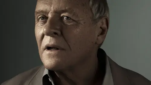
Okay, let's jump into the other federal. What I was describing is like grabbing for your foreground color, like a color of the meat Turn skin color. Right. Okay, hit. Okay, get a solid color of that on. Okay. What it's going tiu have here is that the mosque is going to have, like, a color range in it, being very like fast. But you know, all this already on Duh. What I'm going to do is I'm going to go into like, yeah, that's the problem. I think this is not Let's backtrack this not selecting the mask. We are going to do something to do mass, but not selecting that because you want to apply the whole thing to this. Selecting that layer should give us now a good stuff here. What I want to do right now is to have, like, the shadow selected there is this select and shadows area on color range. And what you can do with that is kind of like what you have in levels. You can just say that. Hey, my shadows come from this place on. They go like into this, you know, tone range. And then you have t...
his range. As you can see, here is the range. If I go from here, it starts with the very blacks, the very darks. And if I say Hey, I want more shadows than I'm just going to do that And now I'm going to just select the shadows here, which is going to be like, That's a like kind of like eyeballing it like this is certainly like a shadows in the image. And just to have the fuzziness would basically just be like, almost like the feather on this whole thing. And so just the feather it out. I'm going to hit, OK, and now this is very confusing. Until now I'm going Teoh, Very simplified. We have a skin color on top of all of these things. Now I'm going to set that skin color to be in the blending mode of a color. But before I do that, just keep in mind that we have shadows selected. That's why I'm here to just simplify it. I have over laid a skin color that I'm going Teoh Teik way all the shadows because I don't want to work. I don't want this to show up on the shadows on. You know, that's why we need the mosque. That's why we have the color range. I guess now it's it's better. And what we're going to do is like we are going Teoh, fill it with black here. Yeah, it's I just hit like Altera Option. Whatever you call it on delete or backspace on that created this mask here. Now, this is just the shadows right down to D Selective. So as you can see now, I have skin color, the same skin color on everything here. What I'm going to do is, as I mentioned, gear into blending mode and just have color. Now, this is to do strong. This would not ever work. So let's just keep it at 20. I forgot that. I don't have you know, the zero key here. This is my story, OK, now it looks kind of natural. It doesn't look through colored steel. If I If I turn it back on and off, you can see the difference. This is one way to do that. And most of the time when I apply this, I apply this to the to the skin. So now what I can do is that I can be just horrible with this at selecting the mask, grabbing like a black brush and just Well, okay, even more than that. And it's going around here. You're right. You could just Okay. I want this to be very blue. I want this to be very blue. I wanted the background to go back to blue. Maybe I don't want it to affect my hair or his hair. Rather is not mine. Yeah. So now I have this color almost like correction on the face. You see, we had these areas that were, like blue. So another ham player can help with this thing. Seeing that obviously don't get to see our effect because we know what we wanted to apply way we can see other varieties of the whole thing, like the whole, you know, the varieties of skin tone, I guess. Okay, let's do it in a group. So? So he was Don't get confused. You are experts. But you know, people watching this are going to get confused. I know that. Let's call it like how? Just to know that this is just going to be the help group. What you need to do is like grab to side colors, that's it. And then just a cups. Three adjustment layers on. What you do is just you need to keep in mind, like 50%. Just grab, like, 50% like brightness as you can see it here, this is the age of it. Just be like hue, saturation, brightness. This is 50% brightness on this is it. Apply it on, then the blending mode should be like luminosity. And now what you're left with is just the colors. This is like a color map, right? You don't have tones. It's the same like the black and white. It takes away the color. Now we took away the luminosity. We don't have numbness it anymore. We just have the colors there. Now. The problem is it's not really, you know, easy to see those things. So let's click, create another solid color, lay up and just go like just bigger color. Just but the main thing, it doesn't matter what color The main thing is just to get up into saturation. 50% on 100% brightness. This is, you know, the key to this whole thing. 50% saturation. The other one was 50% brightness. Okay, I'm going to hit. Okay, Now I have two layers in my how player help group. This is it. I just make that you remember. We had 50% saturation on this, then put it on saturation. Now we have this this horrible blob. Now, what we took away is like the saturation, all differences. So now we don't have luminosity. And now we have saturation. All we have are like Hughes, which is going to help us immensely. As you can see, the hue of the background is like a purplish color, which is no accurate. This is going Teoh. Be a bit wacky, as you can see. So we need one walk up there, which is going to be like a cursed at 3rd 1 You remember there was a class on creative life like curves. I don't know who taught that, but it was something like solar curve in there. What you could do to create that is just to mimic what idea on the screen and up, down, Just trying to grab it up, down stuff. And now look at the image. It's terrifying. I know it's terrifying, however, what you see there is as tones what you see, like three dimensions. Three dimensions there. It's actually just color differences. So if I were and lets collapse this help layer, that's all. What would you need if I were Teoh? Grab this color fill layer and I'm just going to turn it off. Can you see how darker it gets? Its because the color values change the whole thing. This is not His skin is not purple. It's just something that helps your eyes to see it better because it's just a purple. It's not used to that orange. It is very difficult to work with. The purple is going to help you now just to show you how effective this whole thing is. Is that so? This is, you know, just a small adjustment, as you can see. But this is what we did. If I weren t well, that's free hand like a like here. I'm just trying to make it very visible what I'm doing just grabbing a hue and saturation a layer on on this last little what I did. So this is this is where I did that. Okay, let's see how he's going to decent What if I change saturation where nothing really happens? I mean just a slight adjustment, because saturation has, like some few shifts happening sometimes. But what happens? So I dont mentioned this is just no lightness. So if I'm changing like this, still nothing, right? But Julia now what if I change the hue? Wow, it's going into different colors, right? So what happens if you're if your skin color is not is not consistent is that it's going to show up with these help players. So if you can't see it by eyes which I advise you to do like try to train your eyes to see the differences in hue and saturation and every every bit every attribute of color you have have that. But if you can't just go isa tired, Just go to this one and then you can basically neutralize the whole thing the whole skin tone. Now, a word of advice. Maybe you would want to do like and I'm going to you remember this one? I'm just going to grab the capacity to death to up now. It's like this, right? This is just too much. This was the too much kind. You see here that is too much. When it's flat, it's not going to work, because when you look at anyone you have, the shadows are probably going to be more rads, innit? Onda highlights are a bit yellowish, so if I were to color this image and have, you know, like a consistent skin tone, which I would I would do through using curves as I, as I showed you and then you can have this layer as a makeup player, So I'm just going to name it makeup. So everyone going to know what this is putting May company on him is going to be very happy rather than that, and deleting that one because it doesn't really help us what you need to have, like a variation from Shadow to highlight. The question is, how do you achieve that, right? You can achieve that multiple ways. If no photo shop. You know that there is like selective color adjustment layer, which has a while. Talk through the someone shoots selective color adjustment layer, which has like white neutrals and blacks with what you can control these tones with, like the blacks, I could put some like a magenta there and you can see that it's only showing up there. I know it's like of the purple, very frightening guy, but bear with this whole thing. And now that I have that, if I can this help off, it's not really visible right now, because just a slight adjustment. But watch what happens if I just turn it off and on. Apart from you know, having Teoh you know, like the greens are are away. But now you have more of a three D image. Right now. It's not that flat color wise, because that's what you have to think about the color. Correct anything. If you color grade anything, just don't make it flat. That's why. Why I wanted to have this progress and do things, and I got Now, if you don't want to have, like, more of a three dimensional image, you can go into white and maybe just at some science into the wise or just take away some. Some just take away some blues. Either have some yellows in there, and you know it's just going Teoh create like a pleasing result because you don't have that uniform image that you don't want to have basically on. As I was mentioning, You can do that with mortarboard things you can go into. I'm just going to close this, not to use and delete it. You can do the same variations going into color balance, which is kind of the same button old. It'll just turning the help again on going into shadows. I'm just putting some reds in there, and, as you can see, it influences that or I could just put the same magenta in there, and that's going to be almost the same effect now. It's a bit more than I was hoping for. But, you know, that's why you don't do adjustment when you have the help players on, because it's just going to help you differentiate. It's not going to help you to know how far you can go. It's just going to help you when your eyes are tired and you're looking at an image that is like, Okay, so So that part is like, Is it Is it like, blew up? Or is it like I don't know, like rat? Because you're tired? You don't know what what you want to do with it, but then you turn this on and bang. You're very terrified. You're going to have nightmares. But you will know how to correct this image, right? Because if I were just deleting these to not have any problems, help and the background we have. So if you were to, for example, think of this as dodging and burning, but in in like Hugh Mode, if that makes sense, dodging and burning with curves, it's like you are going to have, like higher values and low values like darker and brighter wants. Now you have the same thing with Hughes. Just don't affect, like, highlights or shadows or anything, just a color. So how do you do that? You create, for example, of hue and saturation layer? Because that's very linear. And I would say, as with you know, the curves dodge and burn, you go up if you want to. With the actual cuff Ugo upwards. Now I'm just going to go on the right or to the left. Let's say like on the right light, like 10 for example. Now I just you know, as with the Dodge and burn and curves, I'm just turning it off so I don't have anything on my mosque. It is grabbing a pen, not a pencil, a brush tool on just like I showed you. And just like everyone, everyone news like dodging and burning. You just go in and you see these variations, right? Have, like a white and again with a very low floor, like like a 1%. And if Ugo in on you're just going to do that right now, you know that I'm on plus with the hue and saturation, so I'm basically, you know, going. Plus, I think you can already see the results there on the screen. I think they are visible, but this is basically what I do is that I will get these things to you to look very nice. And now let's look at the before and after this is the before and this is the after. Now, if you get up from here, let's zoom in because I think that would help. Hopefully if I go and now you have to really just watch, this is the before and they 60 after I know it's very difficult, but believe me, for example, let's let's look at this part of the nose. It was a bit like more red Now if I If I turn this on, you have a bit of a yellow in there right now. It's visible. It's better you can see it. This is what you have to train your I see like, Can you see the differences? Sometimes it's very hard that sometimes it's quite easy or you're just very good at this, and you can do this very easily. But if not, we have this help layer to help you. Wow. Yeah, that's actually I think really cool, right? So that's why I say that before the whole thing before that you start to do like color harmonies. Applying a pallet. Let's just go back to the ski thing. Okay, that looks horrible. Before you started flying this thing to your image, cleaning up on, then have it very nice. At least that's my process. Some other people might might do it the other way because I know some summary touches do it like they do the colors, they send it to the client and the client approves it. Then they are going to work on the image. But I said, I have a good relationship with my client So I know whether they are, how the direction I'm going to take with them. They're going to show me like, Hey, I have this movie Still, this is what I want to achieve with the whole image and I'm like, OK, then let's do this color, color, harmony colored scheme How What do you think about that? And then we have this good relationship. Give this talk and email. We just are this start this cleaning up, doing the cars, dodging and burning and then getting into color Correcting is very, very important before applying a palette that that's what I found the same image that we had with the guy, which, which would like crop like this, almost like that with the with a jumper. Uh, when we had that the color harmony was kind of there. But it would have been better if you had, like, not that much of a variation in light skin color, because that would help you just to bring the whole thing together. If you look at this image, I know it's just a very crappy image, but we have, like a Scion ish background with a good orange skin tone and if you look at it, there is a variation between, like shallows and highlights on mitt turns in the skin turns, but not too much in the mittens in itself, not too much in the highlight itself and not too much in the shadows itself. So if you grab that help, too, I just showed you. You can just basically create like a uniforms, but also with variation on skin that makes sense.
Ratings and Reviews
user-1c544c
Great to see how much thought and experience goes into the fine details of professional photos. While focus was for portraits I can see how these applications will help my landscape shots.