Basic Color Theory Adjustments in ACR and Lightroom
Lesson 3 from: Color Theory for PhotographersBlake Rudis
Basic Color Theory Adjustments in ACR and Lightroom
Lesson 3 from: Color Theory for PhotographersBlake Rudis
Lesson Info
3. Basic Color Theory Adjustments in ACR and Lightroom
Lessons
Class Introduction
04:34 2Introduction and Importance of Color Theory
23:32 3Basic Color Theory Adjustments in ACR and Lightroom
09:09 4Manipulating Color Properties in Photoshop
08:48 5Color Theory and the Curves Adjustment Layer
09:15 6Using Color Theory to Affect Mood with Effects
16:02 7Advanced Selections for Color Theory
10:28Lesson Info
Basic Color Theory Adjustments in ACR and Lightroom
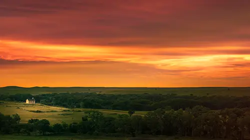
The first thing I wanna show here is gonna be Kansas City. (laughs) It's my city, I love my city. I've been east coast, west coast, and now the mid west. And what I love about it is it's such an accessible skyline, it really is. You can drive up to this place called the World War I Memorial and see the entire city just like this. And you don't have to be that photographer that knows all the great places to go. But the problem with cityscape photography, especially at night, is that white balances can be way off, way off, like this image here. So when we talk about these principles of color theory and we talk about in temperature, you know, you might be saying, "well, Blake, just go up to your white balance "and change it to, you know, auto or something like that "and see what it comes up with, "and then maybe go in there, maybe play with those sliders." But I like to do things a little bit more predictably. I like to say, "Okay, I already know why this image is off." And you might alre...
ady be sitting there knowing why this image is off too. But one of the things that I like to do in order to modify the temperature of my images is to hike up my saturation really high so that I know what the culprit color is in my image that is throwing this whole thing off. So what is it that is making this thing not work? So let's go ahead and just slam up this saturation. So I'm seeing a lot of yellows, I'm seeing a lot of what looks like an orange-ish nature here that's probably coming through with some of the magentas. So what this does is, I would never tell you to just throw your saturation up and put it on whatever your favorite website is, it's a horrible idea. But what this does is it tells me what color I need to add to this. So if I come in here and I start bringing down my blue, what am I doing there? I'm pulling the yellow away from the image by adding a little bit if blue to it. Or I'm looking at the complimentary colors of yellow and blue, which is already right there for me because it's right there in Lightroom Adobe Camera Raw to tell me that. And then I might come in here and maybe knock out some of that magenta a little bit and maybe get a little bit more into the greens. But I'm not gonna leave that saturation at 100%, I'm just gonna come back down to the saturation and set it to zero. So you'll see that using the idea of color theory, and using those principles of complimentary colors, and the color relationship that happens there between those compliments, I can control the white balance in my image. This is a very easy one to see that in. But let's be a little bit more, with a little bit more of a subtle image. So this image, there is something clearly off to me on this one, and I can see it. But let's hike up that saturation and see what color it is that's throwing us off here. So when we hike up the saturation that we see that there's a lot of like this greenish, bluish stuff happening up there in the yellows, in the green areas of the image like the plant area there. So if I come in here and I add a little bit of yellow to it it offsets that amount of blue, which what you're gonna see that happens there is when I add that yellow to it, it allows my yellows to become more vibrant because I'm telling all of those green areas, or the blue areas, to become more yellow, or even the green areas too. But some of the highlights on there were a bluish color. So by adding some yellow to them, I'm knocking them down, but also, bringing those yellow sunflowers up and making them a little bit more potent and a little bit more vibrant in their yellow nature. So if we look at the before and the after, there's the before, it's very subtle. But it's these subtleties, you know, you stack up, you take one subtlety, say it's, that's just so subtle. But if you do that with 10 subtleties, that could be your artistic expression. And you have 10 little things that make one big composition. So if we look at, let's look at our hue saturation and luminance principles here, that are right here within Adobe Camera Raw Lightroom. So I'm gonna go ahead and go to my color wheel for this and I do a lot of this when I talk about experimentation, I experiment with many varieties of color wheels like this, and this is also provided in the downloads so you have your own color wheel at this point. But one of the things that I look at here when I'm looking at a new tool, if there's something that I don't understand, I don't just not use it, I take the time to experiment. It's a lot easier to experiment in these days of photography than it was when I first started, I started out traditional in the dark room in high school, like many of us probably did. And then you think it's a cool idea until you're like, "man, it's been like eight hours, "and I have one print, woohoo!" (laughs) You know? But now in this digital world, we have access to things and we don't have to worry about, you know, messing a print up. So I take these, what I call test watches, and I have many different test watches that I use and I pull them into whatever program I'm using to understand the tools that are there because I can't do it on an image because if I did that on that yellow and green image, I'm just gonna see what's happening to the yellows and the greens, 'cause there's no blue in it, there's no magenta in it, there's no cyan in it. It's just predominantly greens and yellows. So if I wanna understand what's happening with the tools, I'm gonna use the color wheel. So I'll go ahead and go into my HSL adjustment layer. And what I really wanna point out here, specifically, is that these colors on this color wheel are gonna be your most saturated versions of color. So if I were to go into the saturation and try and bump the saturation up, it's not gonna go anywhere. It's not gonna give me any more saturation because it's already at the highest saturation level that it can possibly be at. Notice how I didn't go over here and start playing with the saturation down here. I really don't like this area because when it says saturation, that's a global saturation. If that just says, "okay, every color in this image, "get more saturated." And, you know, I like to have control if you haven't noticed that already. (laughs) So when I go in here to like the color red in my saturation, if I try to bring that up, it's not gonna get any brighter, 'cause it's already the highest intensity that it can get. But if I bring it down, the reduction of saturation is just getting it closer to 50% gray. Not getting it closer to black because that's where we get into the luminance values of that color red, where I can make that color red brighter, in like the whites, or I can make it darker in the darks. Now, Adobe Camera Raw Lightroom work a little bit different when it comes to these adjustments than they do in Photoshop and I'll show you that in the next lesson here. But if we go into the hue, this is where I really wanna show you this is that when you modify the hue of your reds and you move it to the right, notice how far it goes on the color wheel here. If we take this color red and we pick on red, I like picking on red, we move it over to the left, it gets more magenta, right? We move it over to the right, it gets more orange. It's taking on the color properties of the, what would be, the secondary color right next to it. So if we were to go into the oranges, we can make that more yellow or we can make it more red. But notice how we can't make yellow cyan. You know, we can't make it a horse of that different color. (laughs) You know, it doesn't get that much different on the color wheel, but notice the rotation though, and how it's going around the color wheel. If we go to cyan, or let's say the blues here, and we move the blues over, we're now making our blues a little bit more in the magenta area, and now we're making it more in the cyan area. It's taking on the color properties of whatever's next to it in the color wheel so it's really important to understand here, especially because if we go to an image like this that we get from Adobe stock, love some Adobe stock, especially for example images like this. This is where you get to see how this is happening really practically and how it could make all the difference in the decisions that you make on a color level. Now, notice that this is still in that, we're still in that basic area, 'cause we're just staying at Adobe Camera Raw Lightroom at this point, we aren't going into some of the advanced features like blend modes or masks or anything like that at this point. What we're just saying here is, "Okay, I've got these colors here "and all these colors are beautiful, "but none of them are really standing out "above the rest." And this is where you get to decide as a photographer slash artist now, which colors you want to be more prominent in the image. So if I come over to my yellows I can make my yellows a little more in the orange side by changing that hue, I can make it more on the green side, or I can come into the saturation saying, "You know what, I think yellow should just be "a little bit on the desaturated side "because I really want red to be a little bit more powerful." So I'm gonna bump up that saturation in red. Come into the luminance, I usually don't tell people to bump up the saturation in something without modifying the tonal contrast of that color because we have these color properties. For every color, we have three ways to adjust it: the hue, saturation, and the luminance. So if you're gonna bring up that color red and make it really vibrant, make it more intense, you should probably come in here and round it off with a little bit more of tonal contrast. Or make it brighter, depending on what it is that you're trying to to convey in your image. So you might be thinking, you know, "Do you really do this for every one "of your photographs that you bring "into Adobe Camera Raw?" And the answer is yes, I do, because I like to have that control over those colors to the point that, maybe it's the painter in me that says, "You know, I really need to be mixing "those colors up right now, "I really need to see what happens "if I take this color to another level." But even in the workflow that's happening in the next course, you'll see that I pay a very particular attention to all the colors in my image in this really nitpicky way. It's a form of crafting at that point
Class Materials
Bonus Materials with Purchase
Bonus Materials
Ratings and Reviews
user-def74a
Great class! I wish it was longer, because Blake has such fantastic information to share, and his enthusiasm is inspiring. Very much worth the time, although it is best if you have some basic knowledge of Photoshop.
Sabrina Lungen
Amazing class!!! Lots of useful information, very clear and precise in a short course. One of the most useful courses I have ever seen. The teacher also is very dynamic, fresh and clear. This course has encourage me in believing in my own intuition and also opened my possibilities to create photography with more confidence. Thank you!!
Cheryl Tarr
Blake shares some very interesting concepts and tricks which I hope to learn how to use. As a beginner who is still struggling with Photoshop, it went too fast but it is a short class where he covered a lot of ground. I will need some more basic understanding of Photoshop and then I want to watch this again to get a better grip on the tricks he showed. I can see where learning the material in this class will improve my processing workflow and help me bring to fruition the vision I have in my head for where I want an image to end up. Thank you!