Actively Using Your Pairing
Lesson 5 from: Pairing Typefaces: Tips for Combining FontsMichael Stinson
Actively Using Your Pairing
Lesson 5 from: Pairing Typefaces: Tips for Combining FontsMichael Stinson
Lessons
Lesson Info
Actively Using Your Pairing
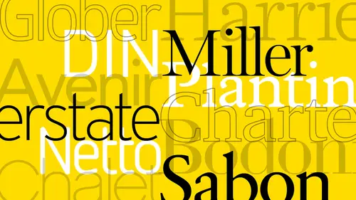
To also see what they look like in action so what I mean by that is let's do another test this is just an example to show you what I've done over the years and doing any reports where I'm doing a bunch of them at the same time I need to kind of do it's like what a chef does in doing prep you know cut all the vegetables and fruits and whatever and get everything you know clump together for that recipe or whatever this is kind of the same analogy of putting in content um and let's see, I have to get the content from somewhere and already have it here so let me just show you what I've done already in this kind of system I have the classic again I mean I wanted to use real content here and I've already kind of set this up so what I'll do is I'll set in the content just with a few paragraphs start with body copy and this is gary mont and gil sounds like I did before and then I'll start to put in my running subheds and when my subheds just with some style and use my sense here for a secondar...
y header in a primary hitter and then come back and do a caption kind of setting and in a legal setting which will always kind of go back to a sand sara because when you go below, you know, eight point. You want to go back to sand surf because it's easier to read it's really small sizes because the feet kind of clumped together you know so I set up this system in my my character styles already right and I'll get it going like this and then I'll go back in and with the colors situation again just see you know what I get as far as like a generic great if I'm going to add color and then maybe just a red and they're already set up so you can quickly see how the emphasis gonna look just with karen mon and gail sands so I want to look at that and I could make the gray you know four or five is a typical way that we've always used in the past but you can make it wider a darker no just to see how the emphasis is going to come out then to the right of that I have the more contemporary version of harriet and all right sands right so here is kind of a different feel but what I'm looking at between these two as far as this system is um the very first thing is read ability okay if my if if I have that financial report in my viewers or from forty five fifty two you know upwards of sixty I'm looking for more emphasis in the color this one is heavier it looks bigger it's set the same um but the reader's going to really notice this and they're going to have to fork focus more here, so I'm looking at overall color here, and this type face is a little bit wider, you know, I used to condensed here, but in all caps, but on older readers going to prefer this, okay, so when we're talking about color and typography, I'm not talking about, um, hugh, I'm not talking about red group blue green, that kind of thing, so to go back to what we're looking at, I'll take the color out of this, the actual hugh, and go back to black and won t show my point here just to tell you what I'm talking about. So now that's in black and white, so now I'm still talking about color, but what I'm talking about with color is overall tone. So this when you look at the overall tone in this typefaces smaller dude, it's x height and it has the same um, um, font size and letting as this one does, this is, uh, got more white space, so it appears lighter. Okay, this one's larger x height and it's stroke variation is less as les contrast. So it's going appear heavier so you can see right away that this side looks heavier than this side and again that's that's something that assaulted I used toe look at when we're looking at to tie faces impairing like this because I'm thinking always thinking of the reader and what they're experience is going to be are they gonna struggle reading here are they going to be happier here with larger type easier to see I still have the old school mentality of still using two story allah gas or double storey allah graphs like is angie's because um or indication you get as the eye scans across this excited to read this is more complex character are I'm trying to believe in the fact that our brains pick it up faster than reading a single story energy because in nanoseconds it'll be confused with uh you know so it just depends on what you're doing it for for brand marks that's all all good but you always want to consider when you're looking at type faces two come on like I was doing before appear if I'm going to use some of the content some of the san serif typefaces for content I mean I want us to be two stories like that like the a is so this might be actually better okay so I may consider that like these two his single story so I mean I want the best of all for it if I if it especially if I start to use sand surf for the legal like I was doing down here right that two story is gonna be easier to pick up as faras readability in a single story so for us it's a fire to put in let's just use kill sounds like you will just shouldn't show my pointer and I put in he's albany oregon having no have any has a two story what has the shelling way have that on here way do not this is a two story as well the two story a single story ji though if we had ah tye face that you met your tie face in here that had a single story eh we don't have shelly I know that has one um sure yeah that's really perfect and this too far is reading is concerned this is a good example characters are far apart here it's slowing down our reading pace where they're closer together here it's more of a natural pace here with kill sounds so but when you come to these characters oh hey oh hey this was mark complex I'm going to read it a little bit faster so even if I types that this a little closer together you know by the way when you when you're setting type like this character spacing right your your body copies you're zero factor your letter spacing is it zero that's what I see as faras character spacey as you go up in in size you want to loosen it up I mean I'm tighten it up so appear in my headlines you know, if it's lower case like this you know it's, I have a minus twenty track so the type size goes up, the character spacing goes down as the type size goes down, the character spacing goes up have a plus twenty here that's that balance ratio thing that I've always learned in the past, so if you think about it right is you get things smaller, the spaces also get smaller so you have to manually spread everything out. So as the spaces is, the characters get larger, the spaces get large, you have to marry only bring it in and that's not only the balance of keeping you know, we talked about balance with letting you also want character spacing balance like that as well. That's a good thing to look at here too, especially when it goes down in size like this. So now that I've got him kind of tracked out the same and look similar, I'm just looking at this two words trademarks futurist excite this taller yes, but so is is it's a sender's, so they're poking out by quite a bit, but this is more compact but a the a's come out a little bit more predominantly because I, when I read geometrics kind of breeze past these two the stems that stick out on either side so I'm kind of old school so I prefer the two stories for reading you know it's not so bad if like trademarks was in a headline kind of situation you know where it's larger you know like this it was just like a a banner size you know like this weird occurred everything together and whatever and bringing see when you make the type size large like that you want to bring in the track in just a hair um so what's up with this size it's not too bad because again these stick out more when they're larger it's just when it gets to reading copy below um it's in my opinion it's better to have the two story allah grass so these are just some examples so when I'm looking at this example between these two if I'm studying these together, you'll notice in the gary mind here I have my my numerals in here right? But I had to come back and change these two old style they did not come default like these do so just sees me a step of using a new typeface most type service the older ones will come lining default but you always bugged me but I know I have to use old style in the in the body copy, but we're so used to seeing things over the years with lining in here um we're just accustomed to it it's the same for acronyms when you get usually going to see this right in here and it's gonna look like this if I do that I would typically wantto make that happen that's the correct setting of an afternoon over here same thing small cap you have to be careful using the small captain in design some of the older typefaces won't give you a correct one they'll give you false drop caps I mean small cap says you know you guys know what those look like they're really done poorly but you really want to see that but now now today's is you guys know we're all used to seeing the full cap acronyms which I'm not sure why but we still keep using those and the ah lining numerals I mean this is how we're used to seeing content these days put it already has the sea that's the other thing about the two typhoons and smart tie faces right so gary mind if I go back and change this and I'm hitting this cap because that's the way harriet works if ike over here but I have to go manually changing gear amman in harriet I just use this it's nicer like ok that's easier right that you asked me earlier why use it that's these little things like this so they will be here I can't give you the example have to actually go back and change it over here somewhere in where's my characters were over here I believe yeah so it's just convenience I guess but if I want to go back real quick I can't so jackson is really designed a nice tie face there um anyway that's just a couple of ways to look at carrying typefaces and test them out um by characters themselves which is a good way to go um like I was saying early in the lecture just parent to tie faces from the same designer like um harriet nor right stands that works out pretty well which was done here and they're pretty close to work with so here I'm using harriet regular here amusing all right sounds black this is all right tense light this is harriet text light to so to see some of those know where it goes from um kind of heavy and then back to thin and then really having and so that alternating pace in weight it's also what you want to look at going down the page and these are just two different cells this is a straight gold and then this is a technique we use a lot in the nineties where you have a lower case and its spaced out quite a bit and it's all caps and just to show another style one of the uh one of the exercise I used to get in college or and my first places where I worked was to take and design a whole page like this out which is have attica or just karen bond and to see how many different styles you khun so you can get because the mentality back then it wasn't the typeface you chose it's what you did with it that mattered nowadays it's all about style so you wouldn't see that much anymore but anyway that's pairing typefaces okay let's just for a quick look at another scenario so I have my character styles already set up here in you know with my head or his body copying everything so let's just since it was pre laid out let's just try something else uh let's start with the body copy again and with preview on week unjust take a look at something else that's totally different and see you're just his body copy I think I might have miller in here which I used quite a bit america and here is well let's just try miller text and make comparison you can already see the jump in size already and see now it's pretty big right so now that it's not much bigger than carom on um what I'm looking at what kill sounds and miller yes that which is an issue to me so I want to use a sense here if that's a lot bigger so if I'm if I'm looking at miller you know I know a big you know a big geometric typeface that will work with that and see if I could get it if we have it, we do. But it's a condensed so let me try something else, even have attica neue will work let's say as far as let's try bold were heavy let's say would not suffice. It looks pretty close. It's got a lower case g let's just try it out and see if it might work well so running I resided in the beginning. Tio start here with the you know, matching excites with your run in sub head, and you can quickly get an idea of how to put them together. But I used the other example that I showed you before because you can really it's a microscopic the first. Now this is kind of a test drive, right? So if I go up to my, oh, I want to go to my subs next, so here myself, they're connected to my my run in sub has I may want these to be really heavy, like a black to say we'll use the same kind of style leave the size the same, and with miller, you'll see the numerals are kind of in between, um, old style in lining because they have the slight dissenter in a slightest center, but it's not quite a severe like they don't quite reach the cat fight, so they're kind of in between um which I always find great for miller and then the legal content down here we probably just want to stick to a medium or a roman there's a roman and then uh the other thing too I noticed this it ligature um a lot of times if I go over here to, um harriet hayes I believe a lot of times they're default as well if I can point in al just tested real quick yeah, so their standard too it recognizes it right away that's another little check okay, got that because here I need it right? You see that I have to go and turn them on so I just look at those things when I when I first saw this come out and and I just, you know, just putting copy and it gave me that might well that's great save me another step. So um jackson might get an influx of purchases and you pretty shortly here but anyway so better as well see, we can do our helvetica neue here let's say he's back out here she will rat and so with the vatican oi is it's such a large typhus family you khun we can still have like a white condense let's say are also like condensed or even a heavy condensed like we had and this I believe is going to be a bleak no talent we'll see talic ok, and this we probably weren't, you know, like a talent let's say, so there's, another version of where we're at. But you can see how, when I start to notice to lookout pushed it down. So it's really much larger as far as the typeface, and I always want to notice a swell. You know how, how it's pushing my content around, you know, if if I got a lot of content about this size, no, I mean I want to bring down the type size, okay? So I also want to start looking at line length and all that, as far as I mean not only the content length as it moves down the page. That's. Another thing, it's a lot, it's larger but it's. Not as dark is harriet, right? So I'm noticing that it's lighter but it's big. It looks like it's a lot wider, devious. Well, no it's not really is pretty big, so miller might be the better choice for older readers, if you will.
Ratings and Reviews
Sarah
A good warm-up course for typography. I learned a lot and gained greater insight on fonts and type.
Ali Shadle
Michael, did an awesome job. He gives you a system for pairing font faces, and if you follow his instructions with your fonts, you'll really nail down why 2 different types of typefaces work or not. Thank you Michael!