Lessons
Class Introduction
01:02 2Create a 3D Product Composite from Adobe Stock
01:56 3Adjusting Your 3D Image
04:50 4Adding 2D Images to 3D Image
05:08 5Creating Realistic Lighting Using IBL
04:59 6Creating a Text Layer
07:20 7Creating a Background
08:50 8Final Details & Rendering Your Image
15:05Lesson Info
Adjusting Your 3D Image
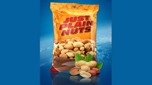
I'm gonna grab that. Just drag it to the photo shop icon here. Well, let's jump over here. So there we go. So it's gonna ask you to set the dimensions of the document. You're gonna put it in? I'm just gonna leave. This is a square format, 2000 by 2000 pixels, and it's going to open it up now because these were optimized for Felix. When you bring him in. Photo shop is a few things you gotta adjust. Um, one thing being the speculum highlights on it. So I'm just gonna grab my three d tool here. Let's go and get my three d pales open. So my three d and properties panel. So if I grab the current view, if you remember, I talked about moving the camera versus the object. I want to move around the object in the three d space. A grab current view. And I used my three D rotate tool to just kind of move around it so I can see the package. Very realistic surfacing on it. There is a lot of blown out highlights on, especially the front here. And that is because of the speculator Highlight. Now If I ...
jump into the three D panel here and click on here, you see the food bag object and then click on the material layer just below. You'll see. This is where you see those property settings. It's really just things like the shine and reflection. We're gonna get into that, but you'll notice the speculum highlight here is pure white. That's why we're seeing those details blown out. So it's just a matter of clicking on that color swatch, and that's making us a darker color. It's just a little adjustment there now. What we want to do is start designing the label art around the bag itself. Now you can use this to create a camp oven, add or product that hasn't been developed yet just to kind of sell the product. Or if it's a product that exist, you can actually get a really very realistic representation of this, just adding the label art to it. So you what you do is go in. Well, while we saw that that material line selected, we're gonna go in here to the diffuse property and to simply choose that it texture, it's gonna open up the document now you'll see a wire frame aside talked about earlier. This is the wire frame overlay. It helps you place objects up till now. I've talked about the wire frame, but I haven't used it for Help me place anything. Here's where it's really gonna come in handy. Now you can adjust this overlay here in the properties panel by going into the very bottom here. You see where it says you ve overlays. You can actually turn this feature off. Of course. Just uncheck it like if you don't need it, you can also change its color. Depending on the background you're gonna be working on you may find yourself on a lighter, dark background. You can go in here, just click on this watch and give it a different color. I'm gonna go and keep it black since we're on the lighter back room and you're gonna just the opacity. So obviously, 100% is just way too crazy. I usually keep it around 10% that way. It's none. It does not very obtrusive to the design. I'm working on even tens a little heil to like five, he asked five. So it's it's just enough. So I can see it, but that's not intrusive to my design as I'm working on it. So we're gonna begin the label design here by first setting in different background color. I'm gonna go in my color swatches here and choose this yellow color. I'm gonna go ahead and just option delete. Fill the background layer with that color and I want to have a Grady in here too. So I'm going to create a new layer new blank layer. As I said, I've always like to keep my elements as much as possible on their own layers in the event I want to change it out or delete it. So I'm gonna go input another great. And honestly, I'm gonna go and choose this red color right here and appear in the options bar. I wanna make sure I'm using a foreground to transparent Grady it there it is, and we'll go in and set it to 100% opacity. And I'm gonna do is just started the very bottom of the document to hold the shift key down and just drag up a little bit. Or here now, before I did, I mean, I should have pointed out a month ago. What I'm concentrating on is just this area here. Basically, what we're looking at is this that food back product laid out flat. This is the front. This lower areas, the front area of the bag. This is the back. And these are the side elements here. What? We're only concentrating. It is what we need to see in the ass. So I'm not gonna worry about the back or anything like that. We're just concerned with the front of it right here. And the way to determine that, if you're not sure, is to grab your brush tool and just move the curve, the image over the cursor, and say that they were going. So as I move my cursor over that overlay, you see the crosshairs appear on the actual object in the other document that helps you determine exactly where these elements are gonna fall. So I could see I saved it. And now that that Grady it has now appeared on the object itself. So now we have the base color in place
Class Materials
Bonus Materials with Purchase
Ratings and Reviews
Lael
Valuable for going deeper into using 3D tools, the course had a great amount of info on using the 3D tool panels & manipulating lighting, modeling materials, merging elements together in 3D space, creating your own lighting & materials as well as trouble-shooting tips. Really helped me feel less intimidated as a newcomer to 3D.