Project 2: Add Lighting Effects
Lesson 18 from: Compositing for Digital ScrapbookersTiffany Tillman-Emanuel
Project 2: Add Lighting Effects
Lesson 18 from: Compositing for Digital ScrapbookersTiffany Tillman-Emanuel
Lessons
Class Introduction
17:03 2Conceptualize & Narrow Down a Theme
11:21 3Build Your Compositing Studio
05:24 4What is Blending?
09:38 5Most Common Blend Modes & Groups
08:07 6Self Blend a Photo Two Ways
12:31 7Drop & Go Blending
07:39 8Blend Two Photos Together
21:36Project 1: Introduction
05:49 10Project 1: Build Background & Focal Point
31:45 11Project 1: Create Grounding
13:57 12Project 1: Add Personalization & Lighting Effects
28:58 13Project 1: Fine Tune & Finalize
10:57 14Project 2: Deconstruct Layer-by-Layer
04:41 15Project 2: Start With a Focal Point
18:13 16Project 2: Add Background & Build a Scene
09:25 17Project 2: Create Grounding
04:07 18Project 2: Add Lighting Effects
14:15 19Project 2: Add Personalization
11:56 20Project 2: Fine Tune & Finalize
18:39Lesson Info
Project 2: Add Lighting Effects
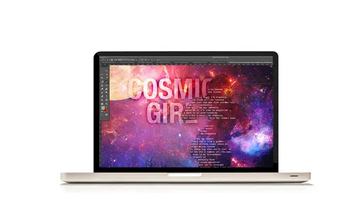
Let's move on to lighting effects, and I don't mean this is the fun part, oh my gosh, this is so hard. I mean like this is the time where you guys are gonna be like, oh, that's how you do that. I love the ah-ha moments, so keep 'em coming. All right so let's make some lighting effects. Compositing is, I really would say is the tale of lighting. When you're trying to create environments, the light that's created is really, really just super important. So there's a lot of different lighting effects. You've seen me use a couple. We're gonna make some more lighting effects to make this more realistic, make it look like a composited layout with look. Okay the first thing we're gonna do, we're on page 23, step eight, is we're gonna create a dark sunburst. This type of effect on a person, on this kind of layout is going to make it look like there's other things happening in the sky. That's what my whole entire concept is is that I'm looking at him into the sky and it's not our apartment build...
ing anymore. It's this sky that's kind of you know superheroing him in the background. If you Google superhero photos, they always have this very foreboding background like I am tough. Well this is my foreboding background for him. (laughs) So the first thing is we need to create a dark sunburst. What I'm gonna do is I'm gonna start from the top of my layers panel and then put him into position so that you guys can see how it looks. If I do it below something else you won't get to see it very well, okay? So the thing is is to create a sunburst, your sunburst has to be coming from some position on your page. I'm gonna have like let's imagine, and you can see my mouse is a little highlighted. Let's imagine there's a sun right there. And the sun is casting off rays. I need to build the sun rays. I need to build the sun. We need to build the sun and I'm gonna show you how to build the sun rays, okay? So first we're gonna select the polygonal lasso tool is usually under the lasso tool. In your tools panel you can also select shortcut L. With the polygonal lasso tool, we're gonna create a kind of a triangular shape for each ray. Okay, so this is how it's going to work. I haven't created a new layer yet, but it's no big deal. I just need to draw a ray. So this is where my sun is. So I'm gonna draw one ray first. I'm gonna click, and I'm not holding anything. And I'm just gonna drag a ray down to him that goes a little bit further out than where he's at. I'm gonna click to stop that point. I'm gonna click out from here and I'm gonna draw another line to close the shape. Okay, so this is the ray that it creates. Cool, now you can go back and create more rays but right now I'm just gonna concentrate on this ray. All right next we're gonna target the solid color fill layer in the layers panel. So that's this layer right here. Because I need to put my ray in the right place. It's not gonna be on this layer. I'm just using it as a pin holder. And then click on the create new fill layer. So now this is where that layer should be. It's gonna be in between your grounding shadow and your color fill layer, okay. It definitely needs to be above your background. If you don't have it, it's gonna blend in with your background paper and you don't want that. Okay so we've drawn this elongated triangular, larger than the layout in the shape of a sun ray towards the bottom of the page. That's our first sun ray. We're gonna double click the foreground color and select a darker color. So I'm gonna double click my foreground color and now I'm gonna look for a darker color. Wow, that was one click and that was quick. That's darker than the color tone from your background. A sun ray, in this case it's almost a shadow kind of ray, needs to be darker or lighter. It doesn't need to be the exact same color so do not choose whatever this color is. Choose something darker or choose something color. If you want a bright sun ray, choose something brighter. If you want something darker and a little bit more masculine for this type of layout and a little bit more foreboding, then choose something darker, okay. And then click okay. That's gonna be our color that we're gonna use, okay. Next we're gonna flood fill our selection like we've done with other layers. We're gonna hold down the alt or option key and then select delete to create this kind of piece, okay. Now I'm gonna deselect that selection using shortcut keys command D or control D. And there we have our first sunburst. And I did say I was gonna leave it at the top so you could at least see what it looks like. And there ya go. That's the first sun ray, okay. Looks pretty good. So I'm gonna drag it back into position. Next we're gonna use an overlay. What does overlay do? It creates contrast, okay? That's what we want. We want it to look nice and contrasty behind him and that's our point. Next thing, we want to repeat this til we have a bunch of sun rays on our layout. So I'm gonna grab the polygonal lasso tool again, and I promise you it will always look better on my original layout than it will on the new layout it created. That's just art. So I'm gonna create a new sun ray, maybe something like a little bit like this, okay? Here we have it. We already have our color set. So we're good to go. I'm gonna flood fill, alt, option and delete. And now we have a second one. Choose overlay as the blend mode. Command D to release the selection okay? Next, do it again. Create a new layer, select the polygonal lasso tool and as you can see I'm trying to build it like a real sun ray, and that kinda means I need to think a little bit about it. It's not always gonna be perfect. You're gonna make mistakes. You may say that one of those sun rays does not feel or look the way that it should. It's okay. You can always go back into your history panel and fix it if you want. So now we have that sun ray as well. I'm just gonna kinda move it over. And as you see as I move over that it's, you know, it's not too good. So let me try it again and fix it. Now if you're using the pen tool, you will not have to worry about it cutting itself off. The pen tool will do that a little bit better. So maybe kinda like over here and then over here, and then over here. Let's try that flood fill, deselect. And then choose overlay, okay? Now we need to do at least one more so that we are filling our layout. You might even want to do one more over here. I don't think it's a big deal. I'm gonna do at least this though and have one more ray like right here, okay? Flood fill, deselect, overlay on how we did that. Are there any questions before I move on on how that works? That was very simple but that's the secret behind making it work, okay? Now we need to blur it into the background. So you can easily do that by going back to filter, going back to blur. Selecting gaussian and blur. And that one's that one over here. There radius is way too high. That's for a grounding shadowing layer. So let's bring it down. And what I suggest is around 50 pixels, okay? So it's just enough. You may need a little bit more. You may need a little bit less. It just depends, and then click okay. And then I'm gonna do the same thing. Now because I've already done it with every single ray, I don't have to keep going to gaussian and blur. I can just go to filter and usually it will save whatever was your last step. So filter, gaussian and blur. Filter, gaussian and blur. Filter, gaussian and blur and now all four of my rays have this kind of sun effect. How cool is that, right? Now I can come back and because I have a blend mode on it, I'm gonna use full opacity and I'm gonna reduce my fill for each ray. They're not gonna be the same. This one's gonna be a little bit lighter. This one's gonna be a little bit darker, okay? I'm trying to create a stronger point here around this part of my layout rather than on the sides, okay? Not every ray is going to be light or dark. You know some are gonna be darker than others. So you can have fun with trying to figure out which ones are gonna be that part for you. So here it is without any sun rays, and here they are with the sun rays. And that's how you create that kind of compositing effect. If you look at movie posters especially, you will see a number of these types of effects on the back of them to kinda give those lighting effects. And they didn't take pictures of them. They created them from scratch, okay? And that was the last for number eight. Any questions on that? Can you talk a bit about the blurs and why do you always choose, specifically gaussian blur? Sure that means we need to take a look at blurs. I'm not gonna go through the examples 'cause we do have a lot to kind of go through. But if you do for example a lens blur, you're gonna get a different effect. If you do a motion blur, you'll get a motion effect. A radial blur's gonna give you a circular blur. A shape blur, so all of these blurs are different. Typically for this kind of simple blur, gaussian blur's gonna be the easiest one to use, just hands down. None of the blurs are a problem, but they're not gonna give you the same kind of effect. For this effect, gaussian blur is the one you'll want to go, okay? Any other questions? All right, okay let's go keep moving on. We're adding lighting effects. Now let's create a lens flare for our sunburst. You could do this with a shape and add a glow to it. You could do this by creating a shape and adding a blur to it. There's so many different ways to do it. I just prefer to do a lens flare because there's a couple of different choices and I want to be quick. All right so to create a lens flare, we're still on page 23, number nine, and we're gonna click on the create new layer in the layers panel right were we left off with our sun rays. Click on the create new layer. And then you shortcut key D to change the foreground color to black, boom. And then you shortcut keys alt option delete, alt or option and then delete to flood fill it with black. No big worries there. And then like you guys have seen me create lens flares before, go to filter, go to render and then select lens flare. And then what I did was choose a brightness of 200%, and I did a movie prime lens. And that one's going to really give you the kind of look you're going for for a sunburst. And overlay blend mode was what I chose. I'm going right off of my steps here. And then I reduced the fill opacity to 49%, and let's take a look at how that looks. And it looks nice and foreboding. And you can see the lens flare there. Right in that darkness, you see how it creates that little effect? So we're gonna put that right over where that lens, where that sunburst is created, okay? So use it to add the triangles where the triangles meet. And now what we need to do is we can reduce our flare. It just depends on how it shows up on your screen, but you can add a layers mask to the bottom portion of the lens flare for contrast and drama, okay? So here's what I would do with this. I'm gonna add it here, and then I'm gonna add a layer's mask and kinda conceal a large part of this, okay? 'Cause really all I want is that create, that part where you see the line in the middle there? And I want a little bit of that flash. You see how it transfers the lighting to this part of my photo, okay? Now just in case, I wanna just look a little bit closer and see if I'm messing up anything while I'm doing it. And I don't really think so. I like the drama that's created. And that's how you can do it with the lens flare. Also one other thing that I wanna point out to your guys, if you don't want to use lens flare all the time, 'cause I do use, tend to rely on it a lot, I'm not gonna show it because it does take a little juice out of your computer to do it, but play with lighting effects specifically. Okay, especially with compositing. It's a great tool to use. It just takes up juice because with lens flare you can make four of 'em. You can make like 20 different lighting effects with many different possibilities. So it's infinity but you can start at least at the beginning with that. I've done it for a lot of holiday layouts where I want the tree to do something else and have lighting effects. A very good idea to do, okay? All right, where are we at? So let's see now. Oh yes, this is an optional step. Also working with kind of grounding and working with grounding and lighting effects is that you see how on his face, his face is highlighted but it looks a little bit more on this side, like the highlight is kinda coming from there? Let's create a highlight layer. This is how we're gonna do that, okay? Excuse me. So we're gonna target the top of the focal photo layer. That's gonna be this one. We're gonna start from here and click on the create new layer, which we've done. And then select the polygonal lasso tool. Same kind of situation, and then we're gonna still do a triangle that goes directly to my friend here. And let's see, we're gonna make it a little bit more than a triangle. We're gonna kinda do this so it gets the outline of the corner, okay? So I'm creating this kind, I'm gonna create a highlight effect right over here. And then double click or make white your foreground color. It doesn't matter how you do that. But make white your foreground color. And then flood fill, alt option delete, and now we have this wonderful white triangle. And then click D or use shortcut keys command D or control D to get rid of the selection, okay? Then what we're going to do is we're going to again blur it out. Go to filter, gaussian blur, and choose a radius of 50 pixels, so that's a nice little highlight pixel. And then I'm going to adjust the fill opacity. I'm not going to, I don't think I did. I'm not gonna add a blend mode. I'm just gonna bring it down a little bit, just ever so slightly so it gives you an extra little flare right there. Not a flare but a little sunburst if you will that kinda says, hey, here's a little highlight layer, okay? And you can see that it's adding a little bit of extra tone to his face, a little bit of extra screening. So if you come back there and you go okay, so let me go to my screen layers and remove it or let me highlight, use a layer's mask and kinda get rid of that, you can totally do that. No big problem there, right, okay.
Class Materials
Bonus Materials with Purchase
Ratings and Reviews
Phyllis
I was in Tiffany's Mixed Media class and was also lucky enough to be in this class. Tiffany is an AWESOME instructor and well organized. Her Mixed Media class was a great building block for this class. The class is well worth the money--well organized workbook and other great bonuses. If you want to take your scrapbooking to the next artistic level, I highly recommend Tiffany's two classes at CreativeLivel.
a Creativelive Student
Great course with easy to understand ways of blending more than one photo together for a great composite layout. Excellent materials and workbooks.. Thanks Tiffany for a wonderful class! - Christa (cfile)
E.L. Bl/Du
I think Tiffany is good at explaining it so those who arent pro photgraphers can start at the basics to learn photoshop. I really liked watching this even tho my vision is in another direction, I like how she explains how to get there in photoshop. She makes it not so scary to jump in. She is clever mom too, every parent wants their own kids to be a star and she surely did that. What a neat thing to "scrapbook" the photos. I liked learning adjustment layers, would like more in curves too. But great place to start out in ps. I recommend if your lost in PS.