Lessons
Class Introduction: What are you going to learn?
06:16 2Composition Basics
11:09 3Guides - Center Composition
05:07 4The Rule of Thirds
04:26 5Golden Triangles
05:17 6Golden Ratio/Rectangles/Spiral
09:37 7Diagonals
08:51 8Lesser Known Compositions
02:42Lesson Info
Composition Basics
Alright. So, let's dig in to this. So, we're gonna start with a few key points on composition. These are general things that you should be keeping in mind as we go through today. First of all, compositional rules are guides. They are guides at best. They don't need to be followed exactly, nor sometimes, even at all. An image does not need to follow any one of these concepts that we're doing to be successful. Not every rule of composition works with every scene. You can't look at anything you're looking at and go, "I can turn this into a rule of thirds, "or a center composition, or a golden triangle, "or all of these other things." Sometimes you're gonna be able to apply multiple ideas to the same scene, other times not. It's important to keep all these in the back of your mind and know what's appropriate, when. At the end of the day, composition is largely about this concept of helping you to bring balance to your image, and there are different ways we can do that. In addition, croppin...
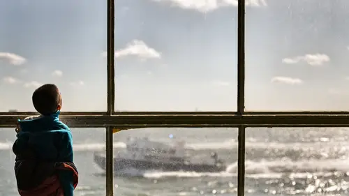
g helps, but it is not a miracle worker. I do recommend, and we're gonna talk about this a little bit more, backing up a little bit so that you have the ability to shift it a little bit when you bring it into your post-production process, but remember, it's not going to save the day. A bad image is always gonna be a bad image no matter how tight you crop it in. Intersections of compositional lines, we call them eyes. Often times, you'll talk about putting the eye on the eye. Very good and easy way to think about it. Composition can project an emotional response. This is something that we don't necessarily think about, maybe, in an obvious way. But, if you were to compose an image and shoot a particular figure a little bit low and very close in the frame, we're gonna make that figure feel a little bit more powerful than if we were to shoot down on them and make them feel smaller in the frame, and so we can actually use composition as a tool to project an emotional response. So, again, we talked about this idea of furthering the purpose. It, very simply, if you're doing a portrait of someone and you wanna project a certain emotion from that person, the way in which you frame them can help you do that. I mentioned this before. If it doesn't help, don't include it in the frame. Disregard anything unnecessary. Only include what you want. Very, very important, composition needs your common sense. If you just were to apply a lot of these rules and guides exactly as they appear, it may not work. You sometimes have to break the rule a little bit to make the image itself work. A lot of these are gonna be on a case-by-case basis, and you will have to be common-sensical to sometimes be more successful. And lastly, composition alone won't help an otherwise boring image. Technical competency is always valuable, but it's never the end result. So, this is why we think about the purpose, and then how this helps to further that purpose. What is important in the image, and how do I communicate it? That is kind of the essence of what you're thinking about when you're composing. What's important? How do I show it's important? Now, you can, sometimes, depending upon the situation, arrange the elements in the scene. Things like people, things like props. Other times, you have to move yourself, or you have to move the camera. Street photography, travel photography, you don't get to move the landscape, right? But, sometimes, both. So, depending upon the situation you are in, the way in which you approach composition is going to be different. Another thing you maybe wanna consider is focal length. If you're shooting with a wide angle lens, it means the objects in the background are gonna be smaller. Where as, if you're shooting with a longer lens, it's gonna compress the distance and make objects in the background bigger. Those decisions as to what equipment you use will affect your composition. So, think about what that means. But, before we can dig into the guide, we actually have to know what we're looking for. So, these are the four things we have to think about first, and these four things are frame, tone, lines, and depth. These are the four pillars, the four building blocks of what we're actually taking a look at. So, let's take a look at the frame first. The frame is the most obvious thing we consider. We look from edge to edge. We decide what is important. We think about what we are putting in the frame. If it's big in the frame, it's important. If it's small in the frame, it's less important, right? This is the biggest decision. Here's three different frames of the same scene, alright? We've got landscape, we've got portrait, or I should say portrait and landscape, and then we have a cropped square. Okay, different ways you can interpret the scene. It changes what we're actually looking at. On the left image, you see quite a bit more water. In the second image, your attention goes a little bit more to the mountains. On the third one, just kinda condenses the space in as much, and it doesn't feel as vast. The frame affects what we take away from the image. Next thing we're gonna think about is tone and color. Things that are bright, things that are dark, where the contrast lies. We have to think about how different tones relate to each other. For example, our eyes are drawn to the brightest part of the composition first. We look at areas of contrast. We look at areas of bright saturation or complimentary colors because that's color contrast. Red on green, purple and yellow, and blue and orange. Right, common complimentary colors. Or if you're shooting black and white, we think about a more aggressive version of contrast usually to help us tell our compositional ideas. All of these things affect our compositional choices, and remember this when we talk about something called figure ground a little bit later. It's gonna be really especially useful for us to talk about it, but creating contrast or separation, light on dark, dark on light, things like that. Very, very useful. Some examples of tone. And, you can see how we help use tone to direct the eye where we need to look, and direct the focus where we want it do be. Some of those use brightness values, or like the second one uses a complimentary color. All creating contrast, help draw the eye exactly where we want the viewer to look. Then we go to lines. Lines are all about eye movement, how the eye moves to the frame. It is about the relationships between different objects in the scene, and it's about the fluidity of that eye movement and the relationships of those objects in the scene. Lines can be literal, meaning they can be actual things that create lines in the physical world. They can be sides of buildings, roads, actual physical objects. Lines can also be implied, meaning gestures, the way someone is looking, the direction of movement, and they can also be purely psychological. For example, if you have related objects in the scene, we can actually use them to link lines together. Maybe you've got an apple, and an apple, and an apple, and you draw the line in between the three apples, that creates compositional fluidity, and these changes can be abrupt, or they can be smooth. The lines can transition smoothly or they can be jagged across the image, and either one of those is correct. They just both project a different feeling. And different kinds of lines have different feelings. So, for example, horizontal lines are usually very peaceful. They are calm. They are stable. Vertical lines are usually more about height, and power, and dignity. Diagonal lines create the most tension, and usually project movement, and curved lines are usually a little bit gentler, they're a little bit more feminine, and they're usually considered a bit more beautiful. Now, these are all quite literal lines, just to show you how lines can be used compositionally speaking, without breaking them down too much. Horizontals, verticals, diagonals, combinations, things like that. And the last thing we're gonna be looking at or thinking about is depth. Depth is all about distance, relative flatness, or not flatness, and then using shadows and highlights to create that perception of depth. We are fundamentally translating a three-dimensional world onto a two-dimensional picture plane. So, what we are creating, in terms of depth in a photo, is a perceived sense of dimension, and we use certain visual clues to kind of illustrate that concept and that idea. We use thins like focus, bigger versus smaller objects, things that are so close they are not entirely in frame, we use the atmospheric effect, lines that converge into the distance, and we use highlight and shadow. Let me show you. So, in this left image, first image on the left, we're using focus to show a perceived sense of depth. Second image, wide angle lens helps us illustrate things that are bigger versus things that are smaller. We can see that the guy in the foreground is closer. And, then on the third one, you can see that the light in the foreground that is not entirely in frame is bigger than the light in the background, or closer, I should say. In the left image, we're looking at the atmospheric effect. Things that are further off in the distance are lighter, they're lesser in contrast, and often times they are a little bit more blue. The second image, we have converging lines, things that we know in our mind's eye to be the same height, as they get closer in the distance, it perceives depth. And then lastly, the third image on the right. Even though it's a light object on a light background, that subtle use of shadow helps us illustrate the concept of dimensionality. And so, these are the things that we think about, whether consciously or subconsciously, when we are arranging what is in our scene. Are we creating depth or a sense of perspective or not? What is important, what is not, and how do I articulate all of these concepts together?
Ratings and Reviews
Sara C. Madsen
Fantastic class, one of the best I've seen so far on Creative Live. The amount of information Chris manages to squeeze in such a short time is simply impressive. Extremely useful, not just for photographers, but for everyone who engages in visual arts. Warmly recommended.
MikeD
I have to say, perhaps if you are an academic or a college trained photographer/artist/painter etc., this may be old hat to you. However, if you are like me and have never been exposed to definitions and descriptions of composition, this was a shock-and-awe inspiring reveal of these artistic concepts. I can guarantee I will watch these over and over again while I try to absorb even a little of this material, but Creative Live could make an all day class of this guy explaining this material. material he quite obviously loves and uses and his passion for the subject matter is very obvious. This class is making me consider a trip back to the campus to get more information on this subject. Quick, contract Chris Knight to develop a whole class before I end up in college!!! Highly recommend this class.
Matthew De Moraes
Really useful tips and tricks to improve your understanding of composition and why you like the images you like - which you can then use to further your own ability to take great images in camera.