Lessons
Class Introduction: What are you going to learn?
06:16 2Composition Basics
11:09 3Guides - Center Composition
05:07 4The Rule of Thirds
04:26 5Golden Triangles
05:17 6Golden Ratio/Rectangles/Spiral
09:37 7Diagonals
08:51 8Lesser Known Compositions
02:42Lesson Info
Visual Theories
Let's dig into visual theories. So we have covered some of the more common rules and guidelines that are present in photography and painting. These things are gonna a little bit more out there, that are going to try to explain how our brain organizes the way that we see, 'cause, remember, we talked about the eye see selectively, but camera doesn't. Let's incorporate how the eye sees into how the camera sees. And so to do that, we're going to talk about the Gestalt Principles. And this is actually taught quite heavily in graphics design, but I think it's so useful when it comes to photographic composition. Now, Gestalt translated means shape or form. It was developed by psychologists in the 1920s on the belief that the mind uses these self-organizing tendencies to form a global whole, and that these theories try to explain how we perceive things and organize them in our brain. "Hey, I go to brightest part of the image," or, "I go to this." or, "I go to that." Why? Where does it come fro...
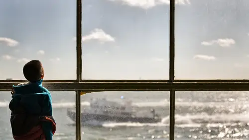
m? And some of these principles are very similar and directly related to each other, they will build on each other. And I'm also gonna pepper in some other compositional devices that you may be familiar with that we haven't talked about. So some of them are actually gonna be found in here as well. These are a few examples of how the Gestalt Principles are often illustrated in graphics design, things like figure/ground, and similarity, and proximity and grouping, and closure, and we're actually gonna take all of these ideas and we're gonna translate them into a photographic sensibility to make it a little bit more relatable to us. And so the first thing that we're gonna look at, which is also by far the most important, is figure/ground. Okay? And figure/ground is all about the brain wanting to differentiate a figure from the background. We are creating separation, right? Fundamentally. The subject, to our mind's eye, is known as the figure, and the surrounding area is known as the ground. This is probably the most important. This is one, out of everything that we're doing today that I probably actively, consciously think about when I'm composing, this is the most important one. How do I show what's important? How do I create separation? Or how do I play with the concept of, sort of, not really creating as much separation, so I can delay where I want the viewer to find the focus of the image? Now, the most common way this is usually asserted, is the Edgar Rubin face vase illusion. And that basically says that our perception of the figure can depend on multiple characteristics, like color or contrast. And this is obviously contrast, right? And if you can learn to control your definition of the figure and ground in your photos, it will allow you to have a much greater control over the viewer's perception of the subject matter and the space around it. Instead of going, "All right, I'm just gonna put my camera at 1.2, "and throw it all out of focus." you can actually go, "Okay, how do I make my subject arranged properly "in the scene." There's a time and a place to shoot low depth of field, but if you can arrange the things more beautifully and elegantly in the scene, it really brings a lot more depth to the way that you see, and the way that you can frame your shot. So, again, you may see the face, you may see the vase, and then as you look back, you may see the other one as we change contrast. Now, this particular illusion also plays in this idea called multiple perception, and being able to interpret figure and ground differently, depending upon how we really focus on it, and it's basically the core of optical illusions. Here's figure/ground in practice. It is all about giving your subject its own space in the image. We've actually been doing this all day, we just haven't really been addressing it. And sometimes it's very obvious. Sometimes you've got silhouettes. Sometimes you've got a really light object on dark background, or vice-versa, but this is really the core of that idea of creating separation. You can do it through focus, but you can also do it through contrast. Here's some more examples. Again, the two outside ones are silhouettes. The middle one, it's about using the kids and having them frames by the reflection of the buildings and the water. They occupy their own space in the scene. Here it is in the studio, of a dark subject on a light background on the left image. Now, the right image is a little bit more of a play on the concept. Where do we go first in the image? Well, we go to the face? Why do we go to the face? Because it's a light object on a dark background, but we still utilize separation in the body to create contrast as well, so that we know where the body ends and the background begins. We're establishing figure/ground, but this is less important than this. And that's what we're telling the viewer to see. Now, as I mentioned, shooting at a low aperture can help with separation, but composition is usually more successful when it utilizes the scene. You can add context and depth to the narrative if you're actually able to show the scene that they are composed in. Now, one of the easiest ways to actually think about this, is to go, "All right. "I'm got a busy background. "Is it dark or is it light? "Or do I have something that is dark or light "compared to my subject?" Annie Leibovitz will do this with, she'll have a busy scene and she'll drop a canvas in the scene, and you'll see the environment, but then you'll have the canvas around the subject. That's this concept, creating separation, creating a figure around relationship, 'cause she's putting the subject on an easier way for the eye to separate them from the background. Got a dark background? Light subject. You've got a light part of the background for the dark subject. Frame within a frame builds on this, but doesn't have to be frame within a frame. So I basically, okay, I've got a subject who's dark, let's frame the subject by the light part of the background, and over there, well, I've got this really beautiful beam of light that's coming through the train station, let's wait for somebody to walk through it, so they get lit up, and then everything else is dark. It's not magic, it's just a little bit of awareness and common sense. In addition to tone, you an also use color to create separation. This is great time to use complementary colors, the common pairs, red, green, blue, orange, yellow, purple. A bolder color will come to the forefront of your image, and a lighter, or a less saturated color, will recede. The eye usually prefers to see vibrant, warm accents on a colder color. And every warm color has a cool complement, and vice-versa. For example, the eye prefers to see a red accent on green, or on a sea of green, or an orange accent on a sea of blue, or a yellow accent on a sea of purple, comparatively speaking. Now, there are different kinds of complements, you've got the digital complements and you've got the painter's complements. The painters, you're looking at like your red/green, it's red/cyan, digitally speaking, but we don't have to dig into that too much. The left image utilizes a strong red, which pops off the scene, helps create that separation, helps create that color contrast. And the image on the right utilizes both tone and complementary colors. So around her face, around Lindsey's face, she's frame by the sky of the background, whereas, down here, on the body, where the contrast is a little bit less, we're using a red dress on its green complement to help create separation that way. Terms chiaroscuro and negative space will fall under figure/ground. Chiaroscuro is the art of using strong contrast between light and dark to effect the composition. Painters like Caravaggio used this a lot. And then negative space uses the space around the subject to help define the subject itself, all while giving the eye a place to rest. They are fundamentally very similar, but they use slightly different tools to do it. Now, chiaroscuro, is seen here. This is Saint Jerome by Caravaggio. Chiaroscuro is a technique that fits under a stylistic element, a style called tenebrism, which is what Caravaggio used to create these very murky, dark scenes. And you can see, it creates a very particular mood. Here it is photographically. This is by a good friend of mine named Jon Henry, and you can check out his work. It's part of a project that he did, kind of merging artistic sensibilities with sports, and it was about using those kind of same ideas photographing athletes. It's very, very cool. So you can see how it can be implemented in photography. These are couple of my own examples. I've got the strong contrast on the left, and something a little bit more studio based on the right, still using a lot of the same principles, contrast to show composition. Kubrick used this in the film Barry Lyndon, when he would light with candles to create something that felt like a painting, and would create the same effect in the film. W. Eugene Smith, Garry Winogrand, all masters of the chiaroscuro. So it can be used no matter what the visual medium you're in, as a way to create a very specific emotional mood and disposition. Now, in photography, negative space, often times, produces a silhouette, drawing attention to the subject or the positive space. In drawing, it's a little bit different, it's about the negative space actually creating an object, but we don't really, necessarily have that luxury a lot in photography, so it's really more about focusing on the space around an object to give a little bit more balance and a little bit more of a restful composition. So whereas chiaroscuro uses darkness to help define what is lit, negative space helps define the positive. So this is actually, we're exposing, we're focusing on the sun rise, but you can see the temple. Or other examples of negative space as well. And often times, more of the edges are used, which puts the actual content of the photo usually somewhere away from the middle, and it gives us this overall sense of calmness with a little bit of visual interest sprinkled in. Then we move onto proximity and grouping. And this basically says, that when you put objects close together they are perceived as a group. Here we go. This builds on the figure/ground principle. Think of it like Captain Planet, individually they are earth, fire, wind, water, and heart, but together they are just a group of people that couldn't do much on their own. So builds on figure/ground, proximity grouping, right? Individually they are just spices, separate shapes, but they're together they are seen as a group. Now, this leads us into something called the rule of odds, which you may have heard of. And it basically says that odd number of things are more harmonious and visually pleasing than an even number of things. So what you want to do is surround your subject with an even number of similar elements, which creates an odd number of related objects. Usually works best with three, because five or more makes us see something as a group. So you'll often times see groups of three utilized a lot in photography. For example, or here. Now this uses a couple different elements. So we've got the rule of odds, which are the three individuals, but we're also using implied lines and framing devices, as well as a triangle. So if you take a look, the implied gesture, you've got her eye to his face, he's looking down. That creates this triangle, which frames the guy in the background, who is also framed by the door. So we are able to draw a connection between him and the two of them just by how we create a frame of them.
Ratings and Reviews
Sara C. Madsen
Fantastic class, one of the best I've seen so far on Creative Live. The amount of information Chris manages to squeeze in such a short time is simply impressive. Extremely useful, not just for photographers, but for everyone who engages in visual arts. Warmly recommended.
MikeD
I have to say, perhaps if you are an academic or a college trained photographer/artist/painter etc., this may be old hat to you. However, if you are like me and have never been exposed to definitions and descriptions of composition, this was a shock-and-awe inspiring reveal of these artistic concepts. I can guarantee I will watch these over and over again while I try to absorb even a little of this material, but Creative Live could make an all day class of this guy explaining this material. material he quite obviously loves and uses and his passion for the subject matter is very obvious. This class is making me consider a trip back to the campus to get more information on this subject. Quick, contract Chris Knight to develop a whole class before I end up in college!!! Highly recommend this class.
Matthew De Moraes
Really useful tips and tricks to improve your understanding of composition and why you like the images you like - which you can then use to further your own ability to take great images in camera.