Creating An Original Layout
Lesson 7 from: Create a Magazine with Blurb's InDesign PluginDan Milnor
Creating An Original Layout
Lesson 7 from: Create a Magazine with Blurb's InDesign PluginDan Milnor
Lessons
Lesson Info
Creating An Original Layout
I think this is a pretty good foundation for the basics of saving yourself time utilizing master pages. But for testing purposes here, I'm gonna delete some of these, delete some of these elements and I'm going to start with a completely blank slate because I know that some of you out there are going to say, Well, I don't really know what I want and I want to start with a blank spread because I'm not really sure what ingredients I would include on my master page anyway. So there's two primary elements that I want to work with, which is a photograph and a body of text. Because I think most of you out there when you're starting out to make books. These are the two components that I think you're gonna utilize the most. It seems like everyone today is using photography to some degree. So where most of us are image makers of some sort, and we're gonna go ahead and we're gonna dragon some text and photograph. But before we do that, because we're talking about magazine and we've talked so far...
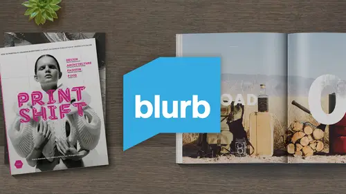
about practice and patients and revision talking about revision within the art world, and how things come from sequential progressions. I wanted to show you something. The magazine that we're going to talk about today is the magazine that I started several years ago, and it revolves around an ongoing project that I'm working on. And the reason I made this magazine was not to sell the magazine. It was not to promote myself. It was not to make myself famous. It had nothing to do with that. The reason I made the magazine was when I do documentary work and I go into the field and I'll inevitably run into people who see me working and they say, Who are you? They ask, Who are you? What are you doing here? And why should we allow you to photograph? So over the years I learned that I had to be very good with my response, to be able to convince people that I had a reason to be there and that I wasn't just, you know, necessarily someone who was a tourist who came through very quickly that was looking to take some photos and leave that I wanted to prove to them that I was a serious photographer working on a serious body of work. So I realized that the best way that I could do that was printing my work and taking it with me in the field. Now, back before blurb, I would take a box of prints. I would make small prints. I would leave him in my camera bag. And when someone said, What kind of work are you doing? I could hand them a box of Prince when the magazines and books arrived. I realize that this was an even better tool, because when people see your work in print, especially when it looks like something so beautiful as a real magazine, it instantly proves to them that you're a serious person and that you're focused and you're actually putting your work in print. So the first thing that I wanted to show you was speaking about revisions was I brought literally the copy of the magazine that we're gonna talk about one version of it. The first version of it. I brought the beat up copy. This is the one that literally I have taken with me into the field for years, and as you can see, the cover is pretty pretty well beat up the inside still looks wonderful. And so this is a copy that isn't so beat up, but it's the same publication. This was my first attempt at this magazine. It's a 20 page magazine, a 20 page sample. I had just started the project. I probably had 1/2 a dozen photographs that I thought were decent. And I said, I need to put these in magazine form So when I go in the field, this to me, was my passport. This works is like, This is why I'm supposed to be here and it worked. So as we get further into the discussion today and we get to the second part of this, you're talking about the revised version. This is the 80 page version of the same magazine, so I worked on the project longer. I had more work. I needed a little bit more thorough publication, and I came up with this one, and this is the final one that I've done. I'm still working on the project, but I haven't done 1/3 version of the magazine because the 2nd 1 is working well enough. And let's face it, 80 pages of content most people don't even have the patience to go through that. So they'll look at it for probably 30 seconds to a minute and say, OK, you're a legitimate photographer, your legitimate person. Okay, What can we get done together? It's a pretty exciting, exciting tool. So going back to the document here, let's say that I wanted to re create some of the spreads in this magazine. The first thing that I want to do being a photographer is I think I gotta bring a photograph in. So I'm gonna go to my rectangular frame tool and I'm gonna create a box here for a photo. Now is you notice I'm putting this box across the gutter. I'm a bit of a risk taker. I like my images running across the gutter. I've always considered that an editorial style or a magazine style image. I think it's a very cool and sophisticated way of using placing imagery. So the in design program, like a lot of other programs, has a multitude of what's called keyboard shortcuts. So instead of using the drop down menus up here at the top, you can do keyboard shortcuts to save your savior time. There are many within in design. And there are exactly two that I am going to share with you today because I don't want to confuse anyone here. I can go up. Let's say that I'm ready. I've got my box in the place that I want to use it. My photobox. I'm gonna go up to file and underneath file, you'll see right here a tap cold place places how you select an image so I can hit place. And it's gonna ask me, where do I want a dragon image from? And I can go down here and I can say I'm gonna drag images from here. Or if I cancel this, I can also do command D and command is places. Well, that saves time. It's a little bit quicker than going through the file menu. For whatever reason, I use a couple of keyboard shortcuts, and that's about it. So I'm gonna go to photographs and I'm gonna pull in an image right here. I'm gonna pull in this image. Now, if you look very, very closely, you'll notice that that's me on the front of the horse in sometime around the mid 19 seventies, and Wyoming, just where I grew up, you'll notice there's not a whole lot there. In case you were wondering what rural Wyoming looked like in the 19 seventies, it looked about like that. So now I've got my photo in here and I could move this photograph around. You'll see that there's a little white border running around the top of this photo. I don't really want that. I'm gonna clean that up a little bit. I'm gonna bring my My Borders in here a little bit just to clean it up, just to be safe. But I can move this anywhere I want. Now you'll see. What if I moved it a little bit too far and I put it here? You'll notice that that's I'm losing critical elements here. Right in the gutter. This is obviously something I don't want to do. So I'm gonna back this thing up a little bit now, the second keyboard shortcut that I'm going to tell you about and again, The second of two that I'm gonna share is shift W and shift W is preview, which allows me to basically clean up my entire monitor and Onley see the spread that I'm creating and I use this, I would say incessantly. I use it over and over and over every time I'm doing it spread because I want to see exactly what I'm working with. And sometimes when I have all the tools and everything else on the screen, I get a little bit distracted. So I'm gonna hit shift W and I'm gonna look at this and think, all right, that looks in terms of where the photo is. The placement is that's fine. I'm gonna escape out of this and go back to my spread, but the spreads a little bit blank. It's not, doesn't really have enough information for me on here. What I need is a little bit of copy to go with this photograph. So if you're opening the magazine and reading it, you're gonna understand what I'm trying to do here. You're not only going to get a visual piece of information, you're gonna get some some copy information, so I'm gonna go up to my text tool, and I'm just going to quickly draw a text box. And if I click inside this while still on the text tool here, the type tool this allows me to create some Some copy. But what I'm gonna do here is I'm gonna actually go get some real copy and paste it in and show you what I would do. So I'm gonna goto a pages document here that I've already created. I'm going to select some text. I'm gonna copy it. I'm gonna go back to my type tool back into my box and I'm just gonna hit command V. I'm gonna paste it, paste it in, and I'm gonna zoom in here and you're going to start to get a little understanding of how this spread is coming together. So now I've got my text box here that I can move around and I've got my photo box here that I can move around. And now, in essence, what it is is it's like a dance between your different components. You've got visual components and you've got copy, and you can move these around and you can organize and then command w You can see how they look on the page. Now I think that's a little bit waited a little too high and a little to do the right. I'm gonna lower this a little move My photos around etcetera. You'll also notice if I zoom in here on the bottom of this copy. There's a plus button, and this is a new indicator to me that there is mawr text that I can't see, because the box that I created is too small. So if I grab this bottom line and I extended, then you'll see the rest of the text. So now my balancing act got a little more complicated because now my text seems a lot longer a lot taller than my actual photograph. So I have a couple of options here. I can go in and I can take my type tool. I can select inside the box, copy everything and say, Well, okay, well, it's point a 12 point font. What if I went to 11? And now suddenly, when I scroll back out, much closer to the ballpark of what I'm looking for here now, my text is much closer in height to my photograph. But if I keep dragging things around and keep moving, moving things around to see how they fit. Maybe I put my copy on this side of my photograph on this side, and then I think? No, it's a little bit awkward. It looks like the horses actually walking off of the page. I don't really want that. I think this is better over here, but actually, something just caught my attention. And that is how this type looks over the top of a photograph. Now, this doesn't look right, but I like how that text looks on top of the photograph. That makes me think about something I'm going to do on the next spread. So let's leave this spread for now and move down to the next one. And with that concept of overlapping overlying text over that image. So let me go back, gonna make another photobox. I go back to my rectangular frame tool. This time, I want the photo to cover the entire spread, the entire thing. So I'm gonna go even outside of those bleed lines and I'm gonna do command d or I'll go up to file menu place, go back out to my desktop, and now, because I am who I am, I'm gonna choose another photograph of myself. This one again from Wyoming in the early seventies. My mom used to cut my hair with it literally a bowl she would put on my head. So in case you're wondering how I got that haircut So you're noticing that the box I made here is Jain. Enormous covers the whole spread. And yet the photograph I made is small. Now, if I was a good bookmaker and I was smart and I had prepared and I had prepared all these files the way that they were supposed to be prepared, I would have made all of my photographs large enough to cover this entire spread. But the reality is I didn't so for testing purposes. And this is something you can do while you're testing as well. You can also go up here to object fitting Phil frame proportionately. And this you'll see. There's a lot of different fitting options here. I'm just going to use pilfering proportionately, and I'm gonna hit that, and it automatically fills the entire container with the image that I've chosen. Now I know what you're thinking, and you are right to be thinking this is that you probably wouldn't want to do this because the key elements of the image which is my face, is right down the center of the of the publication and I'm gonna lose literally lose my my eye in the middle of this gutter. You're not gonna be able to see it now. I'll say two things about that one. You're exactly right. I probably wouldn't do this. The second thing I'm going to say is great bookmaking and great design and great magazine making and self publishing is in some way, shape or form is always about a little bit of risk, and there's a good risk in a bad risk, and this could be either side. But I prefer to look at it as a good risk. There are people that will open this magazine and see an image like this crossing the spread with a piece of key information in the gutter and they'll say, Oh, the designer made a mistake. You shouldn't have done that, But the other side of the coin is that certain people will look at that spread and they'll go. That's interesting. They put key elements in the gutter. Why would they do that? And suddenly they're thinking more in depth about your publication than they were before. You know, you know the expression any publicity is good publicity. I think that applies to some degree to publishing. So just for testing purposes, I'm gonna leave it Because the reason I built this spread was because of the last spread of moving copy around on top of the photograph, I thought that looked really cool. So what I'm gonna do is I'm gonna keep this photo the size of the spread, and I'm gonna go back up here to my type tool, and I'm going to create another tight box text box right here. And I'm basically gonna paste in the same copy that I had picked up before because it's already in the system and ready to go. I'm gonna pace that in. And lo and behold, I've got copy in my text box over the top of my photograph. And again, if I hit shift of you, I can preview it. Personally. I think I'm a design superstar. I look at that and I think this is magical. It's fantastic. I actually really like this spread. I love the old weathered part of the photograph, and this was not done in Photoshopped. This is actually a scan of an existing old print. Believe it or not, But there's something that's bugging me a little bit. And that is the fact that this is This text is black, and it's not super easy to read. It's a little tricky, and I'm not sure if it's that difficult to read that anyone would actually take the time to read it. And because this is one of the first spreads of the magazine, it's very important that people read this because I need them to understand the whole project so I can remedy this. I can go to my type tool. I can once again click inside the tight box. I can select all that and just for testing purposes, we're going to go to Swatch and we're gonna go to Paperwhite just for fun. Now, when I hit command, W. And I go to the spread have the same copy, but in white it really jumps out. It also matches a little bit. It's picking up on a little bit of the white tones here in the in the dandelion, even though my shirts a little green. This was my favorite shirt, by the way, I wore this, I think every day this entire summer. It's also picking up on the white in these little faded sections of the photograph. So these little elements that tie together I think this is a much more successful use of color copy than going with the straight black. So we've just to recap a little bit here we've walked through. When we downloaded and installed this software, we walked through the blurb. But creator, which was this interface here where we walked through the four steps, starting your project, naming it, creating the documents and then the 4th 1 that we haven't talked talked yet about ordering, which we're gonna talk about in a second. But just for the testing purposes, I'm gonna close this document and I'm gonna open the actual finished documents. So I'm gonna go back here to my book creator. And as you'll see, I'm gonna delete my tech, my test book, just to keep things organized and you'll notice here, Oop, you PV small, which is this magazine publication that I had mentioned earlier. And it's a 20 page document and it's telling me once I click on it here in recent projects, he's telling me exactly what it is. Magazine Premium magazine. Soft cover 20 pages and it's saying, OK, your files are already created, and all you've got to go out and do is update the location of where that file is. So the software knows I've already created these publications. I just need to go find it. So I click on this link and I find it. Here it is on my desktop, you PV small. I go to the pages document I had open, and then I can go to my cover document and do the same exact thing. Find the document and all you're doing is you're basically like, ah, bloodhound here. You're telling the software the path of where it can go to find the document that you've already made. So now the documents are created, their behind the scenes here. This last order section is here, but I'm gonna wait and just bounce out to the document to show you what I'm looking at. So we've got the cover of the document here and again. It created those two separate files my cover document and my pages document here. So if I minimize this a little bit, you'll see the pages document here. It's the exact same thing If I go up here into the pages tab and I scrolled down, I can see my entire document here. Everything is ready to go now. I've gone through here. I've double checked all my bleeds. I double checked everything. I think I've really got everything ready to go, and it's about time to hit. Upload Imprint. I go back down to the blurred book creator and again, did Step one Step two, Step three and no Mitt Step for And it's telling me, Okay, this is what you have ready to go. You've got a printed book. I can also check. It's not any book. It's a printed book here on this drop down, it's telling me the price. So it's $5 in 99 cents for one copy of a 20 page magazine, and that's my quantity. Here one through nine, I can also see my price breakdowns. If I click on this drop down, I can see my discounts for volume publishing. So 10 to 19 all the way up to 300 plus, obviously we would all be intensely happy if everyone went to the 300 plus all the time. That would be magic but in this case, I'm just gonna do one. Also, I've got no blurb logo in the back of this magazine. It's removed. And finally, I can check my dollars if I'm also making a book. If I'm in Australia, Canada, Europe, I can check the monetary value of what it's gonna cost me in these other currencies, which is a pretty slick deal. Blurb is a is an international platform. So when you make a plug in and you put your book in magazine into the bookstore, it's an international bookstore. So if you're looking to sell, you can actually sell books, books and magazines to people all over the world. It's pretty exciting. The first magazine that I ever did for public for sale within, I believe, 2007 and it's sold in 15 different countries around the world. I was still somewhat of a novice bookmaker at that time. Some would say that I'm still a novice bookmaker, but at the time I was so surprised that people in 15 different countries around the world would be interested in buying a magazine that I had created. So it was a very simple publication, and it really inspired me to continue to do this kind of publishing and also really inspired me to try to engage with the larger community because I realize there's like minded people all over the world and bookmaking and people who are interested in print and eBooks are a really rabid group of people around the world. There's a lot of talented people out there.
Ratings and Reviews
a Creativelive Student
This is one of the most interesting, informative, and accessible Creative Live classes I have yet seen in the five or six years I have been watching. Dan emphasizes the fun of the process and the importance of just getting started and being patient with one's progress. The aspect of this class that differs from so many "how to" courses is a clear way through production and distribution. I think many creators become stalled at the "how to begin" stage of real-world creativity, and Dan and Blurb provide an avenue through that sometimes hazy terrain.
Tessa Lauren
Thank you Dan and Creative Live! What a brilliant guide. I feel capable of jumping straight back into inDesign and can't wait to start self-publishing zines! - tessalauren.com (Photographer)
user-9eeff8
Clear and concise. Good course! Doesn't hurt that the instructor looks like Rob Lowe. ;) Worthwhile for anybody interested in an easy way to self-publish a magazine. I've used Blurb before for other projects (books) and it is indeed an easy-to-use platform.