Lessons
Lesson Info
Setting Up Background
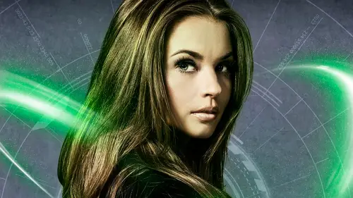
we begin with building the background. I've already got a document created here, and this is in the format of a movie poster. Standard movie poster sizes are 27 by 40 inches. Were not working that big. Is that because we don't need to? Um, that's the base document. Gonna start with. Now. I've got a handful of subjects that we're gonna use here images, and the first thing is gonna start with a background texture. Now, textures are a big part of my work. Will have a large library of textures that I used for a variety of different reasons. So use them. Um, I combine them, I, you know, I'll take textures. I shoot with my phone. How many views stuff you you taken from your phone? Yeah. I mean, they're really powerful tools today. I was just taking a while ago that one of the best somebody asked me what was some of the most important tools in your workflow. I was like, my phone captures ideas. It captures textures that captures things I can use in my in my work. Um, having said all that, thi...
s texture was not taken with my phone. Now it's actually part of a stock image that I got, and I just really like the the overall texture and feel of it. But like most cases with textures, I'm not felt. I'm not a big fan of the color doesn't really work with what we're going for here. And that's something you can always dismissed. I have a lot of friends will say I look up stock images and I see a texture or background. It's not quite the color I want. Like you're in voter shop right there like, yeah, you can change that doesn't have to stay that color. So when I'm looking at textures, I'm I'm mostly looking at the texture itself, not necessarily the color. Sometimes the color of the texture works out fine. But in most cases not now. I'm just gonna go and remove the color of this particular one real quick by doing a shift. Command you just to remove it. Basically, the century, the image and I needed to be in the in the orientation of my poster. So let's just go ahead and image, rotate clockwise, and I'm gonna go and take it and bring it on over to my working document I'm gonna add. Shift is a dragon drop, so it'll land centered in the document. Now, you may notice also and always point this out. Inevitably, get at least one question this. I like to work with floating documents on my background like this on the Mac. You, of course, have the option of turning on the application frame, which contains all the windows and everything in one giant window. I can't stand this from a personal standpoint that just goes back to my habit of using finish up in the old days. So I personally prefer to turn it off, allows me to freely foot, float my windows around and drag and drop my images in between. So that is why if how many of you like ejaculation frame anyone? Anyone use it. I don't like it. All right, So got my texture over there. It's a little big, by my way with resolution, the original resolution, someone that need to scale it down. So when a press commander control T to invoke free transform, but it's still too big. I can't see the box. I'm gonna press command zero, and it's gonna expand the document to reveal the overall image now on a scale of proportionately to the center. So I'm gonna hold down shift. An option was to scale it down till it fits now, actually, gonna release shift and to scale its center disproportionately. I wanna have it snapped right to the edge. Is there because it's a texture and it's an abstract image? Doesn't matter. You won't see any distortion. Now spring back up my layers panel here. I gotta look little folder group there rather that will come that will become relevant just a little bit. So got this on the overtop, the background layer. Now I want to give it a color different obviously from my original color. And I want to be able to colorize it in a way that I may want to change it later very easily. I'm gonna do it with a simple layer style. So I'm going here and double click on the layer, just opens up the layer style panel, and we do a color overlay. And how do you like that? Remembered my settings. This is actually the second only used. I want to use this kind of blue color here. And this was a very scientific decision choosing a particular color. I just put my cursor somewhere in here and just quit once. And there it waas So I always share the numbers. Everybody asked me, You know, how do you get ahead to get that color? Is this? I went in here and I went, but I like that just a lot of people want there to believe, but they want to believe that there's some riel scientific process to choosing some like and it's like, No, you just It's an artist. You just randomly pick a color. Bob Ross didn't calculate the ounces of paint he put on this tablet. He just put it on there and brushed it out. But we are gonna blend this to the background using a blend mode so you'll see you've got a variety of blind moods here. Vivid light is giving me the best. Um, look here, however, it at 100%. Obviously, it's way too powerful. I've seen a lot of people quickly dismiss a blend mode or something like this because it's just overbearing. It's too powerful. Remember, you've got a variety of settings here, so by dialing, it's down to about 35% puts a nice cool cast on that background texture. And it's not to pout too overbearing and again it is a layer style. So even though I've done this, I can go in here and just double click on the layer style turn it off if I ultimately don't like it or just go in here and change the color, make it a nice, warm colors like that. But it's nondestructive. I'm not going in there and manipulating the original pixels. So there we go. OK, we got a background texture there. Now I'm gonna go in here and lower the a pass ity of the layer to about 75% tones the overall brightness of its extra down as well. Now we're gonna introduce another image or another graphic element. So I go in here and I've got this graphic here is is it a stock image? Of course as well. Really cool graphic design element. Once again, I really like the overall design here. The lines of circles even like that, I do not necessarily like the color again. We can fix that. So I'm gonna go ahead, remove the color once more go ahead and rotate it once again clockwise 90 degrees. And then, once again, we'll just drag and drop it into the working file Here. There we go now. Wanna blend this with that background? Texture is a variety of ways. You can go about doing that. You can. Of course, he's a blend mode and blend Modes are very unpredictable. You don't know what's gonna work with one image. They're very different when they blend with a certain type of, ah, photograph protectionism like that. So you get a kind of tryem. In this particular case, though, I discovered that none no blend mode gave me well, is looking for. But I do want to show you a quick tip when you're hunting for a blend mode. How you can do it very quickly is when you have the move tool selected, you can simply go to hold on shift. And then this hit the plus sign and it will toggle you through your blend modes, and you see a visual representation of each blend mode very quickly so you can tell right away exactly how each one's gonna look. Because, you know, if you go on the menu and just try each one like this. If you have that kind of time, go ahead. But you can you also use this trick. But like I said, I'm going to put this back to normal. What I'm gonna do is drop the layer opacity to 50%. So it by doing that, it's that the background black areas putting a little bit of a darker cast in that background texture, and it's lowering its lowering the intensity of those white lines, everything like that. So it's making it, pushing it a little bit further back in the background. No, I want to give that texture a little bit of the same blue overcast I have on the layer below. In fact, I want to use the exact same layer style that I did on the layer below. So here's a cool trick. Hold down your option key Bolt on windows, Of course. Grab the effects icon right here on the layer and just drag it to the target layer and release. And that's a one step copy and paste a Belair style to a new layer. Picks it up, and now we've got that background looking a lot better. So you see the big difference it may in there on adding a little more color saturation to that texture. All right, now, let's go ahead and do one more thing. Let's do a save because that's that's the basic elements are background put together. Something is going to save this stage. At one point, I realize there is the auto save in photo shop, But once you, when you lose enough projects do the photos up crashing, you get in the habit of saving hot, so that's really never left me. That's a good thing. So usually when I do a major step, if I finish a certain element or a three D elemental like I always do a save purposely. Sometimes I'll say that is a separate document myself, like many designers will have a folder in its final one final, too. Final Final Four, That's you said. You've probably seen that online with a lot of people joking about it. It's very true
Class Materials
Bonus Materials with Purchase
Ratings and Reviews
kasmath
So happy to find this class by Corey Barker and loved it! It definitely helps if you are familiar with Photoshop but he teaches you so many fun, new things in regards to poster development. I love this is in video because you can watch and re-watch if you don't understand something the first time. You can see how much Corey loves his work and he shares his passion with you! Thanks for another great class!! I look forward to owning more of his classes and they are so affordable!! Thanks Corey!!
a Creativelive Student
One of the best classes I've taken with Creative Live! Like another reviewer said, I too was yelling at my computer in excitement and taking pages of notes along the way. I learned so many valuable techniques in this short but sweet class. Thank you Corey!! You rock!
a Creativelive Student
I was literally screaming at my computer while watching this... like it was a football game or something!! YES! OMG!! SO much information - was taking notes every 2mins, and laughing along with the studio audience. Best CreativeLIVE course I have seen. Watched in it all in one go, and will re-watch many times I am sure. Very happy with my purchase. Thank you, Corey!!