Lessons
Lesson Info
Celebrity Work
Okay, so we're doing something interesting here. We're moving away from so called riel people. Don't you love that term in photography? When someone is not a celebrity, you say real person, as if as if an actor is not a real person or a model, right or model, Let's say someone word migrating towards something with camera experience. Okay, so in my work, I do a lot of, ah, celebrity photo shoots. So it could be like entertainment style work for movie, poster, TV ad or celebrity endorsing a brand. So I have to show, like this stuff that I'm very passionate about but also have this sort of weaving celebrity portrait Sure, in a way that makes sense. So that's why I chose to go with this. Michael K. Williams shoot is because you'll see. As I turned the next pages in the book, we're going to start going into studio setups. So I needed a shoe in which I had both versions of something that's on location like this image and something that's in a studio. So when I turned the page were in studio,...
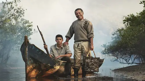
but it's the same subject, so really the only thing that connects these two images is that they're both Michael K. Williams, but it's ah, it's a device to flow better into the next couple pages, so don't see how that works. Okay, well, I turn the page there. All right? So yeah. So, actually, all these images were shot in my studio in Brooklyn. Right? So we see this background here, and I turned the page and voila. Here we are. Right. So it didn't seem that jumpy, I think. Like in the portfolio. If you went from here to here, it's like, Ah, what happened? Outdoor to indoor? Yeah. Between at least that's the trivial detail that I convinced myself in my head. That might be a sign of psychotic nous. All right, now, that's smart. I wouldn't have naturally thought of that. And so but it worked. Yeah, it's like, you know, my work is held together by the fact that it's environmental portrait, but it does have a lot of variety, especially when you mix celebrity and with subjects who we typically a signed photo journalistic roles. You have to be really careful with the order in the presentation. Okay, So this was, ah, assignment that I shot for a friend of mine's charity, um called Feed. It's an affiliate of World Food Program and was shot in my studio. It has a lot of celebrities, subject matter, like the famous model Karlie Kloss and designers and things like that. But we wanted to photograph it in a nice like, you know, homey way, not high fat. I mean, I don't shoot high fashion. I wouldn't even know where to begin, to be honest. So it just the same like a portrait, but inside of my studio. So I just had to come up with a very beautiful way, unified way toe light. All these different subjects show off the product, right? Which are these bags? Um, And there was used to promote their charity Mr Drawn Legend. And again here we have an interesting transition where this is obviously not part of this project, but it still flows together, and I don't have to make any kind of break. Later on in the book, you'll see that I use a white page sometimes to separate the sections because I print in sections. But here, I know that this is gonna live together in a good way. So again. Close up studio backdrop. Honestly, very similar lighting. This one's a little bit more dramatic, but they're both kind of like warm tone and, more importantly, thematically there. Honest, approachable portrait's. And that's what kind of connects these two together so that Aiken flow and not sort of busy backgrounds like you said both in that studio type look and tones. Yeah, I'm seeing that. Yeah, this was actually shot in a movie theater before I Q and A. I had a couple of minutes to do it. So this is the howl of a movie theater yet. Okay, But therefore you don't know. You made it look that Robert near and just showed up to my studio because he loved my work so much. It's not true that way. So two minutes with Robert DeNiro. Wow. Yeah, barely. I mean, it's a long story. I wasn't even really supposed to take this portrait because it was set up for Jennifer Lawrence and we had permission from her and our people. But it was before Screen Actors Guild event, and we didn't hear back from Roberts folks. So the Screen Actors Guild people told me, like if you can convince him to sit for a portrait, then that's good for us. Do it. And then he wandered in by himself, and I think he just honestly thought he had to do it. So I was nice and curious. And, of course, he had to sign the release with Screen Actors Guild. But yeah, we just made that happen. Screen Actors Guild folks, uh, again MAWR celebrity stuff. I don't spend too much time here, but like their Dylan McDermott, Jessica Chastain and this is, you know, taken in the studio with the background composited. I mean, it was taken in a tiny green room with a huge off the bank, suffocating us all. But it's still, you know, it's still flows together. It's still, like very simple, uh, background connecting these images. Now this is the first vertical portrait relative to catch the landscapes out. Can you talk about that transition that is thank you for pointing welcome. So again I have my book formatted this way because 90% of the images, maybe more, are in this orientation. Let's say landscape orientation. There are the occasional portrait. So what? I've decided design wise to keep consistent is this border. Okay, so they're spreads later where we have, like, multiple portrait's, and it has to shrink this way, but this border will remain consistent. So that's the design element or simplified design element that keeps everything consistent. And the reason why I have pulled it this way is just because this is a portfolio presentation book not, you know, find our coffee table book. So since I'm presenting images, I want to slide it just the way from the gutter. That's it. So that'll keep it consistent. It also give just a little breathing room between the two images. So this is still four by three images just clocked the other way. Interesting note that you brought up this image is not okay, but this still stays consistent. Right? So see this edge? That's the exact same, um, wit. Thank you as this. Okay, that's great. Yeah, but you know, I don't want to crop this toe four by three just for my portfolio, because then we'll miss a lot of this beautiful Manhattan skyline, right? So I want to keep it to the original crop as much as I can, but having something consistent in the portfolio itself consistencies. That's great. Then you look like you have your stuff together. Yeah. Uh, okay, so now we're moving into, like, television advertising. So this is for work with National Geographic Channel, Uh, one of my most favorite clients. Toe work with, um And they've actually hired me for a few. These historical reenactment TV films like Killing Kennedy, Killing Lincoln. So those I also have back to back. So the shoot intention again was for key art, which means that have logos and text on it. But again, in my portfolio, I'm just displaying the raw photography. So this is killing Kennedy and then another presidential assassination project with killing Lincoln and these air stylized in the in the sense of the way that they're presented to the camera as not reenactment photos of, you know, actual moments. But, you know, they're the actors presenting themselves to the camera like I'm sure like this never happened. This is more of the theme of Prem emission. Let's say is what we wanted Teoh make something that the viewer has never seen before. You know, it would be easy to go to the site and do a historical reenactment with the sepia tone or something, but creatively, that's not what we wanted to do. But you kept the steam again. We had some actors, and then it flew into actors. But in a different scenario, not just portrait of them, but portraits of them in a scene for different purpose. Exactly. Yeah. And even though these projects were, I think a year or more apart because, uh, the creative director Shin was consistent between the shows, even the sense that, like we're on a studio set with a prop, was even consistent throughout the project. So for me, being obsessed with consistency as a photographer, that's like a dream, honestly, to work on. So, yeah, next next page, Um, yes. So you can see a little bit of consistency here. Now we're in kind of like the darker tones of my work. I think if we were to open the book with these kind of pictures, it would appeal to some clients for sure. I mean, the people who hired me to do this stuff, but it's just too. It's too risky to like open with that because it really puts you in a narrow box. So in my portfolio or the way things are displayed in your website. If you have things like this work, that's a little bit like E don't know who's gonna like this. Just hide it back a little bit. So this was a shoot that was actually for a tattoo magazine with this, uh, performer called calls himself Zombie boy Rick Genest. And we wanted to pay homage to a Philip E. Housman photo Philippe Halsman photo. But we wanted to do it with tattoo. So this, um, this composition of bodies makes a human skull, but they're all tattooed. So for the tattoo magazine, it was Okay, well, we're seeing the image here. Technically speaking, they're lying on the floor, and the camera was rigged above, and we were tethered to capture one pressing the shutter of the camera to get this sort of ah viewpoint. And, you know, as a photographer on set, you have to be really respectful to models. You can't just like touch people. But I was being really overly cautious, and they were lying in this uncomfortable composition like, please, just drag us and push us around into place so we could get this done. So you've seen the video of Mike you. What is the tooth of the small? Yeah, so, yeah, that's that's how that came to be. And then after that set up, I just want to do some very classic portraiture. There's some, um, you know, throwbacks toe great paintings where they put a human skull in the corner. Um, momento, Mori, that kind of thing all went along the same theme as the subject. So, to your point of when you're considering work that might be polarizing, that might be a total turn off to a potential client. Would you actually pull that for a particular showing? Or is it important to you, too, for people to see the total breath of your work? Yeah, well, to me, it's not so much about like being polarizing. I don't think any of this stuff is too far away from what I do. But there are ways that I printed this book in which sections can be rearranged in terms of order. So, for example, if I'm showing my work to someone who doesn't care about celebrity, okay, I could take that entire section out because the way it's printed is actually with all show you later, but it's printed with blank pages in between so I can remove the entire section. What I do most commonly is just rearranged the order. So if there's a personal project that I think relates to the person that I'm eating Mawr or it just makes a better conversation piece, I'll move that section first. So, for example, later on in the book, I have some stuff from Kurdistan region of Iraq and Syria, and I find meeting someone where what they do is more topical, right? Like they know what's going on in the world now. They're that kind of publication. I'll put that the first, especially since it's something that I just got back from. Let's say I'll put it first. Some people don't care about Labadze calendar, but in general fast the best thing to start out with. So that's why have it formatted in this way today. Thank you. Okay. Problem. Okay, So more celebrity stuff. I like following with Ellen Burstyn from this picture because it's literally the same photo, right? Subject background simple. Sitting on a stool subject background, sitting on a stool. Different. Okay, close up portrait. Little bit of gunk Sam, right? It's nice. It feels it feels it feels good. And this This was actually done for. Ah, Lifetime TV movie called Flowers in the Attic on. And afterward, when we photographed Ellen Burstyn in character, we did these portrait of her herself. So later on in the book, you'll see the actual poster. But it's the same set. We just utilized it for two different things because we had the time. Um okay, so now we're moving away from studio setups and we're in environment. So a lot of the times when I got hired to work on the movie shoots, I'm piggybacking off the production of already existing film. And if you think photo shoot schedules, our hectic film production schedules are crazy. And when you're still photographer sent to make ER alongside a creative director Arctic director, a lot of times, you know you're really borrowing time. You're setting up on the side like waiting for you. Actor. Maybe we got a few minutes. Maybe you'll get the whole day, but it depends, and I'm honestly happy to be considered for either style of assignment. So these things look like huge set up because they were there in my own thing, but this is literally in between filming or beside key sets. So, um, this is Martin Sheen on the set of the movie in Rio de Janeiro. Cold trash. This is Ian Glen, who you might recognize from Game of Thrones. I wasn't on Game of Thrones is actually a different movie, but he's wearing a similar outfit, so I try to summon game of Thrones so I could shoot it. That would be a dream job, but yeah, In the meantime, this is in here. So back to my point, what I want to do is I want to show that kind of person that I can also show up on set on. Be very careful with time. So, you know, if he and Glenn is in between shoots or scenes, I'll just walk up and try to, like, do something right or you arrange it through the assistant director. I have a set up over here. I need literally two minutes. Can you please help me like that kind of thing? That's how it works on. So it's not like the huge Hollywood thing where I'm given the whole day with these actors Sometimes it could be very, very quick. And that's what I want to represent with this, with this spread just society, because I think that's fascinating. Did you have missed opportunities where you didn't go kind of get forward and go and ask and then realize that you just had Teoh be really forward and just ask for it was really nice. Not for it's somebody, I mean your Franz somebody else's show. You can't start hijacking it, but you can in a very Canadian way. Yeah, you can push buttons secretly under the veneer of being nice. You know, I'm saying that's Canadian. It's kind of like Seattle to Yeah, well, Seattle's Americans Canadians, right? Um, so, yeah, that's what that's what I wanted to damage history with, um, next spread is Boy Scouts of America. Um, this was done for a TV show also on National Geographic Channel. And if you notice here, we have a lot of like posing right, and I just It really doesn't fit thematically to change its just injecting a sense of action into the book because, like, think about all the last pages are, like, show stoic. Even before that, uh, zombie boy, and it's just like, Are you gonna get your subjects to actually do anything right? So, bam action. That's how I thought about these. Also, uh, less pretentious light, stylized but a little bit of mistakes, right? So it's like there's no amazing, beautiful key light on this subject because that's not how it would work in real life, right? Um, there's a key light on here, but it's really, really gritty. So yes, Justin inject a sense of action to the action being injected. I mean, how far into the book are we? Maybe 1/3 of the way. Yeah, I would say about 1/3. And so is that something you're consciously thinking of in terms of appropriate time to break? Because remember that on some assignments that I work on, you know, maybe they are 40 days long, and some of the asks from the client for that shoot might be a mixture of both right. So I still want to just remind people that the thing that unites my book is environmental Portrait's. In this sort of cinematic lighting quality, it's not so much about being stoic versus not I would hope that I could show a little bit of ah, reality also
Ratings and Reviews
a Creativelive Student
Joey's work is amazing and this class is extremely informative but what I really appreciated the most is his humility. He has worked with so many people and on so many projects yet his humbleness shines thru it all. A great lesson for all of us. Thank you for this class.